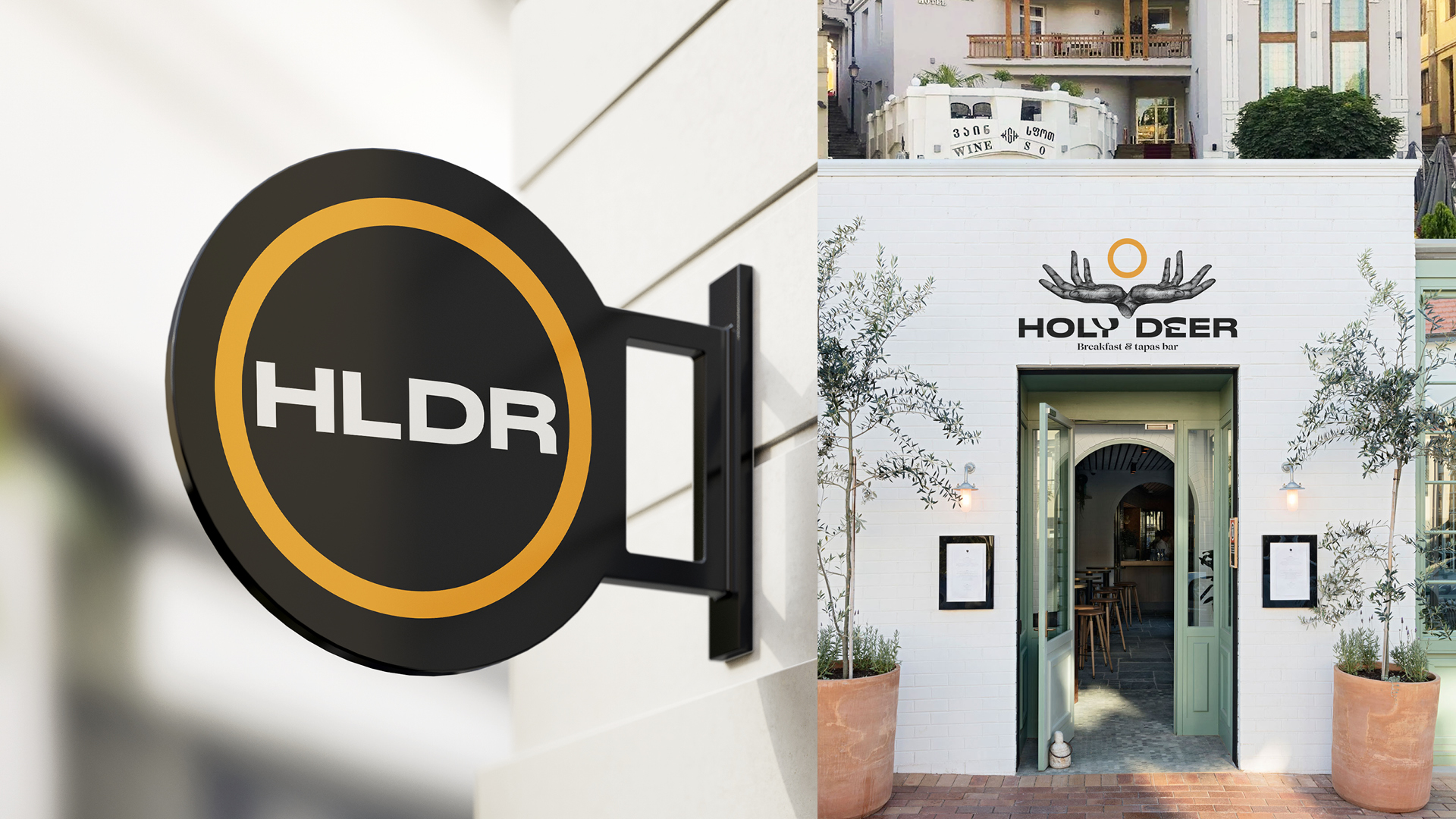
The challenge: Development of brand complex for café/bar Holydeer.tbilisi in Tbilisi. Development of verbal and visual brand identification.
Objective: To attract expats, tourists and especially local residents.
What we have: Premises in the old city (historic centre of the city, very popular with tourists). There is a bar in a residential area on the way to the funicular (one of the important attractions of Tbilisi). There are a lot of hotels and apartments around, tourists and expats like to live in this very district.
The essence is a new culture of recreation (new for Tbilisi and familiar for tourists and expats).
Insight: THEY GROUZINES are tired of eating away from their own food, they want to meet the world trends – they are very receptive to everything new, with a pronounced hedonistic vector.
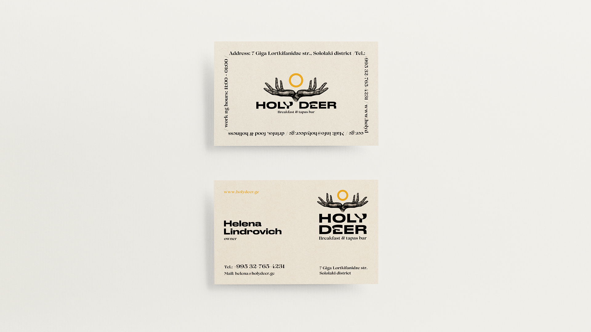
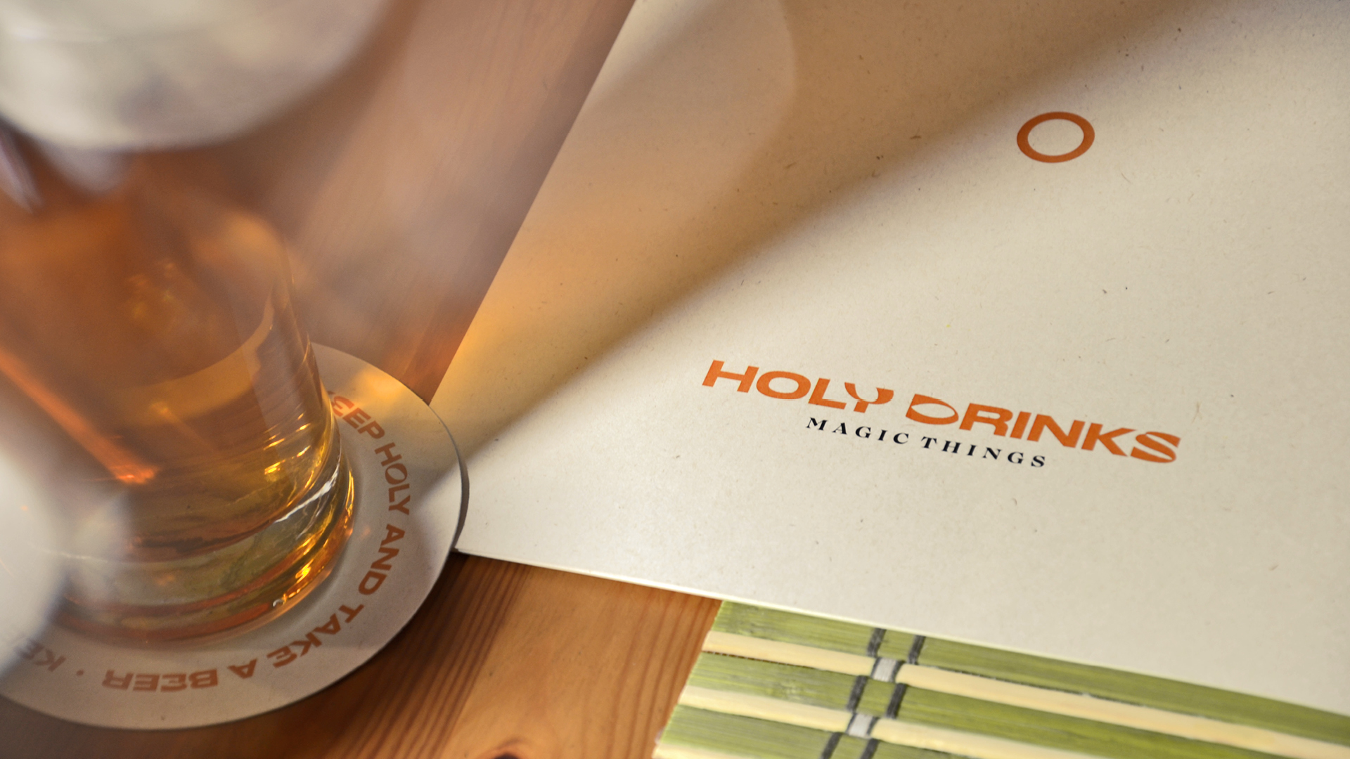
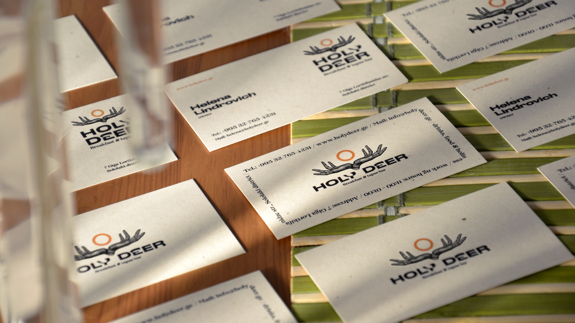
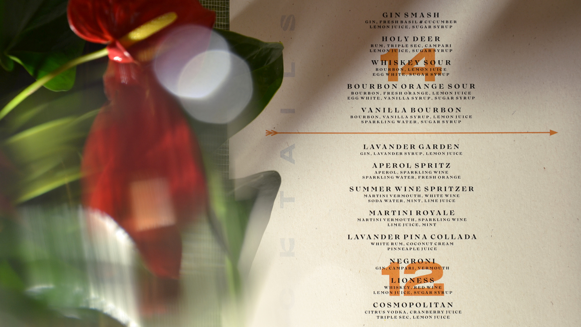
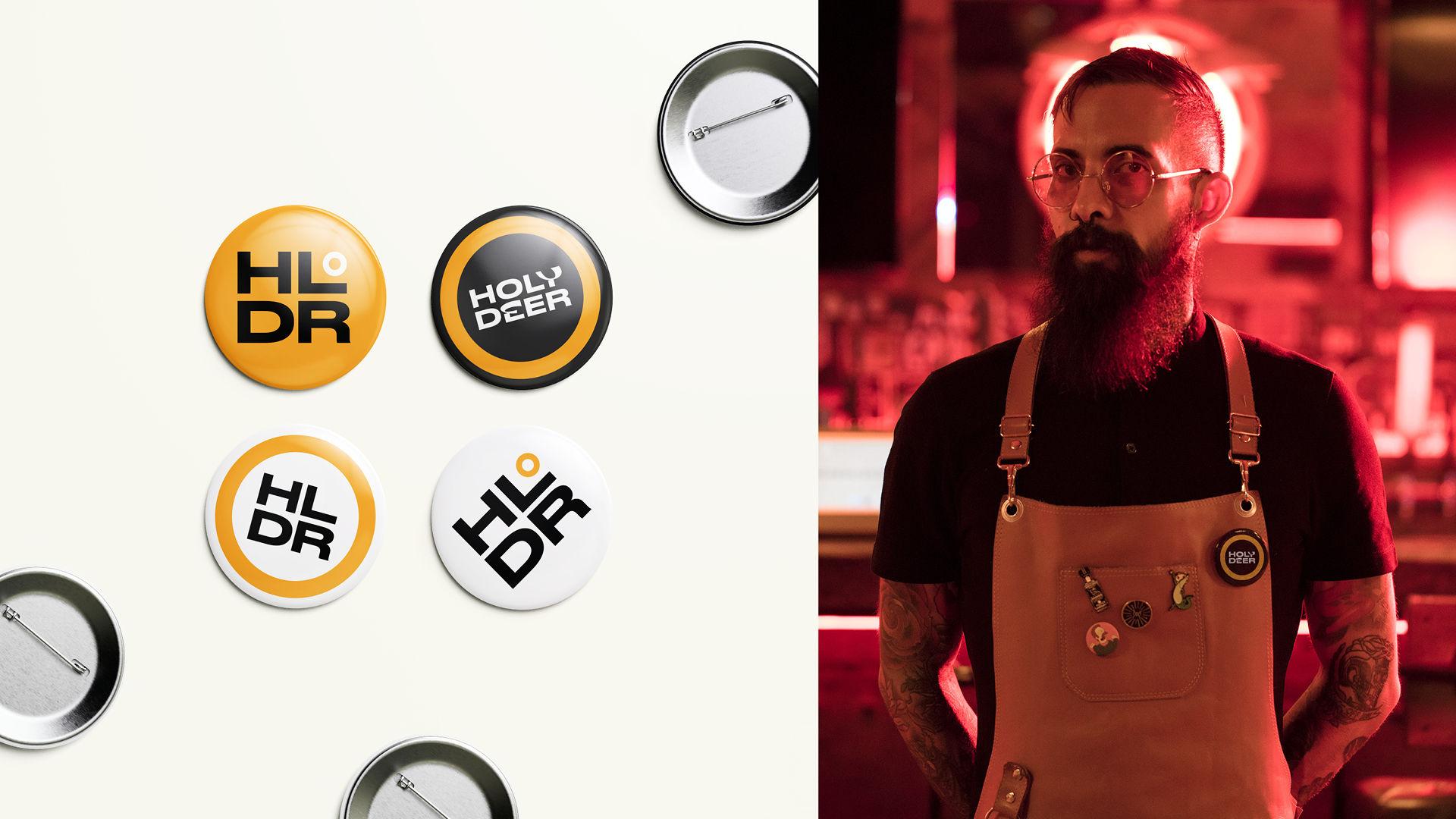
Solution: The name Holy deer came from a legend, according to which deer are the symbol of the city of Tbilisi.
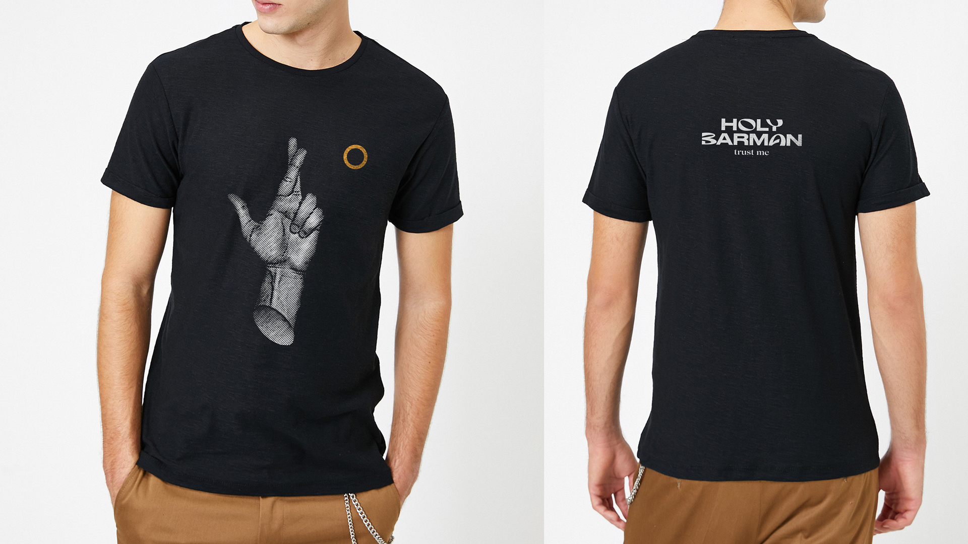
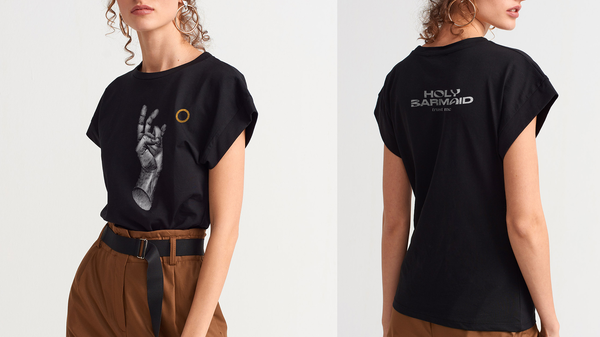
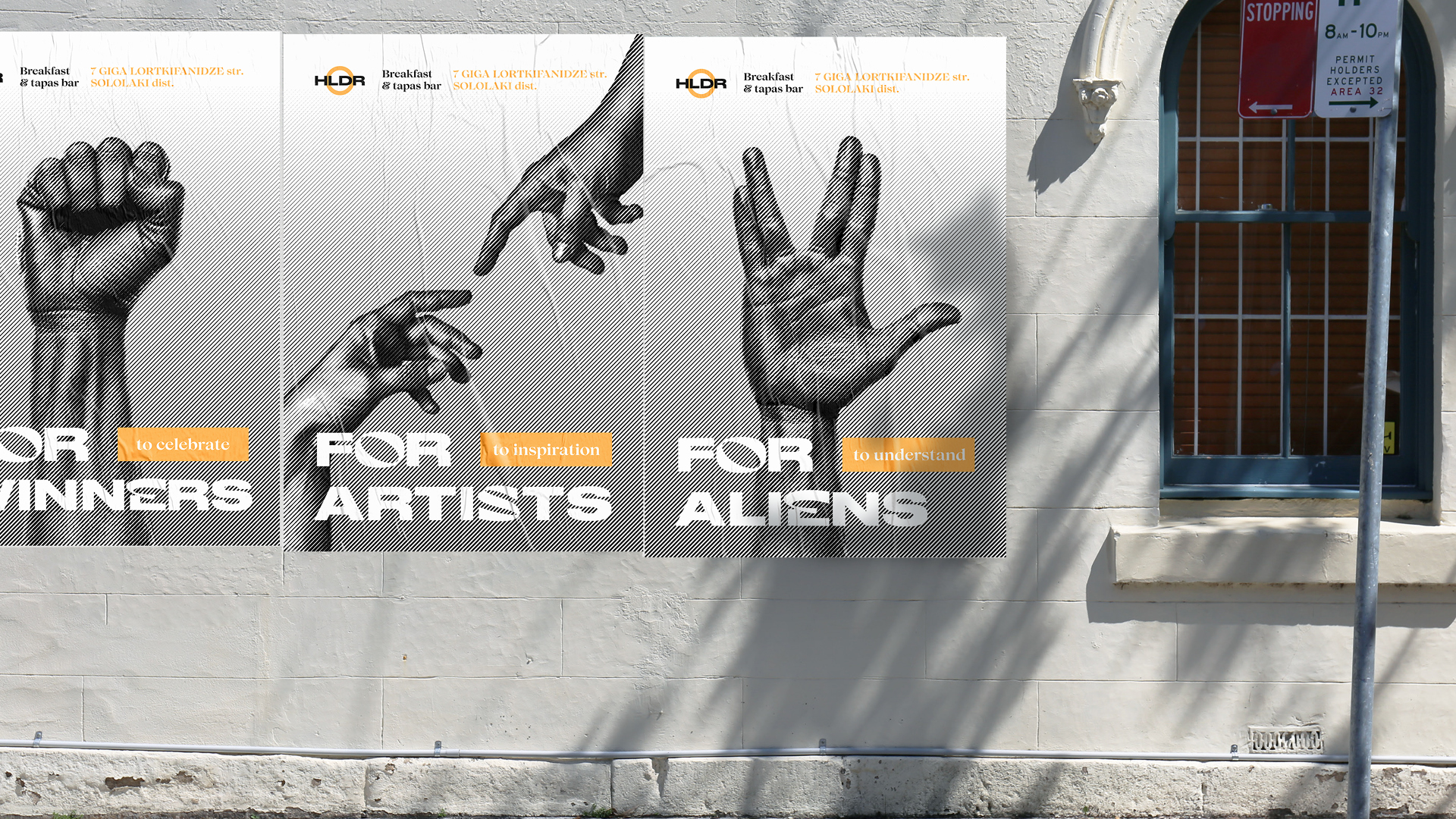
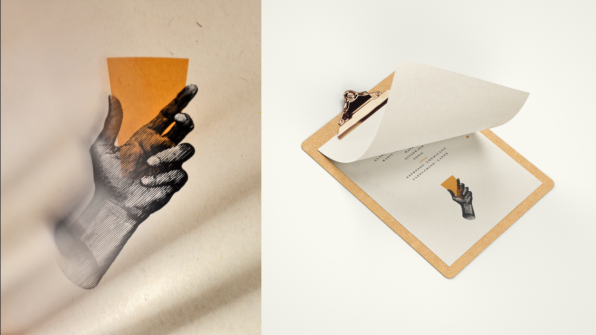
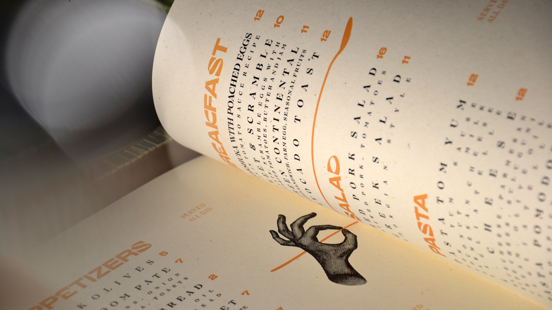
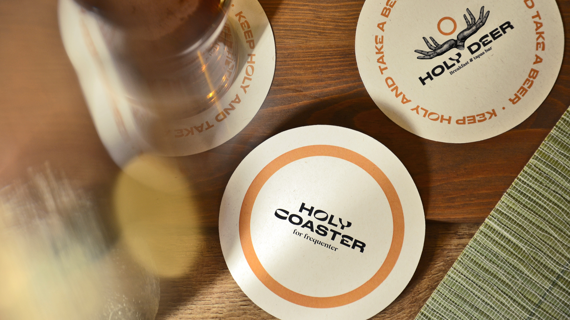
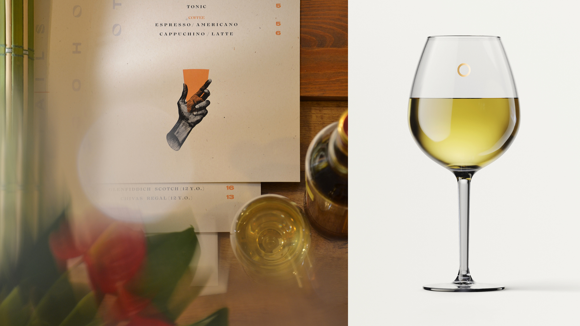
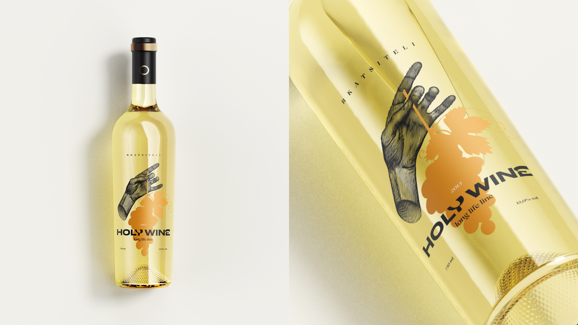
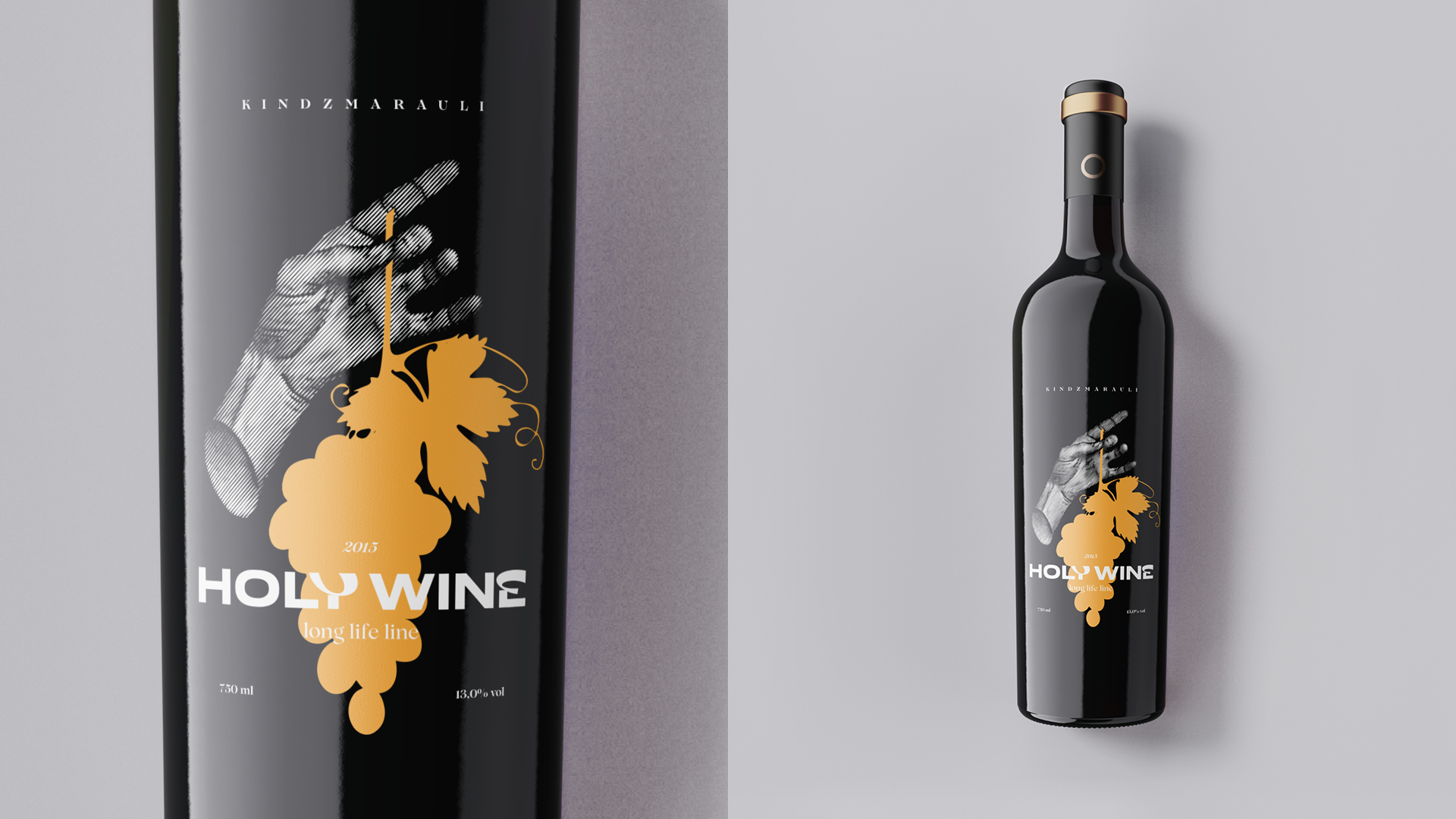
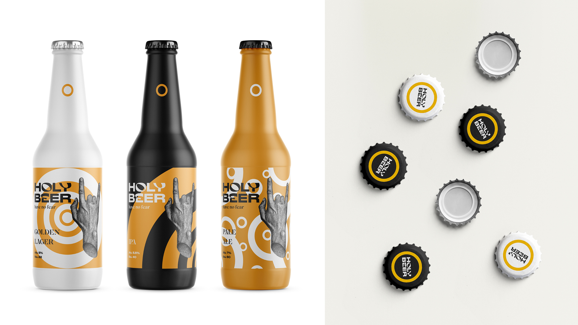
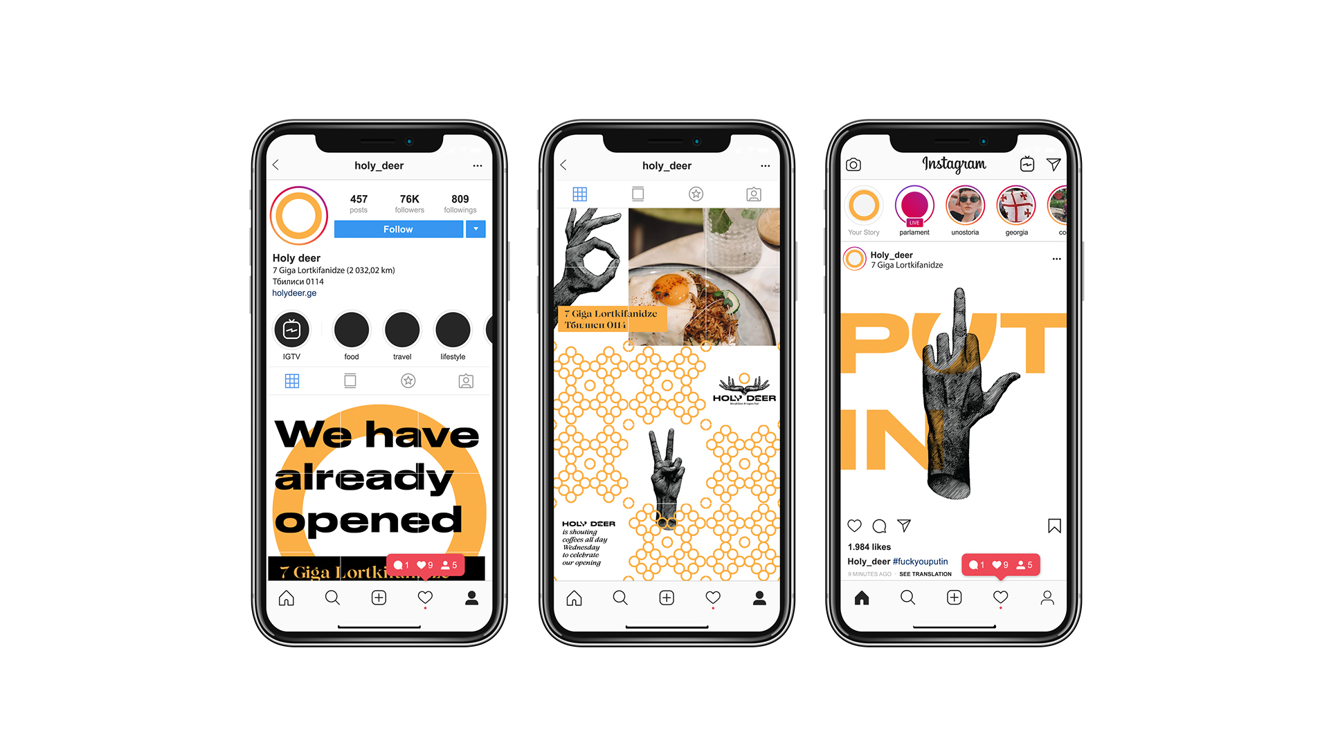
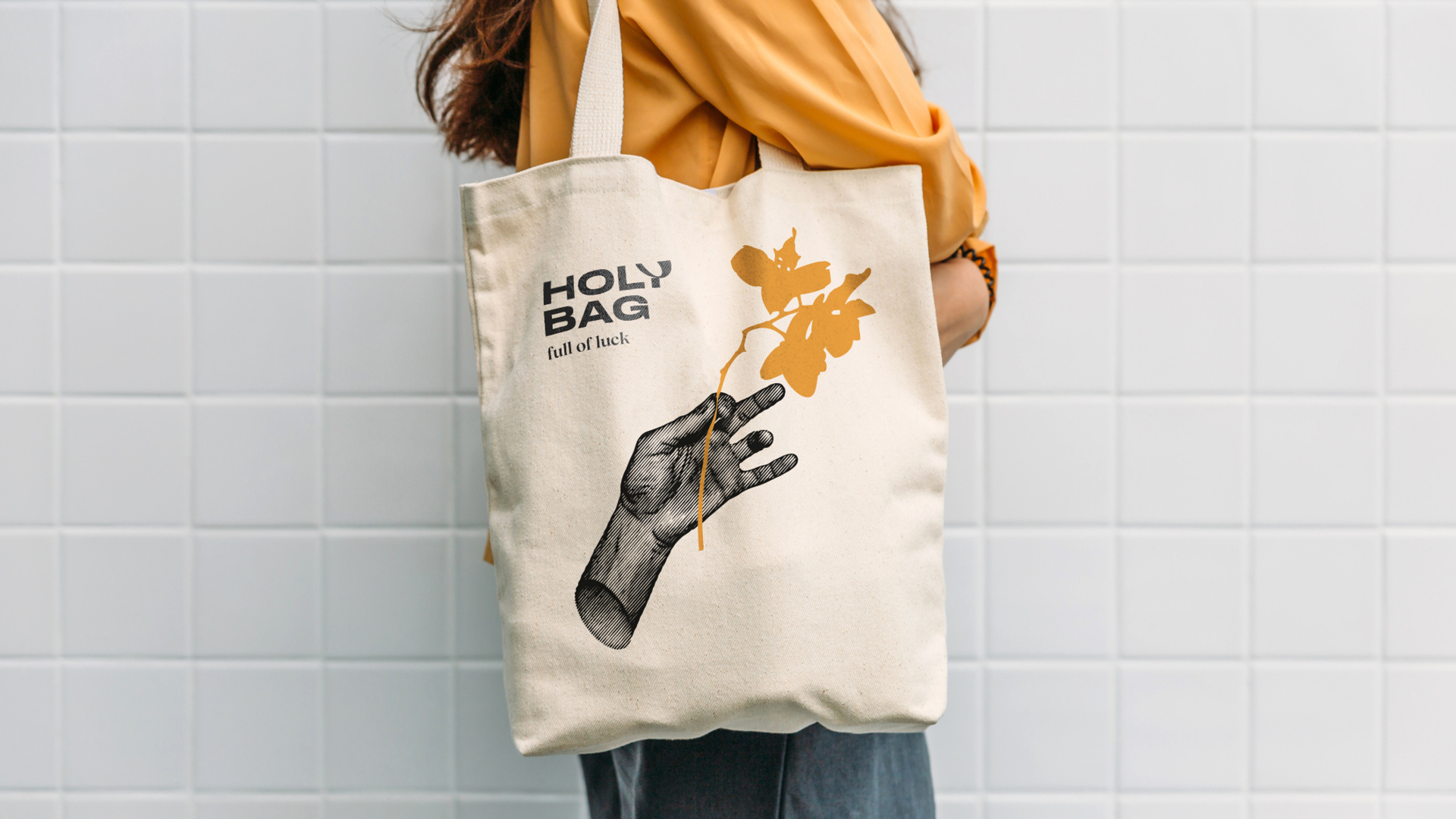
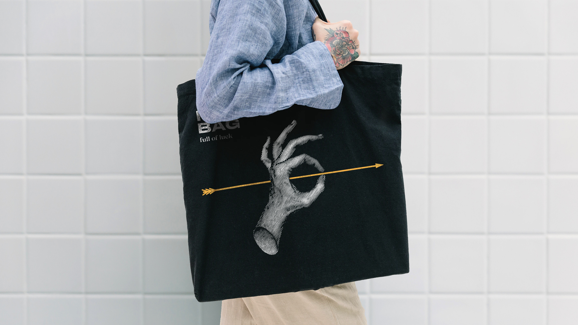
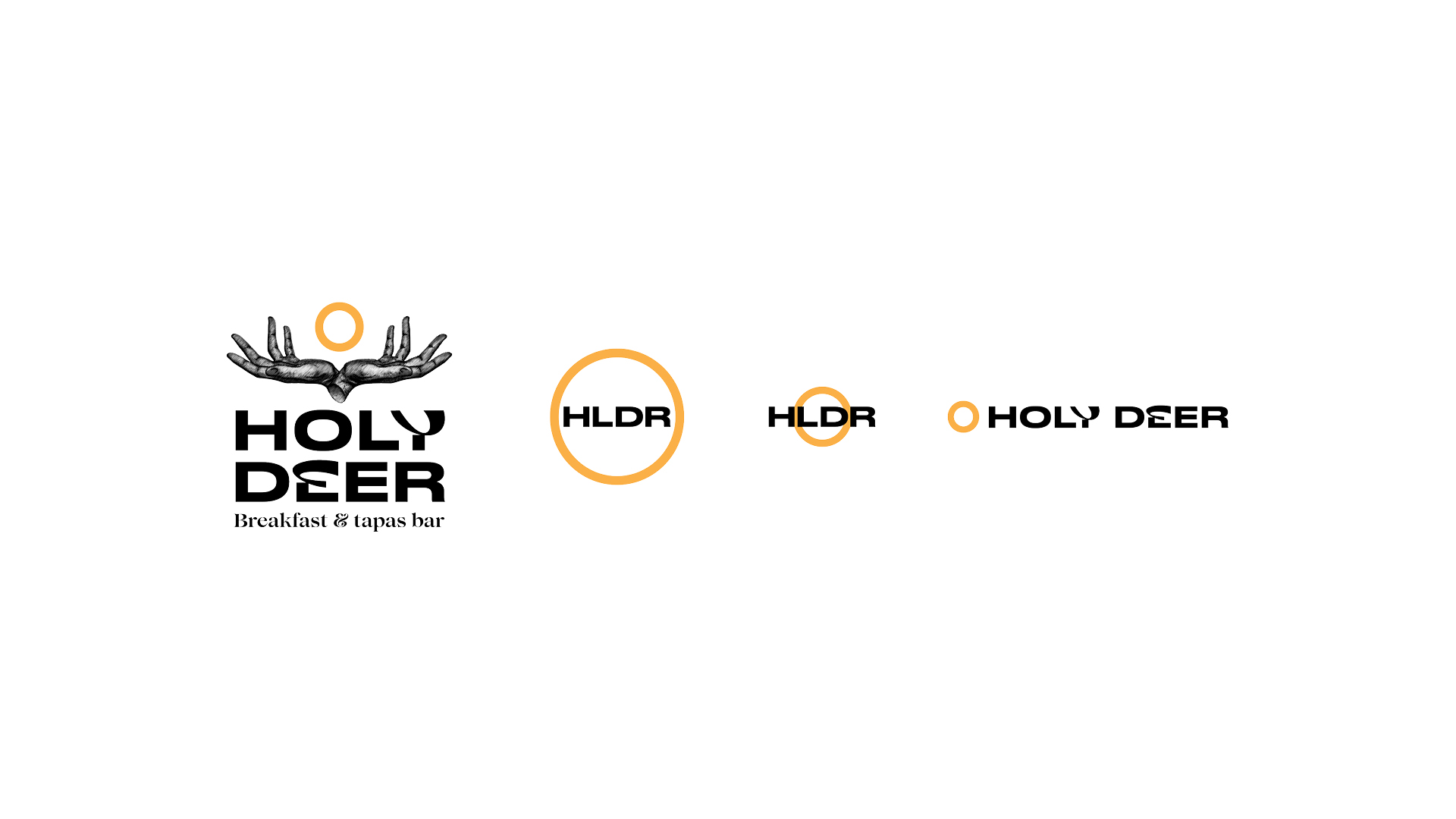
Mainly, which we use in graphics, became a symbol of the hand: the hand of the saint, the Creator. The hands create all dishes and drinks that are handed out by the same hands. In addition, the hands are a means of communication when you speak different languages.
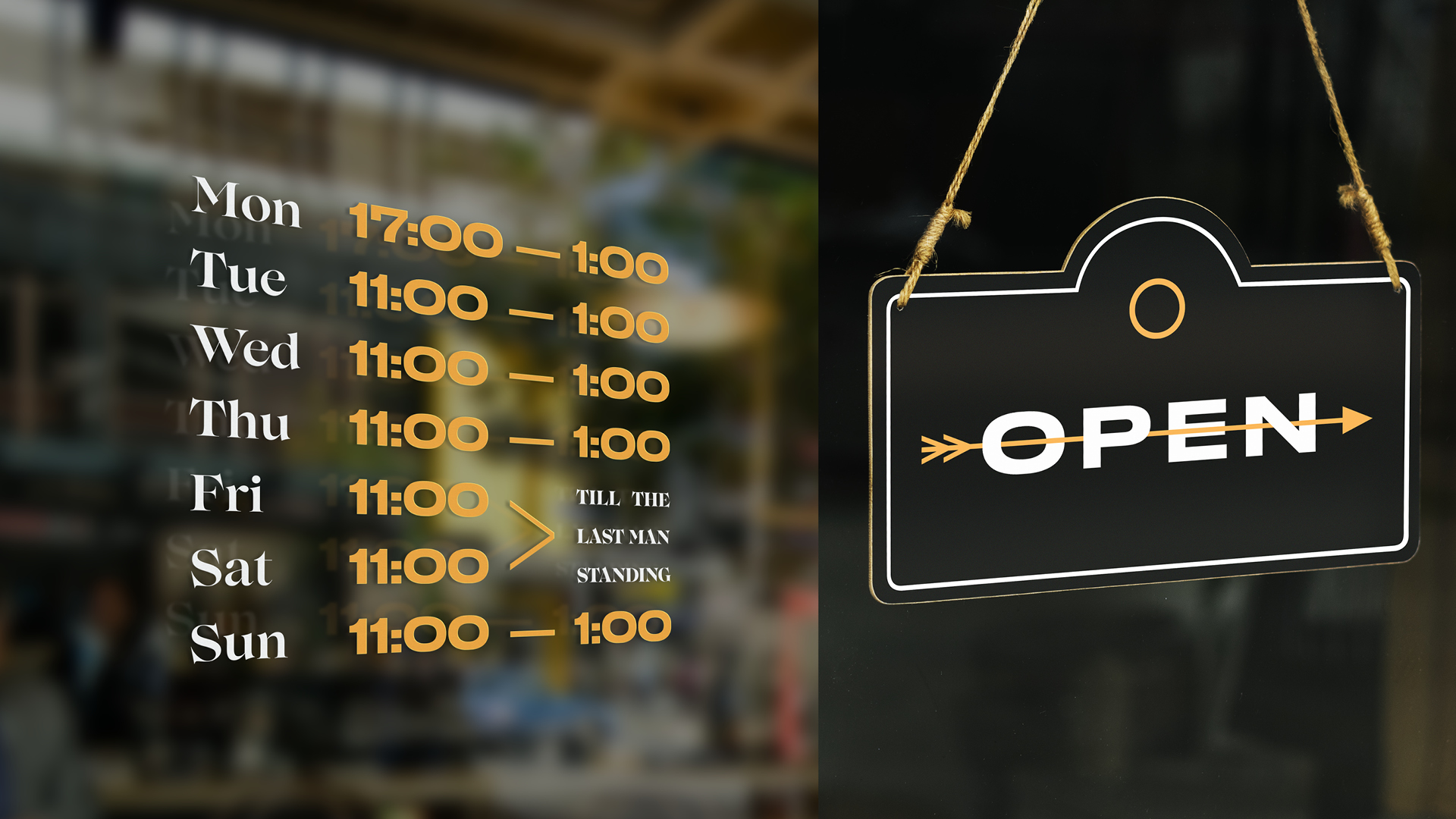
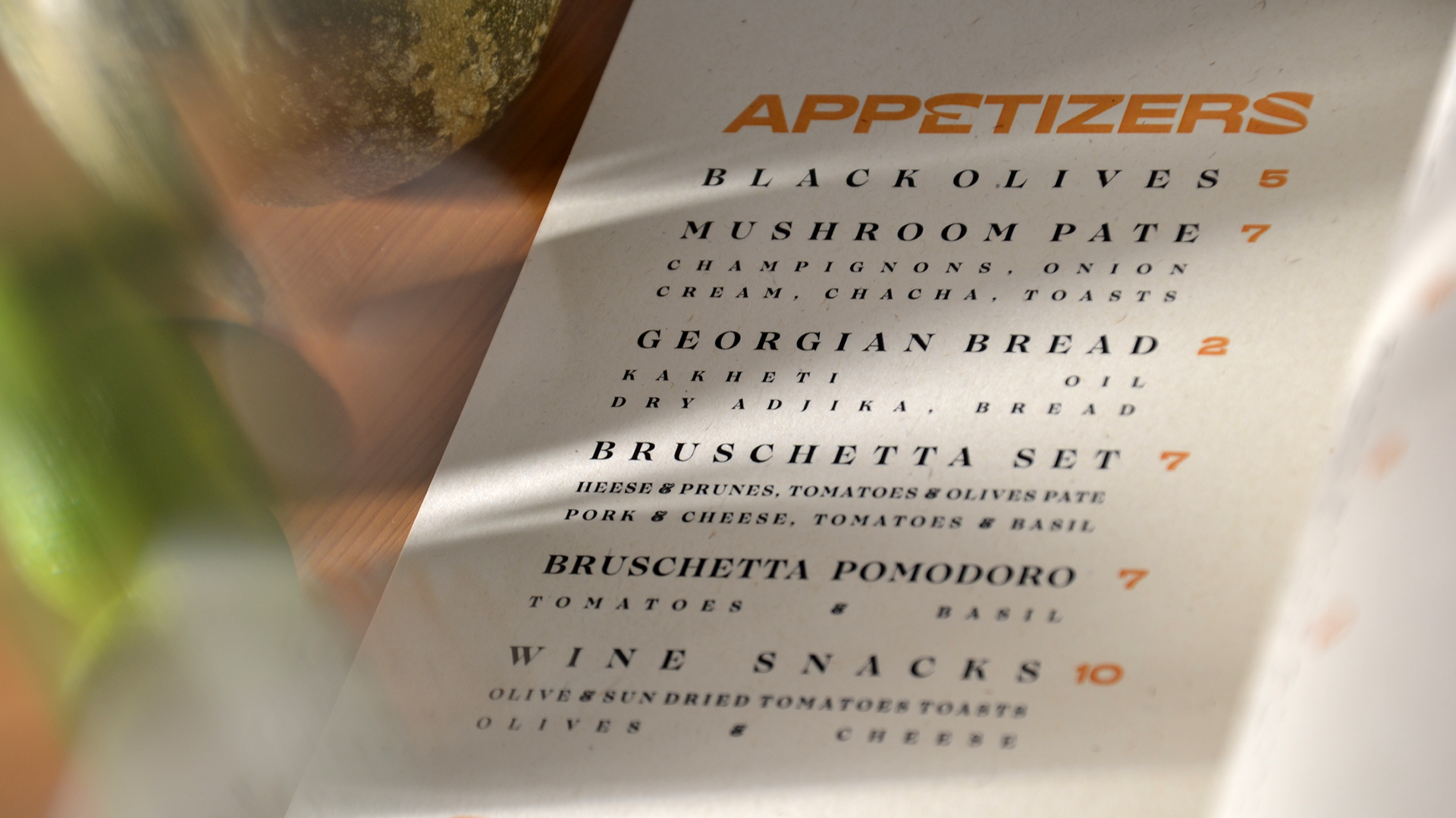
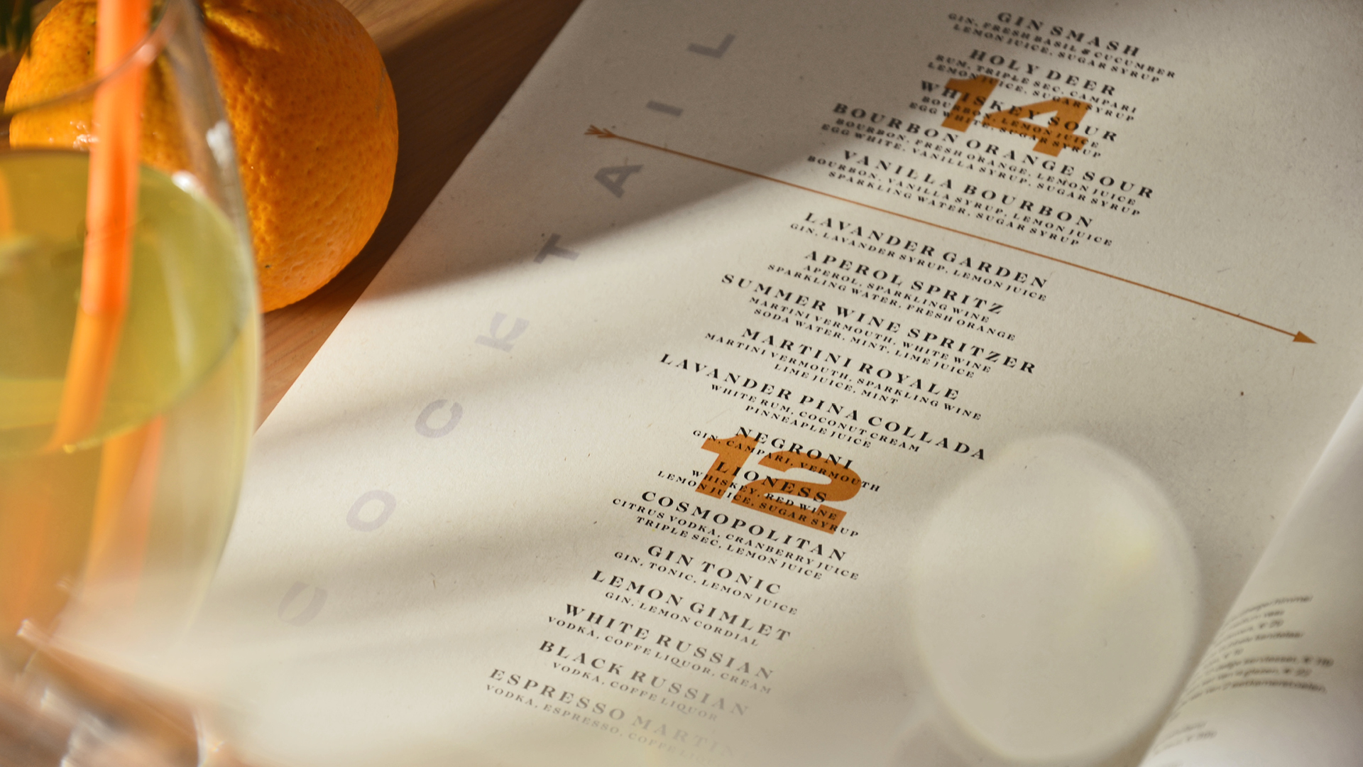
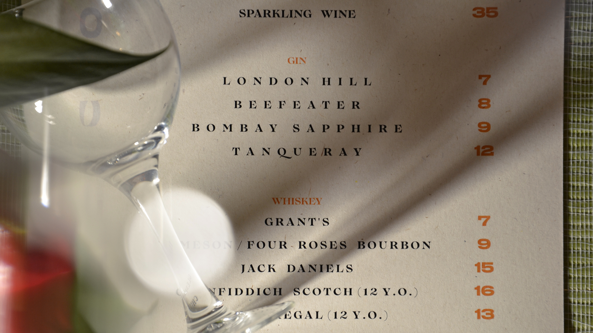
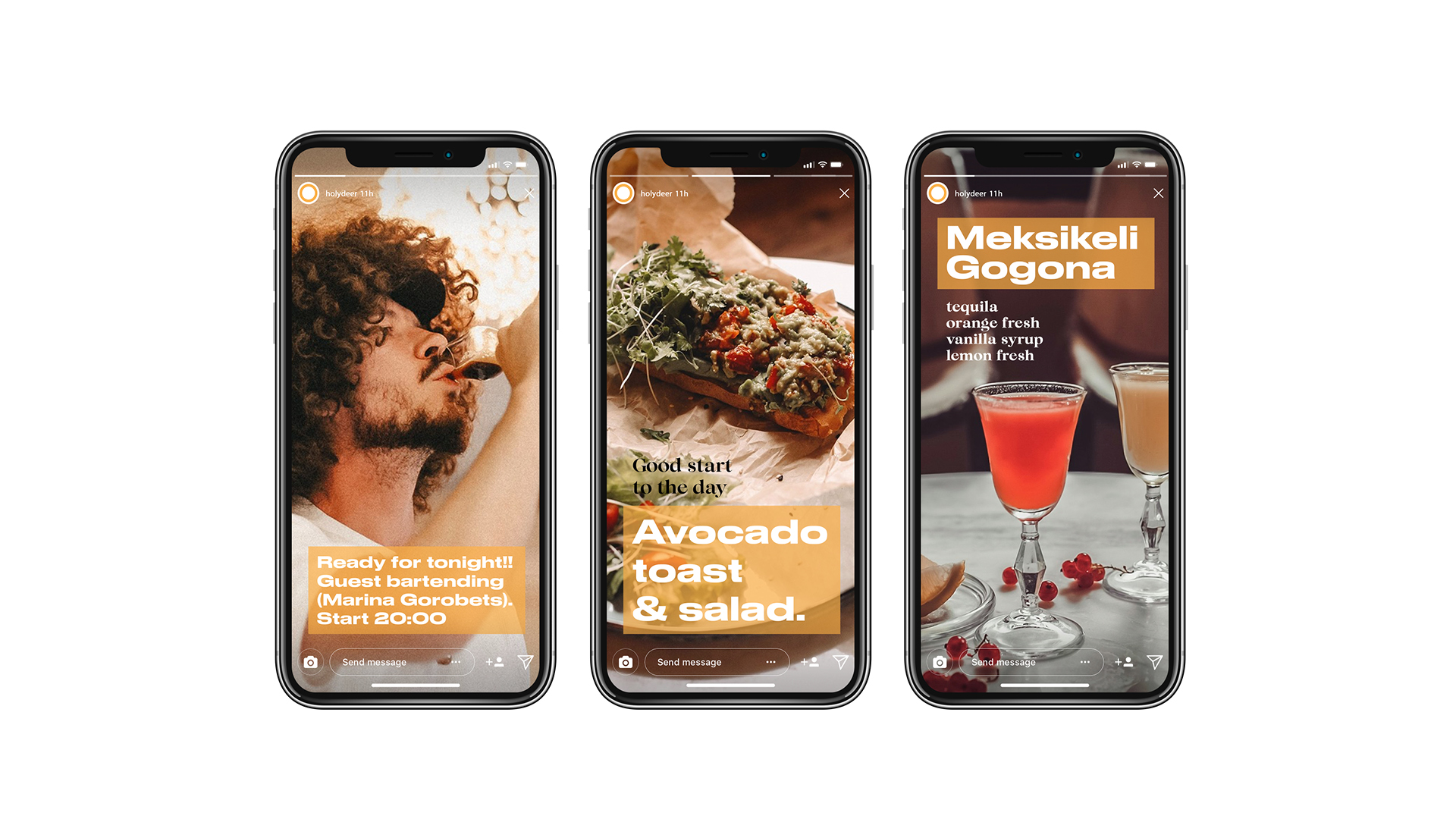
Combining all of the above elements, we only need to add a font that carries the modernity, for which is responsible a locally transformed headset “Druk Wide” and a pinch of historicity, which includes antique “Lovelace” in the signature of the institution.
CREDIT
- Agency/Creative: Ma'no branding
- Article Title: Breakfast and Tapas Bar in Tbilisi
- Organisation/Entity: Agency, Published Commercial Design
- Project Type: Identity
- Agency/Creative Country: Uzbekistan
- Market Region: Europe
- Project Deliverables: Brand Design, Brand Identity, Brand Naming, Branding, Graphic Design, Illustration, Research
- Industry: Food/Beverage
- Keywords: tapas bar, Tbilisi abr, breakfast cafe/bar


