


Who said a sweet snack can’t be both delicious and wholesome?
“Good for you” is the new motto of My Motto, a brand of indulgent wafers launched in 2018. From the beginning, its communication style stood out from traditional category norms, positioning itself as “a bold and unconventional snack” designed to appeal to a young and dynamic audience. With a strong identity and a unique approach, My Motto quickly gained popularity, establishing itself as a go-to choice for those looking for a fun, indulgent treat.
Now, after years of international success, the brand is evolving to align with changing consumer preferences. More than ever, people are looking for snacks that don’t just taste great but also feel like a better choice. In response, My Motto has embraced this shift by carefully selecting more wholesome ingredients, allowing it to reposition itself as a snack that is not only delicious but also “good for you”—a guilt-free pleasure that satisfies cravings without compromise.
This transformation goes far beyond a simple restyling. It is a complete strategic repositioning, entrusted to Break, which has developed a refreshed packaging concept that perfectly reflects the brand’s new philosophy. The challenge was to strike the right balance between maintaining My Motto’s bold identity while introducing a fresh and modern look that communicates its commitment to better ingredients.
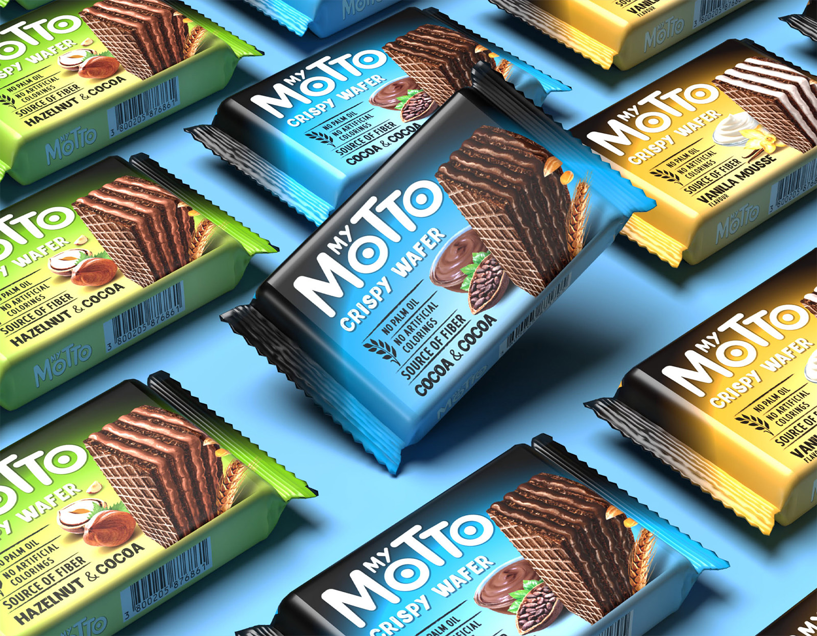
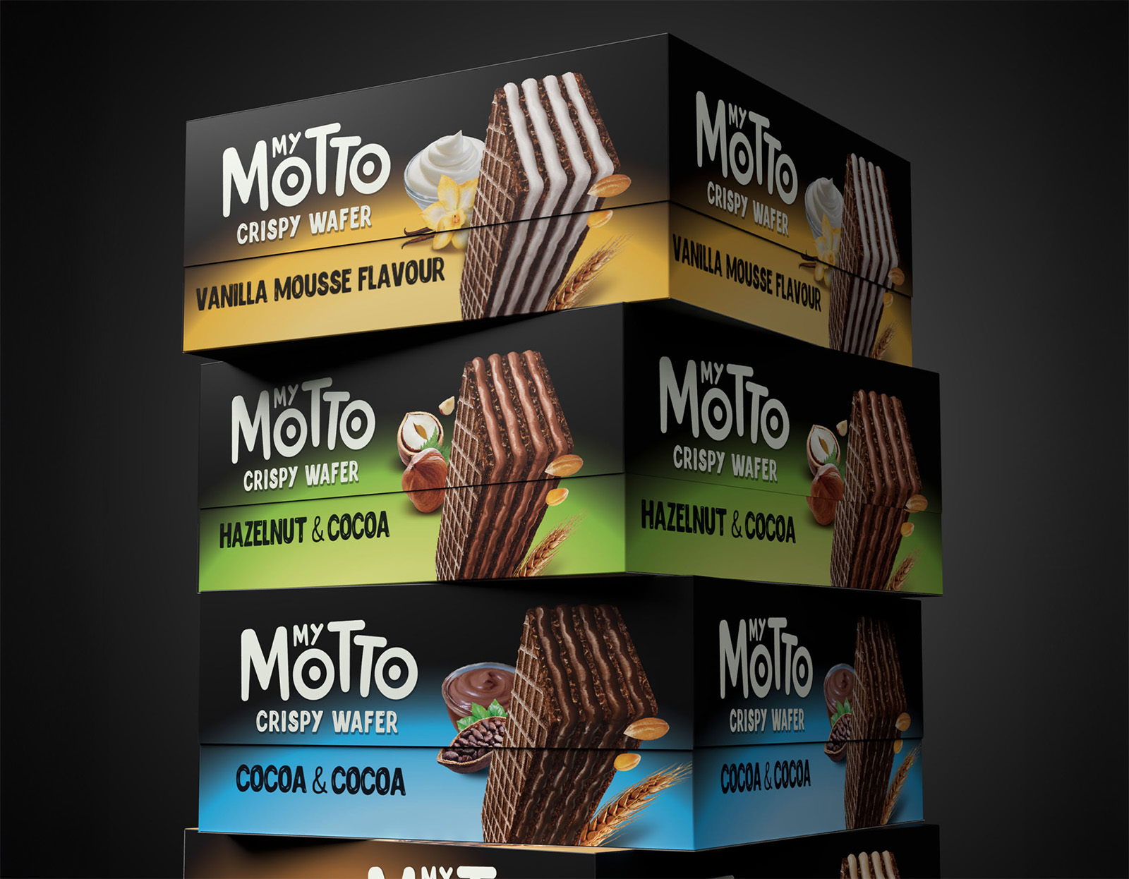
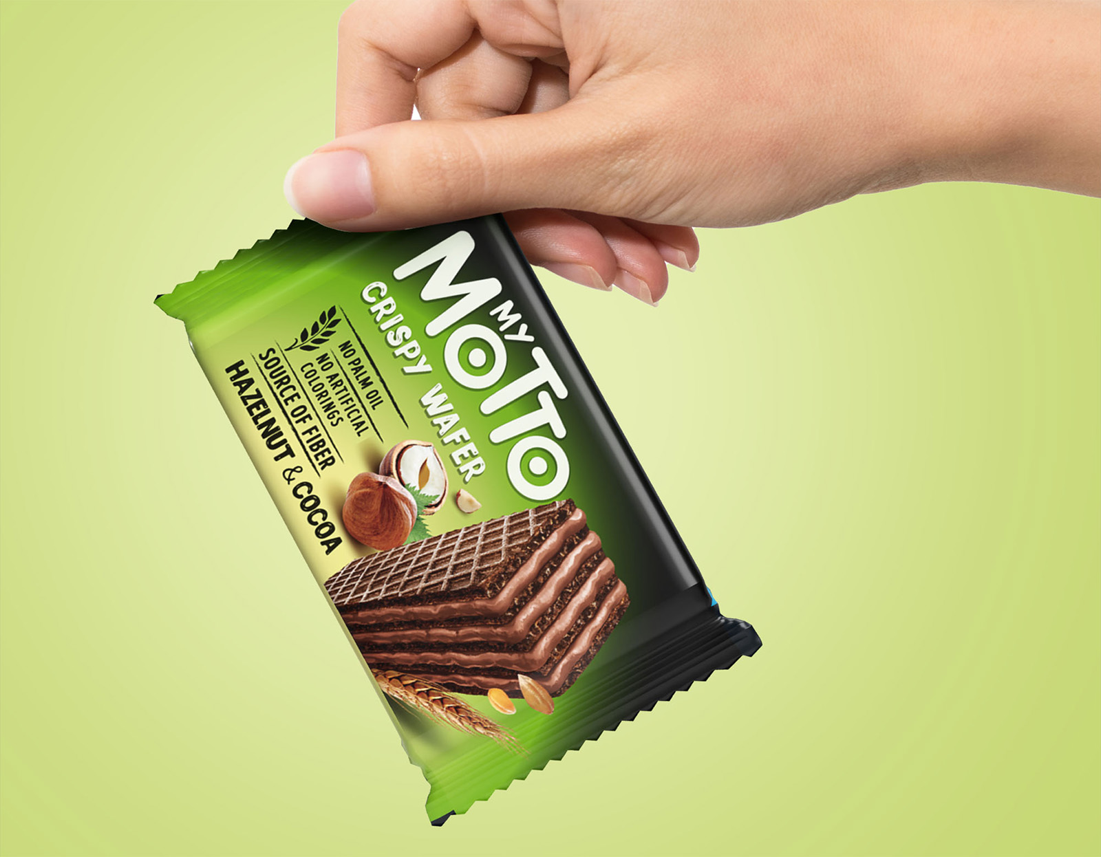
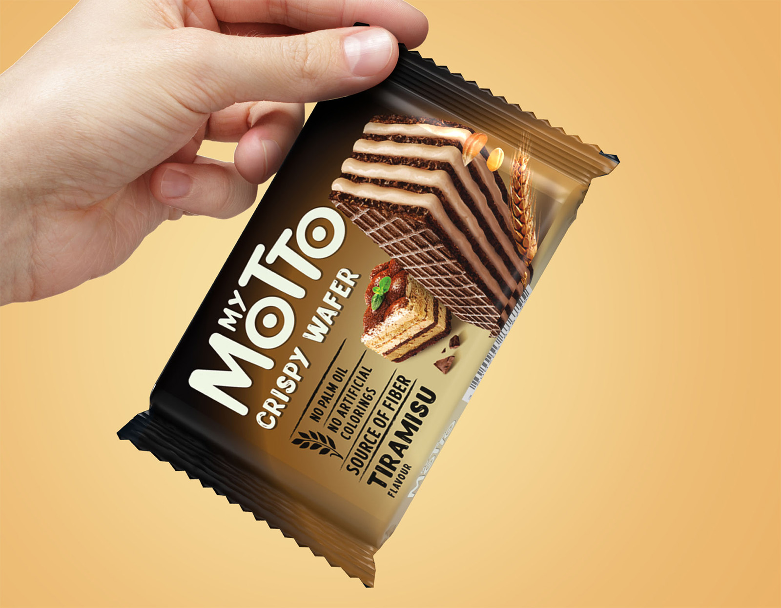
The first step in this evolution was redefining the brand’s visual identity. While the design remains indulgent and creamy, it now has a more natural and realistic feel, reinforcing the idea of a wholesome snack. The black color, which has long been a signature element of the brand but doesn’t necessarily convey the idea of naturalness, has been minimized, now restricted to the brand area. Instead, greater emphasis has been placed on vibrant colors that highlight the different flavors, making them more appealing and instantly recognizable to consumers.
Additionally, a claim system has been introduced to clearly communicate the product’s natural benefits, ensuring that consumers can immediately understand why My Motto is a better choice. The logo itself has also undergone subtle refinements, making it simpler and more balanced, with a better weight distribution between the two words for improved readability. Finally, to reinforce product positioning and make the offering even clearer, the category name “Crispy Wafer” has been prominently added to the packaging—highlighting the key attributes of this delicious, crunchy, and wholesome snack.
With this refined identity, My Motto successfully merges indulgence with wholesomeness, proving that a sweet snack can be both satisfying and a better choice.
CREDIT
- Agency/Creative: Break Design srl
- Article Title: Break Design’s Approach to Merging Flavor and Wellness in My Motto’s New Identity
- Organisation/Entity: Agency
- Project Type: Packaging
- Project Status: Published
- Agency/Creative Country: Italy
- Agency/Creative City: Milan
- Market Region: Europe
- Project Deliverables: Packaging Design
- Format: Flow-Pack, Sleeve
- Industry: Food/Beverage
- Keywords: Snacks
-
Credits:
Account Manager: Olga Mainolenko


