


Cavit is one of the largest wineries in Italy. Founded in 1950, it has grown to become the leading reference point for winemaking in Trentino. Today, the cooperative brings together 11 social wineries and 5,250 winegrowers, playing a crucial role in shaping the region’s viticultural excellence.
After entrusting Break with the packaging design of its wines, Cavit also chose the agency to renew its corporate identity. This was a delicate task: the goal was to modernize a historic, prestigious, and recognizable brand while preserving continuity with its rich past.
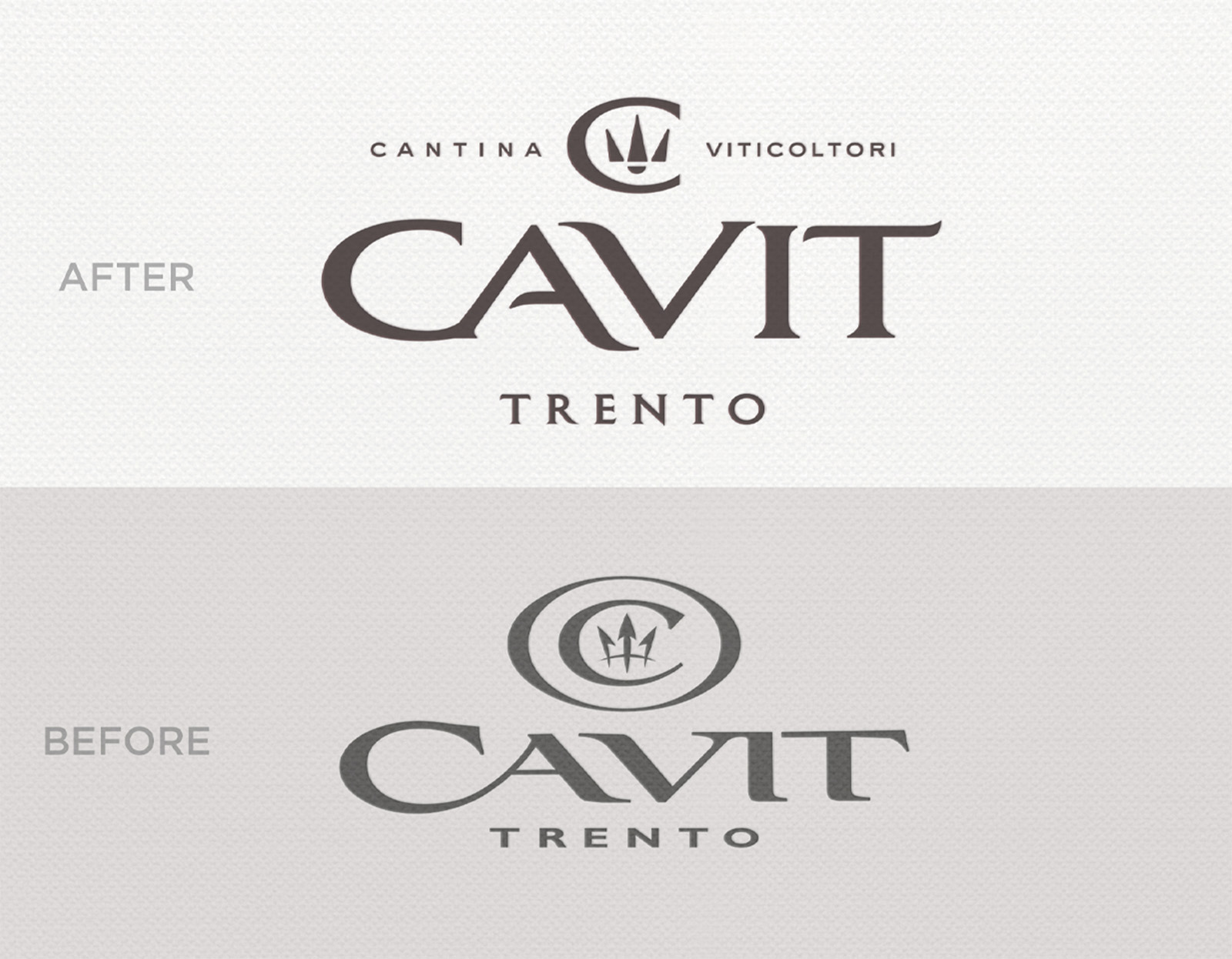
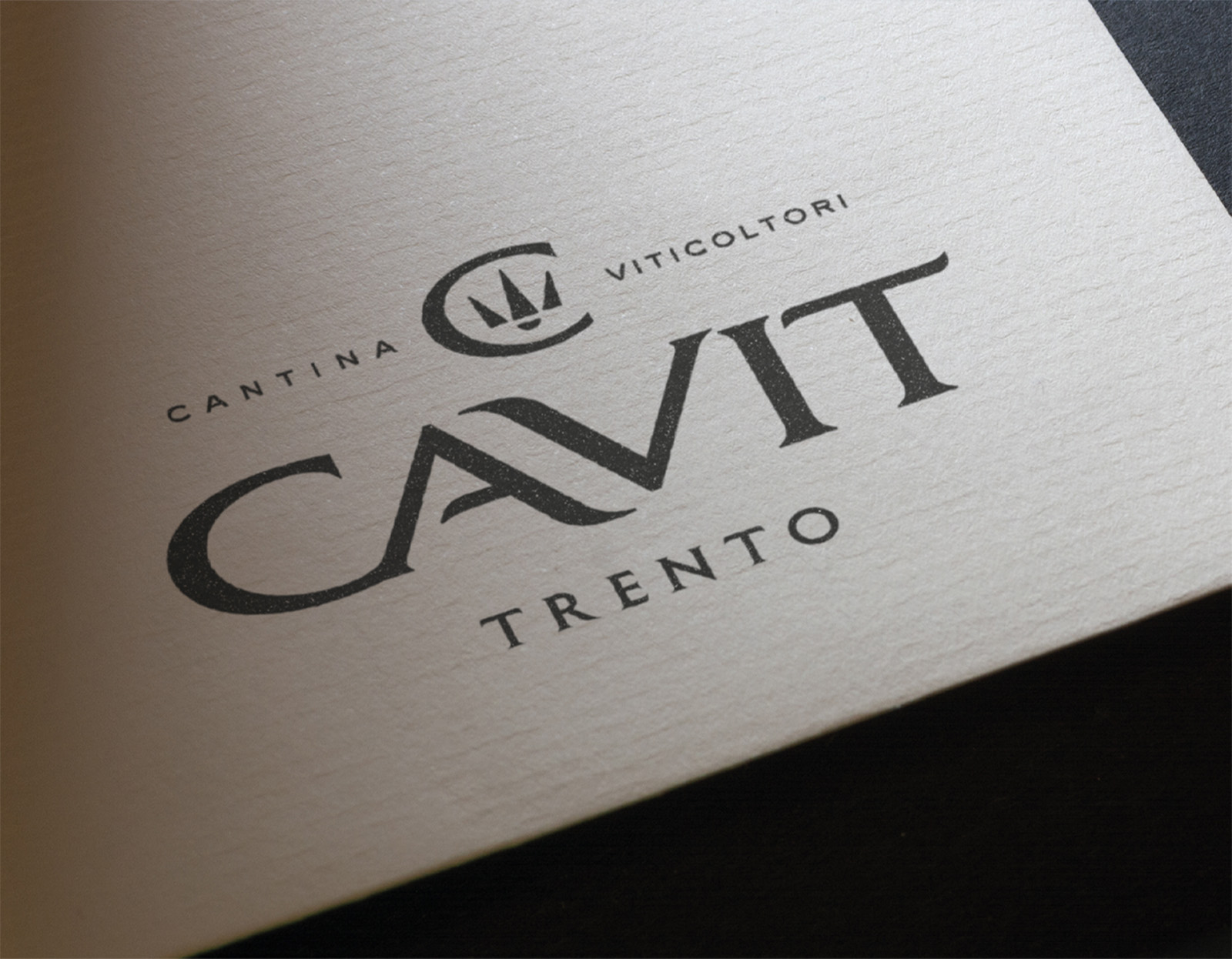
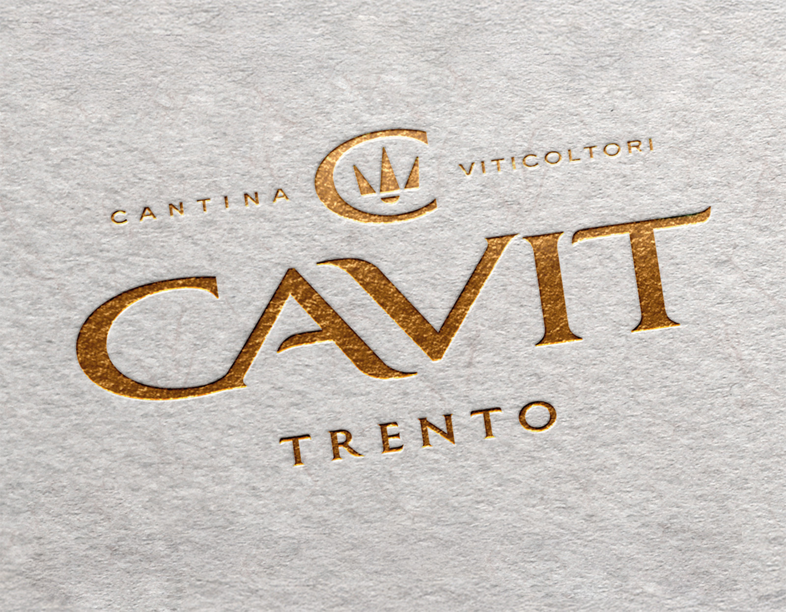
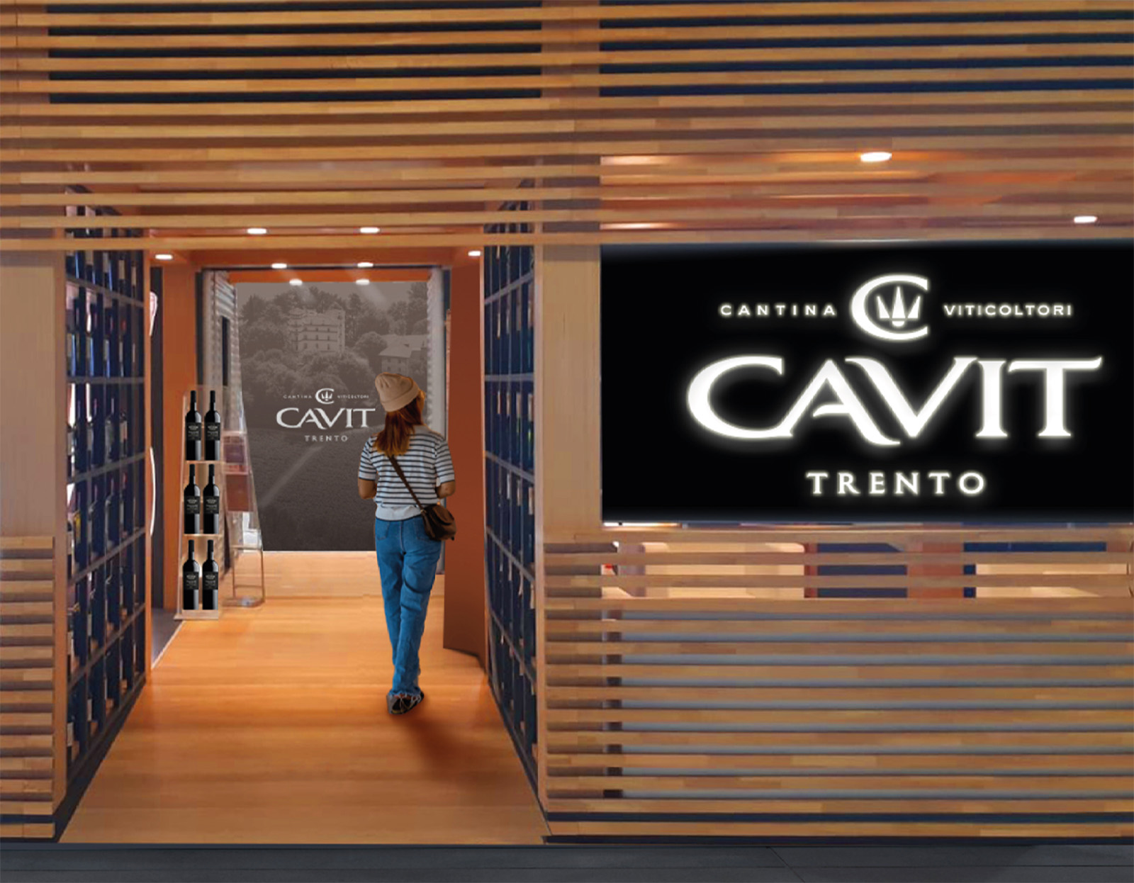
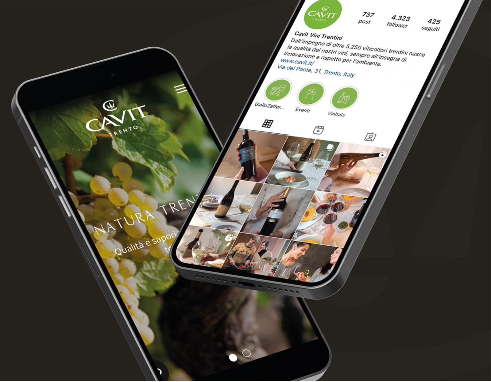
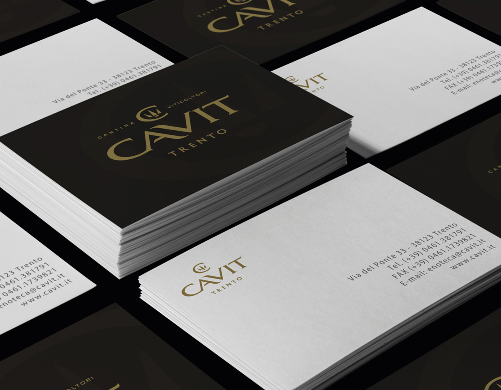
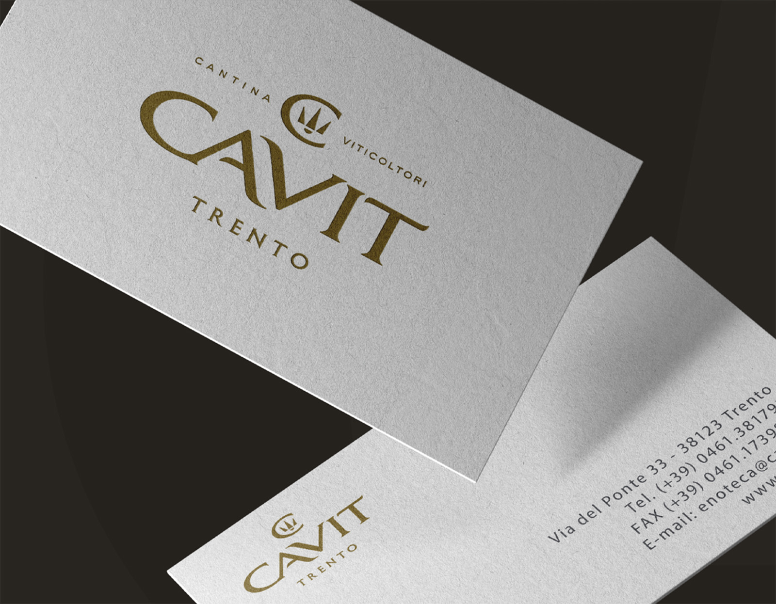
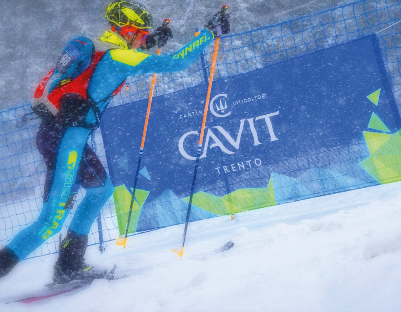
We based the restyling on a simple yet powerful idea: since modernity required the streamlining of certain graphic elements, we strengthened the brand’s personality and elegance to ensure that its perception of prestige remained intact. As a result, the crest of the logo—a “C” enclosing the Trentino trident—was refined by removing superfluous elements, gaining readability and value through subtraction. The new interventions, including an update to the typography, create a harmonious balance between significance and freshness, personality and modernity. The result is a timeless yet contemporary logo that is much more readable across all its touchpoints, from digital platforms (websites, social media, videos) to traditional sponsorships (such as skiing and basketball), where it often appears in reduced dimensions due to the nature of the communication.
The trident itself has been simplified, and alongside the enhanced prominence of the word “Trento” and the addition of “cantina” and “viticoltori,” it reinforces the brand’s strong connection to its territory—an essential element for a winegrowing cooperative.

CREDIT
- Agency/Creative: Break Design srl
- Article Title: Break Design Elevates Cavit’s Heritage with a Timeless Corporate Identity Refresh
- Organisation/Entity: Agency
- Project Type: Identity
- Project Status: Published
- Agency/Creative Country: Italy
- Agency/Creative City: Milan
- Market Region: Europe
- Project Deliverables: Brand Strategy, Brand Tone of Voice, Packaging Design, Rebranding
- Industry: Food/Beverage
- Keywords: Beverage Corporate Identity
-
Credits:
Managing Partner: Paola Garavaglia


