


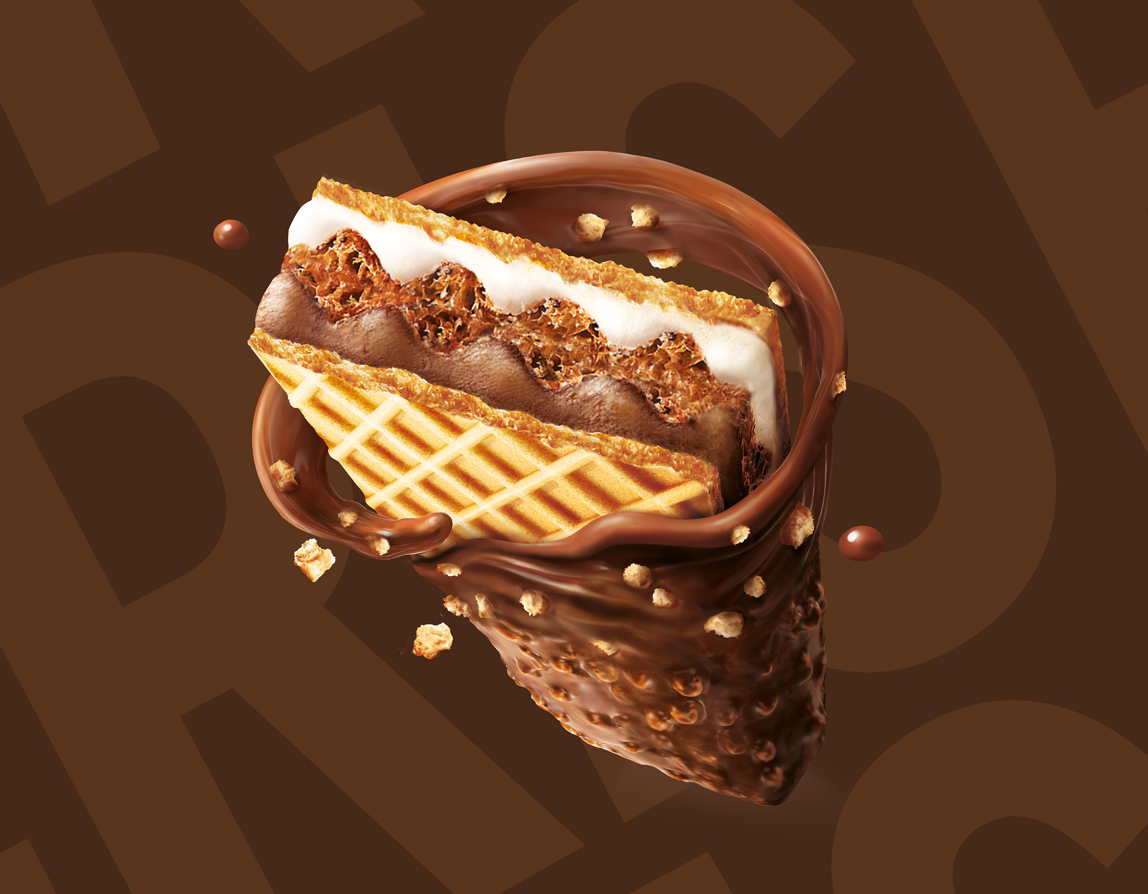
The experience is nothing short of intense and irresistible: a coating of grains and chocolate invites you to take a bite, immediately meeting the delightful crumbliness of the wafer. You sink into a double embrace of milk and hazelnut cream, before feeling the final ‘crisp’ of the crunchy wafer core. This careful layering ensures a balanced texture contrast with every single piece.
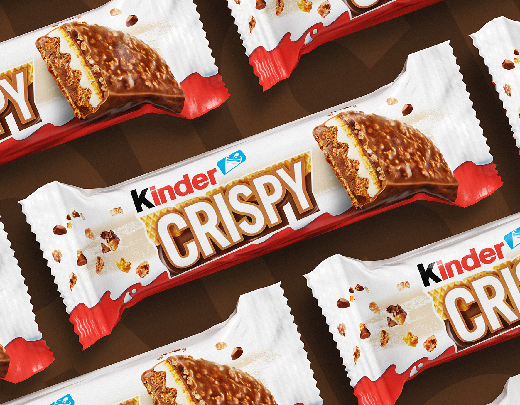
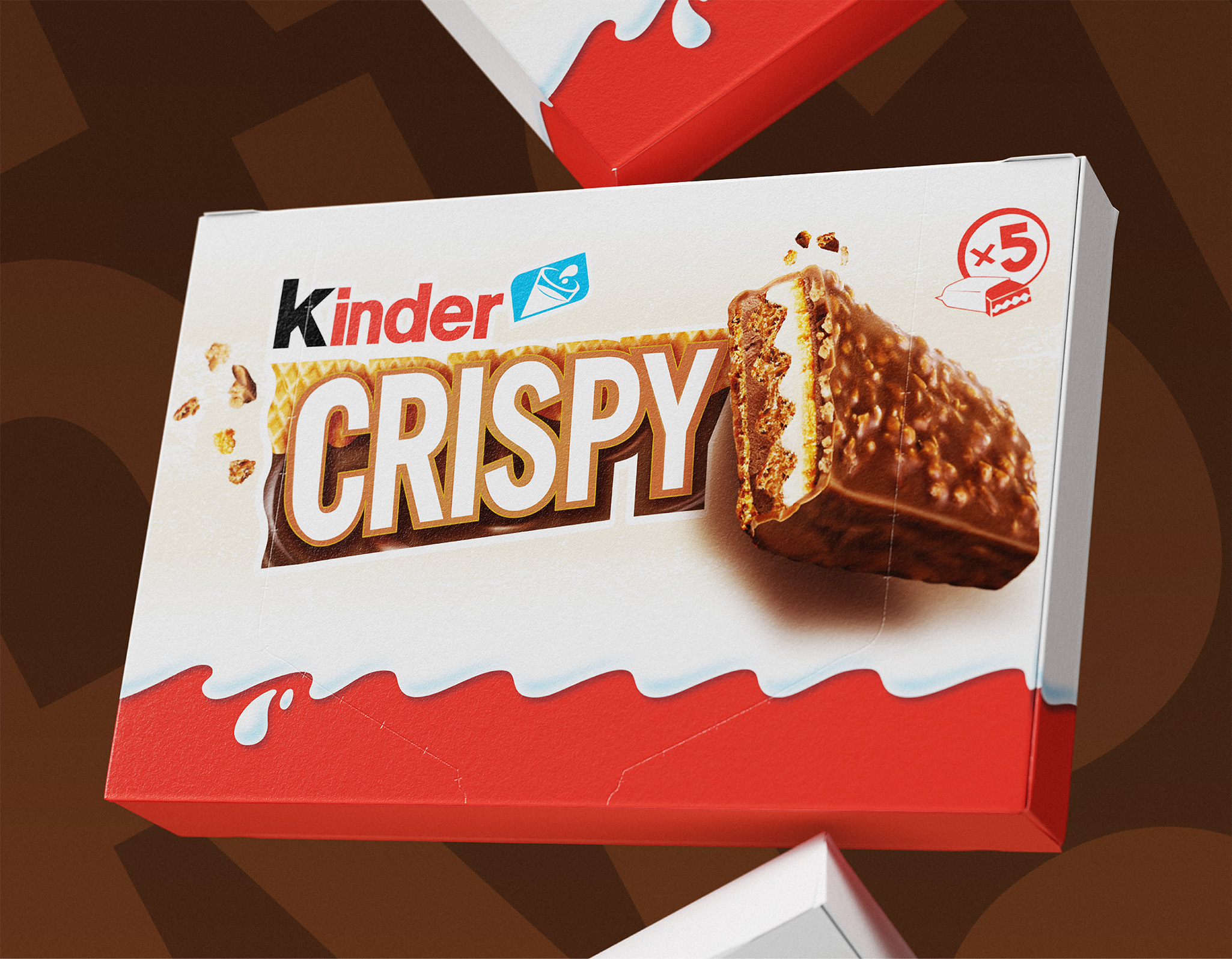
With such a taste experience, communicating the product becomes a marketing textbook case: when you have something exceptional to say, just say it plainly (this snack will delight you with its perfect combination of texture and flavour, in a journey where you will be overwhelmed by creaminess, but will remember crunchiness). That’s why it’s called Crispy – a name that speaks for itself, straight and clear. And that’s why in similar manner, the logo boldly celebrates the crunchy, delicious pleasure of wafer combined with cream.
But it’s the visual that truly takes the spotlight: a thoughtfully crafted illustration showing each layer. It’s like a cross-section of the full experience that awaits ahead, showing the delicious interplay between crunchy texture and creamy richness, a joy to be discovered and rediscovered with every bite. This illustration does more than just inform; it builds powerful anticipation by promising structural integrity and ingredient transparency. It serves as a visual contract, assuring the consumer that the advertised perfection of texture and flavour is literally built into the product.
CREDIT
- Agency/Creative: Break Design
- Article Title: Break Design Brings Crispy to Life Through Irresistible Texture and Flavor
- Organisation/Entity: Agency
- Project Type: Packaging
- Project Status: Published
- Agency/Creative Country: Italy
- Agency/Creative City: Milan
- Market Region: Europe
- Project Deliverables: Packaging Design
- Format: Flow-Pack
- Industry: Food/Beverage
- Keywords: Packaging design
-
Credits:
Account: Olga Manoilenko


