Automare is an industrial automation company in southern Brazil whose main objective is to optimize its clients’ production processes, combining engineering and technology in a strategic way to deliver the best result in each project.
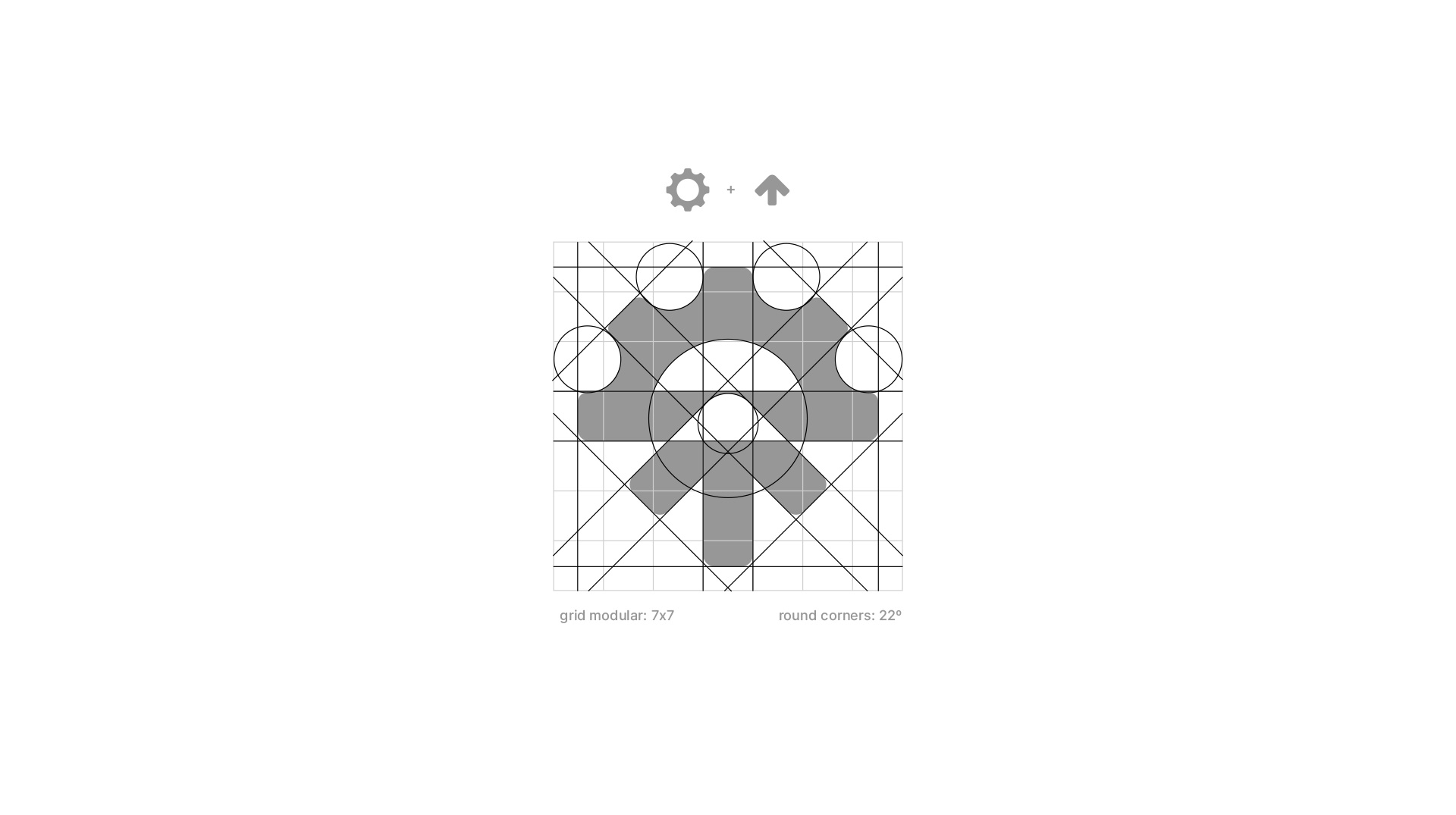
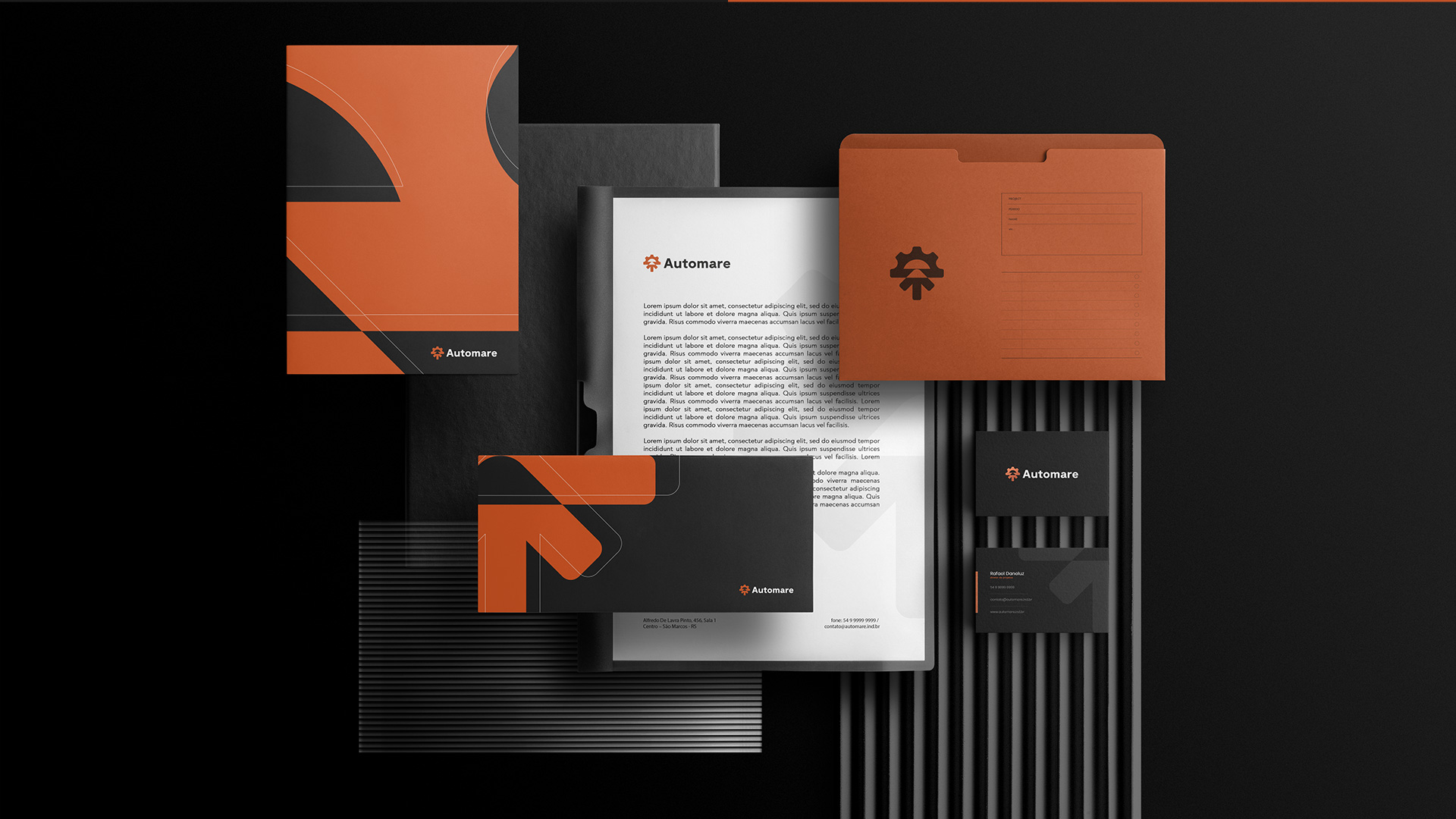
The symbol was developed with two main concepts, based on the brand’s personality and taking into account the link the company wanted to convey between engineering and technology. The first concept illustrates a gear, representing the engineering part of the industrial sector. In the second concept, I used an upward arrow, referring to technology, more specifically the optimization it brings to production line processes. The animation developed for this project reveals the two basic concepts in a subtle way, helping to memorize the brand.
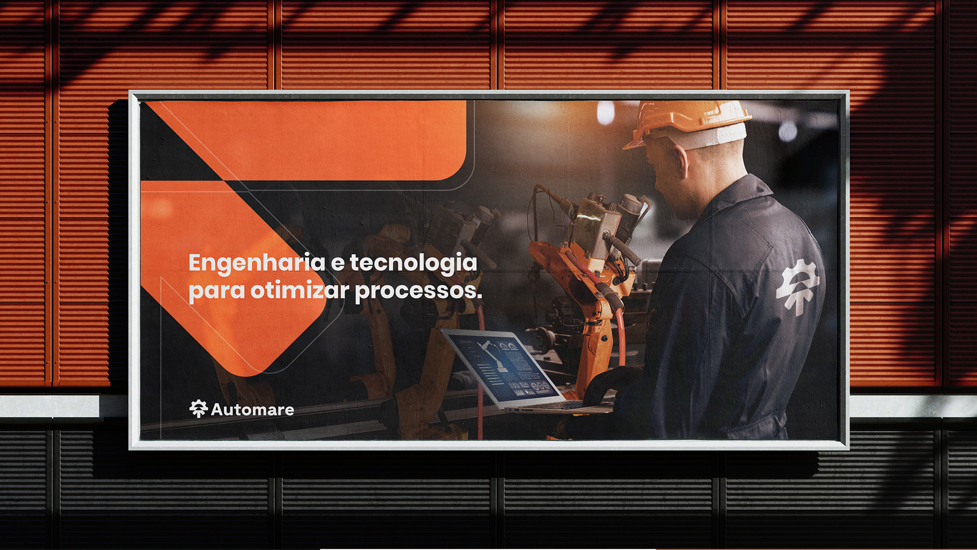
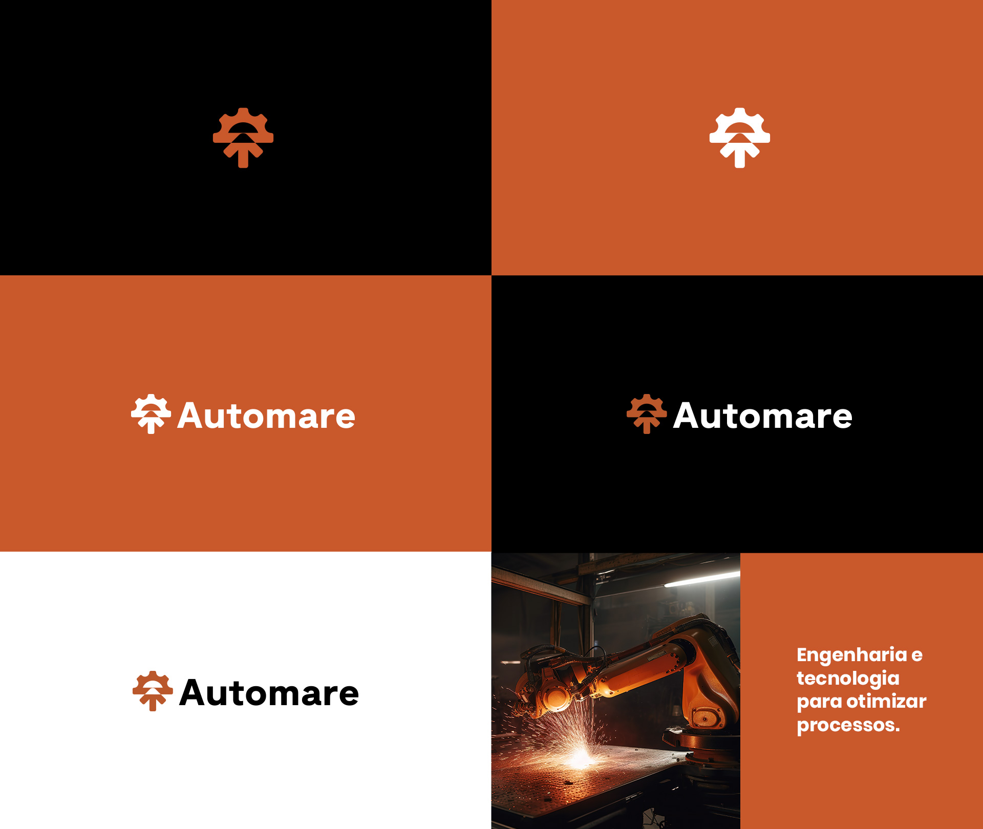
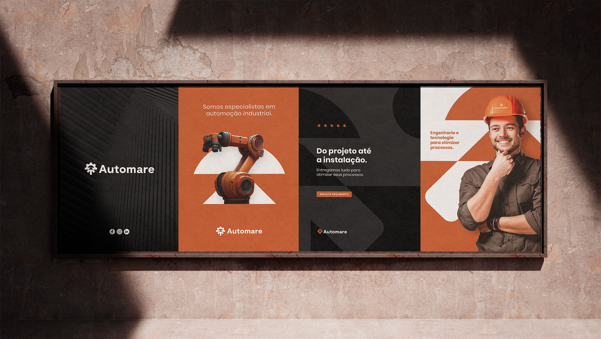
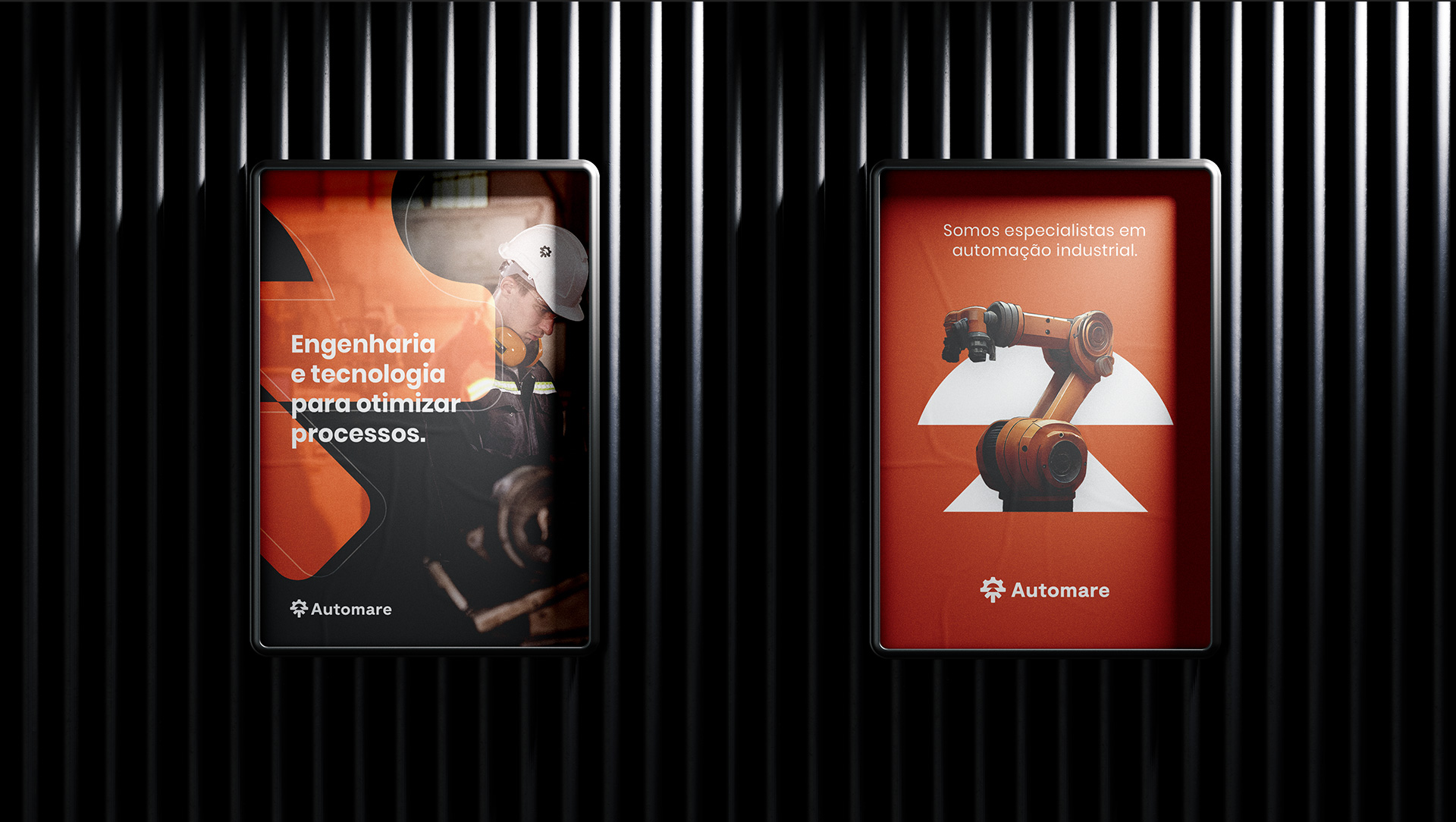
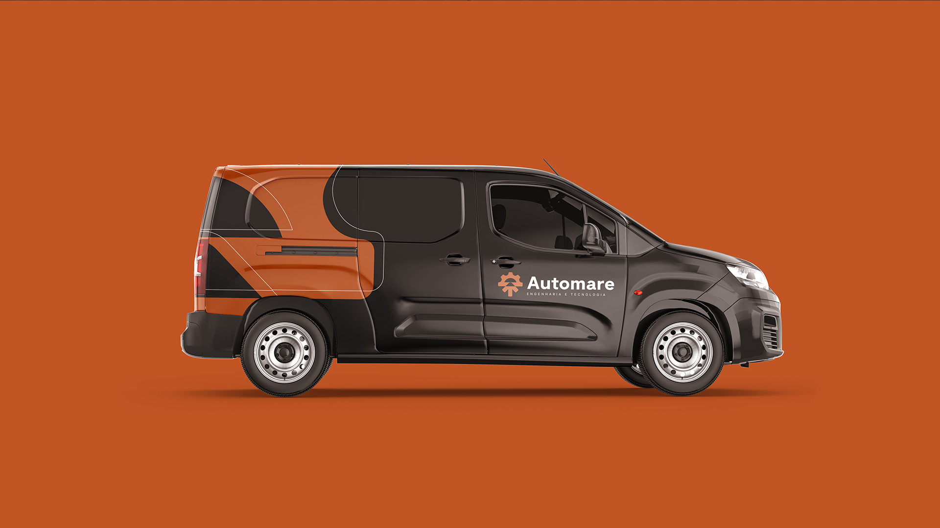
The entire project was developed based on the brand’s strategy, with a focus on reaching the client’s target audience. Both the colors and the symbol gave the company a unique and minimalist personality, standing out from its competitors and conveying authority.


CREDIT
- Agency/Creative: Drop Estúdio
- Article Title: Brazilian Drop Estúdio Creates Minimalist Concept for Industrial Automation Company
- Organisation/Entity: Freelance
- Project Type: Identity
- Project Status: Published
- Agency/Creative Country: Brazil
- Agency/Creative City: Caxias do Sul
- Market Region: South America
- Project Deliverables: Brand Design
- Industry: Technology
- Keywords: brand, visual identity, industrial automation, engineering, logo
-
Credits:
Brand Designer: Reinaldo Carminatti Pissaia


