


The Creative Union – Brava Studio
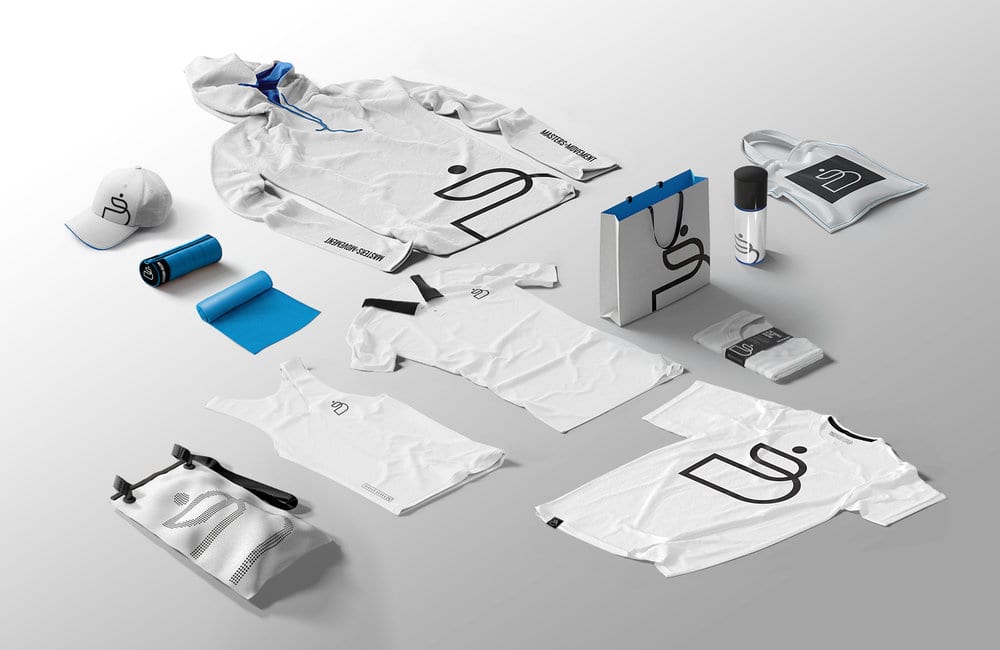
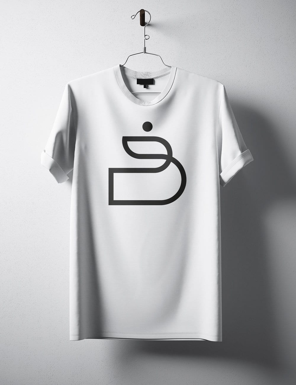
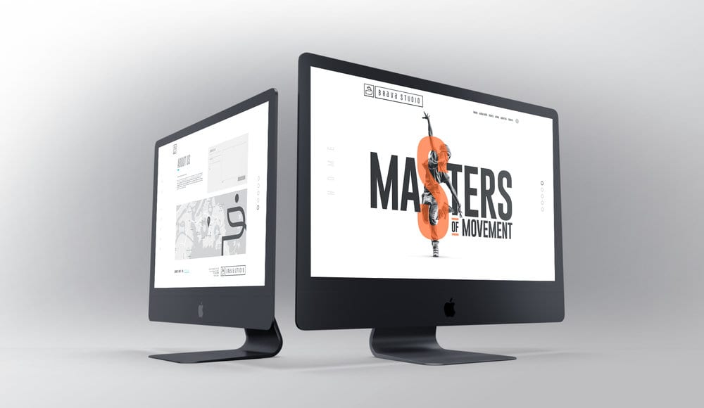
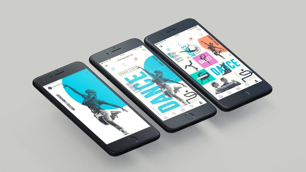
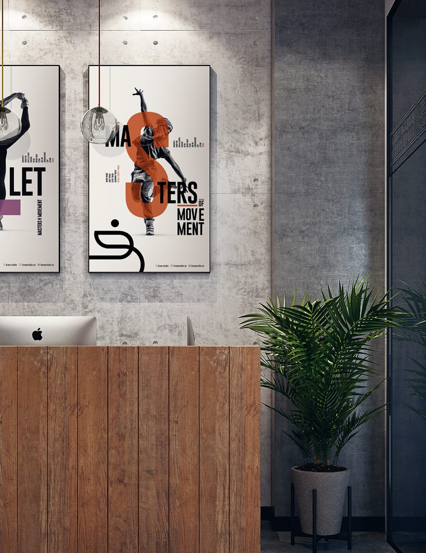
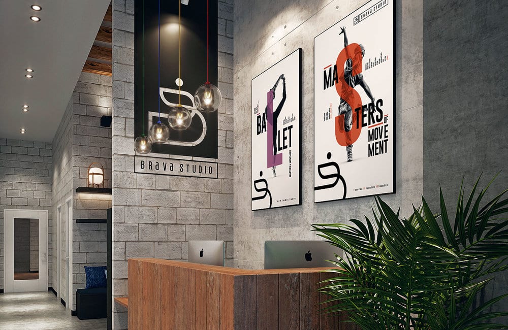
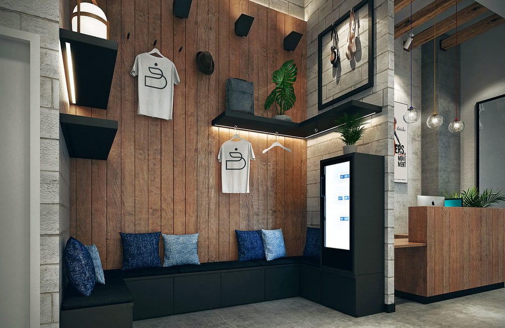
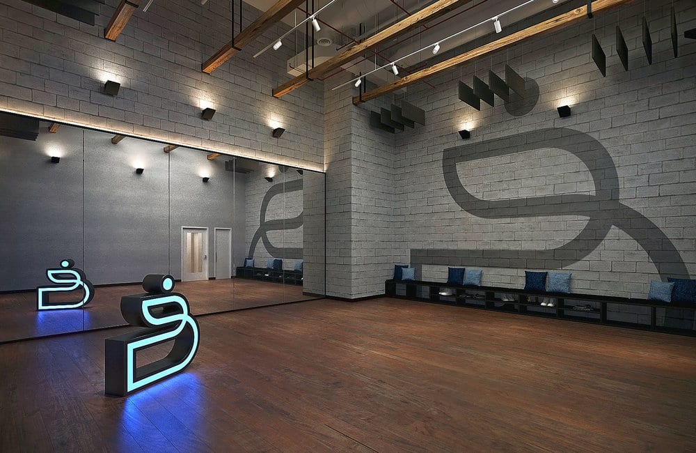
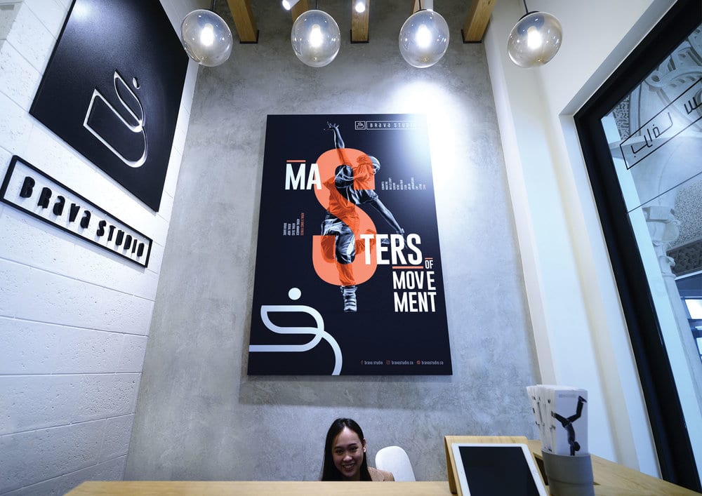
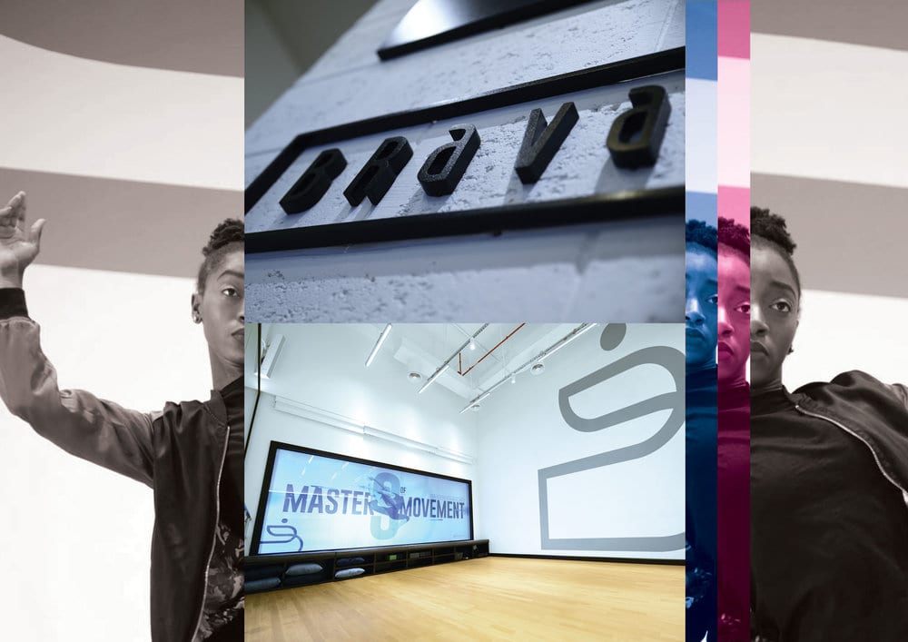
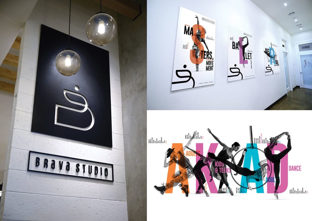
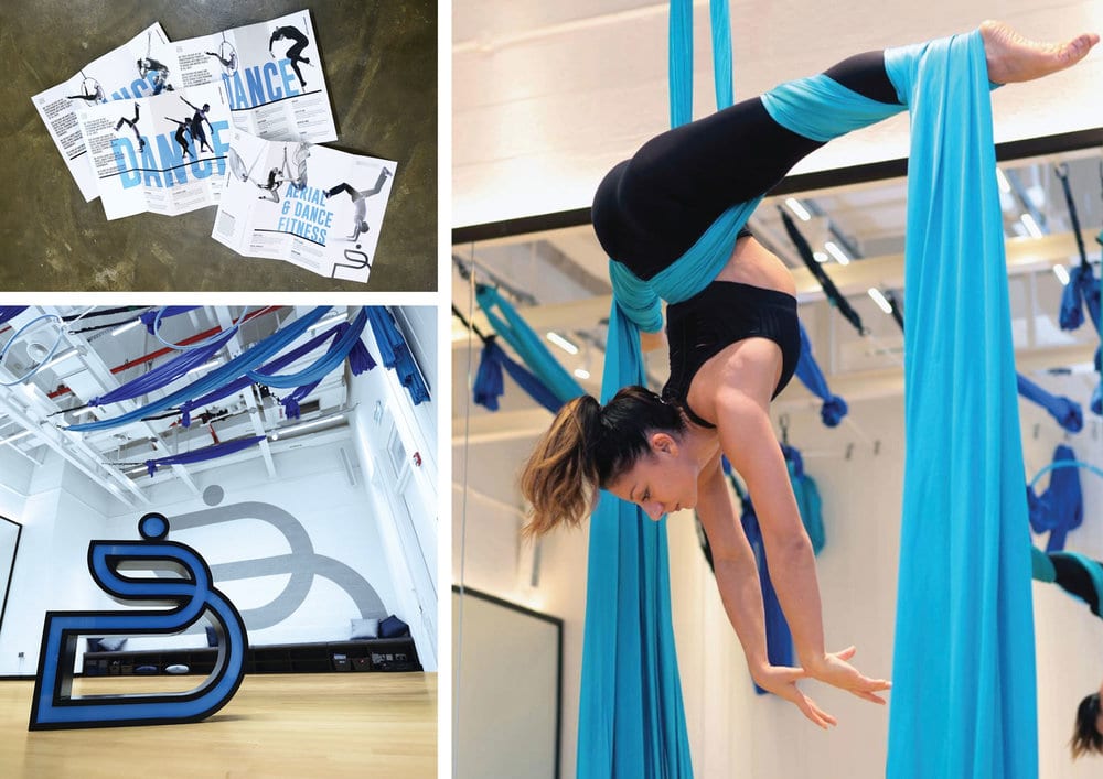
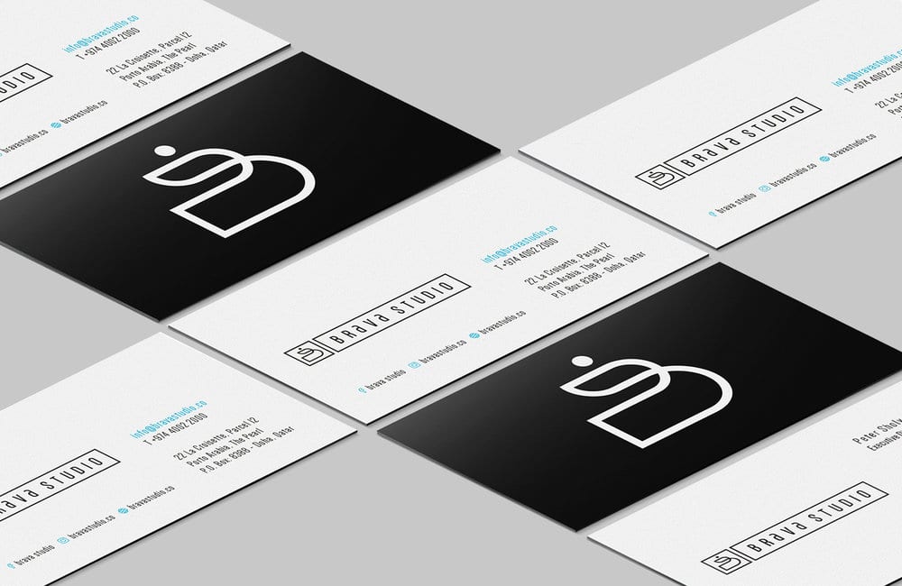
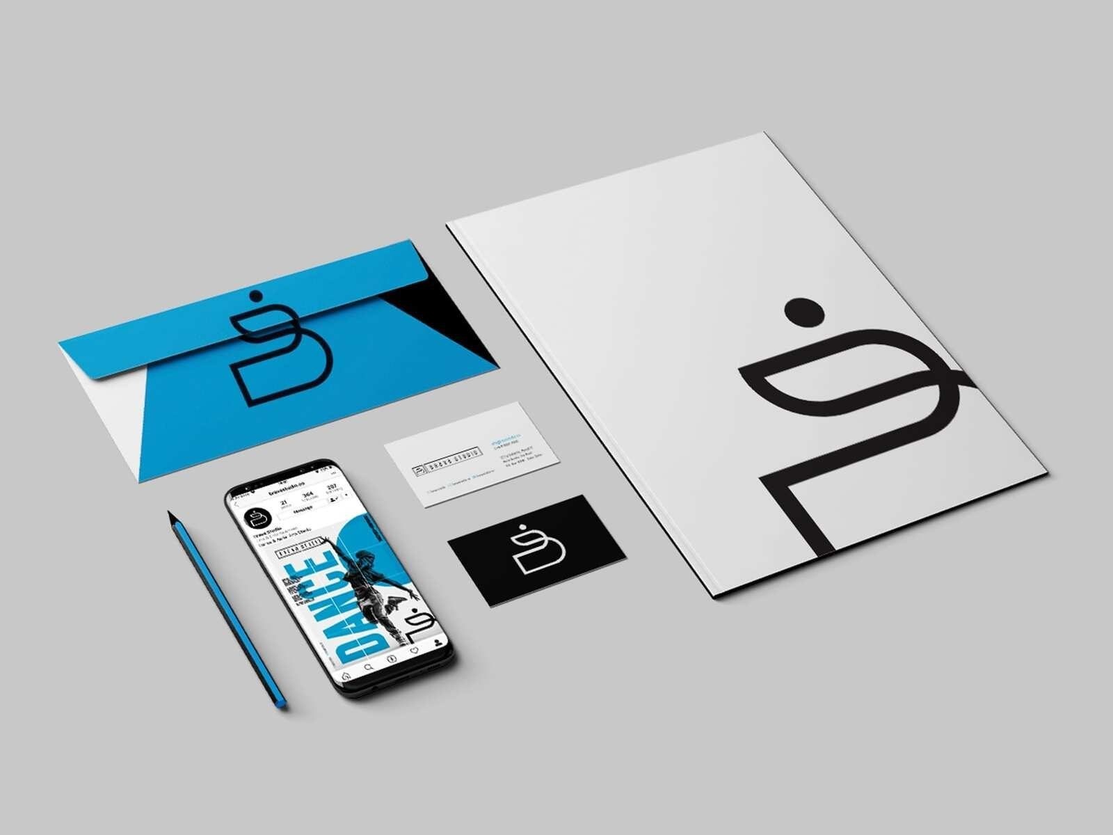
The branding developed is inspired by movement, flexibility, and lines. A contemporary brand that can be adapted in many ways. The crafted brand logo represents a “B” but also forms a fluid abstract outline of a dancer in motion. The typography used is tall and elegant to mimic the graceful nature of the art of dance and the mastery of movement, gender neutral and resonating well for both males and females of all ages. The brand language is contemporary, bold and plays with enlarged letters overlapping black and white imagery. For the interior space, we drew inspiration from the streets of an urban city where you would find professional dance studios in funky parts of town. We used mixed materials treated in a sophisticated and elegant way. Woods, concrete, white bricks.
CREDIT
- Agency/Creative: The Creative Union
- Article Title: Brava Studio Branding
- Organisation/Entity: Agency, Published Commercial Design
- Project Type: Packaging
- Agency/Creative Country: Qatar
- Market Region: Middle East
- Industry: Entertainment


