


About the Brand
Fiya is a beauty soap brand inspired by the purity of natural ingredients and traditional skincare rituals. The brand focuses on creating gentle, nourishing soaps using organic cold-pressed coconut oil combined with carefully selected natural elements.
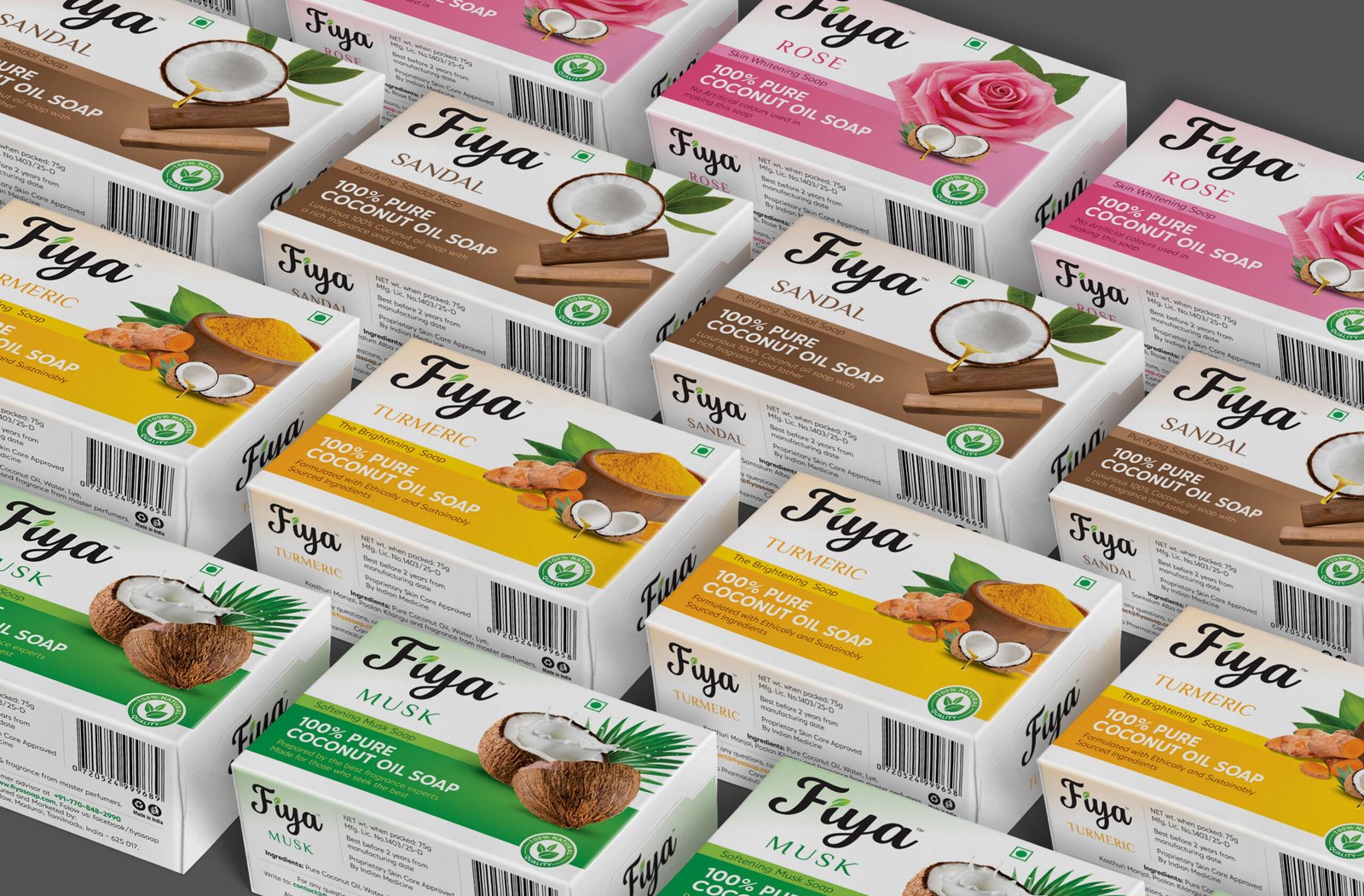
Each soap variant is crafted for different skincare needs, using ingredients such as rose, turmeric, sandalwood, and herbal blends. The goal of the brand is to deliver a skincare experience that feels both natural and luxurious while maintaining simplicity and authenticity.
Branzone Creative partnered with Fiya to build a brand identity and packaging system that communicates purity, softness, and the natural essence of the product.
Design Process
The design process focused on communicating natural skincare benefits while maintaining strong shelf appeal.
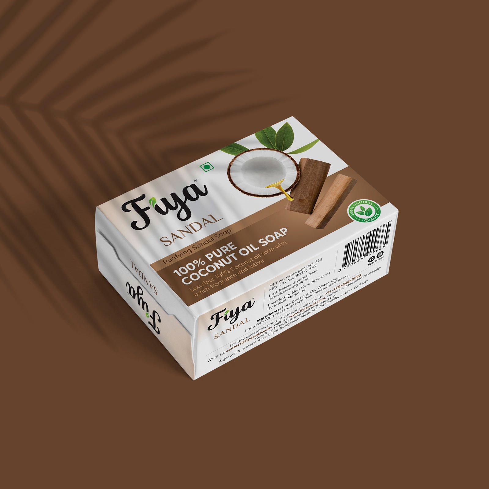
Since the product highlights natural ingredients, the packaging needed to visually reflect those elements. The strategy was to make the ingredients clearly visible through the design language so that customers could instantly understand what makes each variant unique.
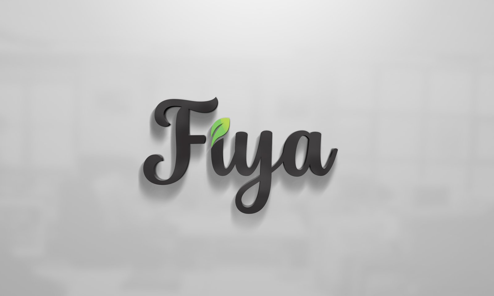
We developed a simple and elegant logo to create a recognizable identity for the brand. The packaging layout was designed to balance clarity and aesthetics while ensuring that the product ingredients remain the central visual element.
The concept focused on three main principles:
• Highlighting natural ingredients
• Creating a soft and feminine visual tone
• Maintaining clarity and simplicity in packaging
Visual Identity
The visual identity of Fiya reflects purity, softness, and natural beauty.
The packaging uses soft color palettes that align with the target audience and the gentle nature of the product. Each soap variant is visually distinguished through ingredient-based colors and imagery, helping customers easily recognize the product while shopping.
Ingredient illustrations play a key role in the design. They communicate the core benefit of the soap and reinforce the natural formulation of the product.
The typography and layout are kept clean and minimal, allowing the packaging to feel fresh, approachable, and easy to understand. This simplicity ensures that the product stands out on the shelf while maintaining a premium and trustworthy appearance.
Outcome
The final design creates a clear connection between the product and its natural ingredients.
Fiya now has a cohesive packaging identity that highlights purity, simplicity, and skincare benefits. The visual system allows each variant to be easily recognized while maintaining a consistent brand presence.
Through thoughtful design and ingredient-focused visuals, the packaging communicates the brand’s promise of natural beauty and gentle skincare.


CREDIT
- Agency/Creative: Branzone Creative
- Article Title: Branzone Creative Crafts a Natural Beauty Packaging Identity for Fiya
- Organisation/Entity: Agency
- Project Type: Packaging
- Project Status: Published
- Agency/Creative Country: India
- Agency/Creative City: CHENNAI
- Market Region: Asia
- Project Deliverables: Brand Design, Logo Design, Packaging Design
- Format: Box
- Industry: Health Care
- Keywords: soap logo design, soap packing design
-
Credits:
Creative Director: Suman M


