


About the Brand
Test2Build was founded with a clear mission: to bring reliability, accuracy, and transparency to the construction industry through professional soil and material testing. In an industry where safety and structural integrity depend heavily on the quality of materials used, the brand positions itself as a trusted technical partner for engineers, builders, and developers.
The vision behind Test2Build is simple yet powerful. Every structure begins with the ground it stands on and the materials used to build it. By ensuring these elements meet strict standards, Test2Build plays a critical role in building safer and stronger projects.
The brand represents precision, responsibility, and trust. It stands for the idea that strong construction begins long before the building process starts. Through scientific testing, technical expertise, and disciplined methodology, Test2Build helps ensure that every project begins with confidence and ends with durability.
Branzone Creative partnered with Test2Build to translate this technical reliability into a professional brand identity that reflects credibility, strength, and industry expertise.
Design Process
The design approach focused on communicating technical expertise and structural reliability while maintaining a modern and professional visual language.
The first step was understanding the core role of Test2Build within the construction ecosystem. Soil testing, material analysis, and laboratory verification are not always visible to the public, but they are fundamental to the safety and success of any project. The brand needed to reflect this invisible yet critical responsibility.
Our design strategy centred on three core principles:
• Precision – representing scientific accuracy and testing standards
• Strength – reflecting construction and structural reliability
• Trust – positioning the company as a dependable industry partner
The visual direction combines strong geometric forms with structured layouts to reflect engineering discipline. At the same time, the brand language remains clean and contemporary to ensure clarity and professionalism across all communication materials.
By aligning brand strategy with industry relevance, Branzone Creative developed a structured identity system that communicates technical authority while remaining approachable and modern.
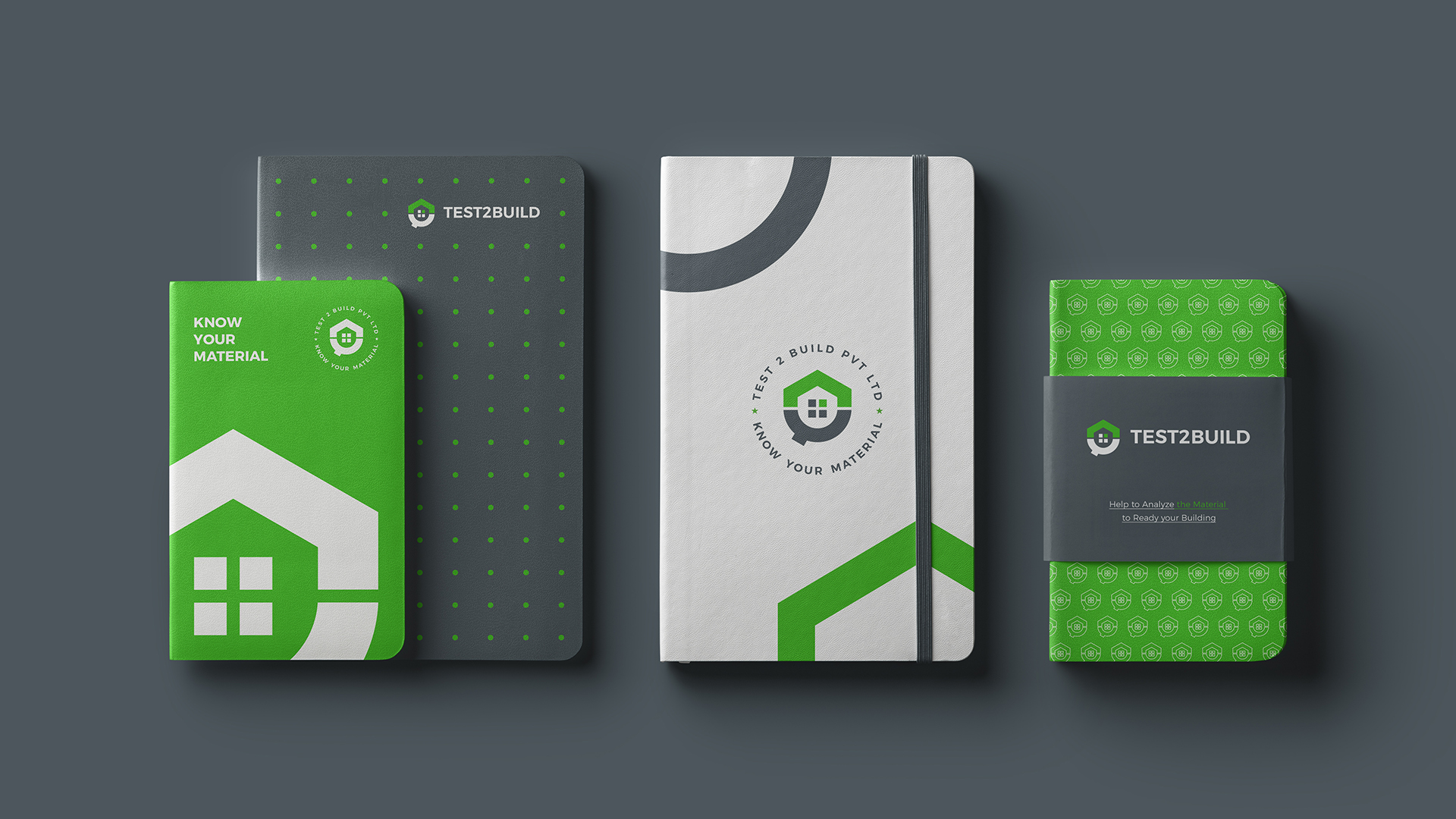
Visual Identity
The visual identity of Test2Build reflects its role as a technical foundation within the construction industry.
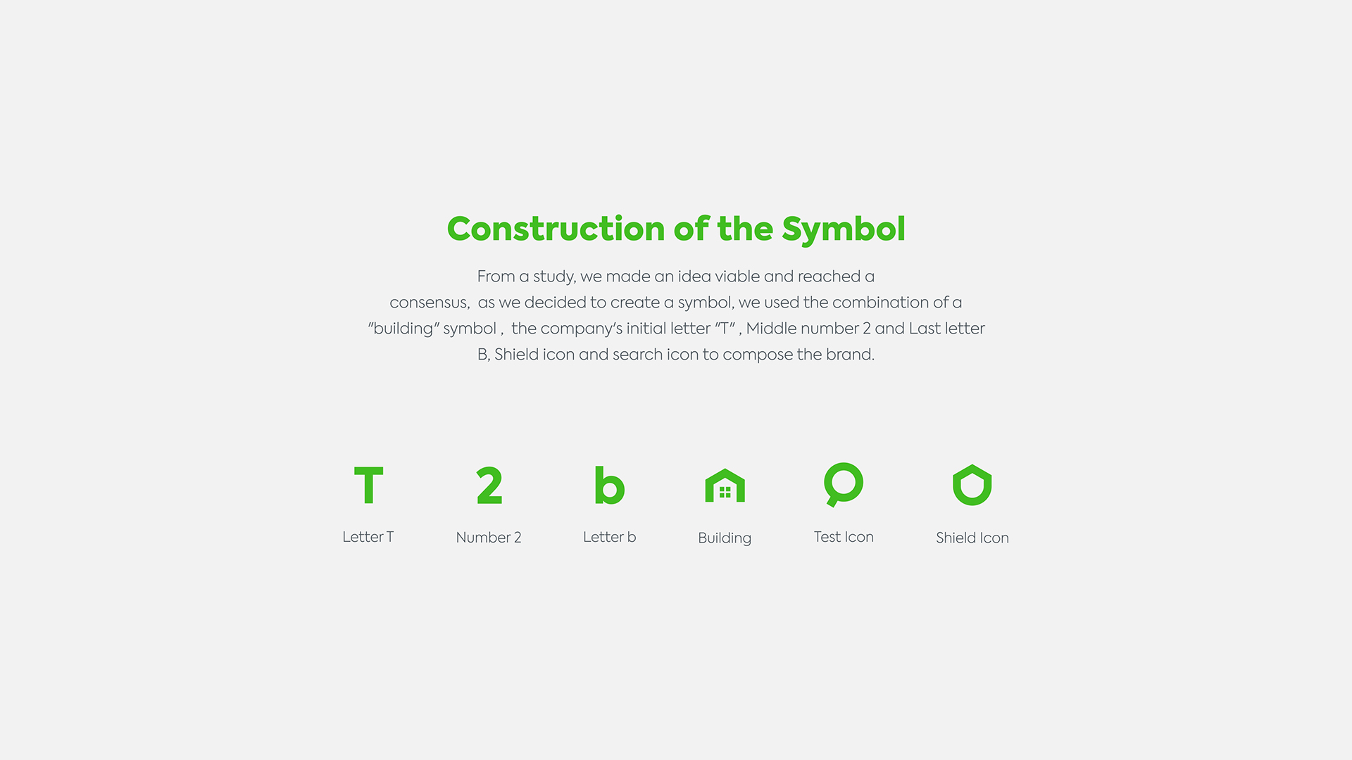
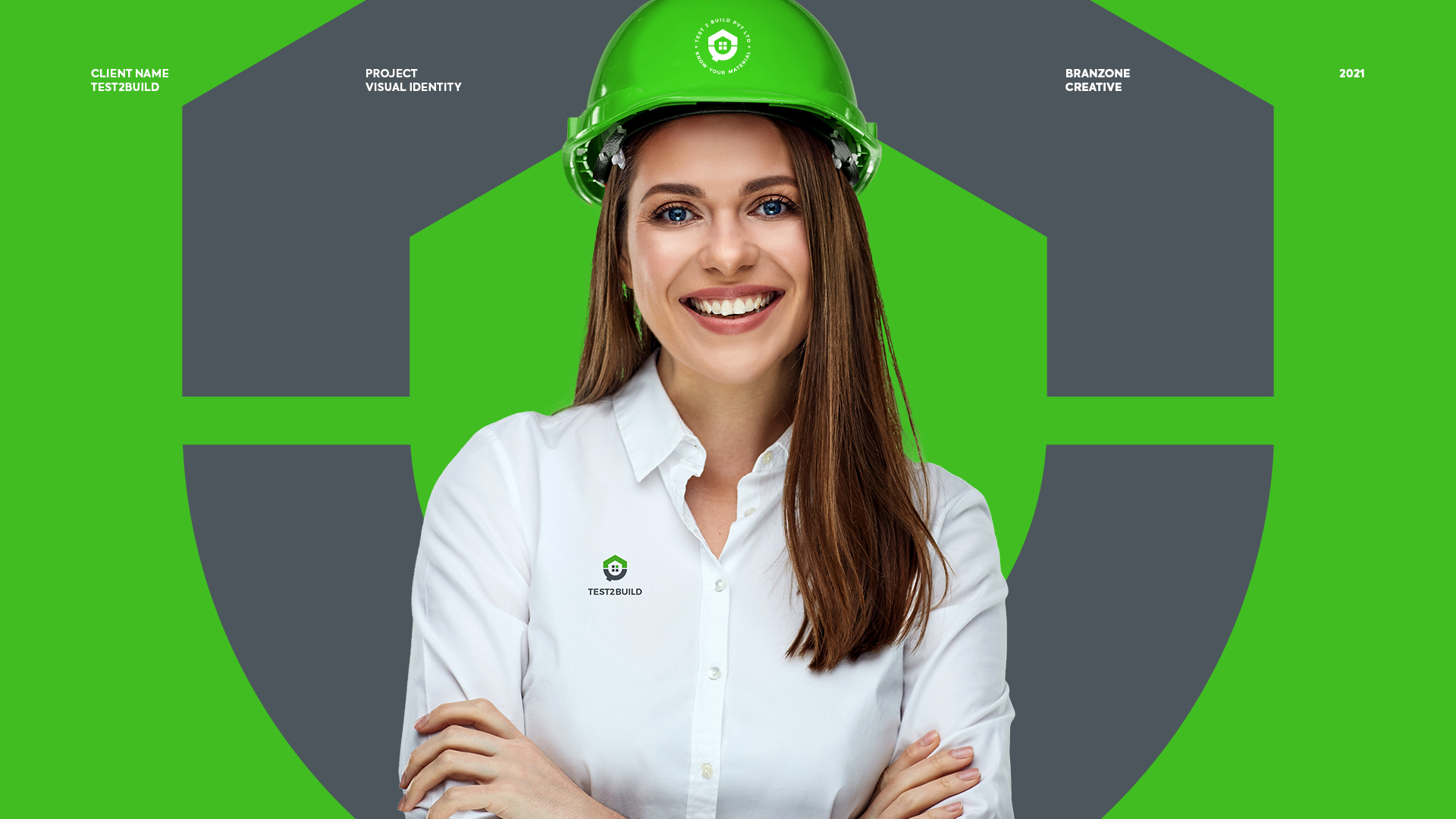
The logo design draws inspiration from structural elements and ground layers, symbolising the process of testing materials before they become part of a building. Clean geometric forms represent engineering precision, while balanced proportions reflect stability and order.
The colour palette uses strong and confident tones that are often associated with engineering, infrastructure, and industrial reliability. These colours communicate trust, safety, and professionalism while maintaining a contemporary look suitable for a modern testing laboratory.
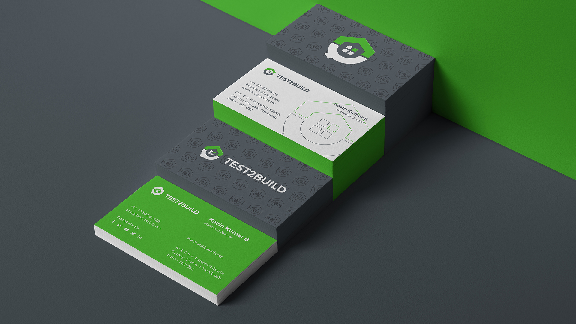
Typography plays an important role in maintaining clarity and authority. A clean and structured typeface ensures readability across reports, documentation, and digital platforms while reinforcing the brand’s professional tone.
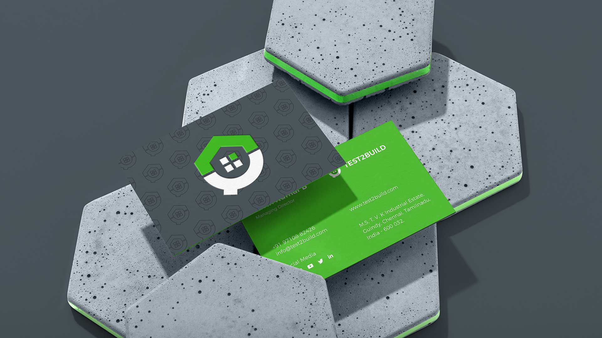
Supporting graphic elements and patterns take inspiration from construction grids, soil layers, and laboratory precision. These subtle visual cues create a consistent design language that connects the brand with its core services.
Branzone Creative developed the complete visual system including logo design, colour structure, typography, layout principles, and brand applications. Each element was carefully designed to ensure consistency across reports, marketing materials, digital platforms, and corporate communication.
Outcome
The final result is a brand identity that reflects the precision and reliability behind construction testing.
Test2Build now stands with a clear and professional brand presence that communicates technical expertise and industry credibility. The identity system is built to scale across multiple touchpoints while maintaining clarity and consistency.
More than just a visual identity, the brand establishes Test2Build as a dependable partner for engineers, contractors, and developers who rely on accurate testing and quality assurance.
Through strategy, design, and structured visual communication, Branzone Creative helped transform Test2Build into a brand that represents strength, trust, and the foundation of safe construction.


CREDIT
- Agency/Creative: Branzone Creative
- Article Title: Branzone Creative Builds a Strong and Reliable Brand Identity for Test2Build
- Organisation/Entity: Agency
- Project Type: Illustration
- Project Status: Published
- Agency/Creative Country: India
- Agency/Creative City: CHENNAI
- Market Region: Asia
- Project Deliverables: Brand Creation, Brand Design, Brand Identity, Branding, Logo Design
- Industry: Construction
- Keywords: Construction brand design, modern brand design, brand identity design
-
Credits:
Creative Director: Suman


