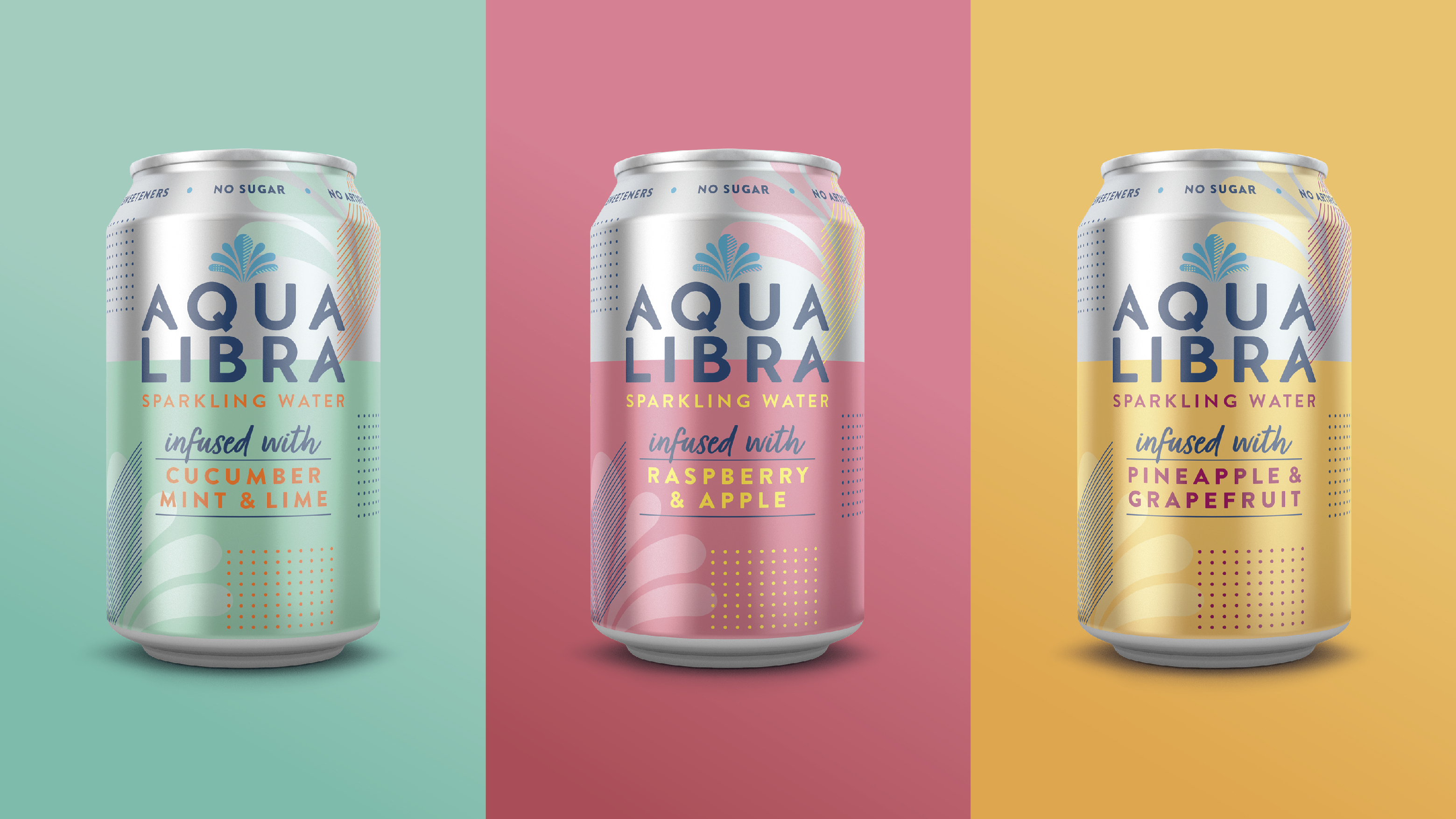
Aqua Libra is the UK’s leading sparkling-infused water. Our challenge was to help Aqua Libra move from a niche drink to the mainstream and make the same kind of ‘splash’ that La Croix and Spindrift have had in North America.
Our work needed to bridge the gap from the carbonated soft drink market to infused sparkling waters – bringing some of that joy and positivity to the brand that is inherent in the more sugary soft drinks. People needed to be able to look at it and realise they could enjoy it, not that it was a compromise.
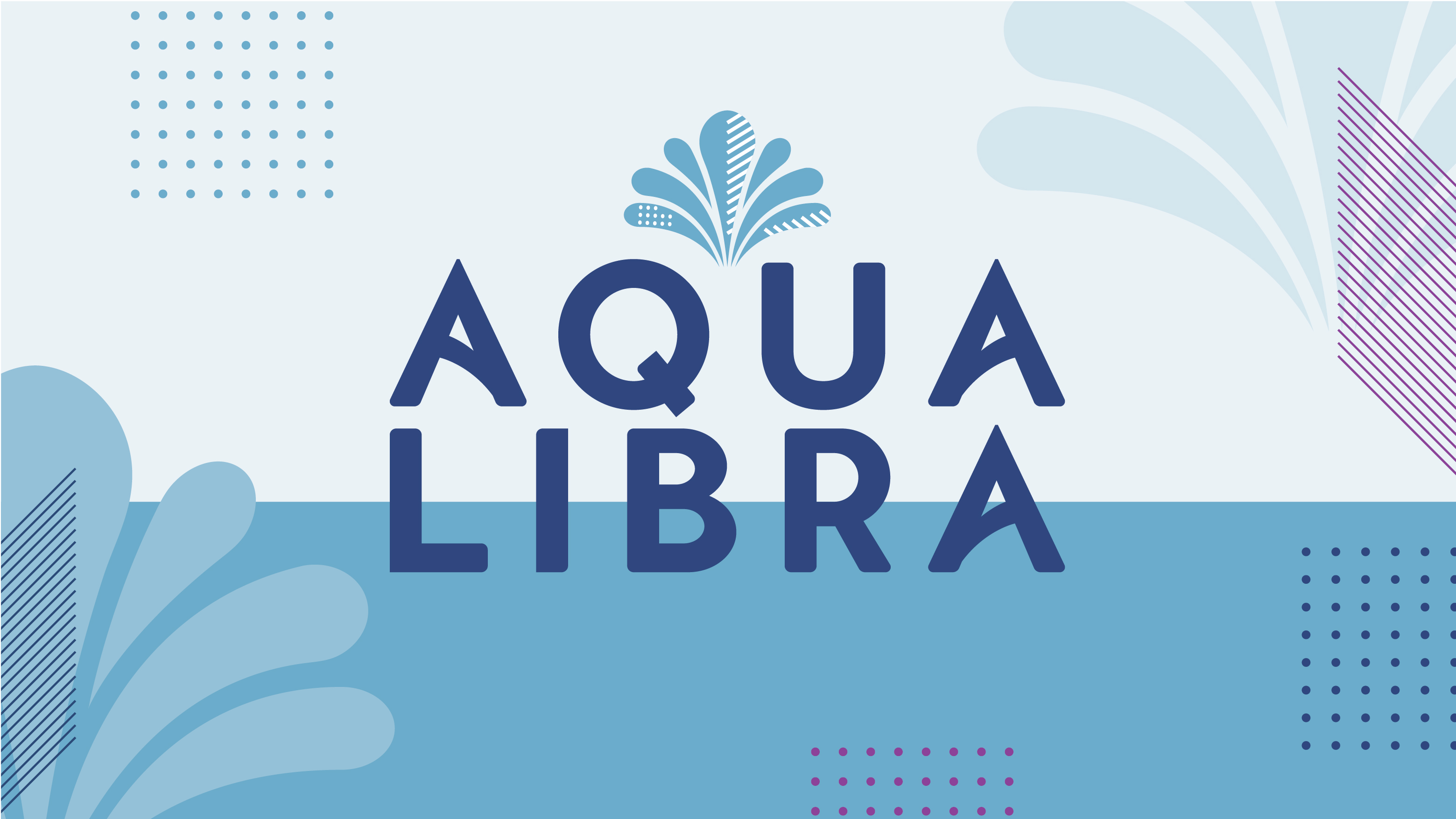
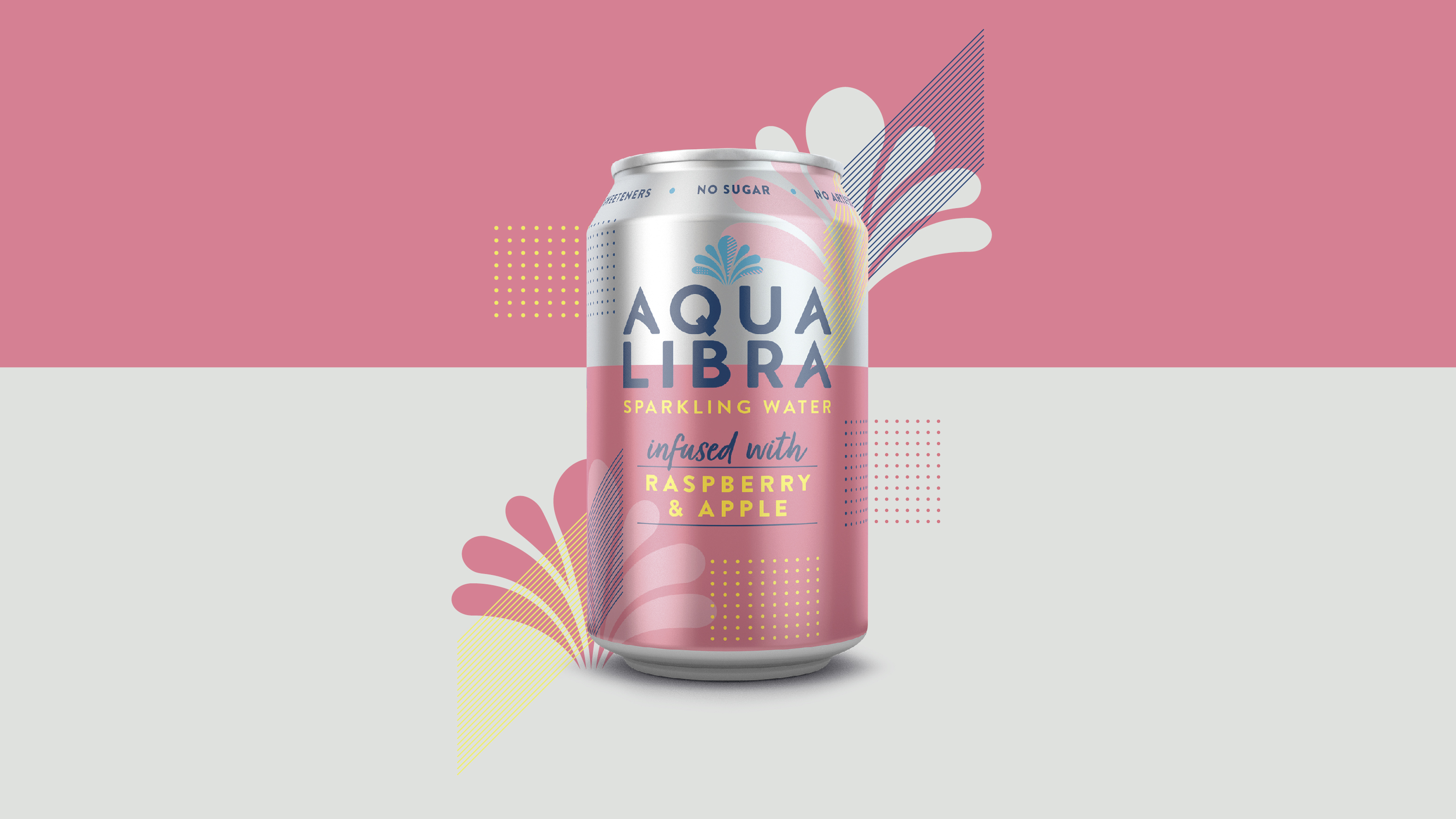
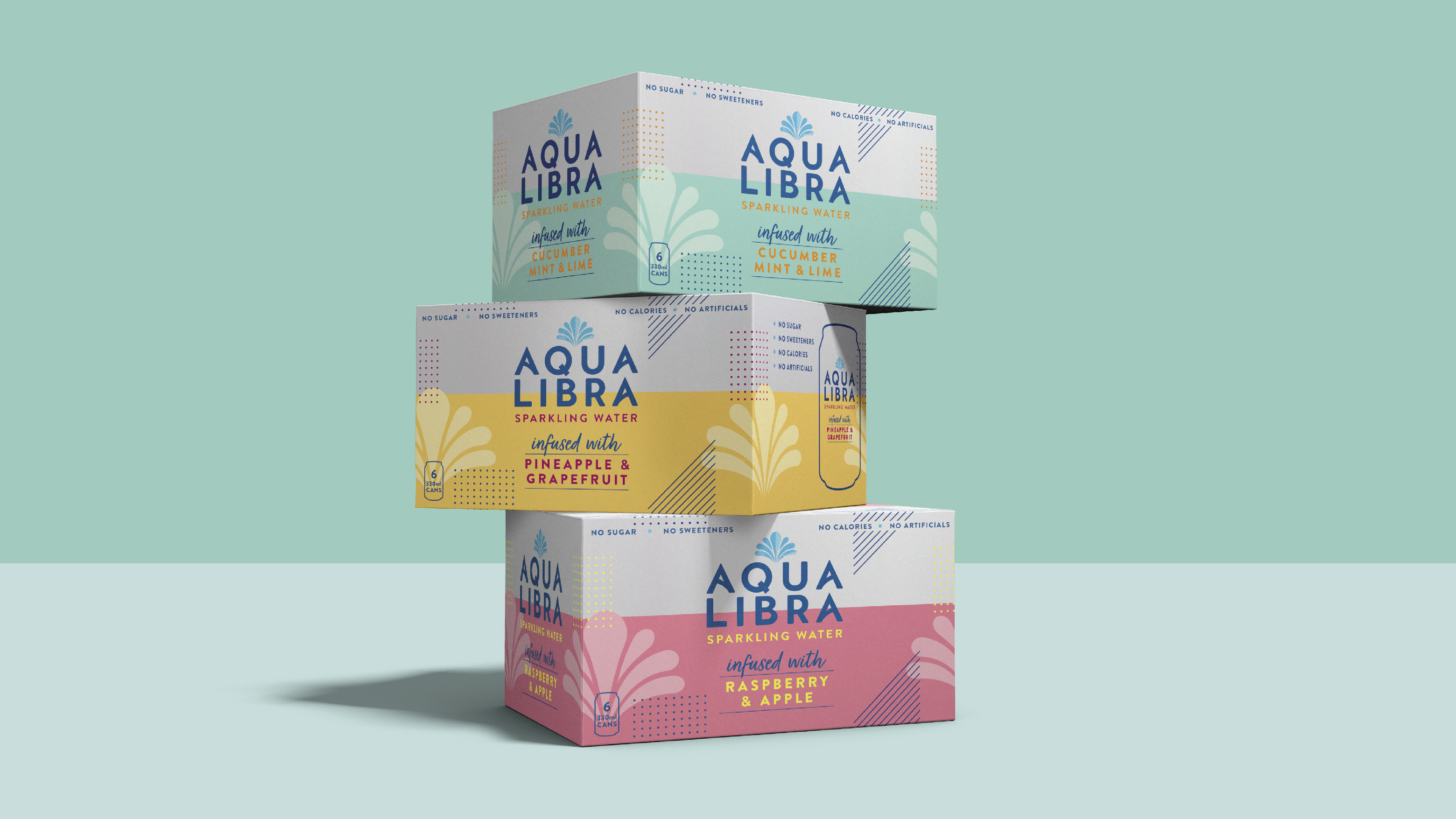
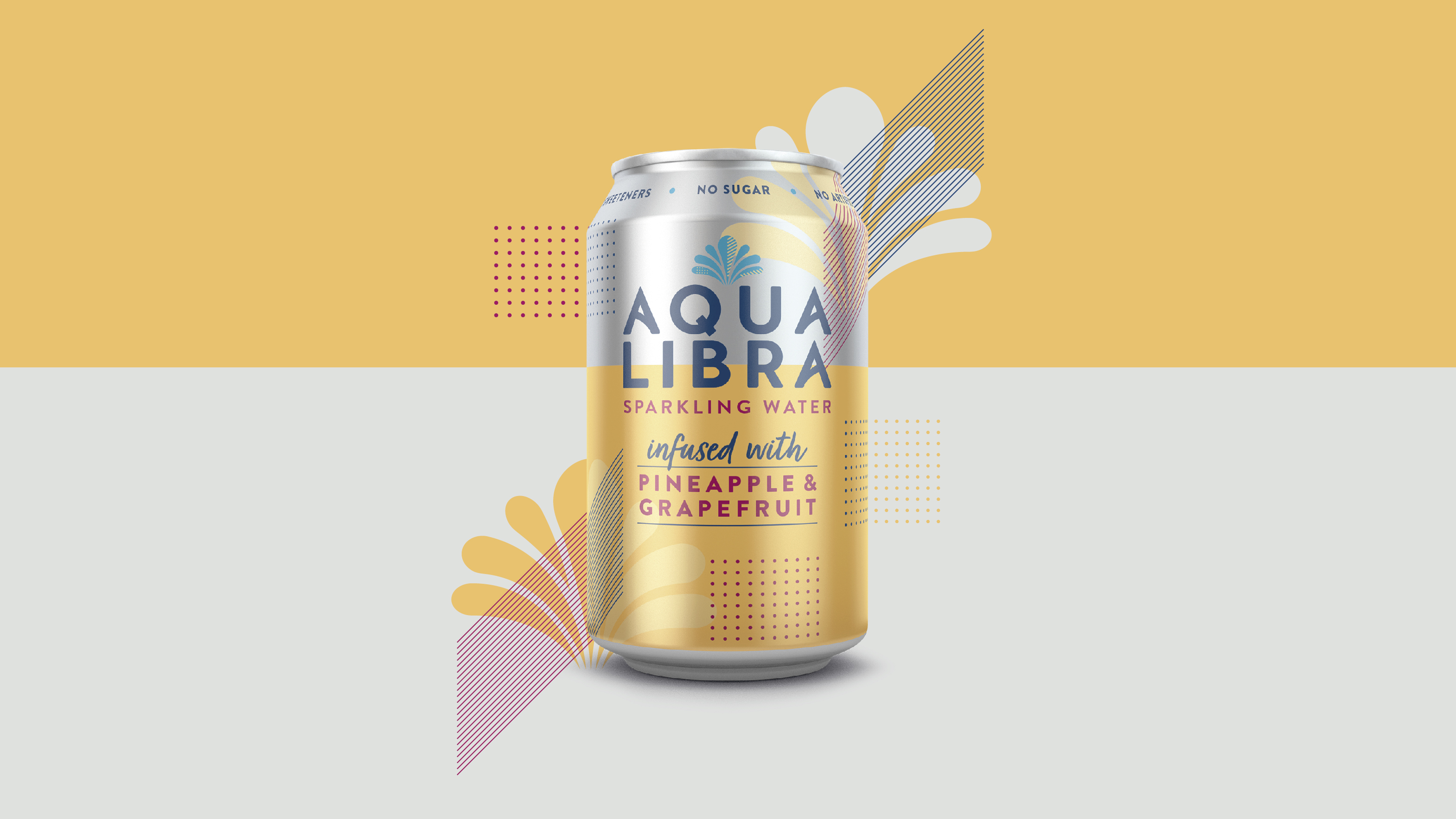
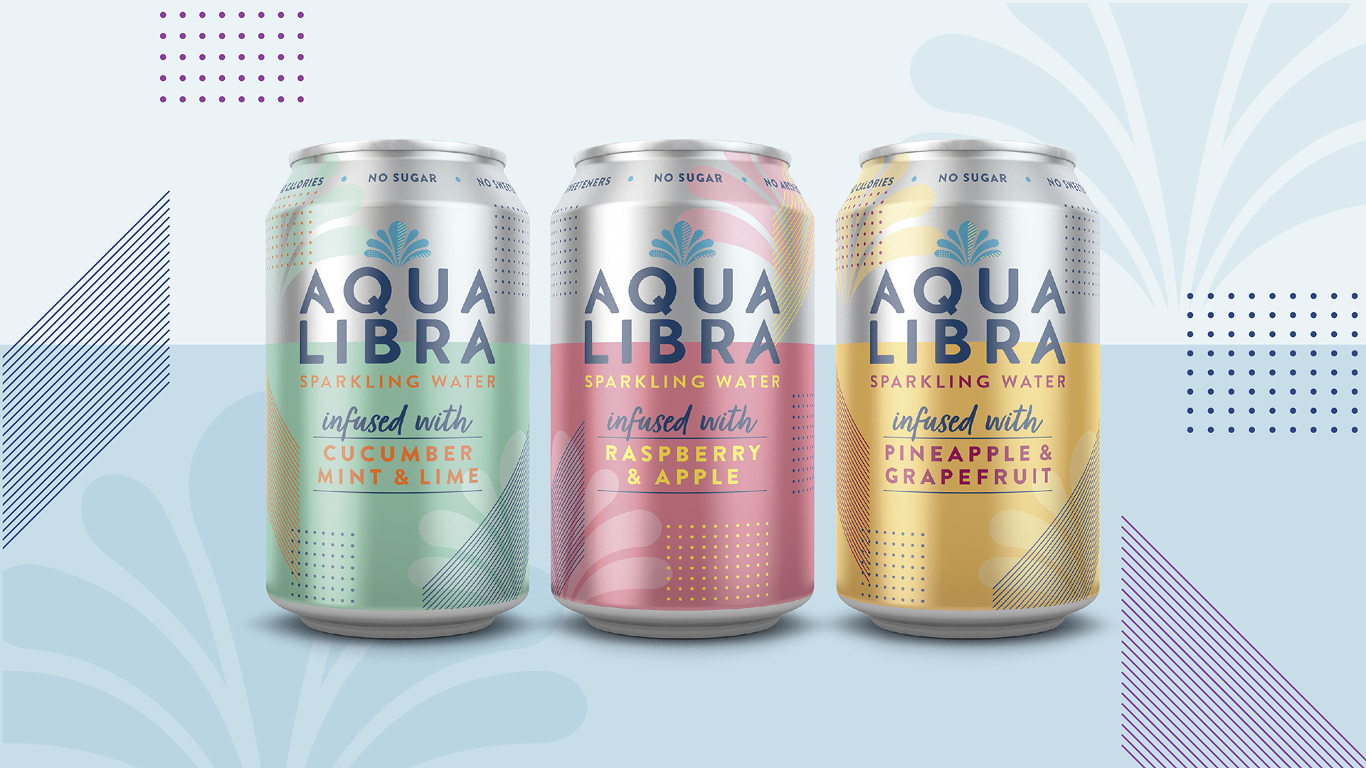
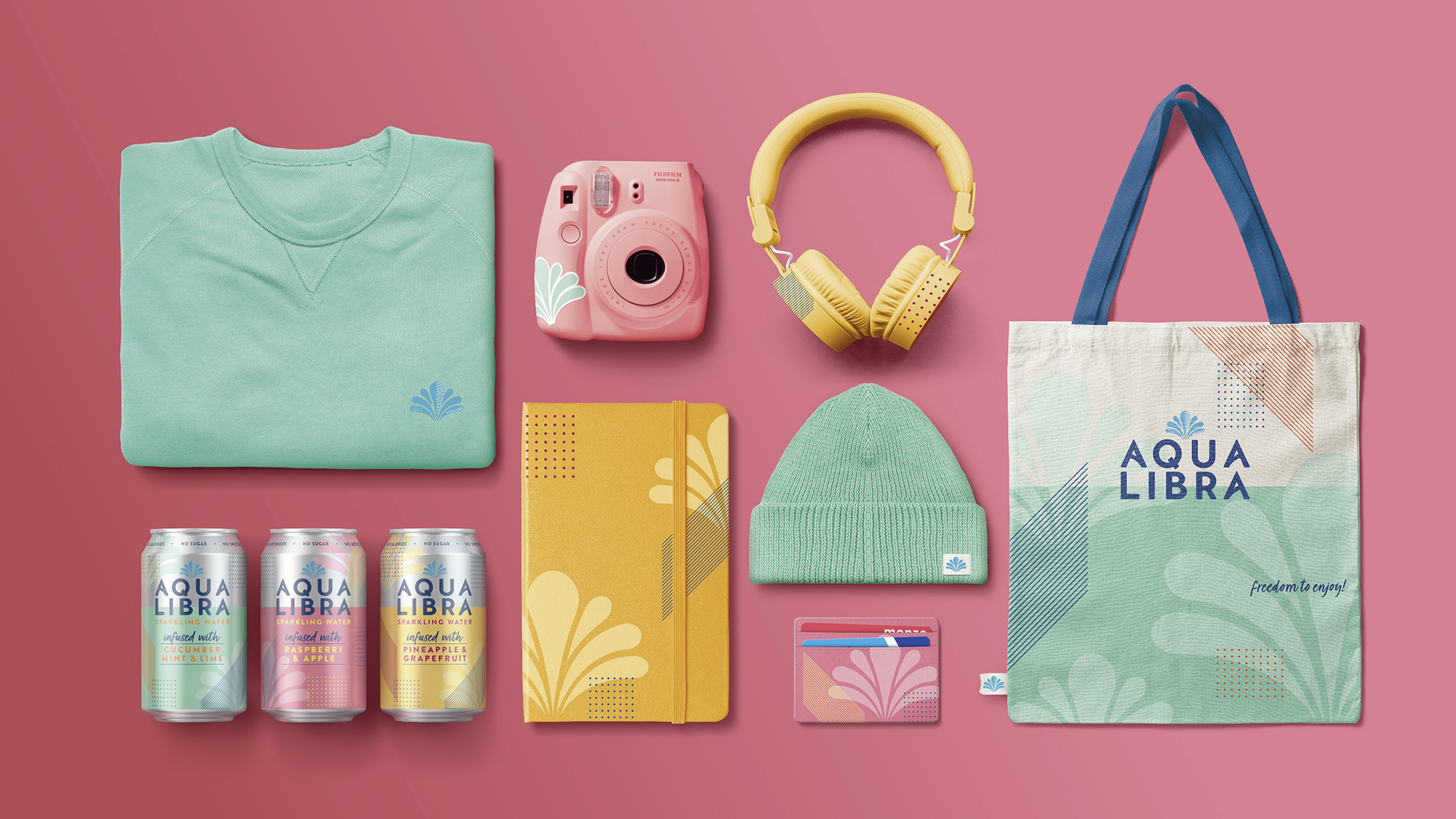
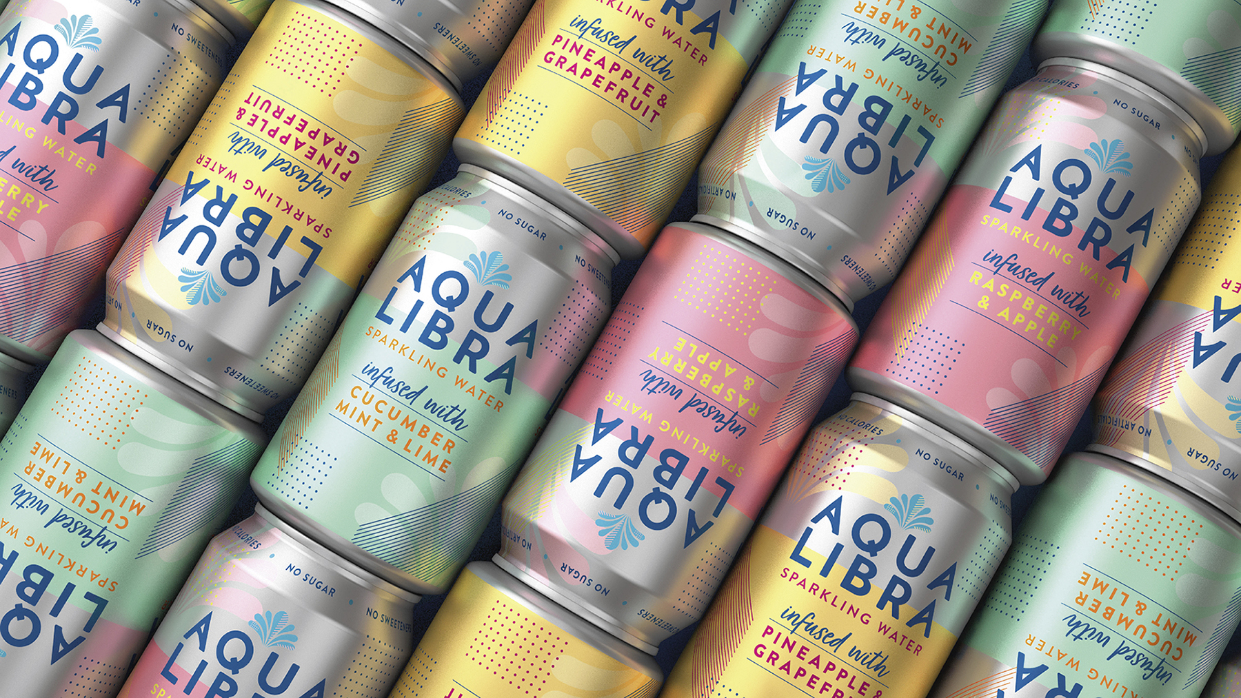
At the heart of the new identity is the fountain symbol – a metaphor for the uninhibited enjoyment the brand can bring. And the new packaging design with free-flowing unstructured elements, gives the brand a much more expressive feel.
CREDIT
- Agency/Creative: BrandOpus
- Article Title: BrandOpus Rebrand Aqua Libra for Britvic
- Organisation/Entity: Agency, Published Commercial Design
- Project Type: Packaging
- Agency/Creative Country: United Kingdom
- Market Region: Europe
- Project Deliverables: Brand Guidelines, Brand Identity, Brand Strategy, Brand World, Branding, Packaging Design, Rebranding, Research, Tone of Voice
- Format: Can
- Substrate: Plastic


