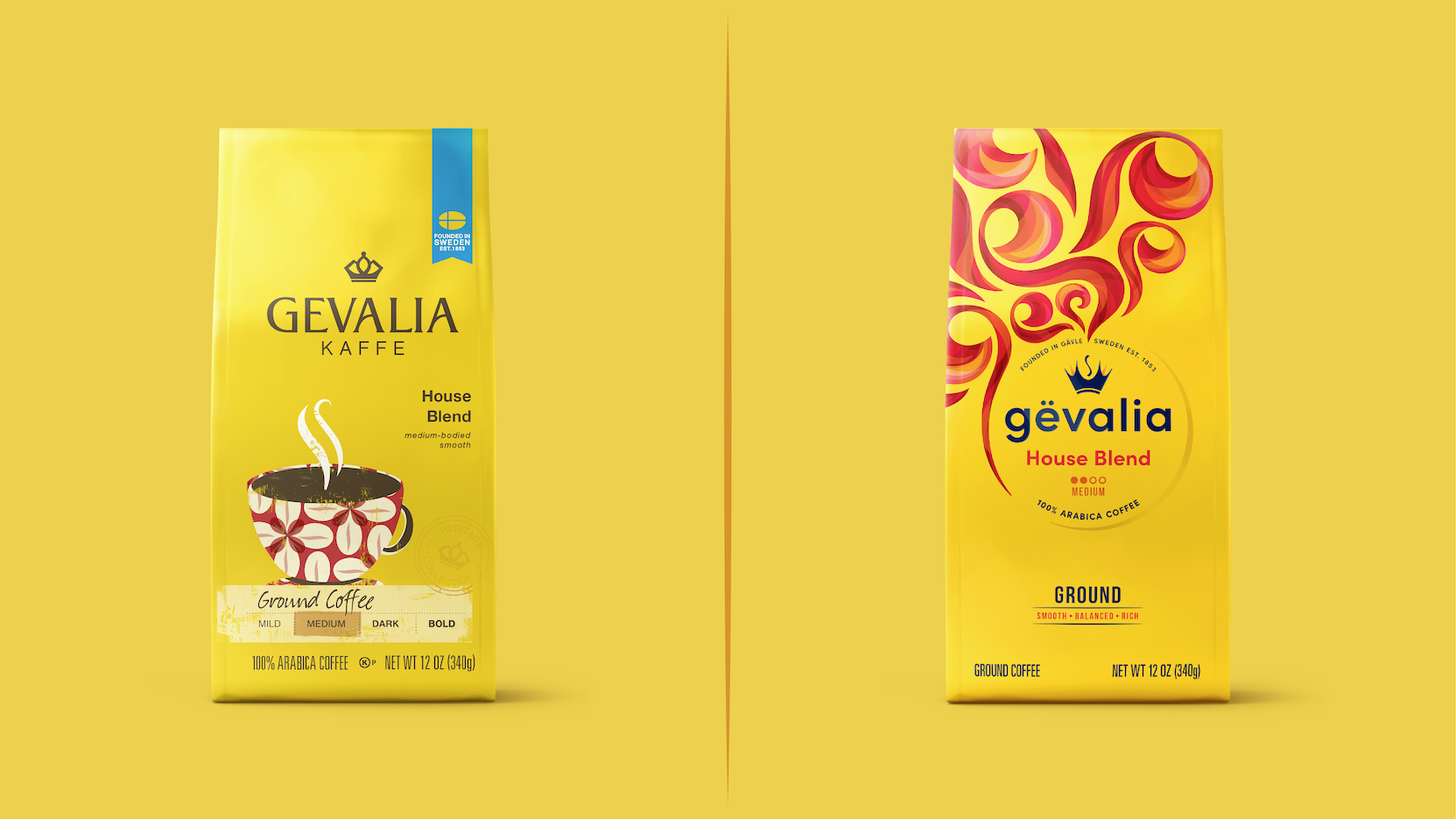
Kraft Heinz has unveiled a bold new positioning and modernized identity for US coffee brand Gevalia to elevate its position within the premium coffee market. Partnering with global brand-led creative agency BrandOpus, the new branding will be rolled out across US supermarkets nationwide in April.
The reinvigorating new work is in response to a significant category shift that has seen more and more consumers trading up from mainstream coffee at home. Inspired by the brand’s traditional Swedish methods of slow roasting and snap cooling, the new branding aims to capture savoring moments with Gevalia, by unlocking its full-bodied flavor and aroma with an expressive identity.
Embracing Gevalia’s rich heritage through its Swedish roots and signature bold yellow packaging, key assets have been both revitalised and introduced to contemporize the brand. Gevalia’s crown identity embodies a more imaginative and fluid expression – working to awaken the senses; driving sensation, emotion and energy back into the brand.
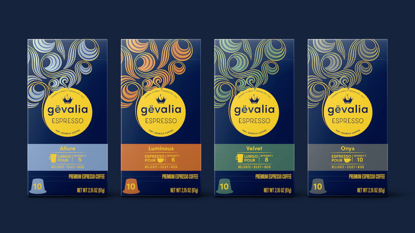
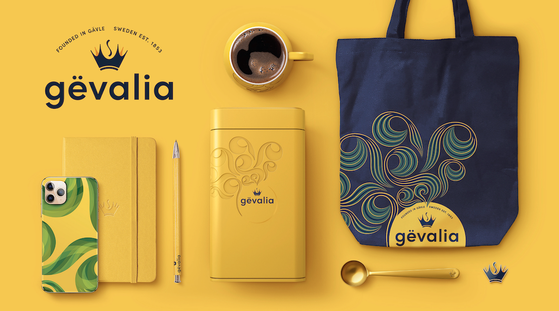
The new work sees the brand name shift from upper case to lower case, aiding pronunciation of a soft ‘g’, whilst playing into contemporary Scandinavian aesthetics. Other elements of the brand’s evolution include the introduction of the elegant aroma swirl symbol. This new distinctive visual connotes the unlocking of rich flavor and aroma and works to premiumize the brand. Embodying a more sensorial experience, the aroma swirls aid navigation at shelf and can be activated as flexible visual equities across touchpoints, such as point of sale or wearables. Changing color across the range, the artistic graphics make Gevalia feel both engaging and ownable in a crowded category.
“We wanted to establish a narrative that felt more attitudinal, and less product-benefit focused. The new look and feel goes against category norms that focus on caffeine fuel benefits or standard taste messaging. It’s an evolution that feels more artistic, expressive and accessible – speaking to coffee drinkers today and coffee drinkers to come” comments Paul Taylor, chief creative officer and founding partner, BrandOpus.
“In realizing a huge growth opportunity in the premium coffee market, we were looking for an agency who could strengthen our existing equities, while bringing new and distinctive meaning to Gevalia. Embodying just that, we’re excited to see the modernized aesthetic hit shelves and breakthrough in a competitive category” adds Tom Merriman, Senior Brand Manager, Gevalia.
The new branding extends across all touchpoints including identity, packaging and website.


CREDIT
- Agency/Creative: BrandOpus
- Article Title: BrandOpus Premiumizes Coffee Giant Gevalia with New Rebrand
- Organisation/Entity: Agency, Published Self Promotional Design
- Project Type: Identity
- Project Status: Published
- Agency/Creative Country: United States
- Market Region: North America
- Project Deliverables: Brand Architecture, Brand Identity, Brand Redesign, Brand Refinement, Brand Rejuvenation, Brand Strategy, Branding, Graphic Design, Identity System, Packaging Design, Rebranding, Tone of Voice
- Keywords: Brand Identity, Packaging Design, Brand evolution, symbols, typography, colour palette, coffee brand


