Molson, Canada’s beloved beer brand, has embarked on a journey to reignite the country’s passion for its iconic brews. With a focus on elevating the brand and delivering a clear, consistent message, Molson partnered with global branding agency BrandOpus to bring its vision to life. As of Q2 of 2023, following the rebrand, the Molson Brand Family grew across revenue, share and volume in Canada versus the previous year. What’s more, it’s now the second best-selling beer brand at Canada’s largest beer outlet, The Beer Store, behind Coors Light.
Aiming to unify the many Molson beers under the Molson masterbrand, the work reflects a new strategy from the business which will give Canadians a clear understanding of why Molson exists and what it stands for. “We knew there was an opportunity to make Molson Canada’s beer again,” said Leslie Malcolm, Vice President of Marketing in Canada at Molson Coors Beverage Company. “Our aim was to create an ownable and clear visual identity that reflects a cultural moment relevant to Canadians’ lives today. We believe that there is a Molson for every Canadian, and we wanted to make sure that message was conveyed effectively.”
BrandOpus, Molson Coors’ branding partner for over eight years, amplified the strategic insight that Molson proudly ignites a sense of togetherness for every Canadian. With the intent to represent a shift in culture and the many different identities that make up the Canadian society, Molson aims to bring Canadians together by welcoming everyone in with their products. The brand’s new “We Are Many” creative thread – – created by BrandOpus – echoes the diversity of Canadian culture and highlights its commitment to bringing the nation together through its products.
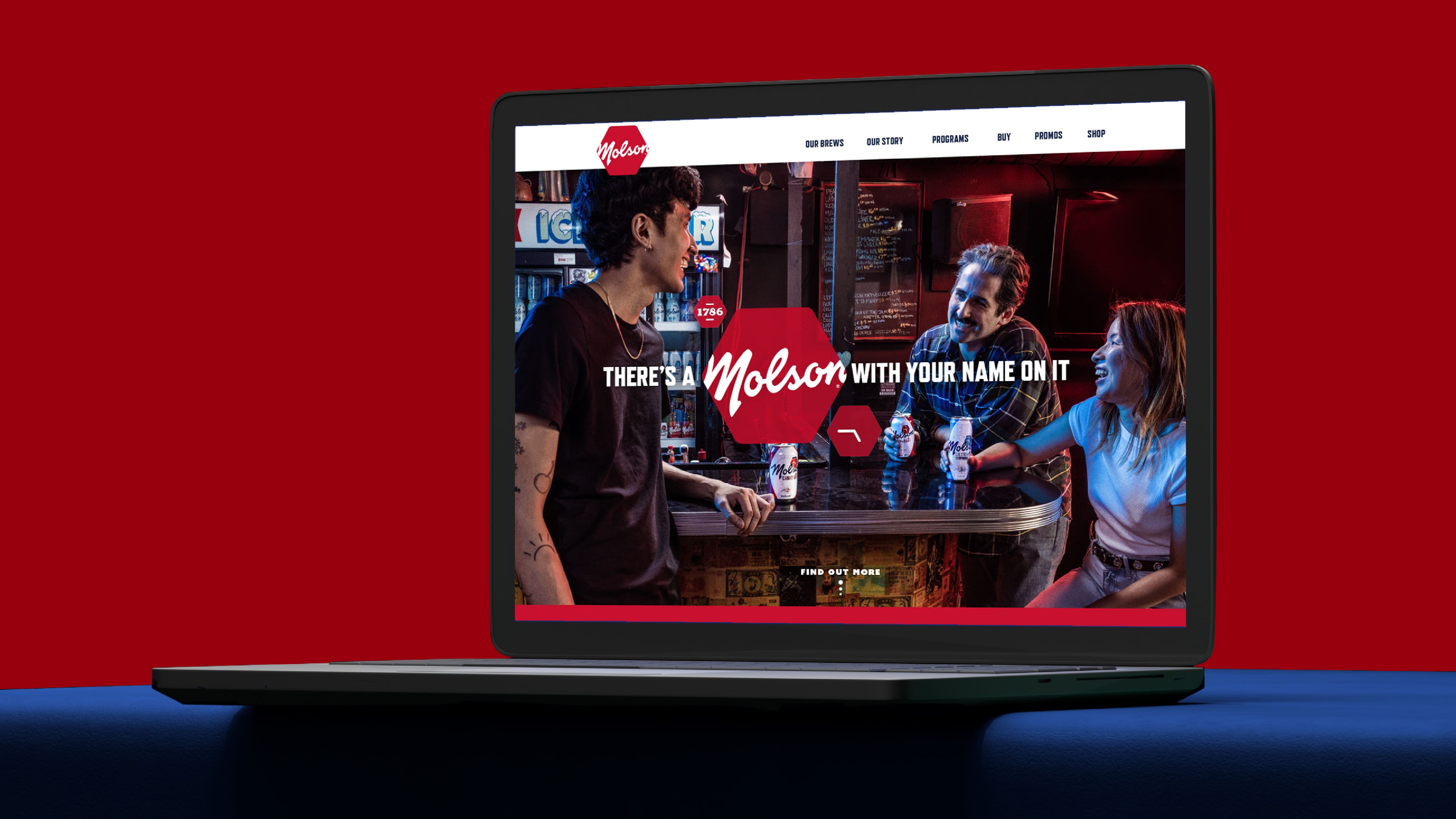
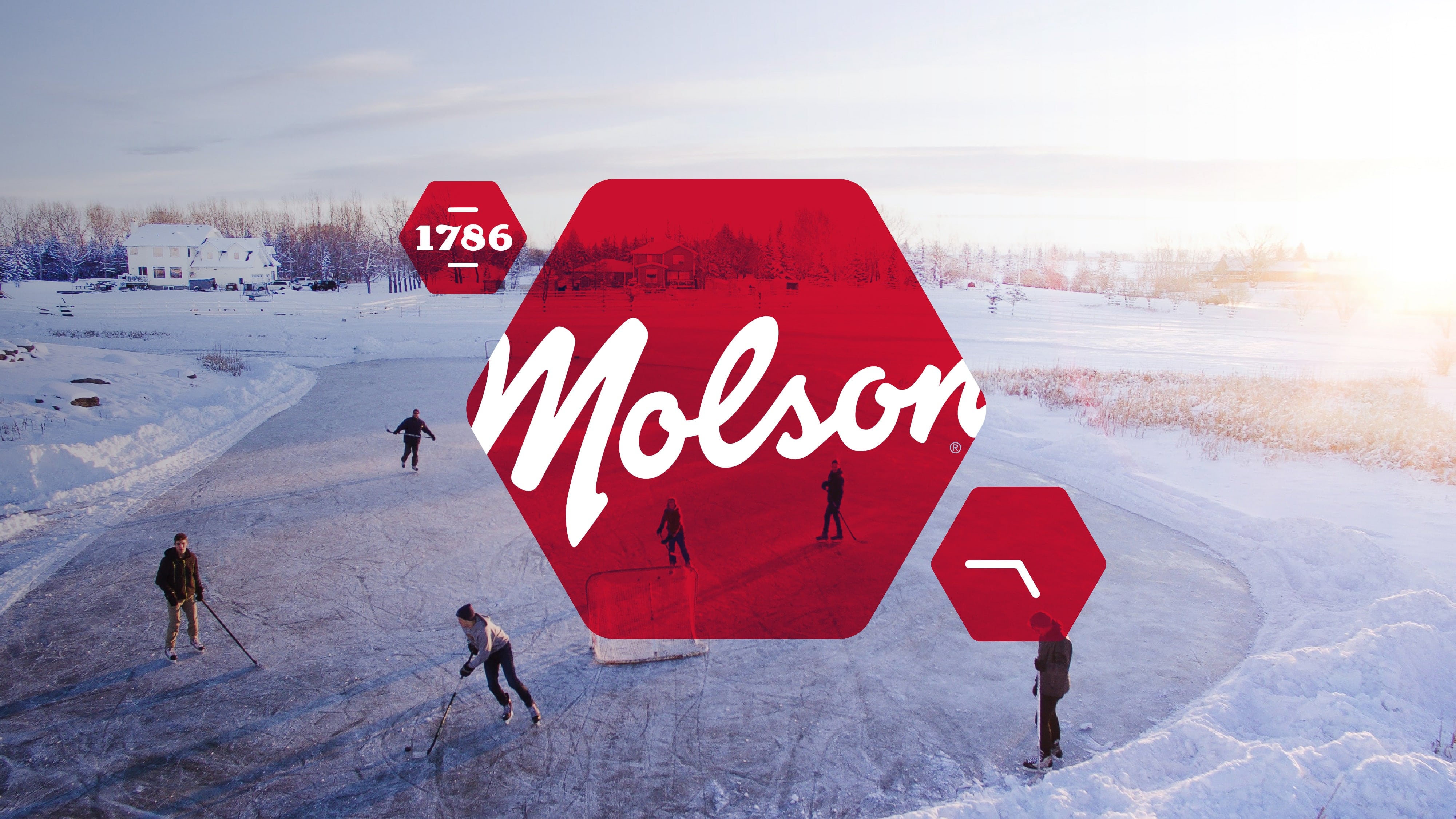
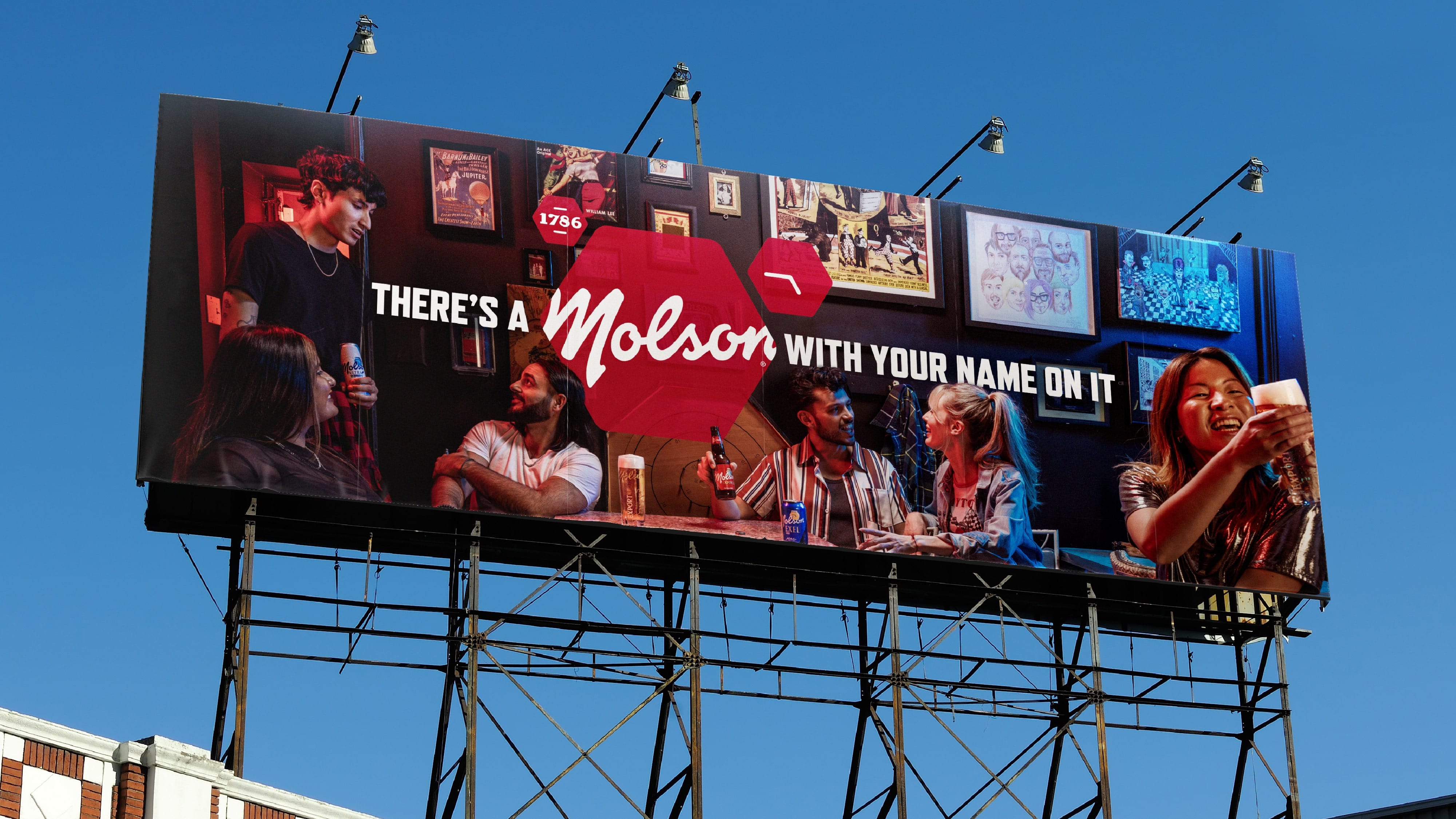
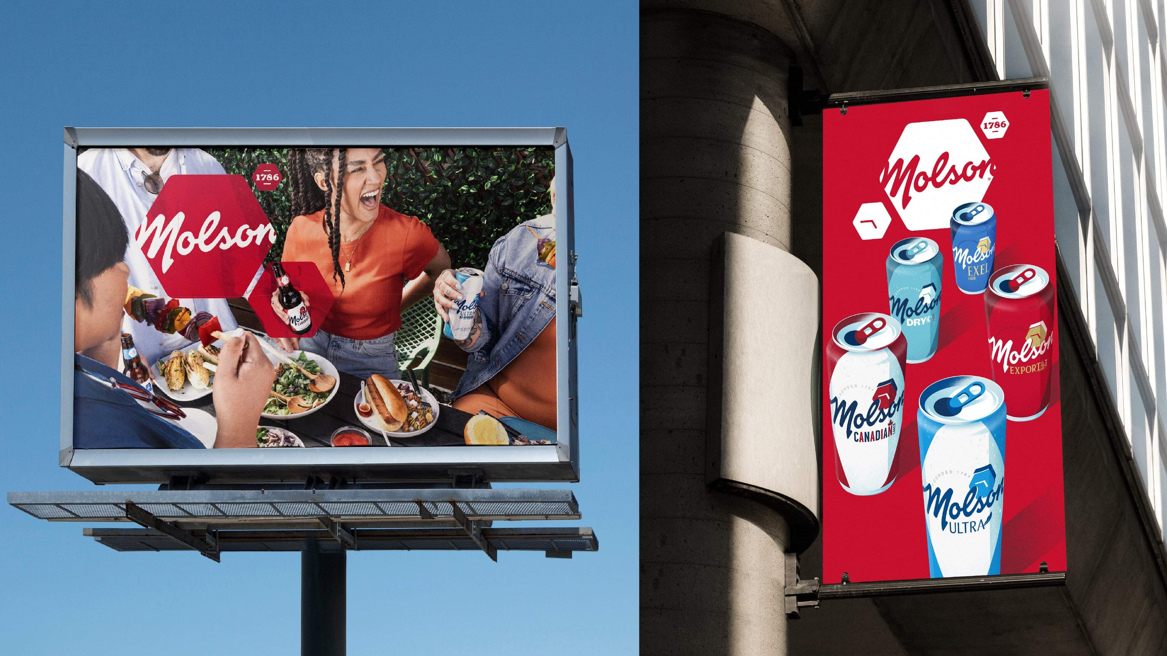
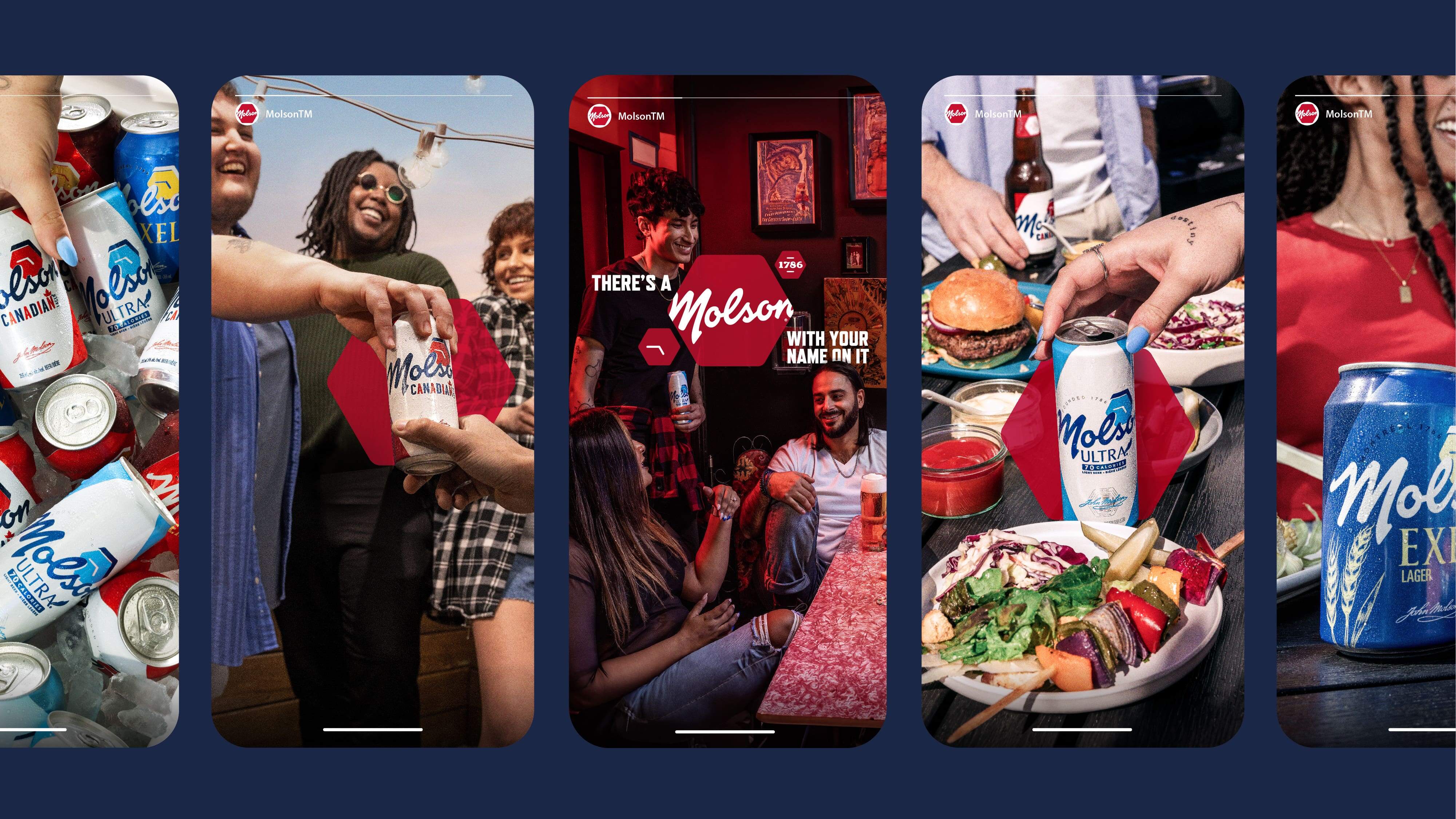
To create a visual identity which reflects Molson’s unique position in the market, BrandOpus developed an adaptable system of a mosaic of hexagons – bringing ownability to both illustrative and photographic assets. By leaning into a historic brand asset, the new identity drives a clear representation of the many identities of Canada.
A unique library of journalistic-style photography, shot across multiple locations, illustrates different slices of life, from backyard BBQs to rooftop parties and everything in between, all highlighting moments of inclusive connection across Canada. The illustrative assets depict brand assets such as the cans, as well as Molson’s breweries spread across the country’s provinces, mirroring the connectivity of the brand. Together, this brand world encapsulates the authentic moments of connection between real Canadians who come together to create a mosaic, rather than a melting pot.
The new Molson Masterbrand logo takes the distinctive script wordmark and holds it within the hexagon, a strong multifaceted symbol of togetherness. A new pairing of complementary typefaces was introduced that gives the brand flexibility across every touchpoint, ensuring that the brand remains strong and distinctive while complementing the already established colour palettes of the products that sit under the Molson masterbrand.
“We are thrilled with the outcome of this partnership, which has allowed us to bring a consistent and compelling message to our consumers,” said Malcolm. “We believe that our new brand identity truly reflects our commitment to bringing Canadians together and that we now have a visual language that showcases the unique spirit of Molson.”
Nir Wegrzyn, CEO of BrandOpus, commented: “We are proud to have partnered with Molson on this exciting journey to revitalise their brand. By unifying the portfolio and breathing new meaning into Molson, we have helped to create an iconic identity system at a masterbrand level. We believe that the brand’s new design system will work seamlessly across multiple channels and put people and product at the heart of the brand.”
CREDIT
- Agency/Creative: BrandOpus
- Article Title: BrandOpus Helps Molson’s Symbolic Hexagon Takes Center Stage in Masterbrand Makeover
- Organisation/Entity: Agency
- Project Type: Identity
- Project Status: Published
- Agency/Creative Country: United States
- Agency/Creative City: New York
- Market Region: North America
- Project Deliverables: 2D Design, Brand Design, Brand Identity, Brand Mark, Brand Redesign, Brand Strategy, Brand World, Branding, Copywriting, Design, Identity System, Rebranding
- Industry: Food/Beverage
- Keywords: Molson Coors BrandOpus Redesign Design
-
Credits:
CCO: Paul Taylor
Business Director: Caroline Winnington
Creative director - brand experience: Ian Ritch
Senior Designer: Coburn Chambers
Motion Design: Tyler Livingston
Senior strategy director: John Matthews
Creative Director of Brand Ambition: Neal Colyer
Senior image creator: Myles Dewbury
Head of creative finishing: Jeff Russo
Senior creative finisher: Jason Darby


