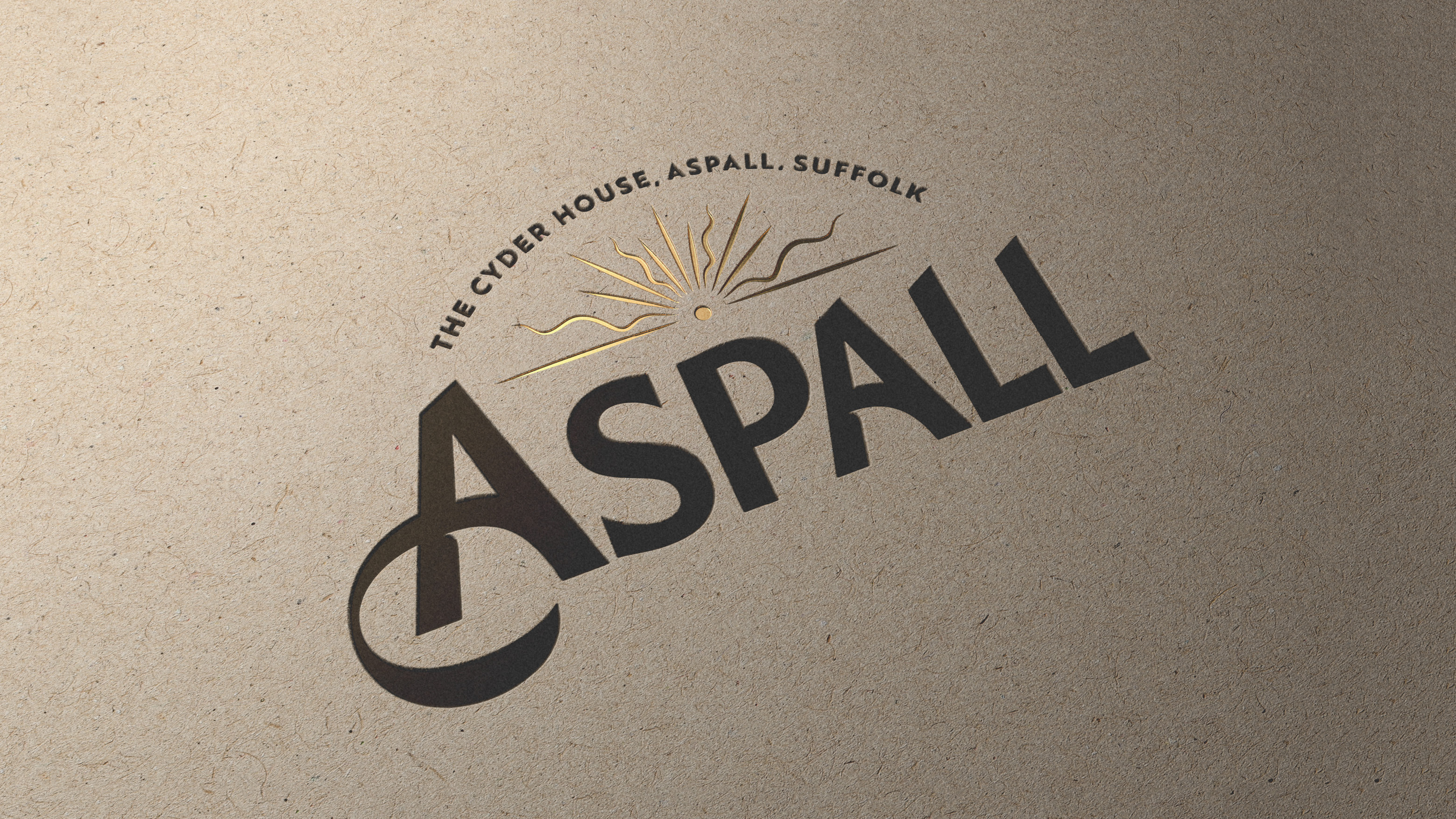
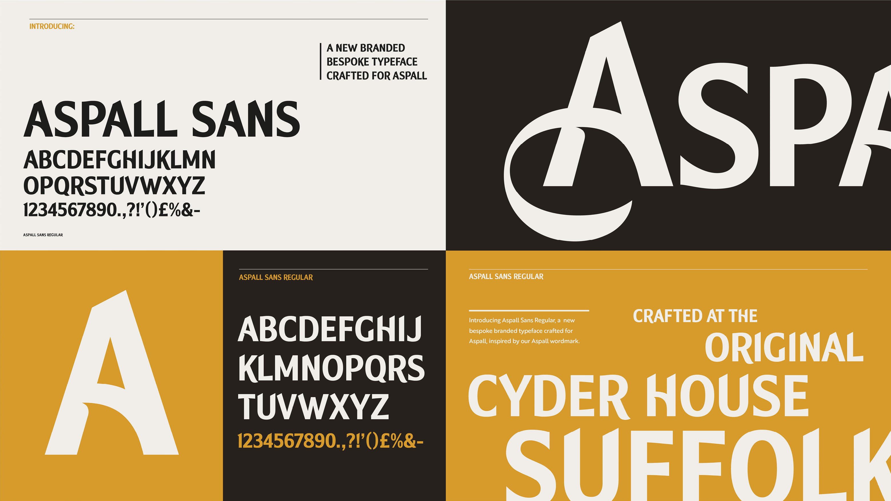
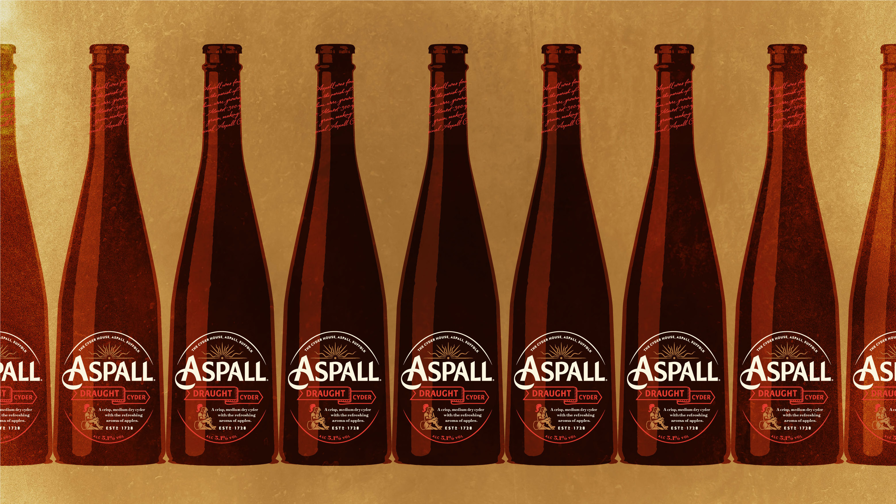
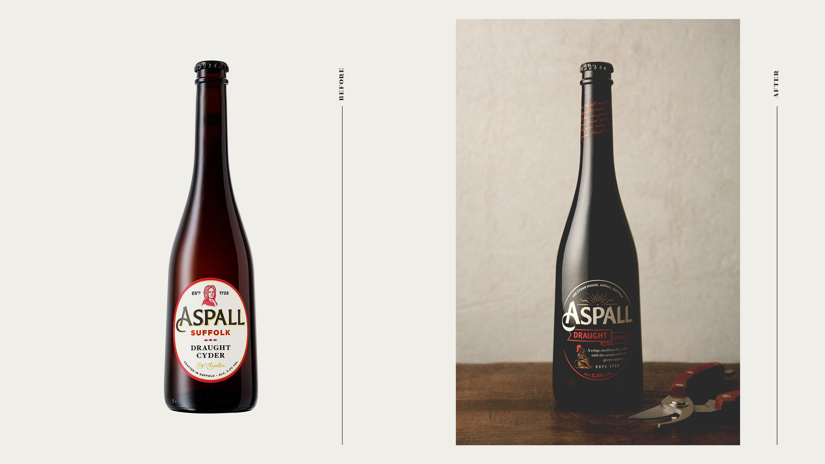
The new branding for Aspall was designed to re-assert its position with the UK cider category as the cider of sophistication.
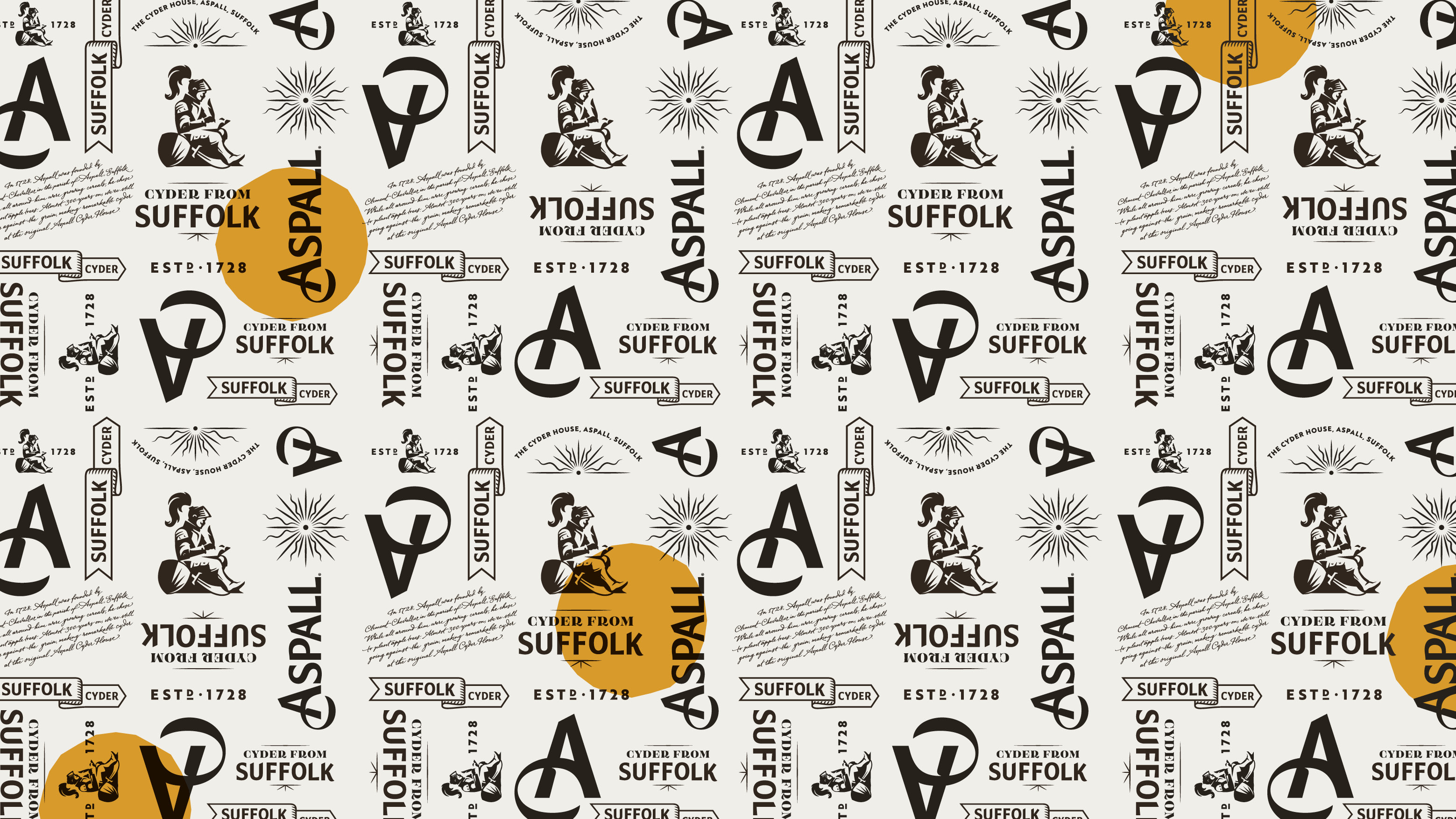
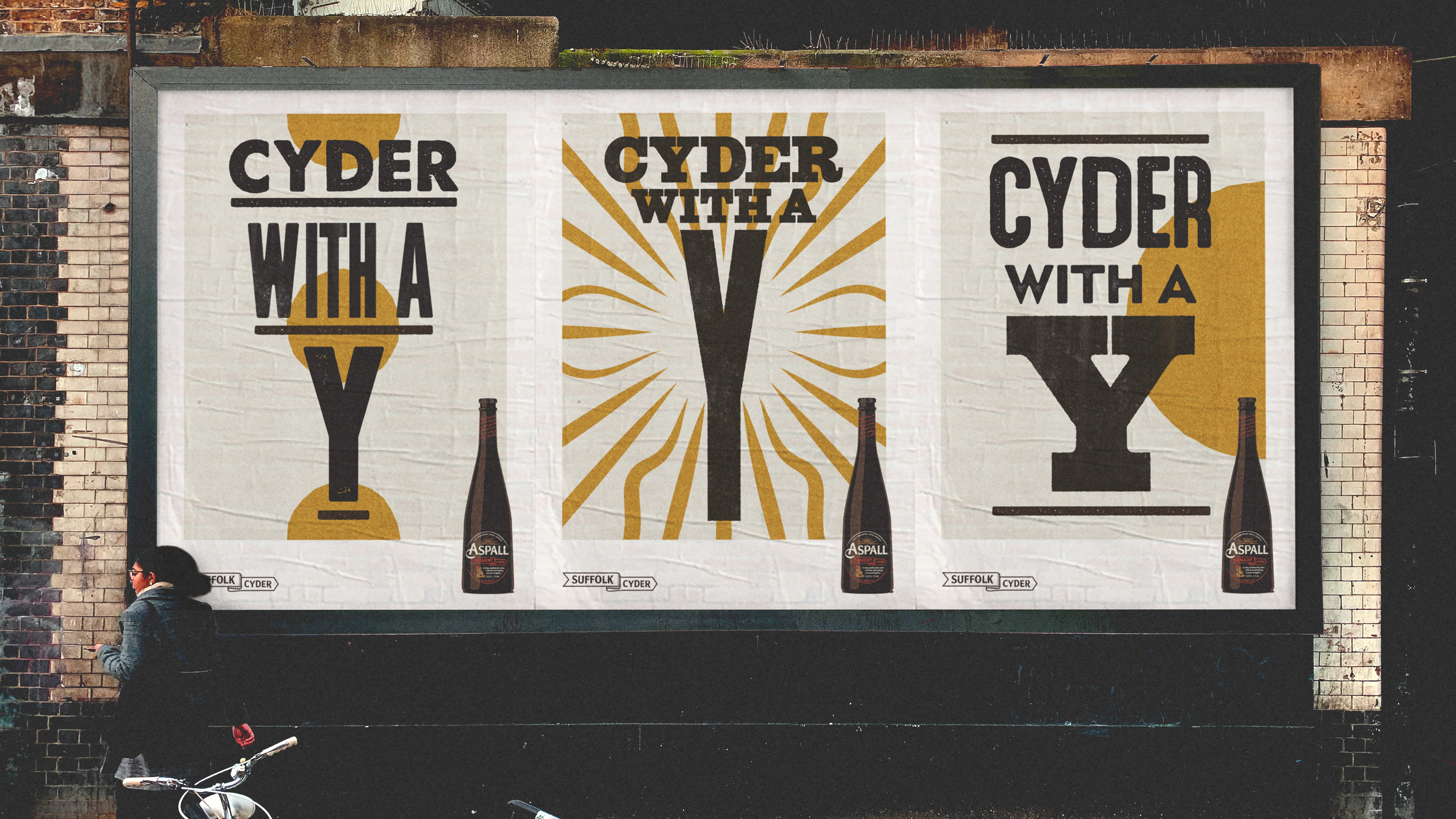
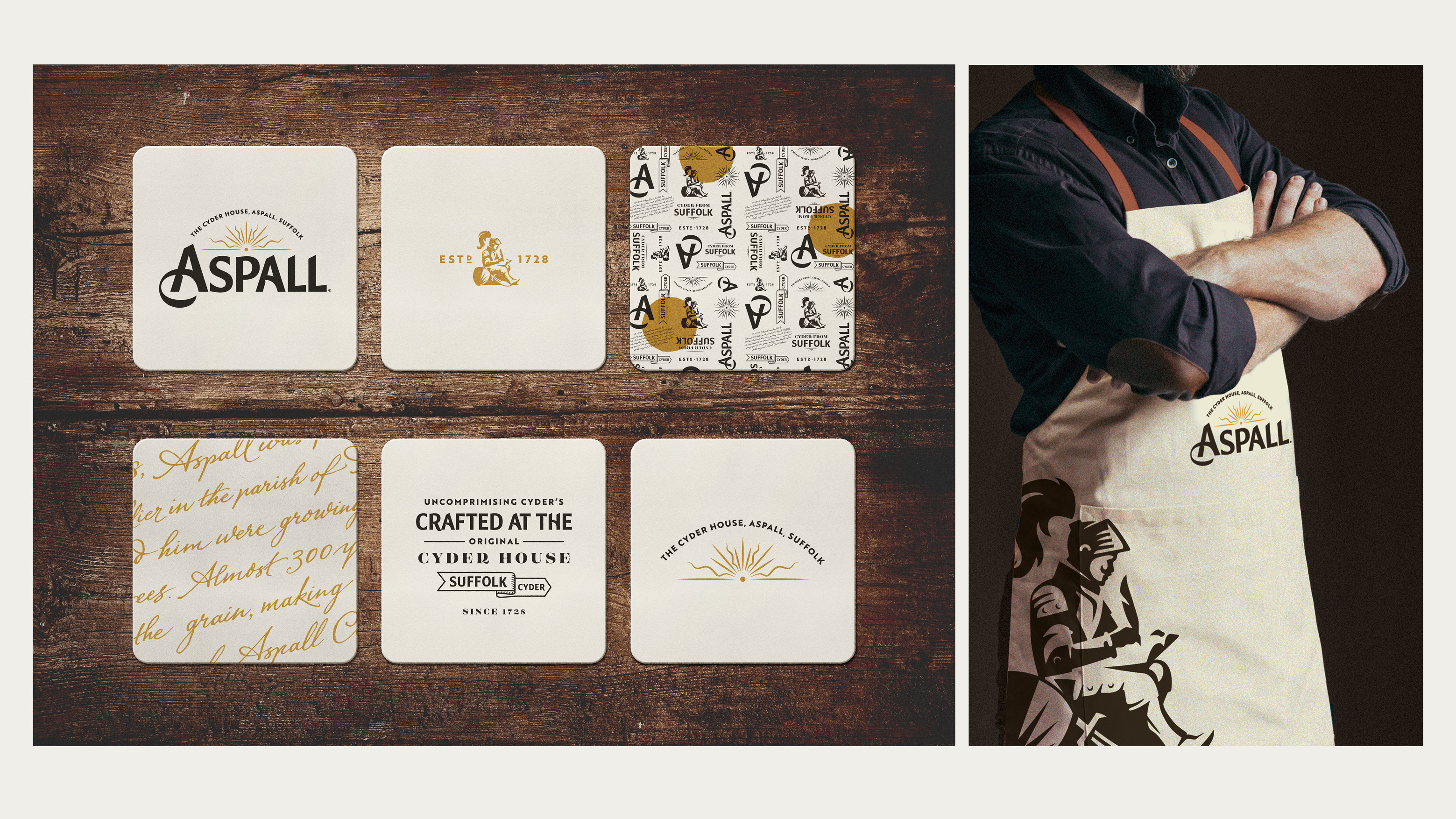
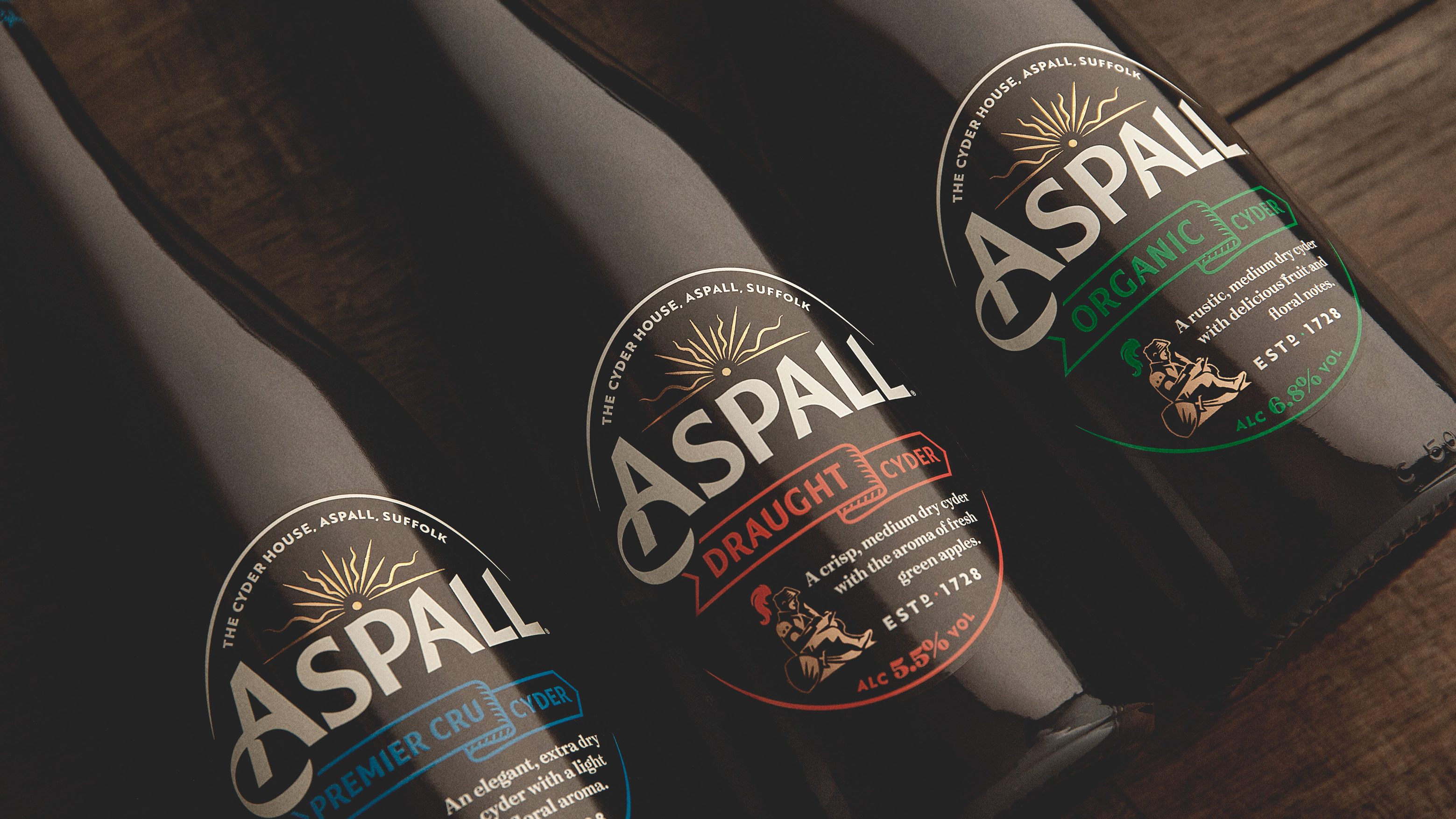
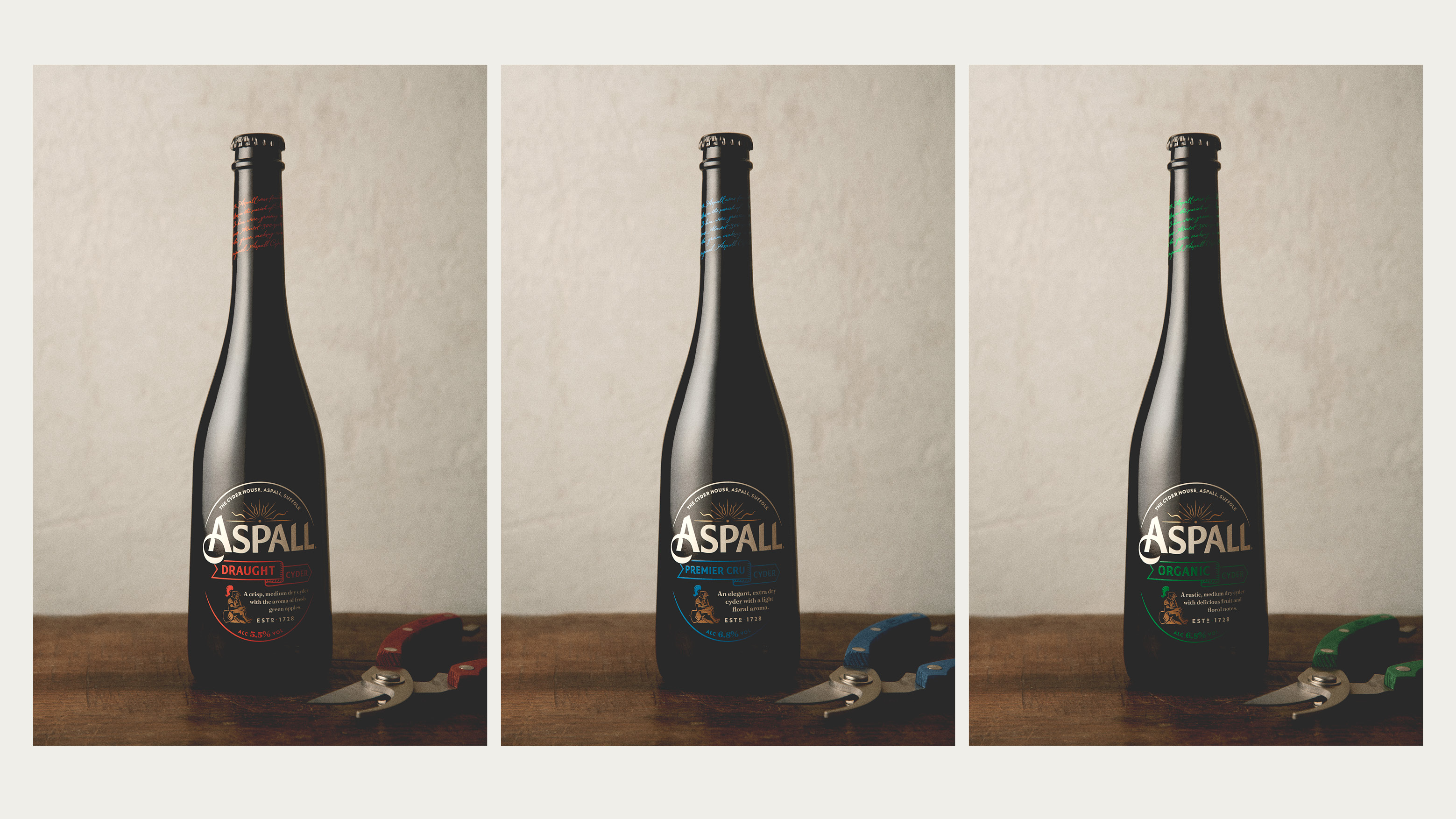
The new brand identity and packaging design recognises Aspall’s desire as a brand to take ‘the road less travelled’. Celebrating its heritage in the East of England with the rising sun identity and the unconventional knight helps the brand sit apart from more conventional cider cues.
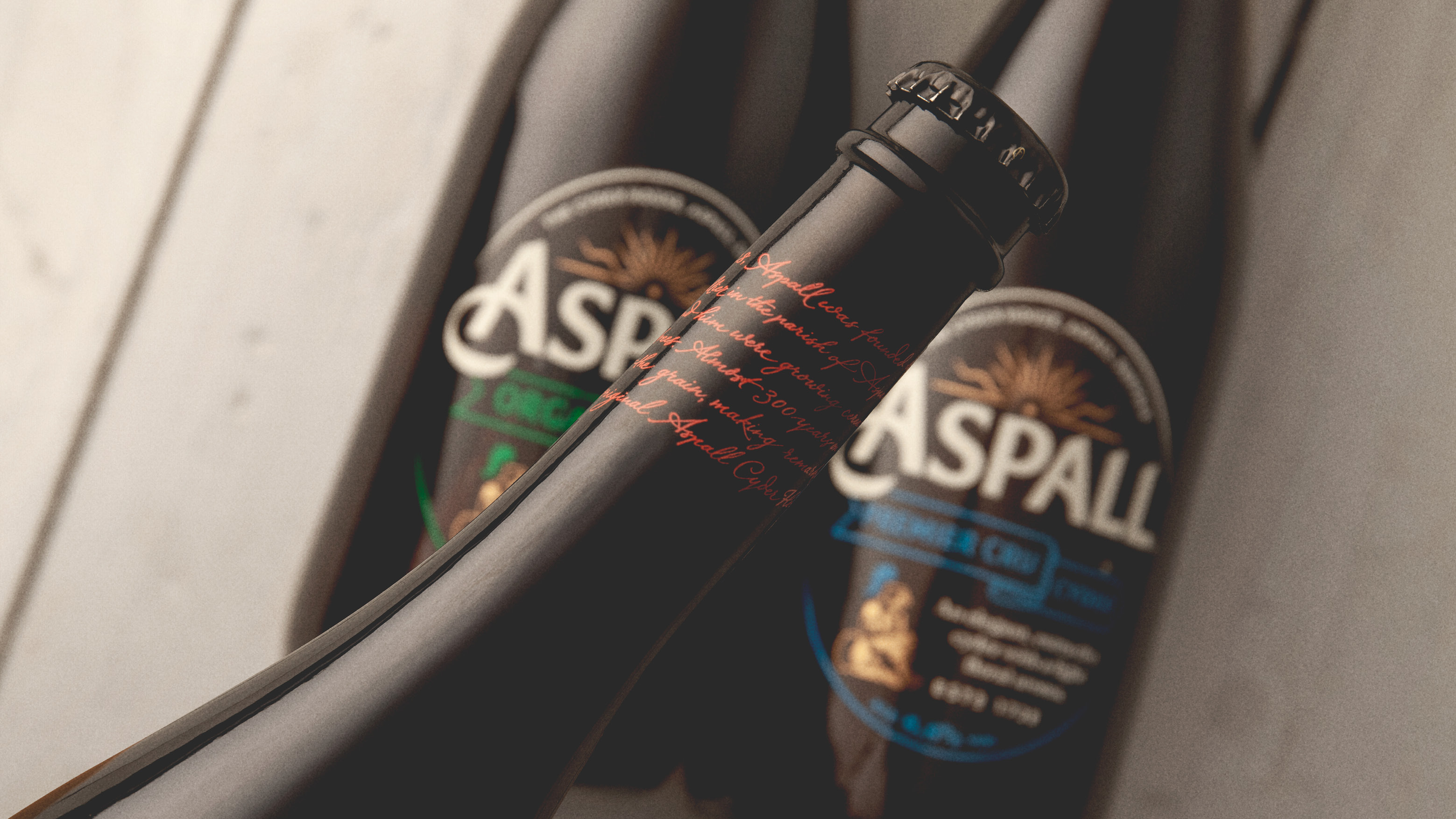
Building on the brand’s commitment to craft and heritage, the new redesign features the addition of a handwritten script on pack inspired by journals from the Aspall family.
The more elegant and sophisticated design has been created through the combination of traditional crafts with contemporary colours and finishes.
CREDIT
- Agency/Creative: BrandOpus
- Article Title: BrandOpus Help Aspall to Become the Cider of Sophistication
- Organisation/Entity: Agency, Published Commercial Design
- Project Type: Packaging
- Agency/Creative Country: United Kingdom
- Market Region: Europe
- Project Deliverables: Brand Guidelines, Brand Identity, Brand Redesign, Brand Strategy, Brand World, Branding, Graphic Design, Identity System, Packaging Design, Rebranding, Research
- Format: Bottle
- Substrate: Plastic
FEEDBACK
Relevance: Solution/idea in relation to brand, product or service
Implementation: Attention, detailing and finishing of final solution
Presentation: Text, visualisation and quality of the presentation


