mio, a Kraft Heinz brand and the creator of the liquid concentrate category, has partnered with BrandOpus, a global branding agency, to create a refreshed brand that champions the wellness benefits of mio’s liquid water enhancers.
Shifting away from a product that helps to ‘fix water’, mio’s refreshed look and feel is the first step on a multi-year journey to target the Gen-Z audience and show them that through mio, wellness is accessible, easy and can be personalized to meet their needs.
Working with the brand purpose that mio exists to make living well yours, BrandOpus formed the design idea of ‘Wellness on your wavelength’. However you feel, whatever the situation, whatever type of wellness you’re looking for, mio has the little bottle of what you need to squeeze goodness in. Into your life, into your day, and into your water bottle.
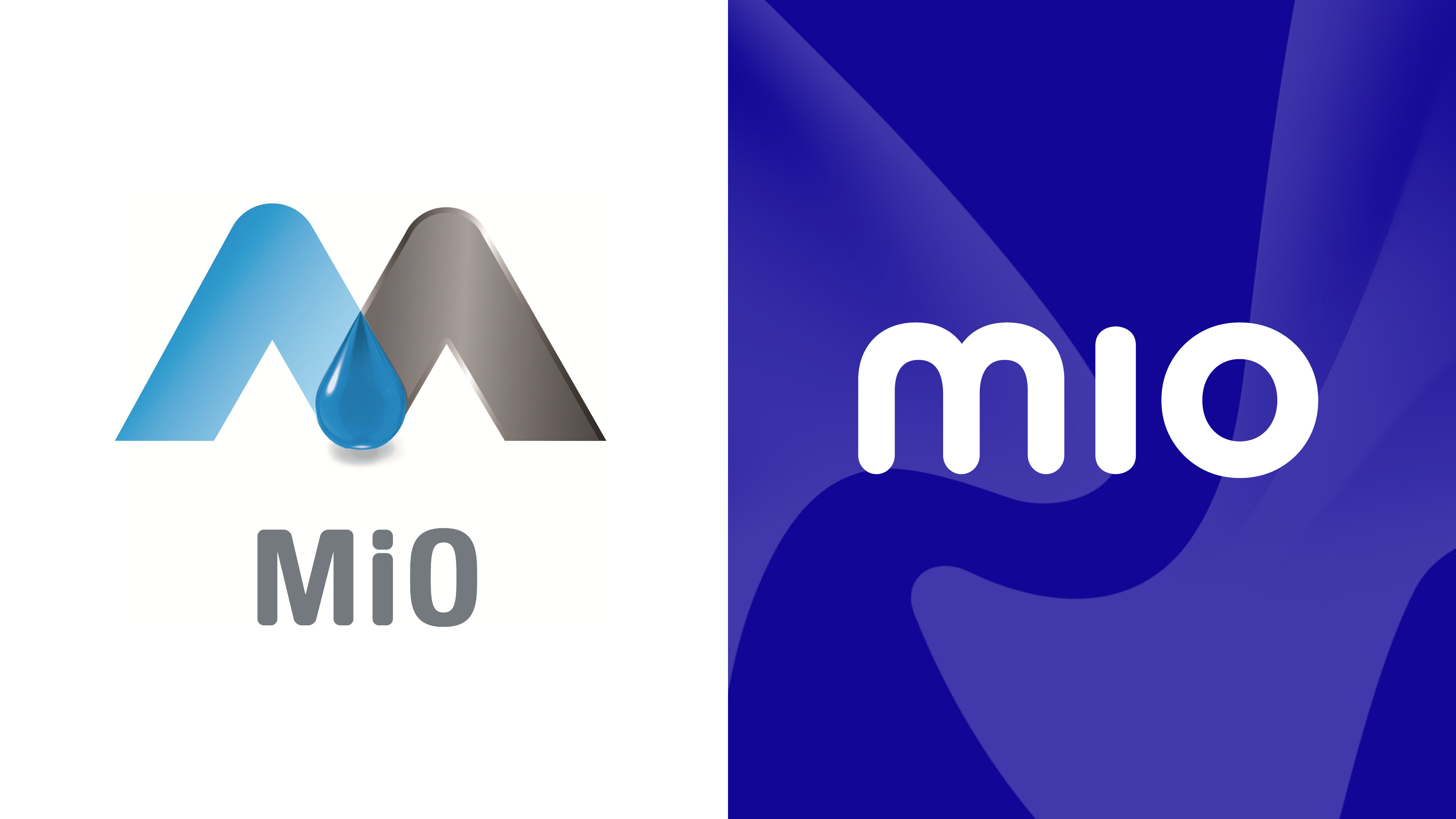
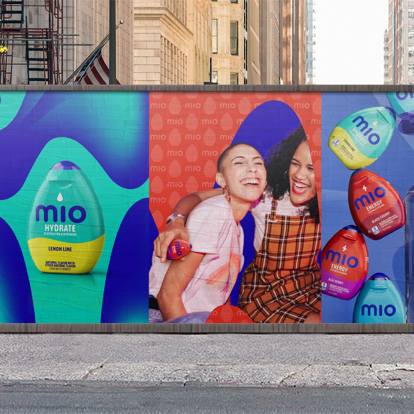
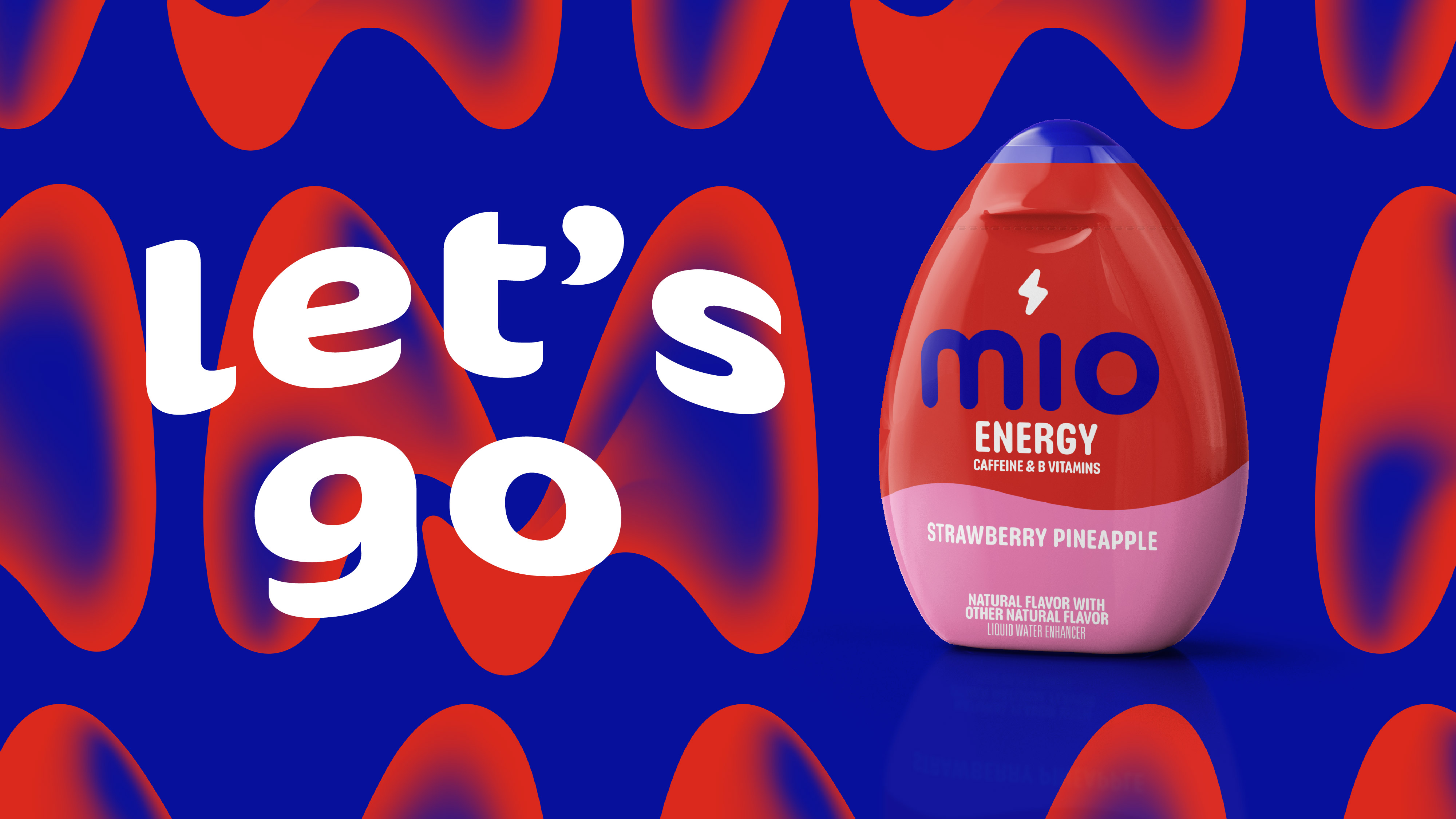
The new brand identity expresses the fluency that mio’s audience wants and expects from their wellness, starting with the new logo. The logo’s soft and rounded font is complemented by the wave-like split of colors across the product packaging – and is a consistent presence across the rest of the brand world through the implementation of the wave pattern, created as a new distinctive asset across all touchpoints.
Wider details of the new identity system:
Wordmark – The new mio wordmark is clear and simple, yet soft and accessible with rounded sans-serif letterforms, always appearing in lower-case, accentuating mio’s role as an approachable presence in our Gen-Z drinker’s life.
Color – Shifting away from the sterile & mechanical silver of the past, the masterbrand’s contemporary cobalt and cyan blues create a calming yet dynamic combination, working with the color for each benefit to allow individual benefit-led assets and communications.
M Wave – The interlocking forms of the M represents holistic wellness –, mental and physical wellbeing coming together to create a positive balance of the two. As a lead distinctive asset for the brand, it drives the ‘wellness on your wavelength’ idea, radiating vibrancy alongside the mio wordmark to add depth, dynamism and storytelling.
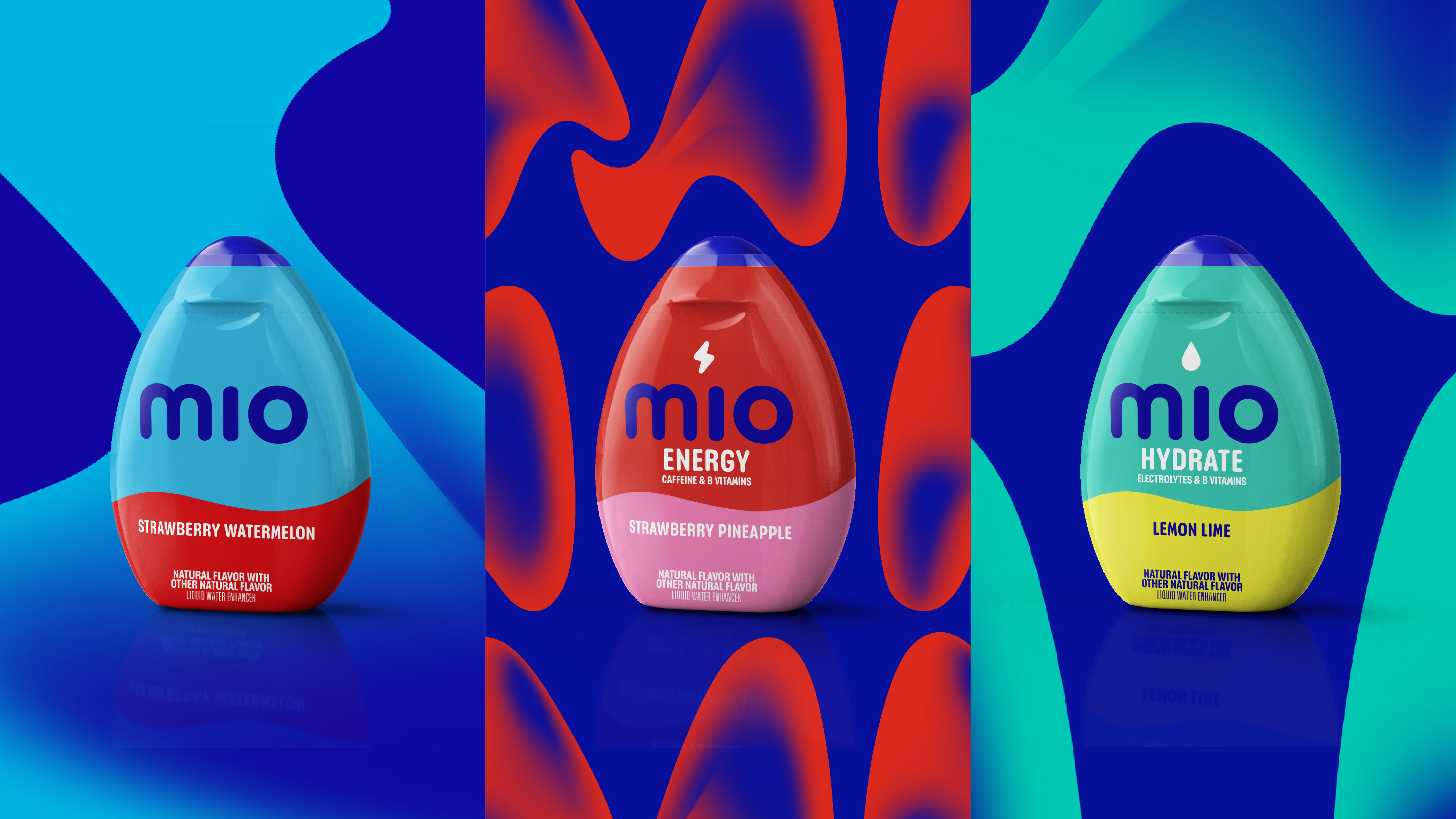
Wave patterns – Taking inspiration from the M-wave, the fluid benefit led patterns radiate vibrancy while helping to differentiate each benefit by giving them their own tempo and vibe.
Benefit Icons – the icons play a key role on pack to strengthen communication of the specific relevance and performed particularly strongly in pack testing. They create simple and fun visual cues that can be used off-pack to reinforce mio’s association with different benefits and transition towards a wellness brand.
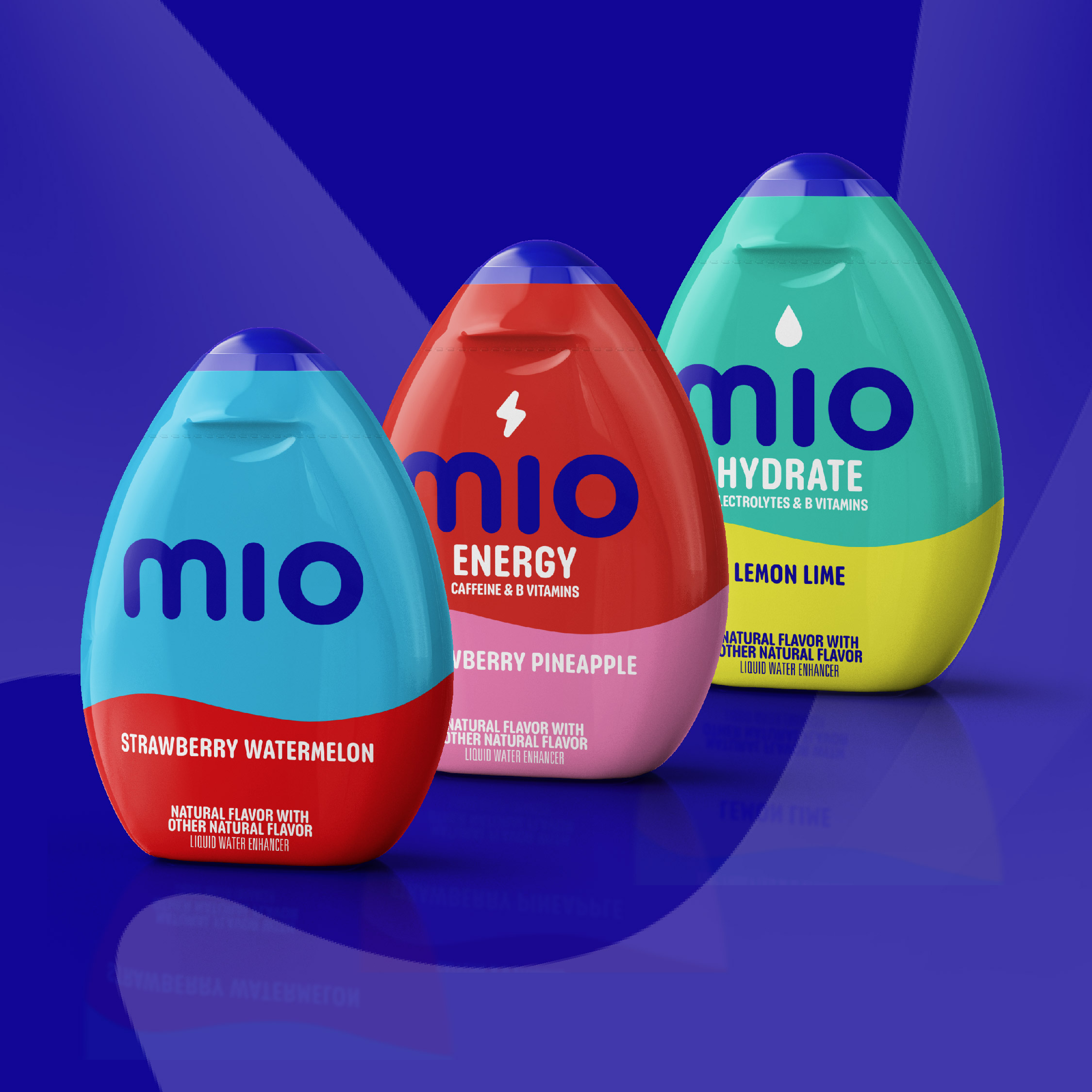
Iconic bottle graphic device – heroing the recognizable mio bottle shape, the cobalt graphic brings existing consumers on the journey into the new mio world and connects with the brand at shelf.
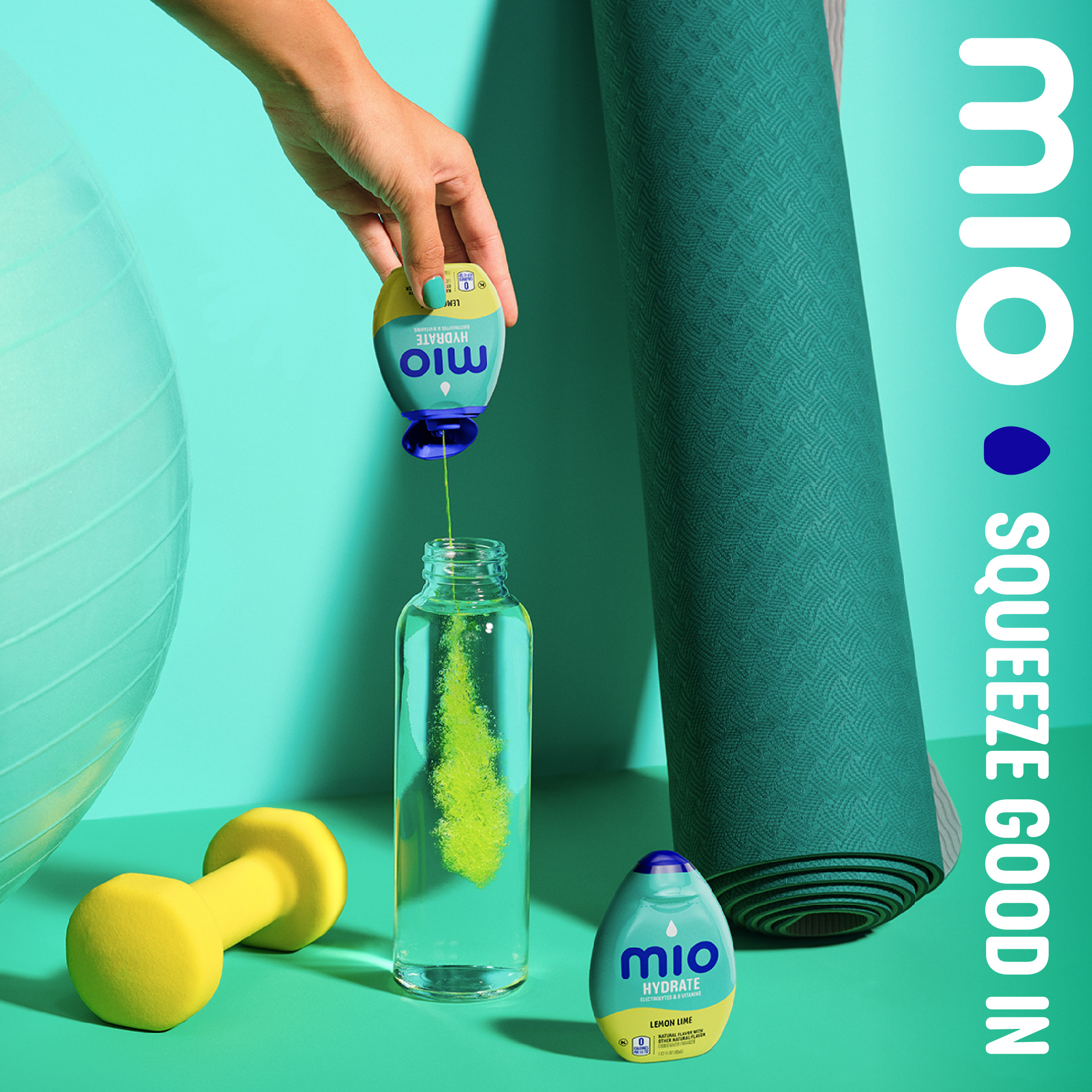
Flume – our photographic flume shows the impact of mio as it hits your water – playing a multi-faceted role of aiding consumer understanding, reflecting the vibrancy and fluidity of the brand while adding mouth-watering appetite appeal.
Packaging – the packaging design system creates an intuitively navigable system between the different ranges on shelf, maximizing the use of space on the small packaging forms and making mio a breakthrough beacon & brand block at shelf.


CREDIT
- Agency/Creative: BrandOpus
- Article Title: BrandOpus Chicago to Unveil Brand Refresh and Partners with mio
- Organisation/Entity: Agency
- Project Type: Identity
- Project Status: Published
- Agency/Creative Country: United States
- Agency/Creative City: Chicago
- Market Region: North America
- Project Deliverables: Brand Design, Brand Guidelines, Brand Identity, Brand Mark, Brand Redesign, Brand Strategy, Brand World, Branding, Design, Identity System, Motion Graphics, Rebranding
- Industry: Food/Beverage
- Keywords: Rebrand, Redesign, Brand World, Branding
-
Credits:
Chief Creative Office: Paul Taylor
Managing Director: Alice Waterman
Eva Legemah: Senior Designer
Sarah O'Conner: Designer
Jack Rodgers: Motion Lead
Jason Darby: Senior Creative Finisher
Jeff Russo: Head of Creative Finishing
Myles Dewbury: Senior Image Creator


