


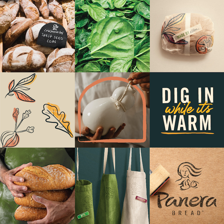
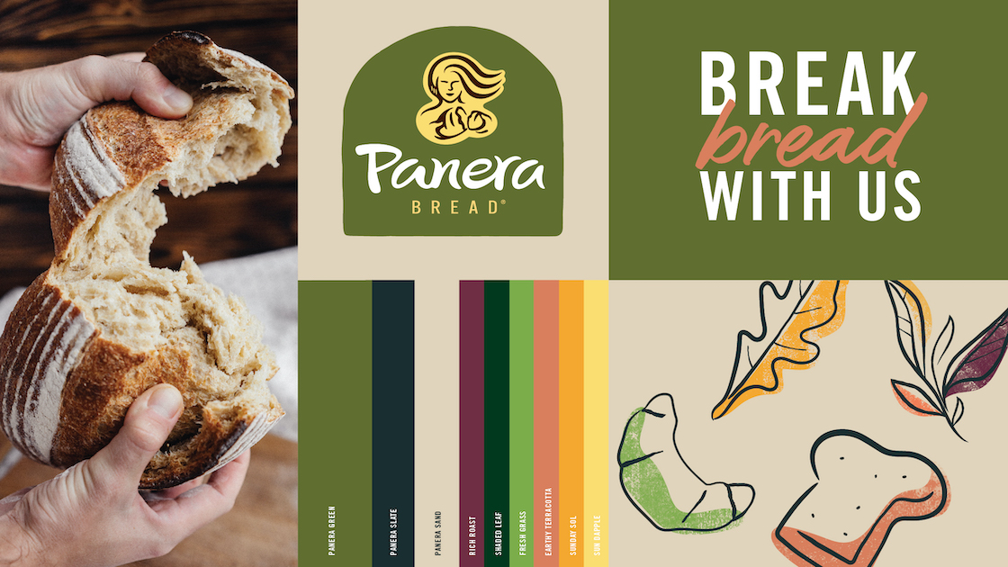
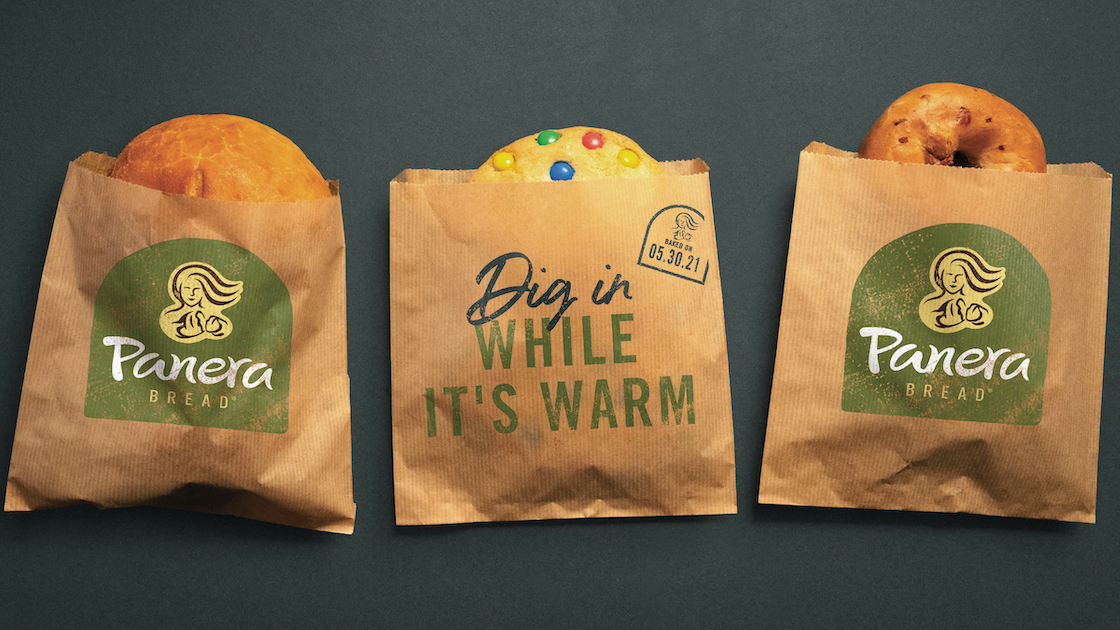
Global brand-led creative agency BrandOpus reveals a refreshed brand identity for leading fast-casual restaurant chain Panera. Dialing up deliciousness through a more contemporary design, the new logo depicts Panera’s iconic Mother Bread logo actively breaking bread toward the guest – a simple act that symbolizes warmth, generosity and bringing people together. It will be debuted across Panera’s packaging, restaurant décor, signage, website and app throughout the year.
Panera is one of America’s biggest bakery-cafe chains with more than 2,100 restaurants nationwide, and bakes bread fresh every day in its cafes; in fact, its “Mother Bread” mark is named after the more than 30 year old sourdough ‘Mother’ starter that its bread is still made from today. Pioneering great-tasting clean food, the fast casual brand was looking to increase relevance amongst consumers and redefine how the brand showed up in the world.
BrandOpus undertook an in-depth research phase that combined a deeper look at cultural codes through a semiotic study and implicit association tests to uncover perceptions of the brand. The research indicated that the brand needed to be more abundant and welcoming in its expression. “Mother Bread” is now reimagined in a more contemporary style, and is the focus for the new visual identity. More youthful and dynamic, her hair flows wild and free, evoking a sense of untamed abundance. And by actively breaking bread, the new logo quickly and non-cognitively codes a feeling of togetherness and generosity.
Design details:
· The wordmark has been redrawn to make it more free-flowing and handwritten, evoking a sense of passion, naturalness and authenticity.
· Panera’s distinctive color ways have been maintained; however, they have been evolved alongside an expanded palette to give the brand a fresher and more energized feel.
· The new distinctive holding shape is handcrafted to reflect a bread oven. Moving away from the previous square shape design, it creates a feeling of warmth and comfort.
Nir Wegrzyn, CEO and founder, BrandOpus comments, “Our biggest challenge was preserving vital memory structures from Panera’s rich heritage, whilst tapping into new associations rooted in pleasure, enjoyment and warmth. Inspired by the passion and abundance of the brand, the revitalized design is a radical revolt against food restrictions today. It’s a rediscovery of the pleasure that comes with eating delicious fresh food and we’re excited for the world to experience it”.
Eduardo Luz, chief brand and concept officer, Panera adds, “Panera has always been a bakery first that carries its tradition and welcomes people in a warm environment, and we wanted our visual identity to better tie into that story. Teaming up with BrandOpus, we believe the new identity captures and unites the new direction of the brand, while remaining true to our rich bakery heritage. We want the world to feel excited about food and we’re eager for our new visual expression to do just that”.
CREDIT
- Agency/Creative: BrandOpus
- Article Title: BrandOpus Breaks Bread with a New Identity for Panera
- Organisation/Entity: Agency
- Project Type: Identity
- Project Status: Published
- Agency/Creative Country: United States
- Agency/Creative City: New York
- Market Region: North America
- Project Deliverables: 2D Design, Brand Design, Brand Identity, Brand Mark, Brand Strategy, Logo Design, Packaging Design, Rebranding
- Industry: Hospitality
- Keywords: Brand Identity, Packaging Design
-
Credits:
Creative agency: BrandOpus


