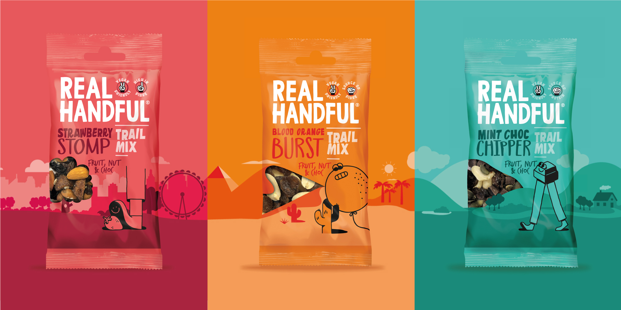
Challenge: Real Handful is a successful ‘healthier’ snacking start up that has rapidly established itself in market. It is a brand with bags of personality; the founders and employees live and breathe it and its customers are loyal brand advocates – loving its distinct design amongst several ‘worthy and beige’ brands in the category. While the packaging design had served the brand well in terms of establishing the brand personality and gaining distribution, the brand dominated the pack at the cost of clearly communicating the product benefits.
Consumers were finding it difficult to navigate and understand the role of the brand’s range on shelf in an extremely competitive category, and Real Handful needed to address this in order to secure further distribution gains and future growth.
Our role was to evolve and craft the brand identity and messaging on pack to encourage purchase and enable future growth, while ensuring that the heart and soul of the brand wasn’t lost.
Insight: Real Handful exists to provide snackers with a healthier range of snacks that don’t compromise on taste. Its protein bars and trail mixes are full of nutritious, natural energy and fuel but packed with unruly flavour.
This fundamental truth led us to the territory of ‘All Hail the Trail’ – trail mix dates back at least to the 1910s and continues to be a well-known and widely popular snack format in the US and Australasia; but less so in the UK. It’s therefore a distinct and ownable format for Real Handful, so we sought to bring all its positive associations to life on pack.
Execution: Space on pack was a challenge – we had a very small canvas to convey a lot of information. We worked with Real Handful to establish the correct pack hierarchy for brand, flavour, range, descriptor and benefit, and which messages were the most motivating to consumer.
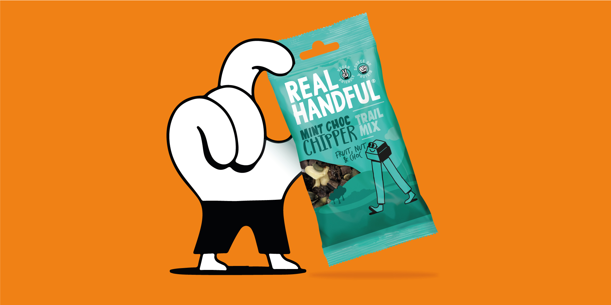
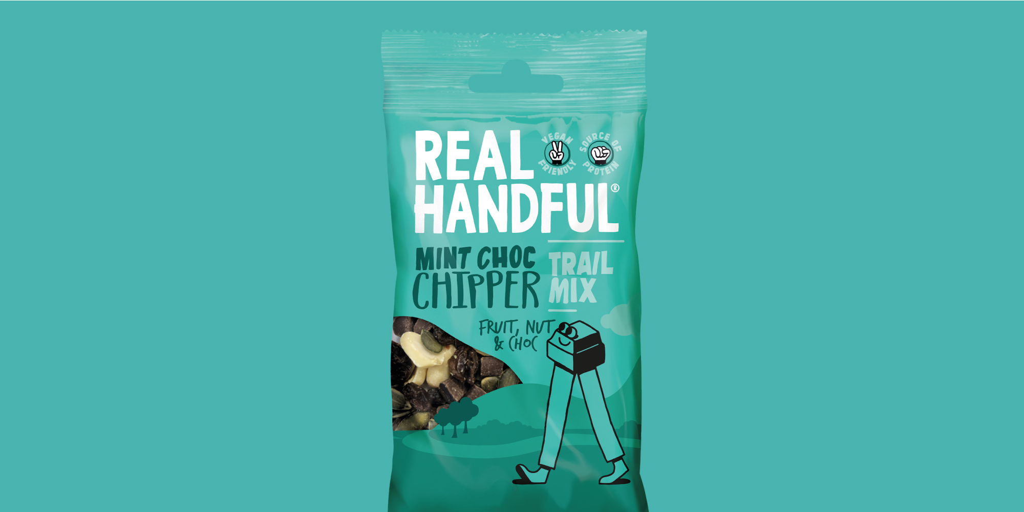
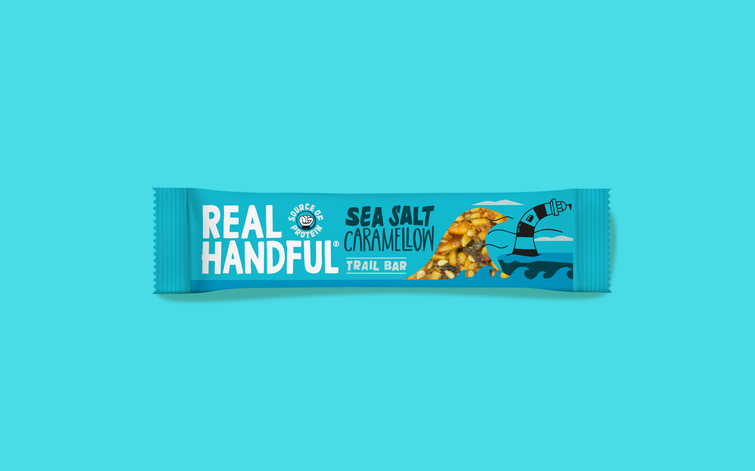
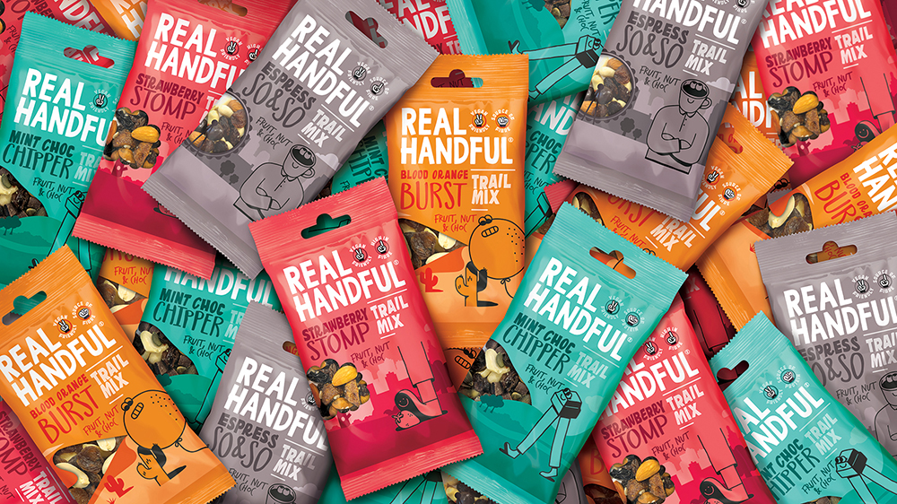
Across all three ranges, to increase differentiation between SKUs and aid consumer navigation, we retained the existing variant illustrations, but added a suite of landscape backdrops to allow the characters to live within their own environments. The mountain, desert / beach and city landscapes also hinted at the great outdoors and the origin of trail mix to help establish a connection and ownability of the category. They also provide a platform for the brand world to exist off pack.
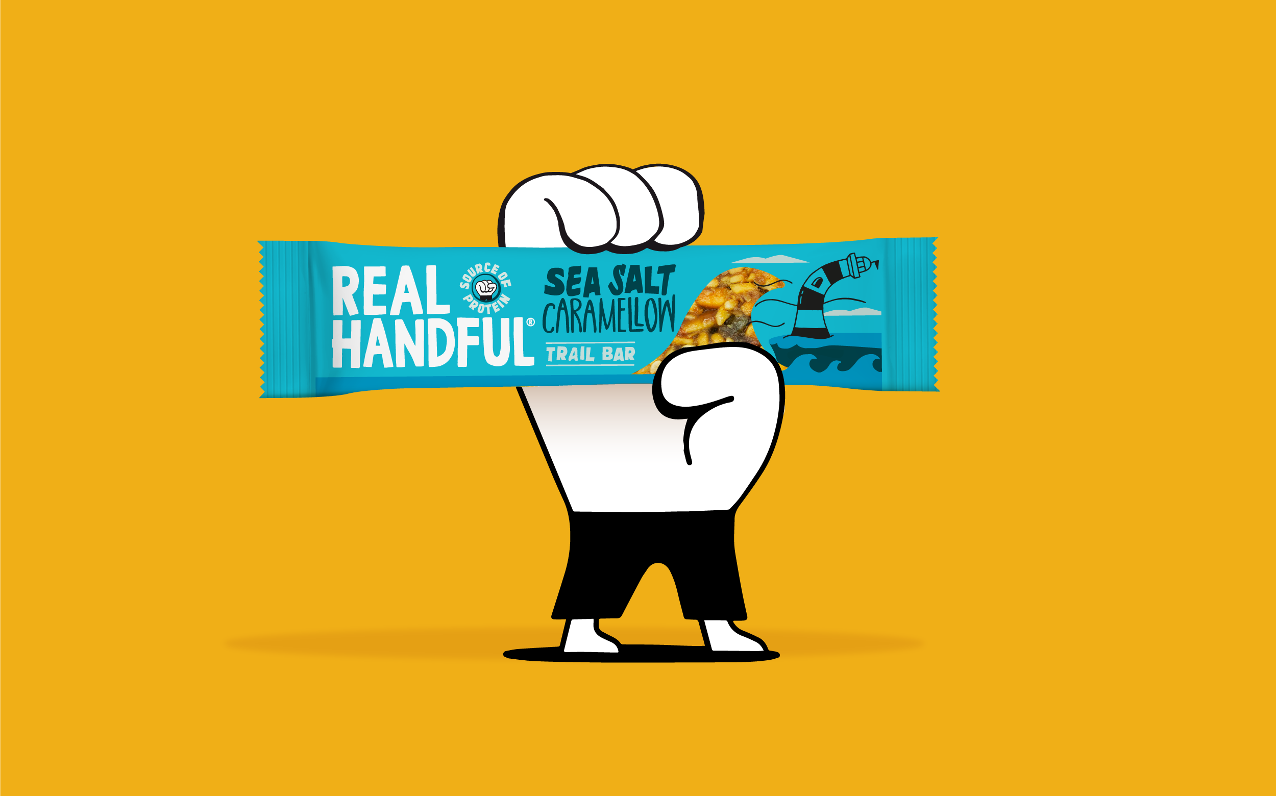
We added a window into the backdrop design on the trail mix, and a product shot to the bars, in a ‘Real Handful’ way to dial up flavour cues and appetite appeal.
Using the Real Handful hand icon, we also brought product benefits and nutritional claims, such as ‘vegan friendly’ and ‘gluten free’, to the front of pack to provide consumers with the information they want at a glance.
Client Testimonial:
“We’ve enjoyed working with the Brandon team throughout this project and found them very supportive. Their work has given us a solid platform to take Real Handful and ‘Trail Mix’ to the masses while also enabling innovation within the range. As a smaller company, we’ve also hugely appreciated the completeness of the project handover with Brandon which has provided us with all the assets we’ve needed to communicate the evolution of the brand with our trade partners. We’re very excited to see this refresh rollout across our range in the coming months.” – Joe Taylor, Co-Founder at Real Handful
CREDIT
- Agency/Creative: Brandon
- Article Title: Brandon Refreshes Real Handful Brand and Packaging Design
- Organisation/Entity: Agency, Published Commercial Design
- Project Type: Packaging
- Agency/Creative Country: United Kingdom
- Market Region: Europe
- Project Deliverables: Brand Architecture, Brand Redesign, Brand Refinement, Brand Rejuvenation, Brand Strategy, Branding, Graphic Design, Packaging Design, Rebranding
- Format: Pouch
- Substrate: Plastic


