


Freshlay Farms™ made its debut in Co-op in 2019, and after impressive success, expanded into Tesco and Sainsbury’s supermarkets. With the specialty egg market on the rise, the company aimed to attract the attention of consumers that prioritise taste, the local origin of free-range eggs, and have a willingness to spend more on produce that upgrades their home cooking and baking experiences.
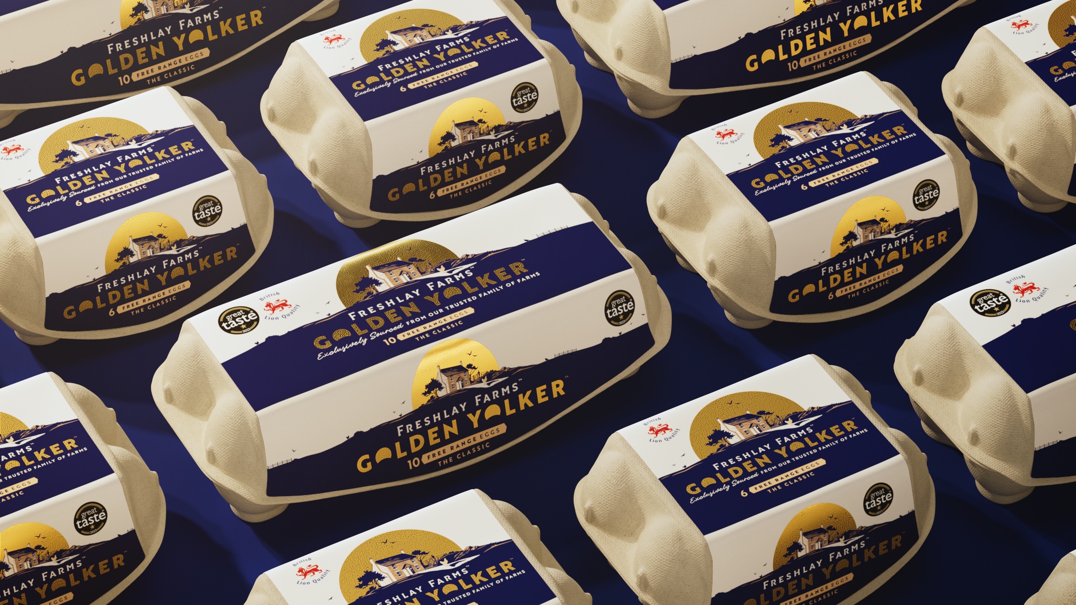
We understood that this segment of consumers are people that ‘eat with their eyes’ and perceive that darker yolks are tastier eggs. Because Freshlay Farms Golden Yolker™ eggs guarantee a deep golden yolk, Brandon sought to leverage their unique product with a new distinctive identity that showcases the star of the plate, the golden yolks themselves.
“Our aim was to craft a unique identity for Freshlay Farms™ using a brand-driven and distinctive visual style, putting taste at the heart of the design and providing a fresh perspective to a cluttered category. The design focuses on highlighting the stars of the plate—those famous golden yolks— and creating packaging that is not just recognisable but also radiates accessible luxury by including gold foil and luxury textures. Says Katie Rowley, Design Director at Brandon “This approach effortlessly establishes ‘Freshlay Farms Golden Yolkers™’ as a category-defining icon at shelf and paves way for further brand growth.” She continues.
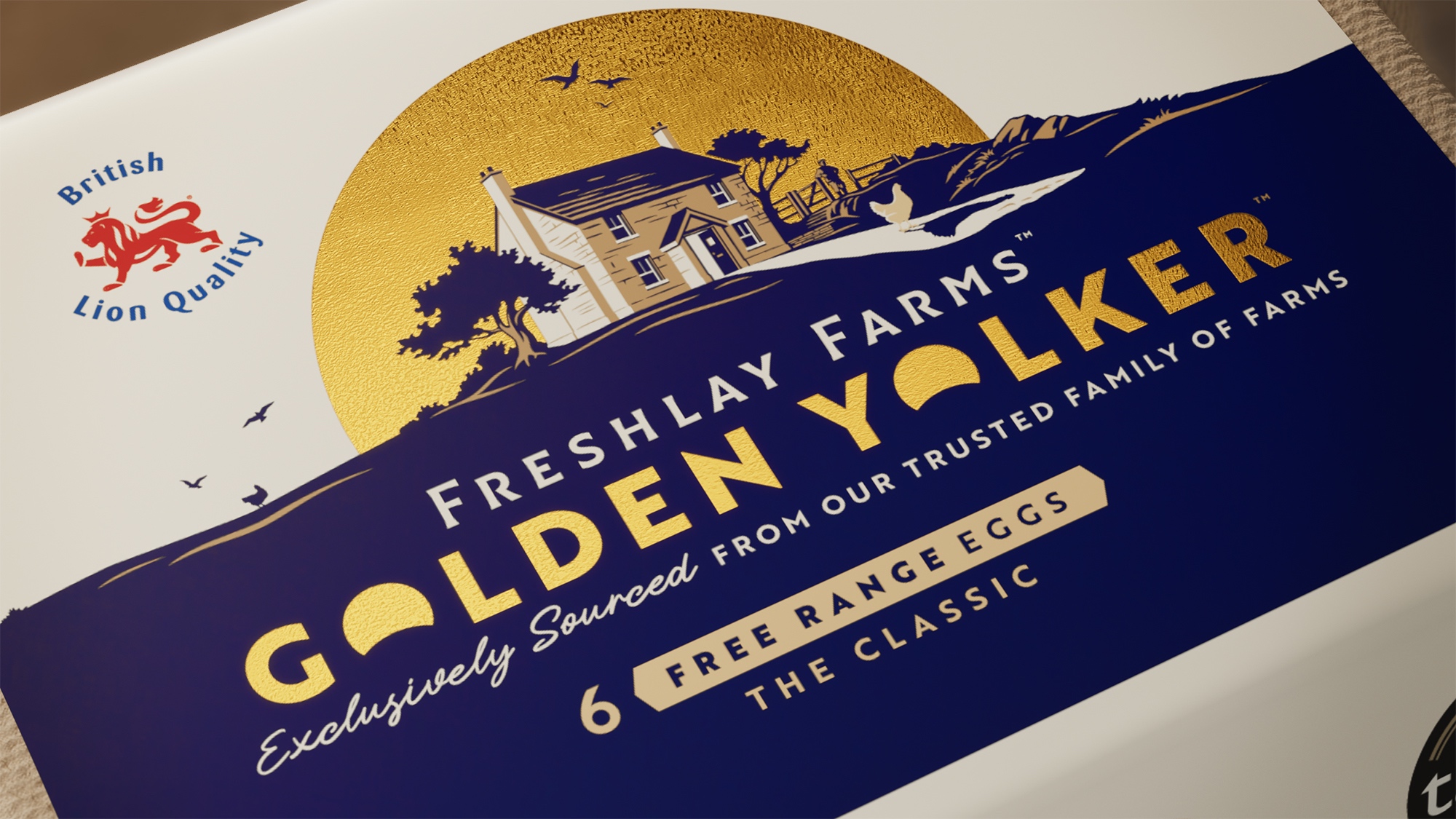
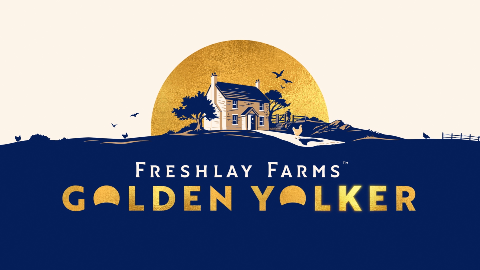
The design is inspired by the world of premium spirits, going beyond mere aesthetics to create a compelling origin story. Brandon intentionally placed emphasis on the typographic styling, utilising elegant letterforms that were skilfully crafted by Dan Forster that subtly considers the rising sun in the characterful Golden Yolker™ name to evoke a positive association.
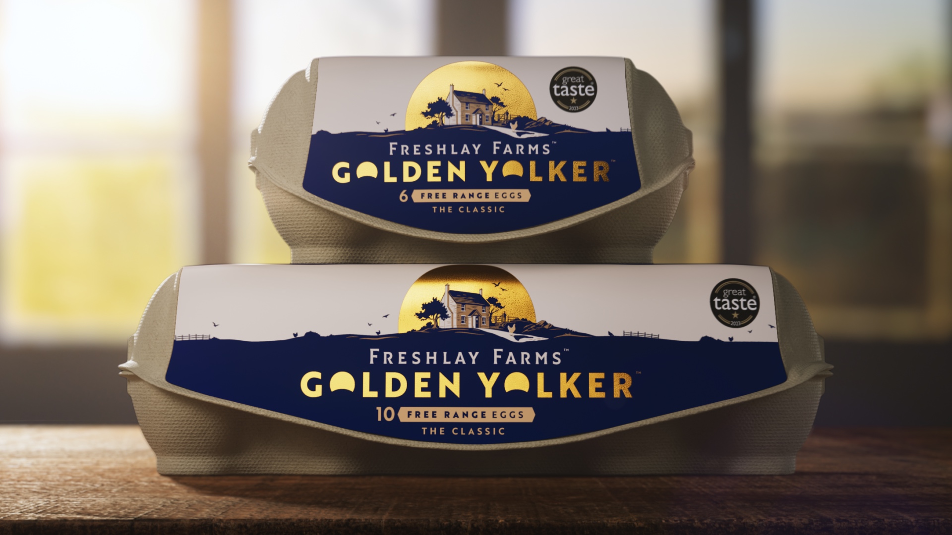
Brandon worked with the illustrator Chris Mitchell to meticulously craft the Freshlay Farms™ Farmhouse which exhibits a refined aesthetical detail that reinforces the Freshlay Farms™ commitment to excellence and craftmanship.
This harmonious blend of typographic mastery and artistic precision showcases Freshlay Farms’™ dedication to quality but also elevates the packaging into a symbol of sophistication.
Brandon added an opulent gold foil against a royal blue colour palette to enhance the brands visual appeal and confirms the brands position as both accessible but luxurious. The sign-off, ‘Exclusively Sourced from our trusted Family of Farms’, reinforces the brands messaging of being family centred.
CREDIT
- Agency/Creative: Brandon
- Article Title: Brandon Gives a Fresh Perspective on Speciality Eggs
- Organisation/Entity: Agency
- Project Type: Identity
- Project Status: Published
- Agency/Creative Country: United Kingdom
- Agency/Creative City: Manchester // London
- Market Region: Europe
- Project Deliverables: Brand Design, Brand Identity, Brand Redesign, Brand Strategy, Craft, Illustration, Label Design, Packaging Design, Typography
- Industry: Food/Beverage
- Keywords: Brand design, Brand identity, Packaging design, illustration, typography
-
Credits:
Creative Director: Jonathan Rogers
Design Director: Katie Rowley
Designer: Holly Broome
Illustration: Chris Mitchell
Typography: Dan Forster
Account Director: Beth Johnson
Senior Account Manager: Charlotte Vallance
Visualisation: Stuart Humphrey


