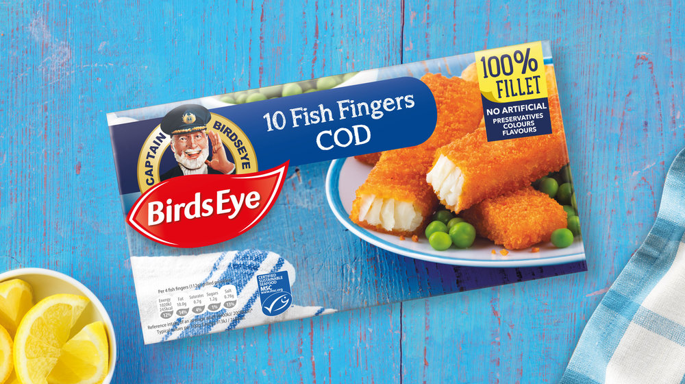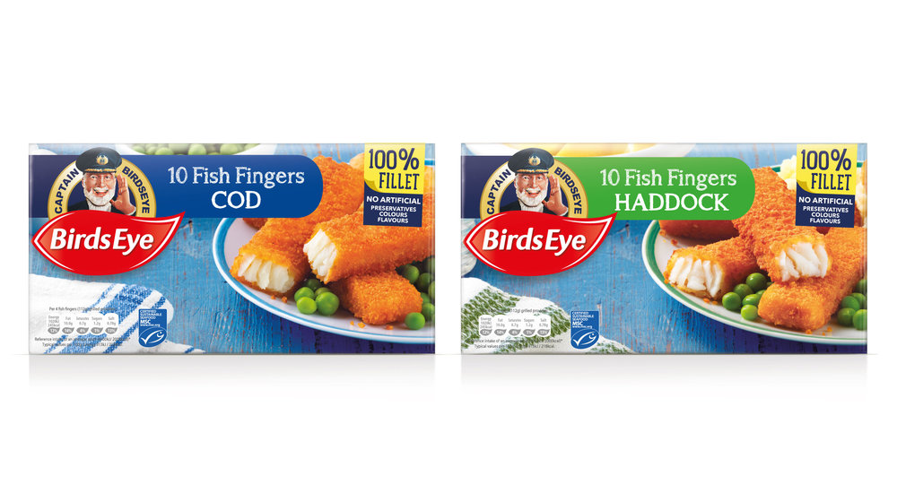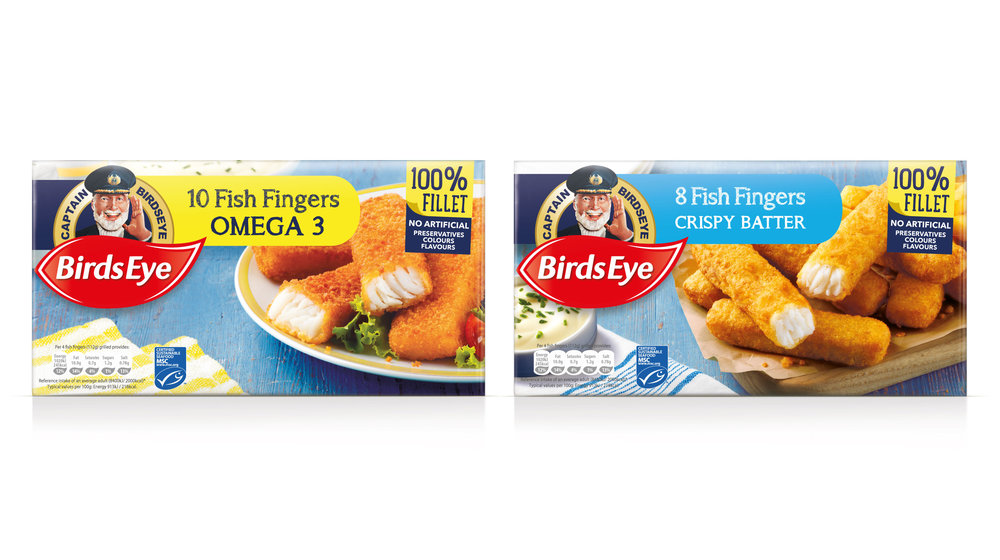
“Today, leading frozen food brand Birds Eye, announces the launch of the new packaging identity design for its notorious fish finger range. Following the recent success of its Simply Breaded and Harry Ramsden’s coated fish range rebrand, Birds Eye has once again sought the expertise of brand design consultancy Brandon to redesign its famous fish fingers.
The new Birds Eye fish finger packaging moves away from Birds Eye’s ‘masterbrand’ approach to focus on the memory that we all have and love of Captain Birds Eye, bringing back our favourite fish fingers from the sea to the fork.
This new packaging not only stands out on-shelf, it helps a generation of mums who recall the role that the Captain played in their lives when they were children. That positive memory association takes mums today to the happy family time they used to have around the dining table with their own parents. This memory can be a positive driver to connecting families in a digital world, where many parents now struggle to recreate those family meals around the table without a digital device getting in the way of what used to be sacred family time together.
The new Fish Fingers range of packaging now makes it easier for consumers to know they are picking their famous British Birds Eye fish fingers, with Captain Birds Eye much more prominent on the packaging. Range differentiation is then clearly signposted with bold slab colours to denote the various product variances.
Adam Draper, General Marketing Manager at Nomad Foods, comments “We were eager to ask Brandon to help with the re-design of the brand we are most best-known for, the Birds Eye fish finger. We set out with the same goal; to make it as easy as possible consumers to find their favourite fish finger brand. Bringing the Captain back to the table in a more prominent way just made sense, he stands for a lot good memories with families and had to play a stronger role on packaging.”
Adam continues: “Brandon has been a fantastic partner from start to finish; they really understood what we wanted and put themselves into the shoes of the consumer. Making sure that the new packaging was iconic, bringing the Captain back and standing out in the freezer.”
Richard Taylor, Managing Director at Brandon, concludes: “We were delighted to help take Birds Eye fish fingers on the next stage of its long voyage. In part looking back to what was good about the past, bringing the Captain back to the nation. We set out with three clear goals; hero the Captain, drive the emotional fish fingers meal photograph and ensuring that colour helped us to standout on a busy fixture.”
Birds Eye Fish Fingers range has been a family favourite within the UK for over 60 years, and is the most well-known fish finger brand in the UK.”


CREDIT
- Agency/Creative: Brandon Consultants
- Article Title: Brandon – Birds Eye’s Great British fish fingers redesign
- Project Type: Packaging
- Format: Box
- Substrate: Pulp Carton, Pulp Paper


