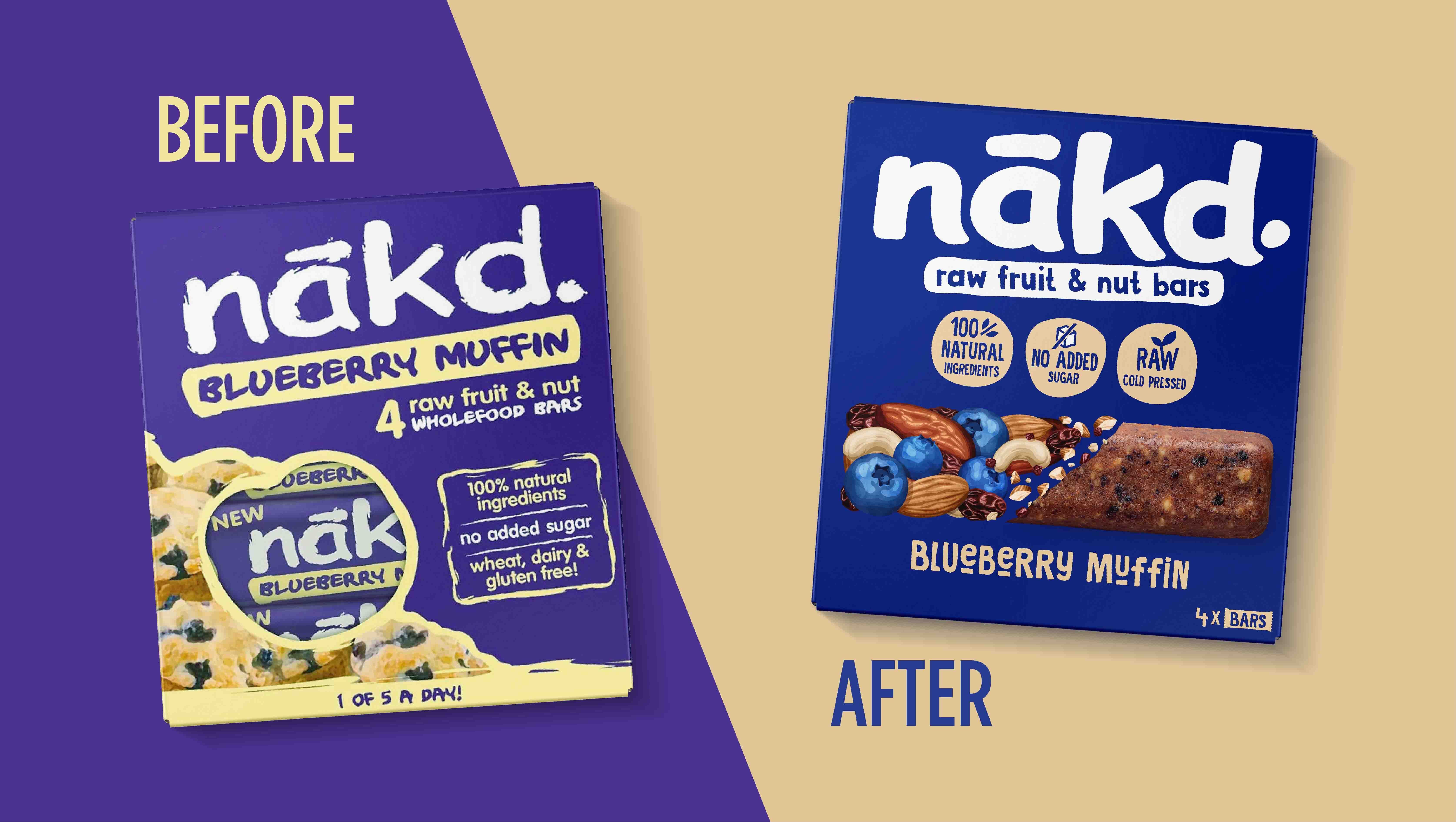
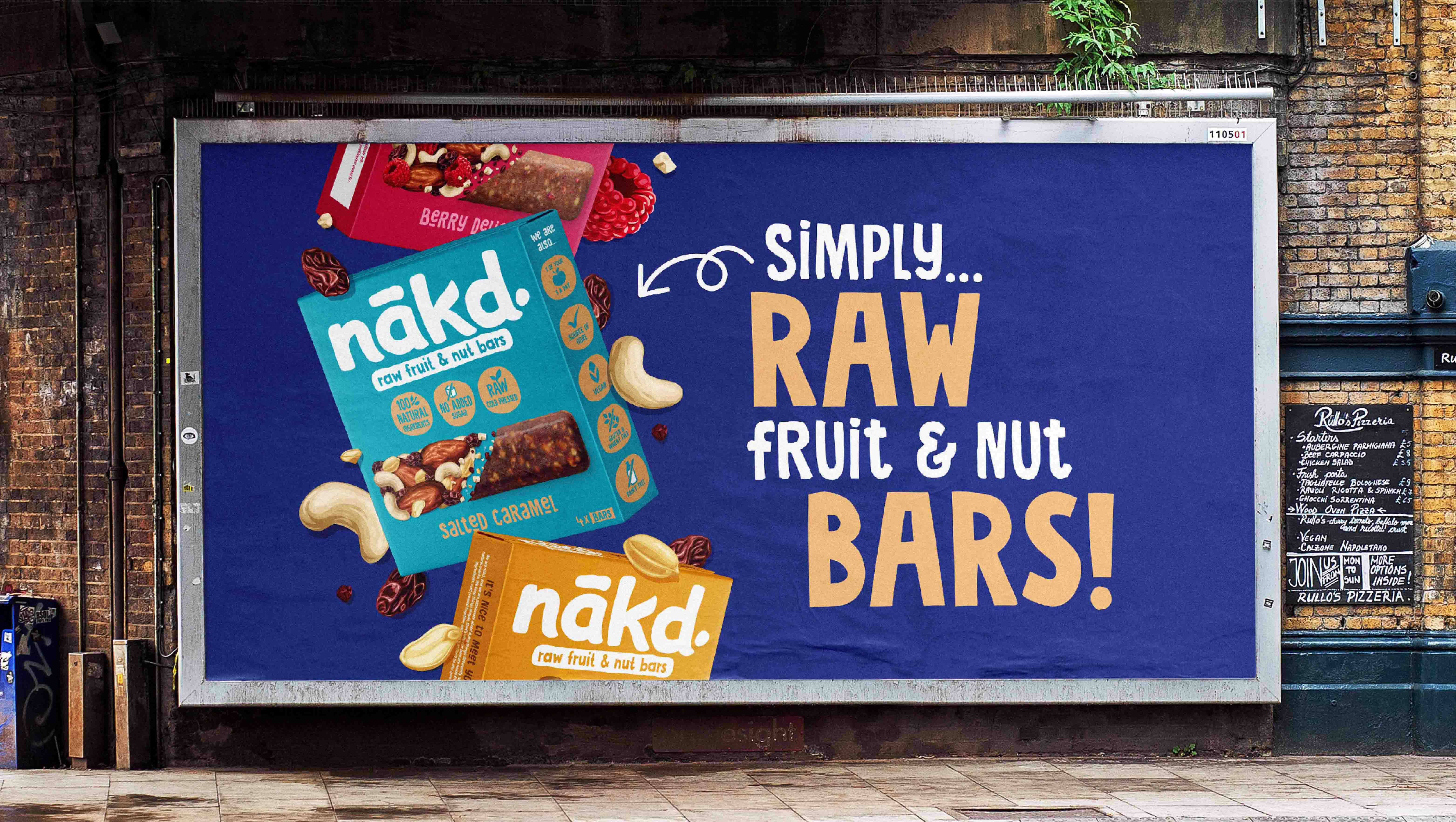
The iconic global natural snack brand, nākd. has been refreshed by BrandMe. The new brand identity delivers a bold, impactful look that contemporises nākd.’s presence and emphasises its healthy, natural ingredients and mind-blowing taste. It will play a vital role in further establishing the status of nākd. as a global leader in its category.
nākd. first launched in 2006 as a natural snack brand that revolutionised the market with its raw bars and surprisingly different flavours. The bars are made from just fruit and nuts, cold-pressed together. In an increasingly saturated global market where consumers are spoilt for choice, nākd. set out to communicate its unique balance of attributes: its flavour variety, taste, and healthy, natural ingredients.
BrandMe collaborated with the nākd. team to craft the brand strategy, positioning and packaging design, aimed at strengthening and evolving consumer perceptions. The challenge was to balance communicating nākd.’s pure, unprocessed products with its exciting tastes, whilst enhancing recognition of the iconic identity.
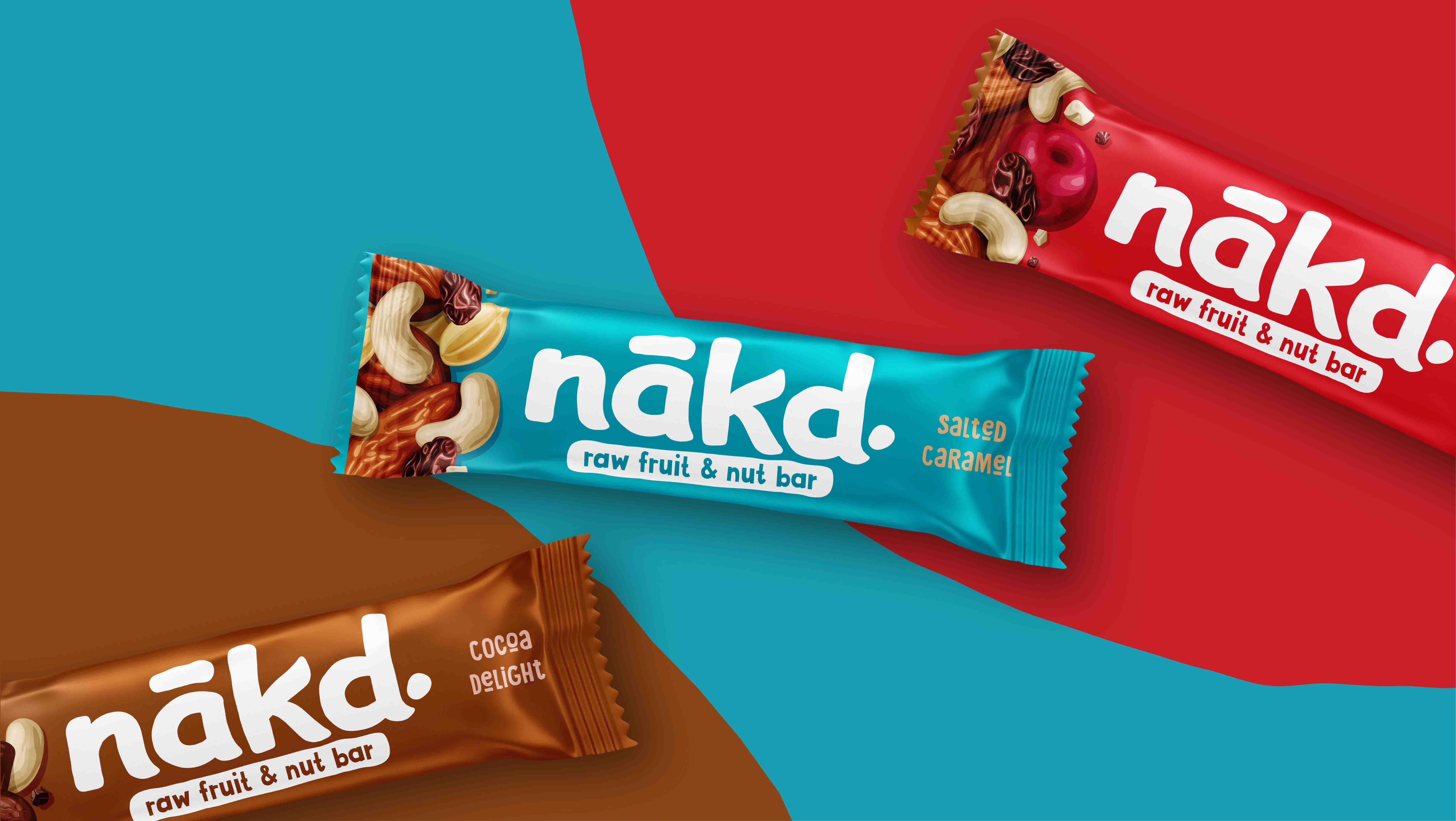
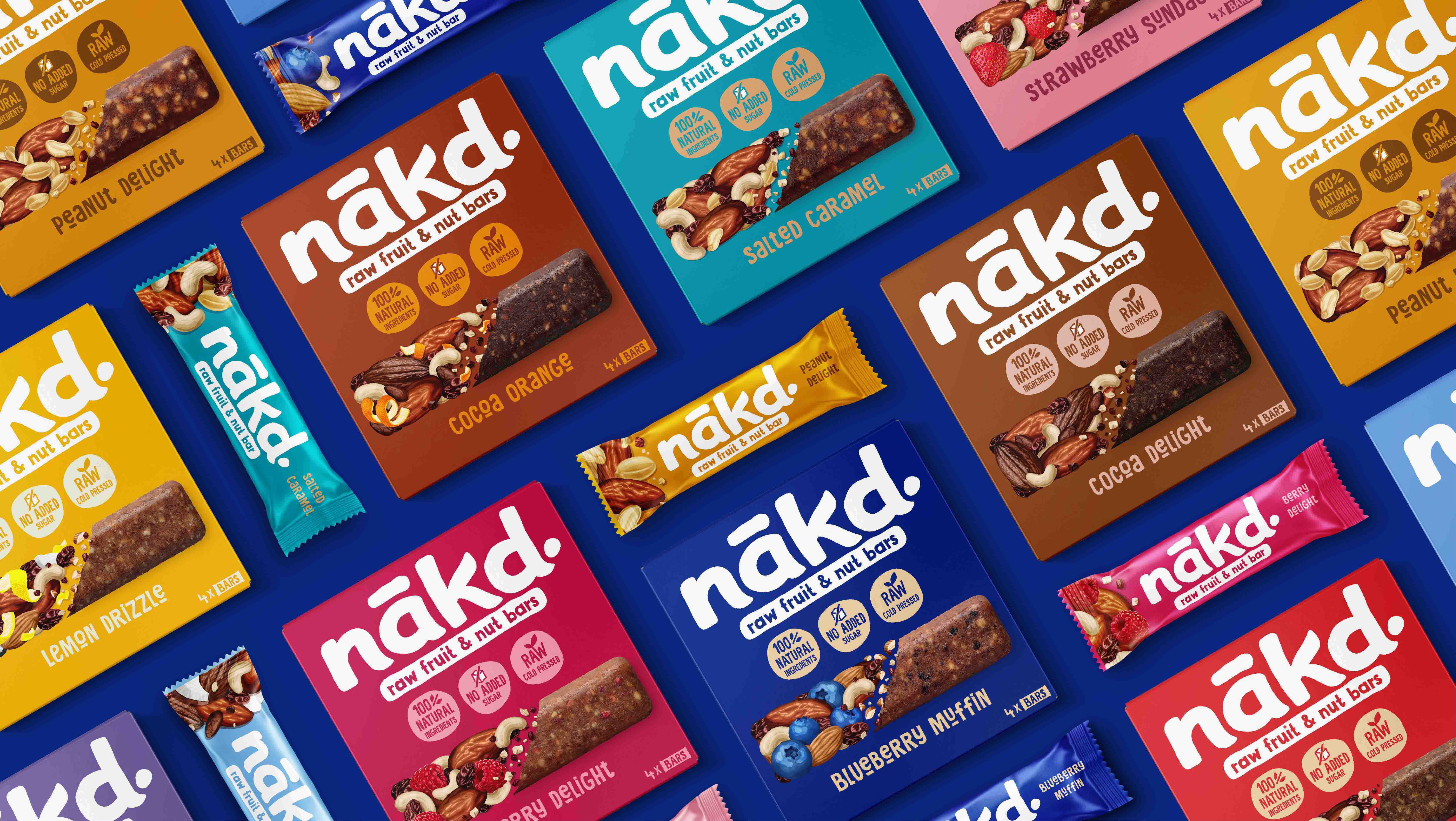
The rebranding brings vibrancy, joy and consistency into the new look and feel. The new design delivers a rich taste story and captures nākd.’s all-natural engaging flavours. The contemporary illustration style with consistent colour coding ensures the range becomes more cohesive and highlights the playful personality and natural good taste at the heart of every nākd. product.
BrandMe Creative Director, Adam Wilford:
“The challenge of this redesign was to communicate nākd.’s great taste in a way that resonates with today’s global, health-conscious consumer. We wanted to overcome the misconception that great- tasting snacks can’t also be healthy. We created beautiful bespoke illustrations that feature prominently on pack in order to communicate the bars’ natural ingredients and taste appeal. We have also refreshed the range’s colour palette to enhance differentiation between the variants and give a more modern feel. The logo has been simplified for a cleaner more impactful look. Three front of pack icons clearly communicate to the consumer the brand’s unique reasons to believe.”


CREDIT
- Agency/Creative: BrandMe
- Article Title: BrandMe Creates Brand Identity for Snack Brand Nākd
- Organisation/Entity: Agency
- Project Type: Packaging
- Project Status: Published
- Agency/Creative Country: United Kingdom
- Agency/Creative City: London
- Market Region: Europe
- Project Deliverables: Brand Identity, Brand Redesign, Brand Strategy, Packaging Design, Packaging Guidelines
- Format: Box, Wrap
- Substrate: Pulp Carton
- Industry: Food/Beverage
- Keywords: rebranding, brand strategy, brand repositioning, healthy snacks
-
Credits:
Creative Director: Adam Wilford
Designer: Georgia Howell


