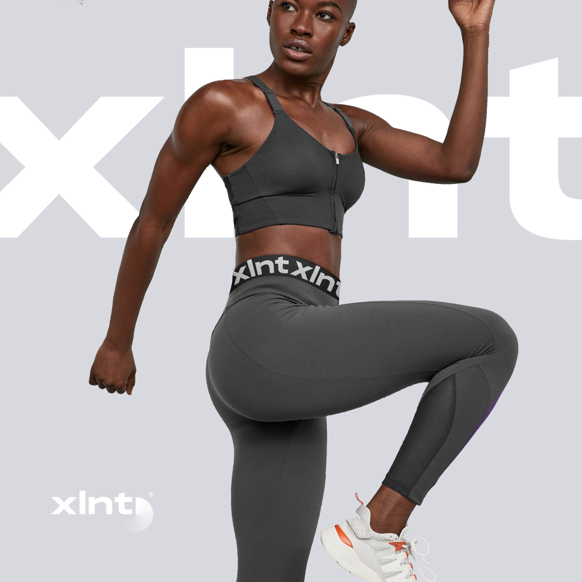
Philosophy, naming and visual style for women’s fitness studio without compromise. XLNT is not just a long-awaited coach’s words at the end of a grueling workout. 4 letters are 4 chapters of the brand philosophy. In XLNT, the content is more important than the cover. Minimalism and emotional media content allow you to focus on people and convey the brand’s mood.





CREDIT
- Agency/Creative: TODO agency
- Article Title: Branding Women’s Fitness Studio XLNT
- Organisation/Entity: Agency, Published Commercial Design
- Project Type: Identity
- Agency/Creative Country: Russia
- Market Region: Europe
- Project Deliverables: Brand Architecture, Brand Creation, Brand Identity, Brand Strategy, Branding, Graphic Design
- Industry: Health Care
- Keywords: branding, fitness studio, woman
FEEDBACK
Relevance: Solution/idea in relation to brand, product or service
Implementation: Attention, detailing and finishing of final solution
Presentation: Text, visualisation and quality of the presentation


