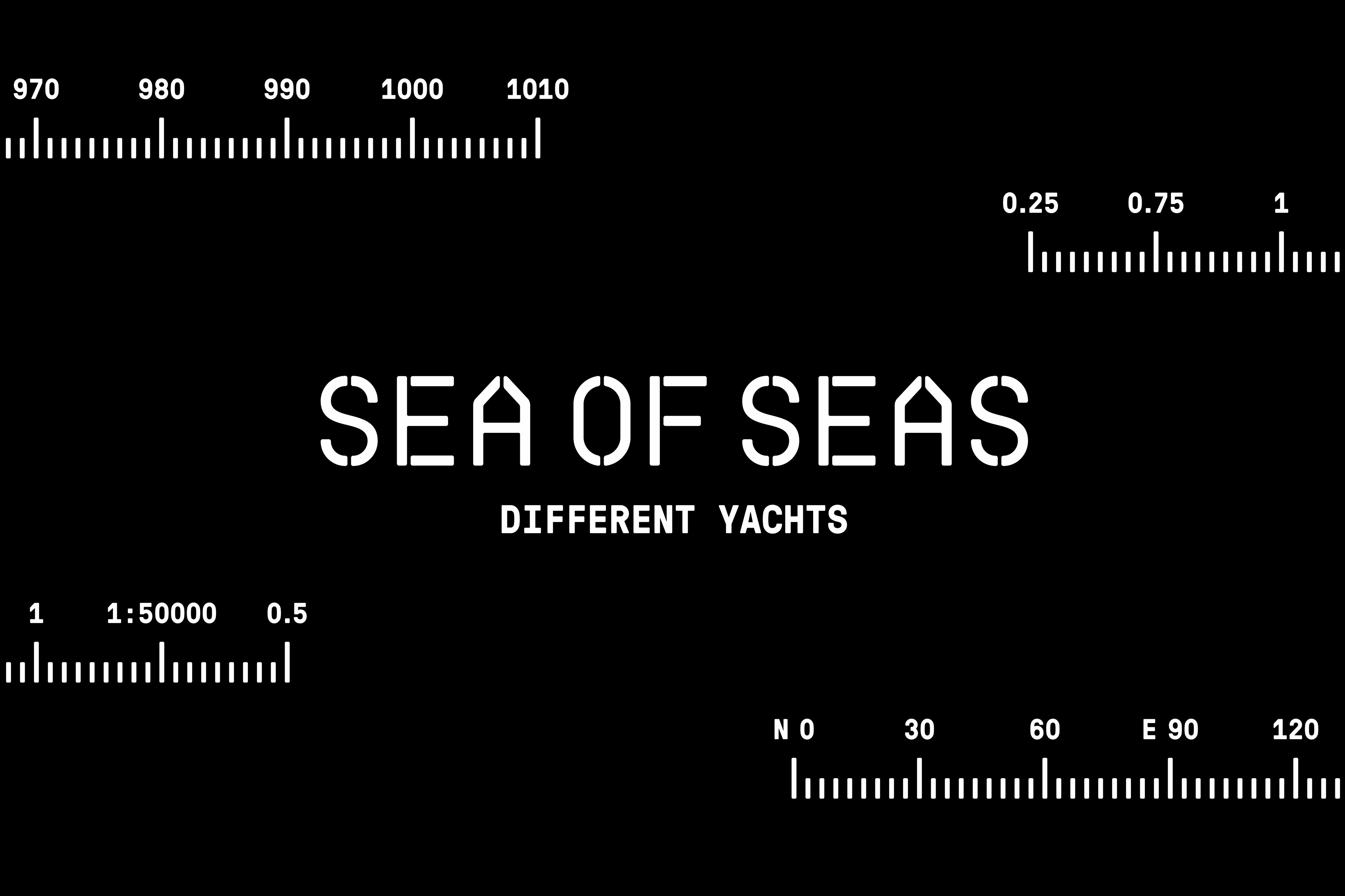
Introducing Morillas’ recently awarded bronze Laus for naming: Sea of Seas, a new yacht retailer based in Barcelona that challenged us to create a brand that would stand out while transmitting the emotion of sailing, beyond technical attributes.
A name that alludes to the subjective experience of the sea: the expert’s Mediterranean is experienced differently as a beginner, a sea made up of many others. Also, the name uses repetition to convey the rhythmic component of the waves’ swaying. In a category that is a sea of descriptive names, acronyms and patronymics, Sea of Seas is an island of emotionality.
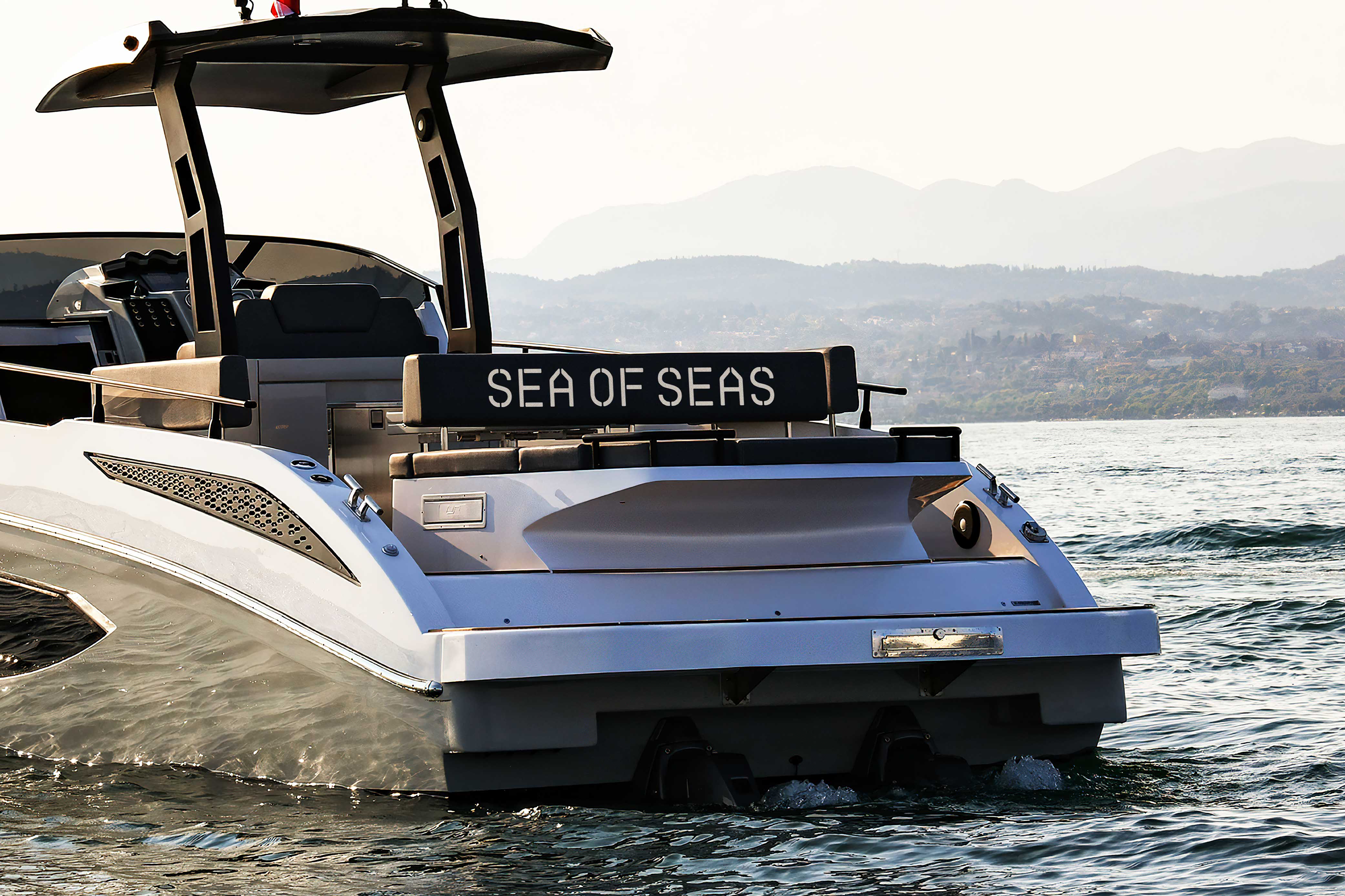
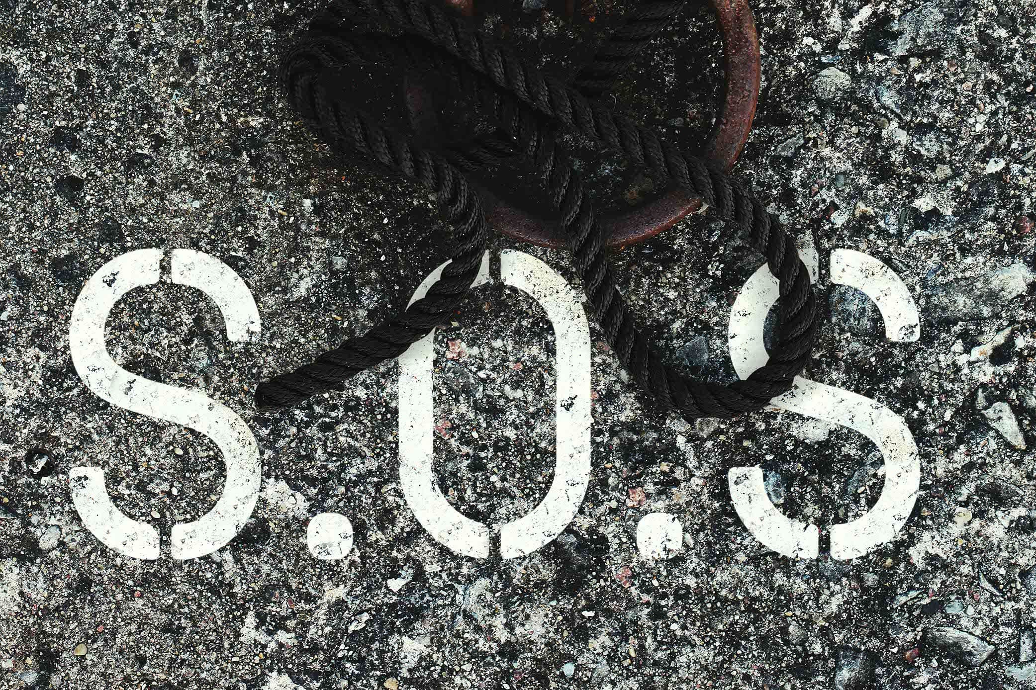
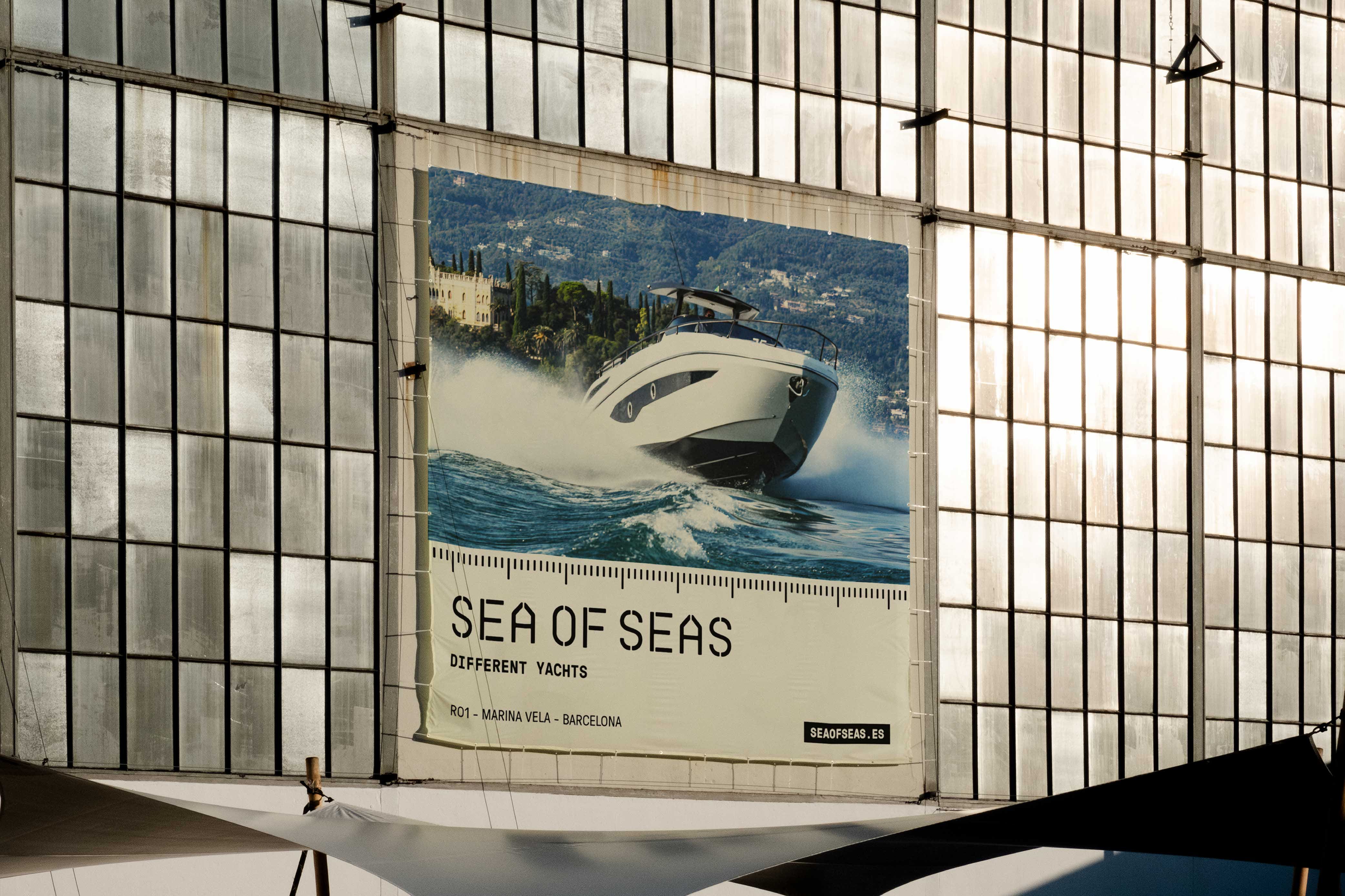
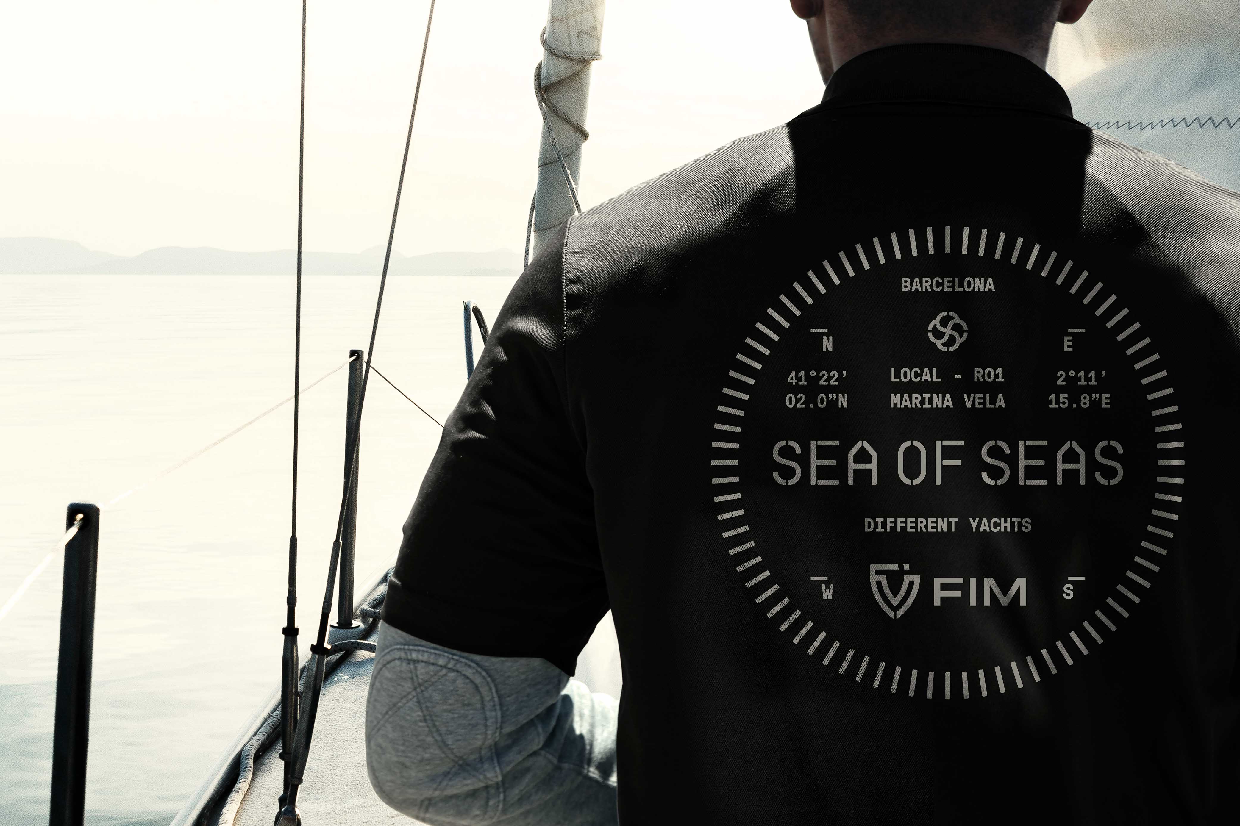
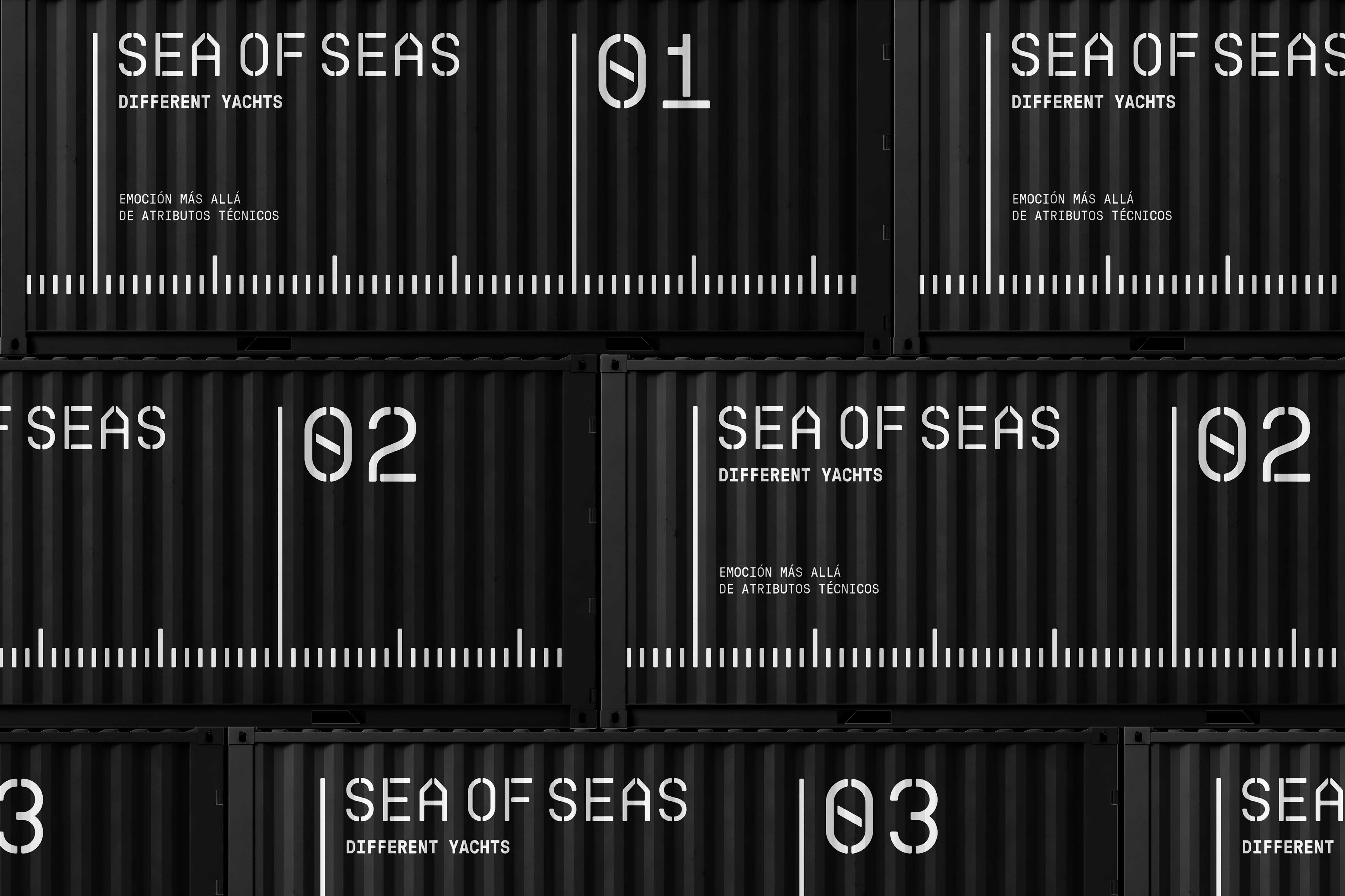
This new brand’s visual identity sets sails towards the nautical imaginary. We appropriate the naval visual codes to generate a brand that exudes oceanic vibes through all its pores. The logotype is represented by a stencil typeface that alludes to those used in piers and ships, bringing a mechanistic essence that relates to the industrial origin of its product. The two a’s in the wordmark are drawn to resemble the prow of a ship facing the horizon, reiterating the concept of seeking for adventure.
To be able to convey the premium aspect of the brand, we developed a black and white colour scheme that originates from the navigation systems used by sailors and their ships across
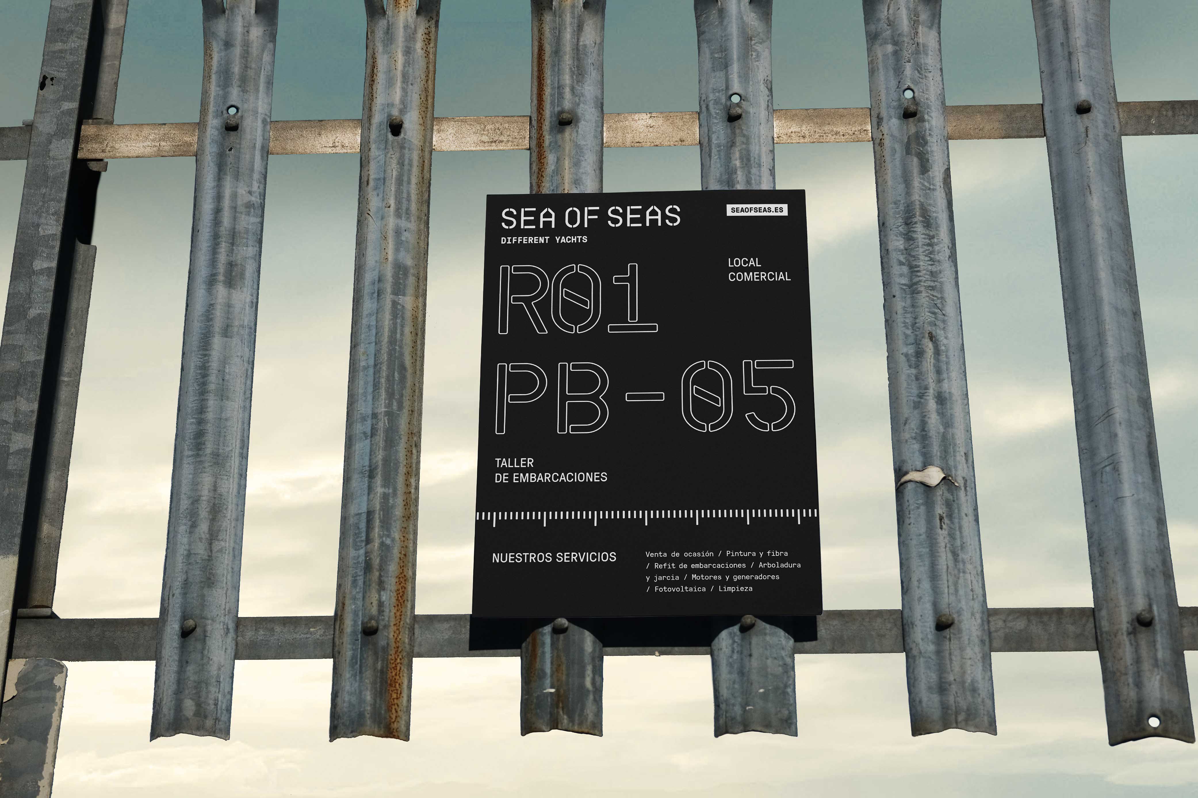
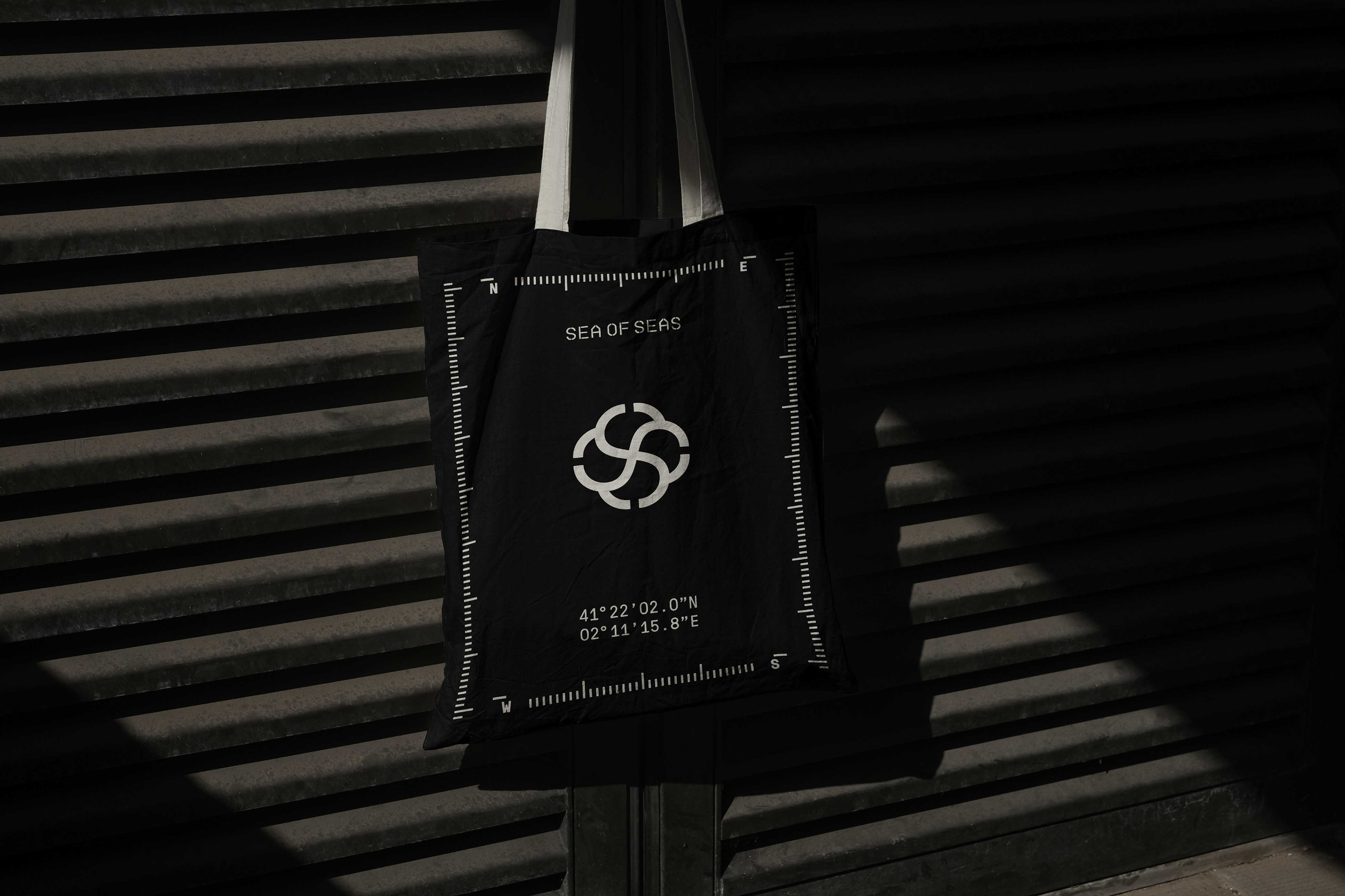
the seven seas. Besides the colour, other graphic elements used to style the visual proposal are inspired by marine navigation elements that help keep the sailors en route, a parallelism to Sea of Sea’s consumer guidance when deciding its next adventure.
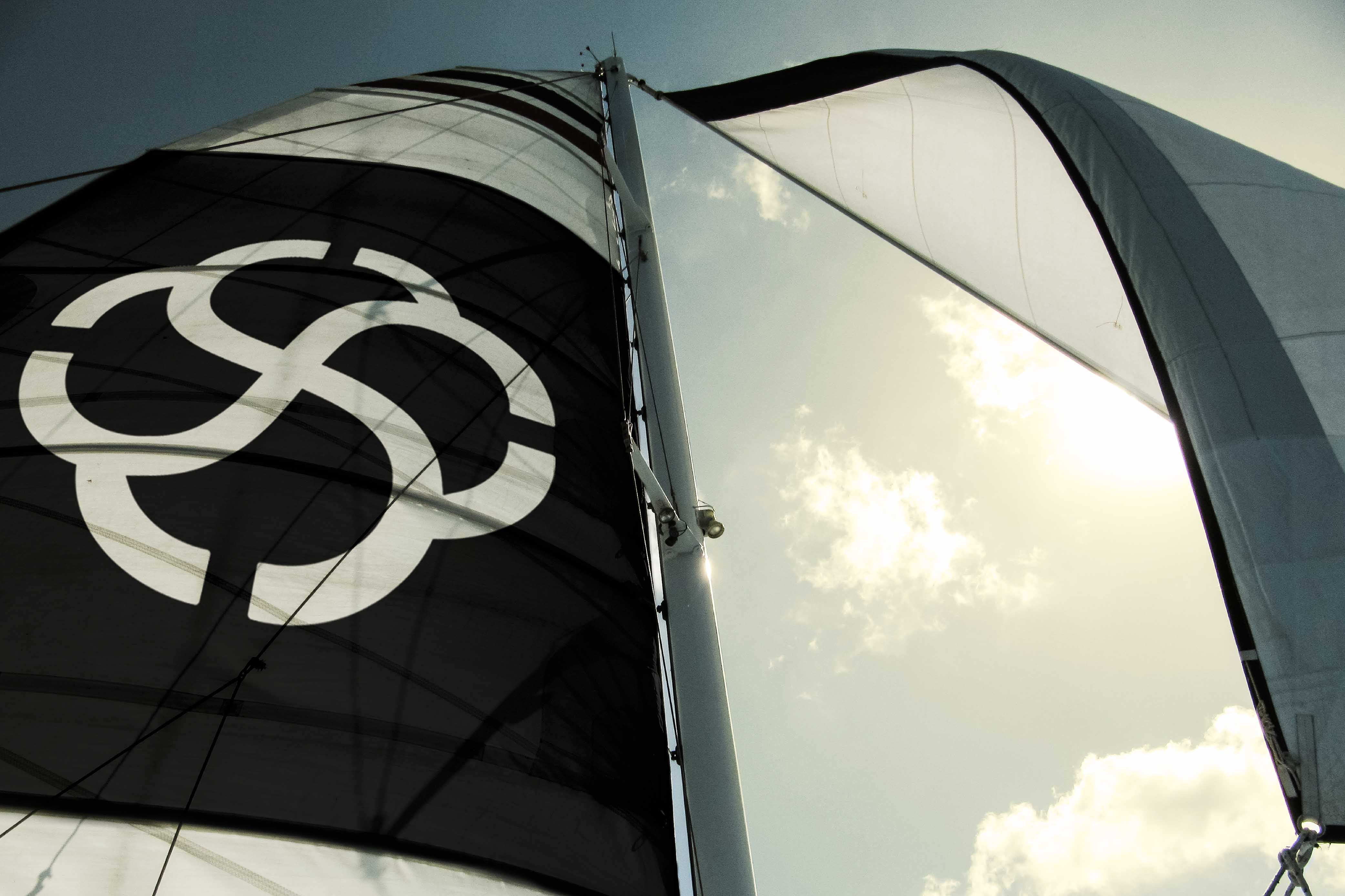
The proposal is summarized in a symbol that combines the twos’s of the wordmark in a helix-shaped nautical knot, which conveys a nautical feeling to whoever sees it. All together combined with an action driven photography from the brand’s manufacturers, empowers Sea of Seas to be able to arouse emotion to those who seek adventure offshore.
Naming Concept
A name that alludes to the subjective experience of the Mediterranean, a sea made up of many others.
Challenge
A differentiating naming in a category that is flooded with descriptive namings, acronyms and patronymics, that can transmit the unmatched emotion of sailing the Mediterranean.
Values
Emotional / Storytelling-fertile / Unexpected / Memorable / Easy association with its core business / Outstanding
Naming Construction
The repetition of the word ‘sea’ conveys the rhythmic component of the waves through its captivating sibilant phonetics.
CREDIT
- Agency/Creative: Morillas
- Article Title: Branding the Feeling of the Mediterranean – Sea of Seas
- Organisation/Entity: Agency
- Project Type: Identity
- Project Status: Published
- Agency/Creative Country: Spain
- Agency/Creative City: Morillas
- Market Region: Europe
- Project Deliverables: Brand Identity, Brand Naming, Branding, Graphic Design, Logo Design
- Industry: Retail
- Keywords: #morillas #createsomethingextraordinary #visualidentity #brandidentity #branding #yachts #barcelona #luxury #mediterranean #sea #SeaofSeas #sailing #boats #brand
-
Credits:
-: -


