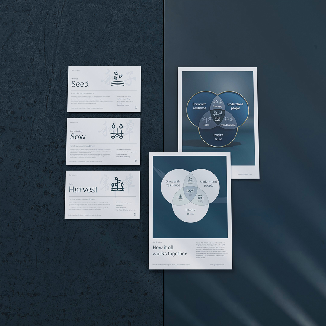
Qiva is the operating partner powering some of China’s most successful brands. They help successful businesses in the western market transition into the Chinese market, utilising a data-led, digital approach. They approached Ludus for a full rebrand that would position themselves as experts in their field. The brief was to create a visual identity that forms a balance of East and West culture, whilst avoiding any overused visual troupes or stereotypes associated with China. During the exploration phase, it became clear that QIVA’s work takes place in a fluid and turbulent environment, and their use of precision and process to help their clients stand out and get a foot in the door of China’s marketplace.
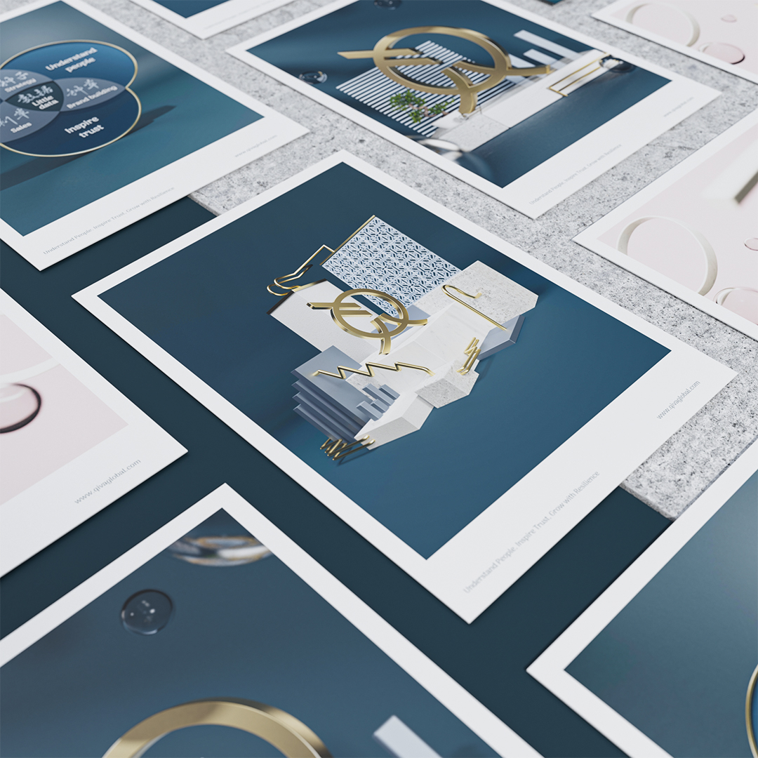
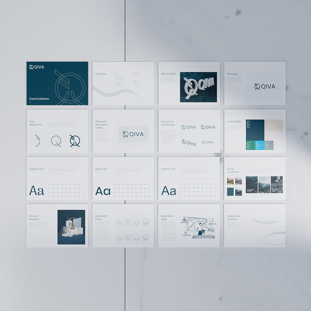
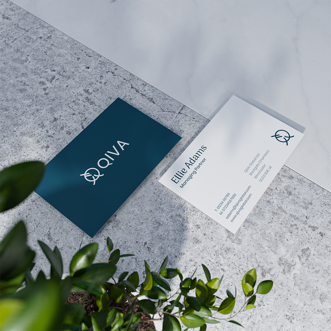
Ludus designed their brand to give it more dimension, confidence and elegance. The contrast between China’s chaotic market and QIVA’s systematic methodology become the core principle of the brand identity. The design balances digitally produced visuals inspired by traditional Chinese architecture and calligraphy, with slick, geometric shapes and design grids. The colour palette was inspired by ancient Chinese pottery, rich blue pigments, glossy white ceramic and subtle gold inlays.
QIVA’s logo icon is a play on the Chinese word, qīng. The definition has meanings of clarity, distinction, honesty and purity. Qīng is written in Chinese using the character that translates to water, evoking fluidity and transparency, all of which QIVA practices in its brand ethos. The Chinese character is combined with the Latin character of ‘Q’ to connote the blend of Chinese and western practices.
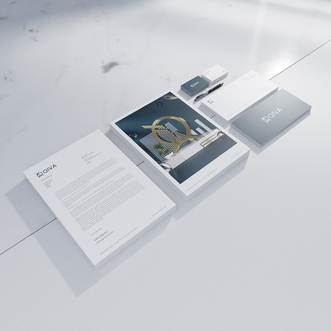
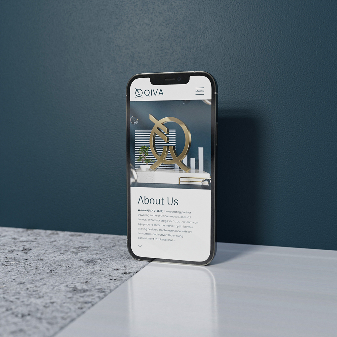
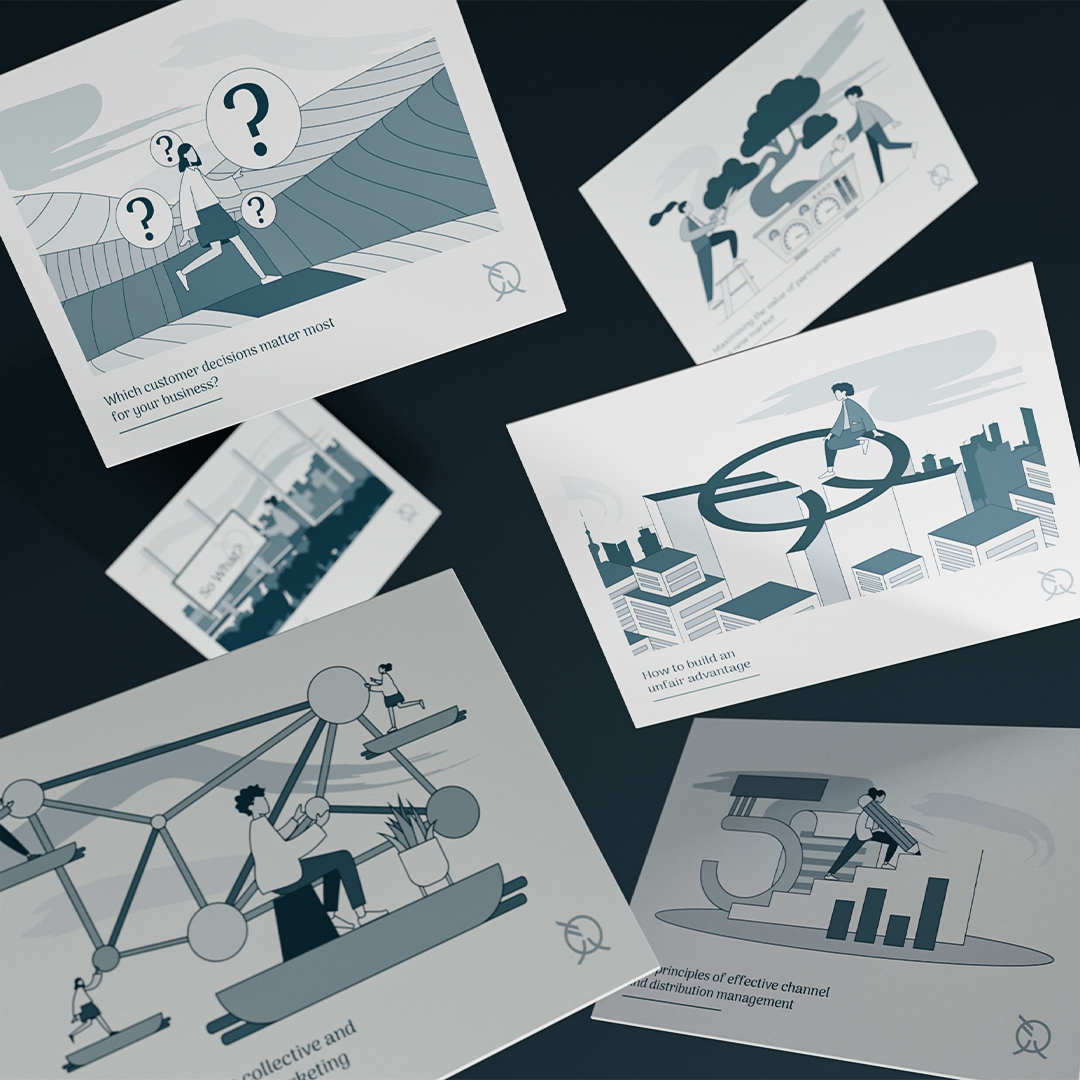
Ludus created a suite of imagery to illustrate Qiva’s processes in an eye-catching and sophisticated way. Using CGI, Ludus mixed materials that connote quality, success and wealth such as marble and gold with strong and functional building materials such as concrete, metal and plaster to give a simple and subtle message; Qiva will help build your business to be strong, successful and profitable. These images were then stylised with the brand’s colour palette, design flairs inspired by Chinese architecture and interior design, and typical marketing imagery. The imagery was then applied to all the printed collateral, and animated for the website.

CREDIT
- Agency/Creative: Ludus
- Article Title: Branding that Blends East and West for a Consultancy with Global Reach
- Organisation/Entity: Freelance, Published Commercial Design
- Project Type: Identity
- Agency/Creative Country: United Kingdom
- Market Region: Asia
- Project Deliverables: Brand Architecture, Brand Design, Brand Identity, Brand Redesign, Brand Strategy, Graphic Design, Identity System, Illustration, Rebranding, Research
- Industry: Information
- Keywords: Marketing, China, CGI, Print design, Consultansy, Minimal, asian, Brand design


