


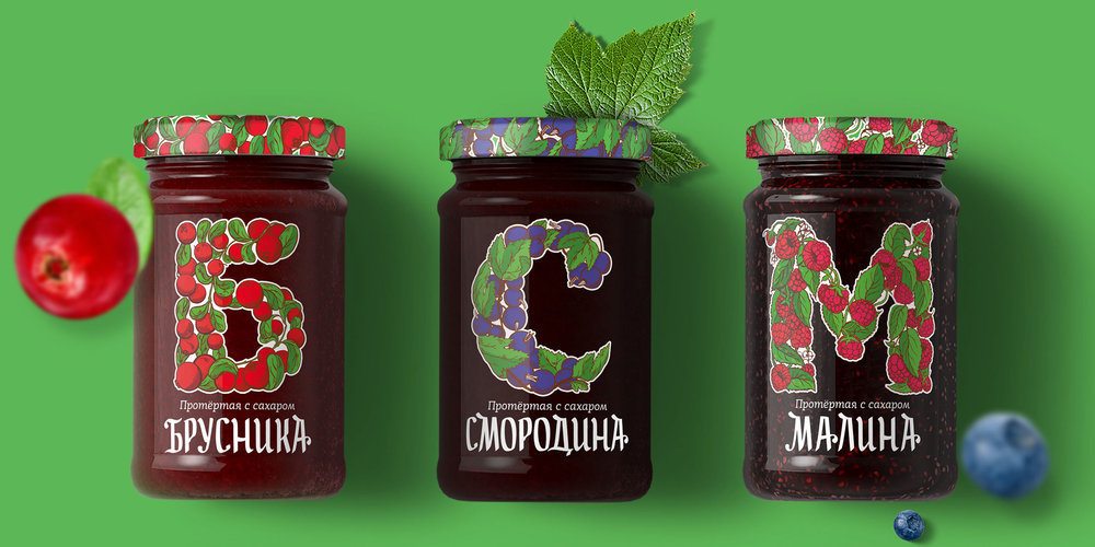
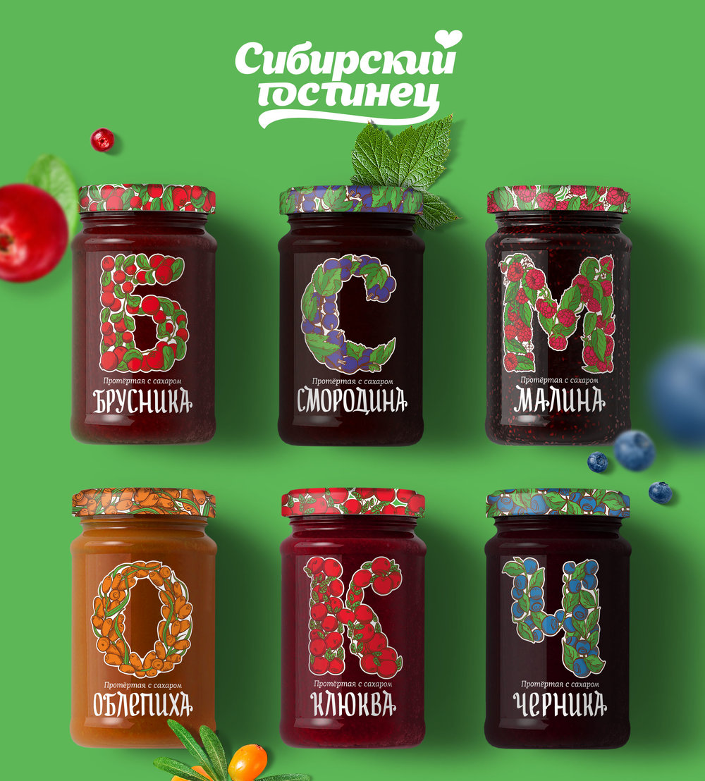
“The main design element is the first letter of the berries jar name. Its pattern reflects the content of the jar and marks it out on the shelf. It draws attention and opens the door for a “guerrilla” marketing channel — the customers won’t be able to resist to lay a word out of their jars on the shelf.”
CREDIT
- Agency/Creative: Branding studio Typomaniacs
- Article Title: Branding studio Typomaniacs – Sibirsky Gostinets
- Project Type: Packaging
- Substrate: Glass
FEEDBACK
Relevance: Solution/idea in relation to brand, product or service
Implementation: Attention, detailing and finishing of final solution
Presentation: Text, visualisation and quality of the presentation


