


Branding of institute of psychoanalysis
EEIP is the Eastern European Institute of Psychoanalysis, the oldest educational institution dealing with the topic of psychoanalysis in Russia. The EEIP diploma is highly appreciated among experts. Over 30 years of work, the Institute has developed its own approach to training and created a strong team of specialists. In recent years, the Institute has been paying more and more attention to the modern technological format of teaching, but at the same time the canons laid down earlier in teaching are preserved. EEIP is developing, and there was a need for updating at the brand level: it was necessary to determine its place in its category, structure the vision of the team into an ideological system and build visual and verbal communication with the audience on its basis.
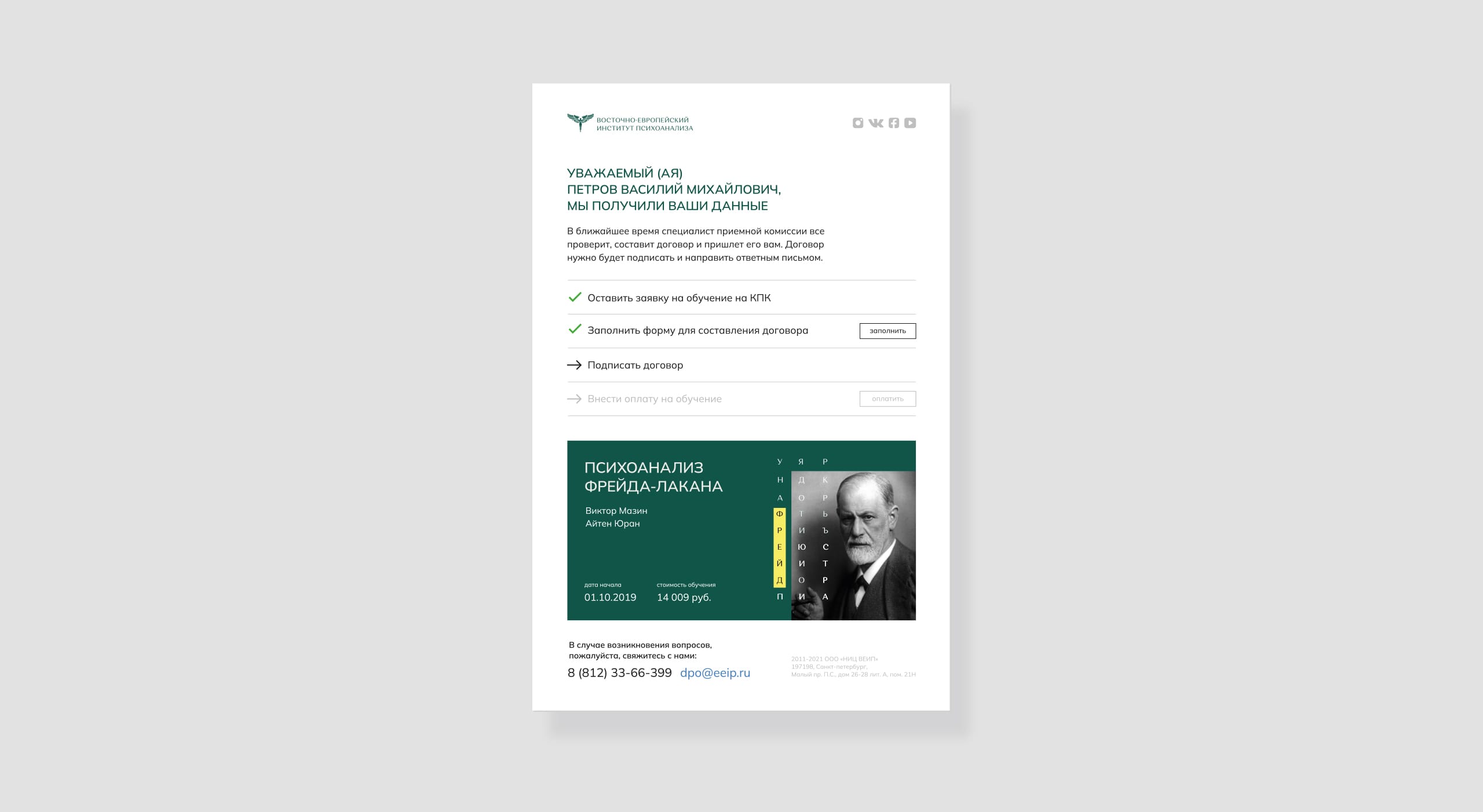
Highlighting the main
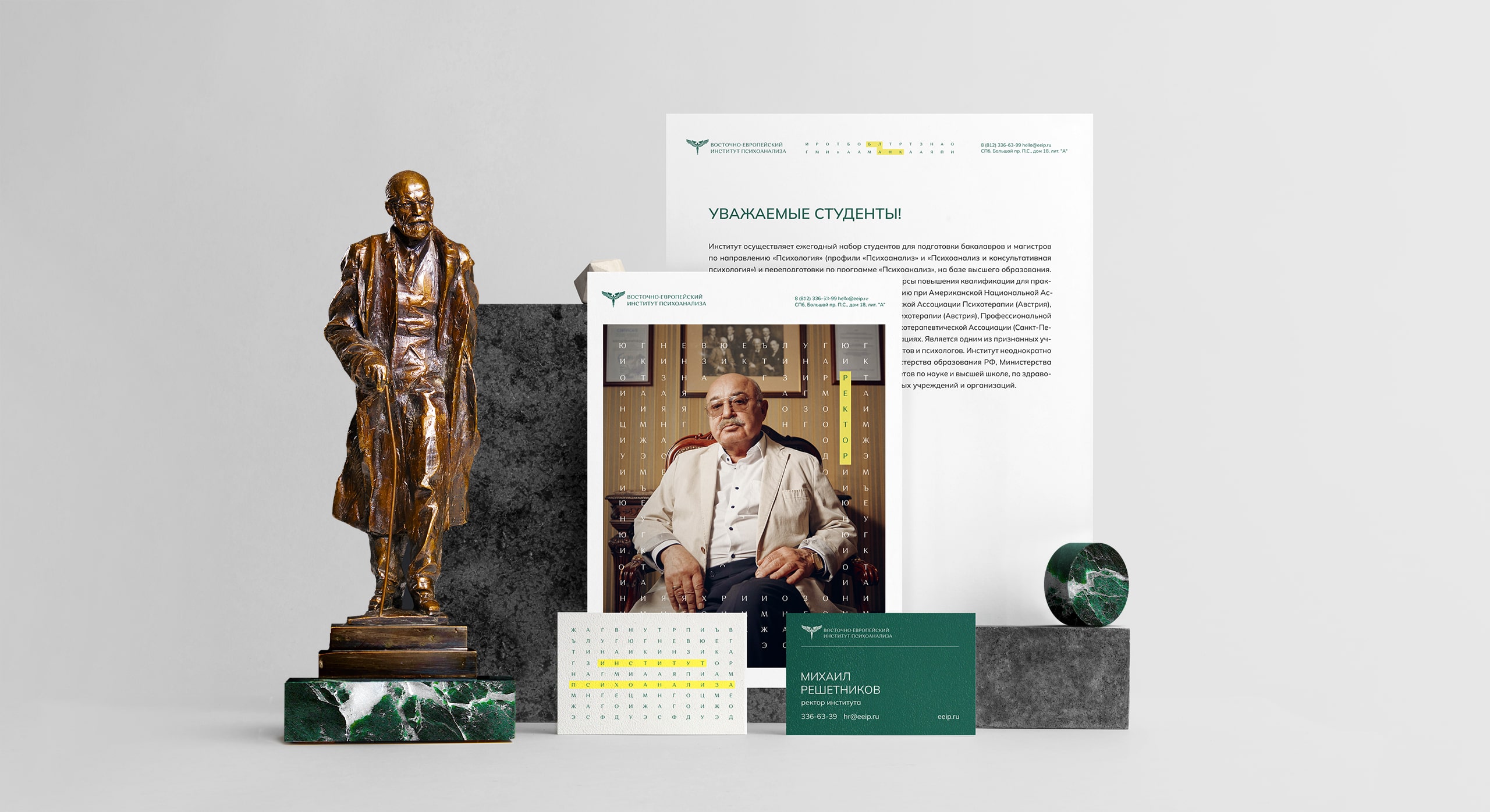
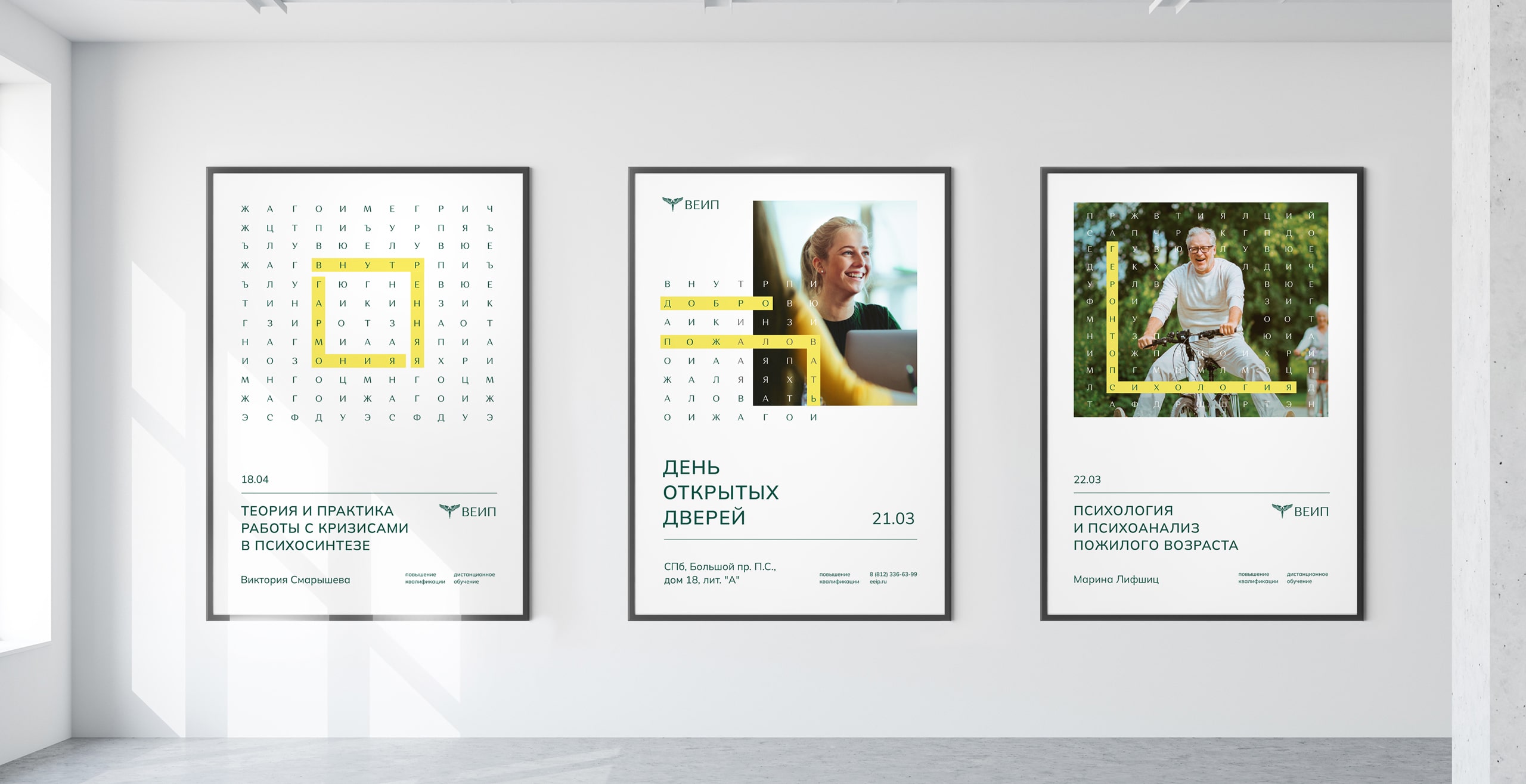
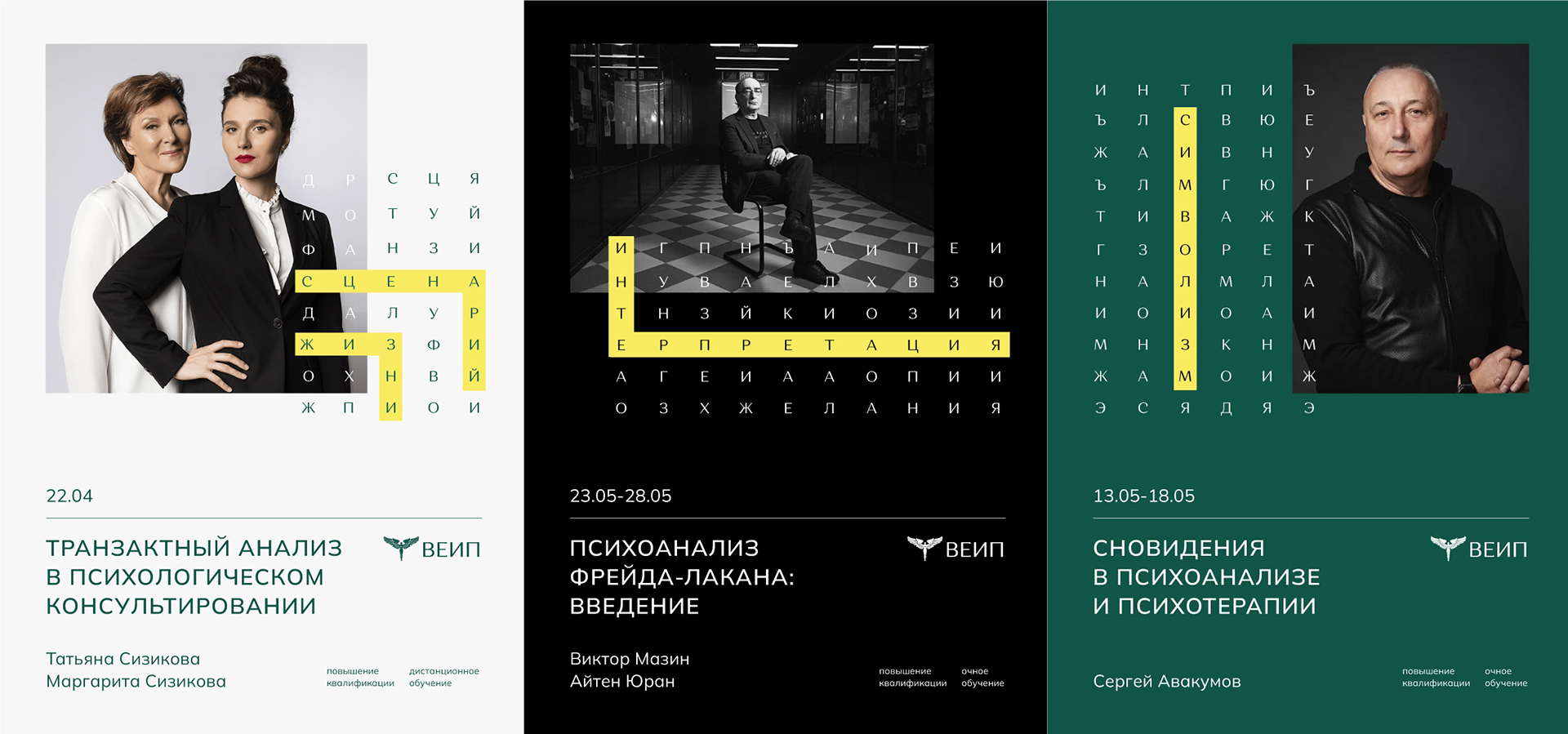
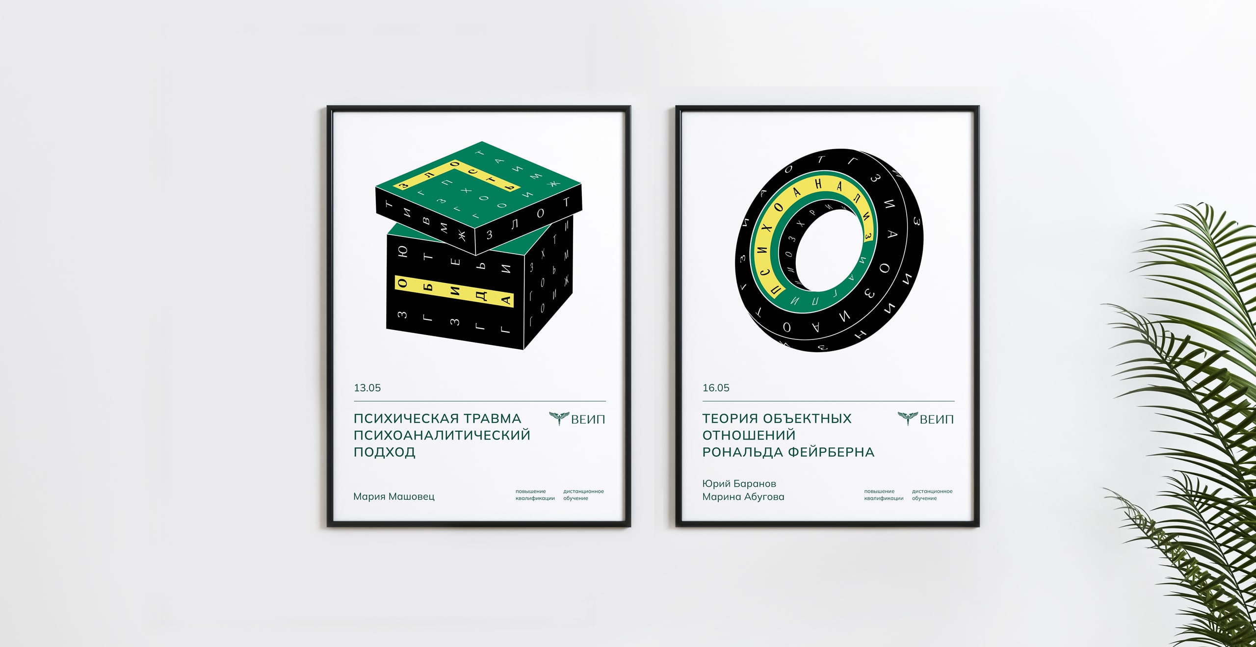
The new brand platform is based on a combination of the basic principles of psychoanalysis and the vision of the institute’s team with its unique approach. Having endowed EEIP with the qualities of the “Sage” archetype, we returned to the identity. So we started with the fact that psychoanalysis is based on the patient’s story about his experience. At the same time, the psychoanalyst gives the person a recommendation to say whatever comes to mind. This approach is called the “free association method”. It is important that the specialist does not ask the client leading questions, and the sessions turn into a stream of patient experiences. But out of the endless stream of thoughts, we ourselves are not able to find the necessary patterns in behavior, and it is the psychoanalyst who determines what is important and helps the client interpret his experience at the level of the unconscious. It was the selection of the main thing from the general flow of information that formed the basis of visual communication and supported the general principles of the institute’s work.


CREDIT
- Agency/Creative: ICU
- Article Title: Branding of the Institute of Psychoanalysis by ICU: A Visual Metaphor Through the Basic Principles of Psychoanalysis
- Organisation/Entity: Agency
- Project Type: Campaign
- Project Status: Published
- Agency/Creative Country: Thailand
- Agency/Creative City: Bangkok
- Market Region: Global
- Project Deliverables: Brand Identity, Brand Strategy, Branding
- Industry: Education
- Keywords: brand strategy, brand core, brand identity
-
Credits:
Creative Director: Alexey Molchanov
Brand Designer: Semyon Kokorin
Strategist: Valeria Tyapina
Strategist: Yana Bilyuga


