Happer – Betson
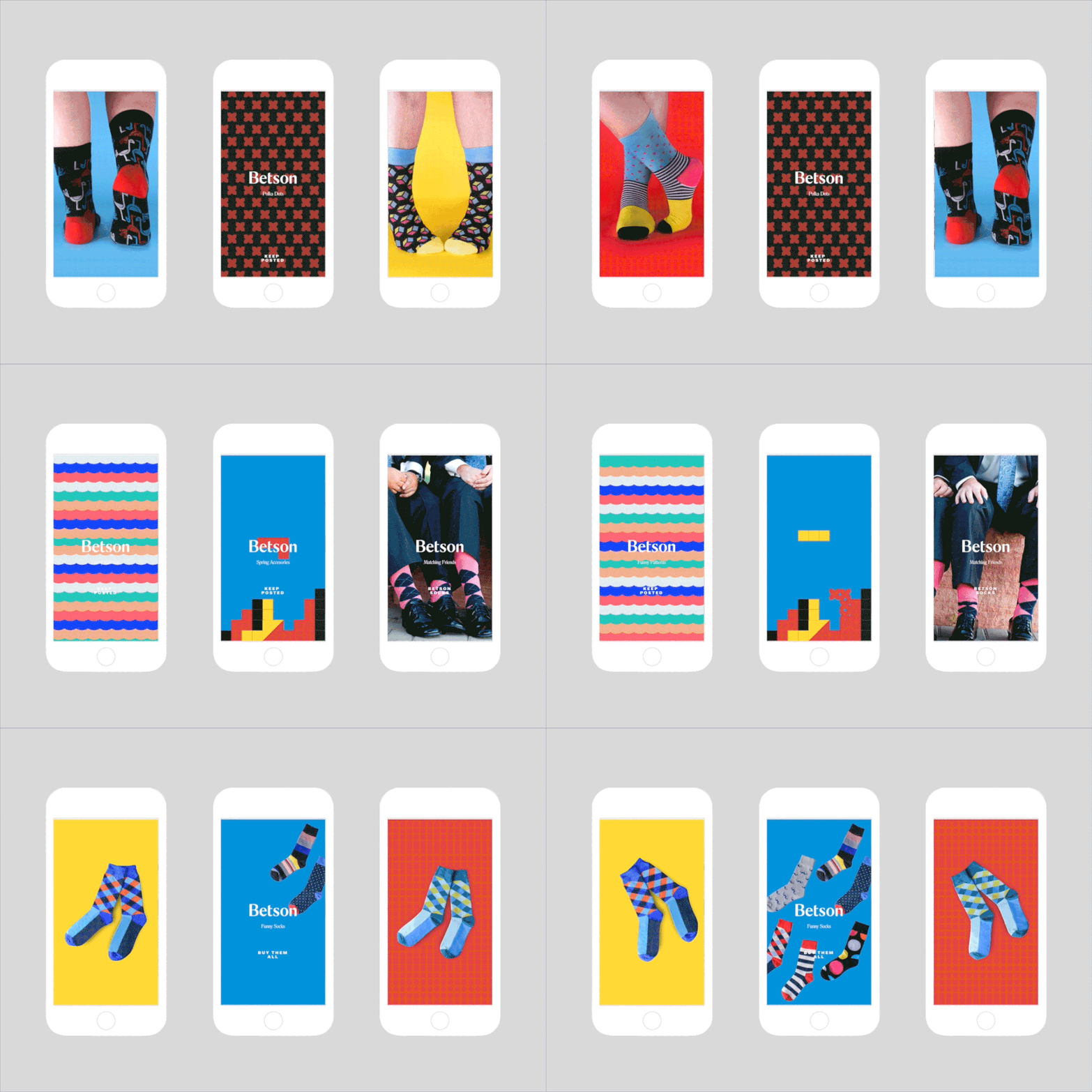
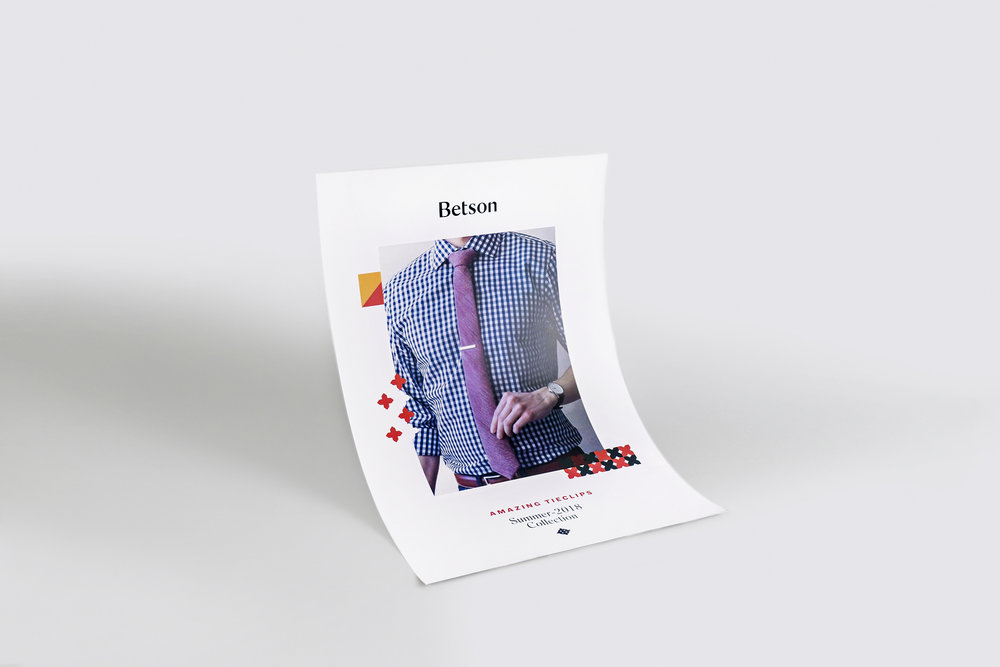
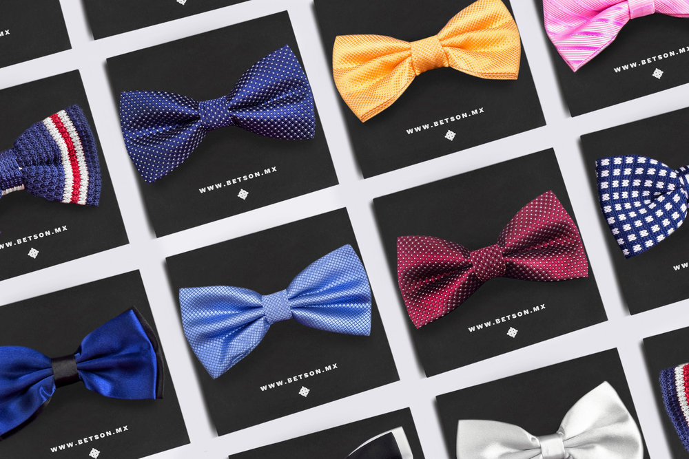
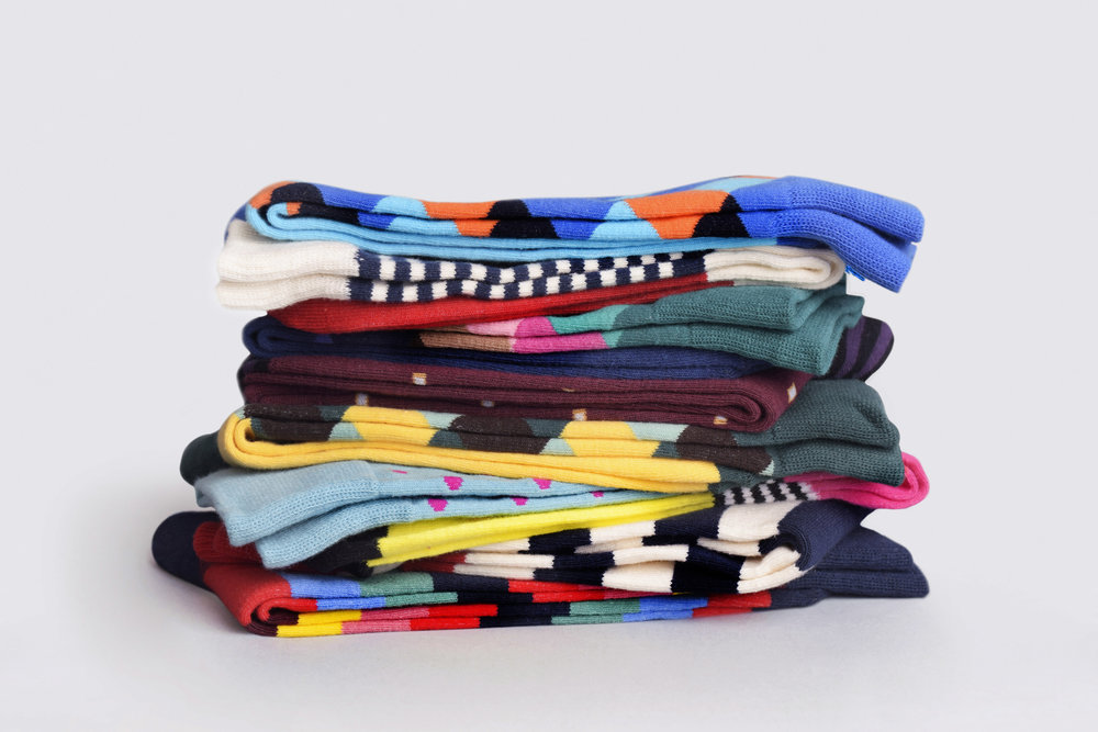
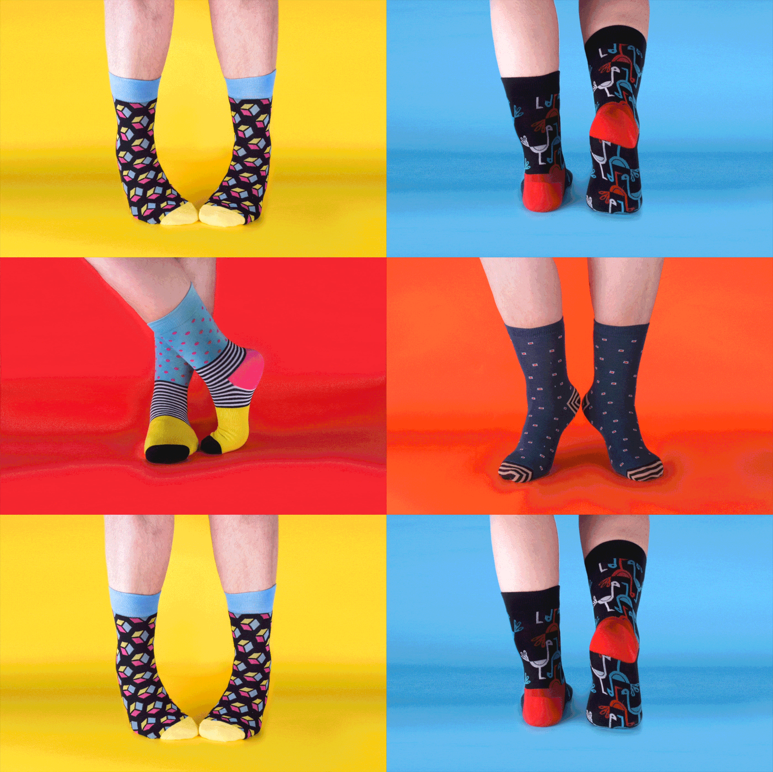
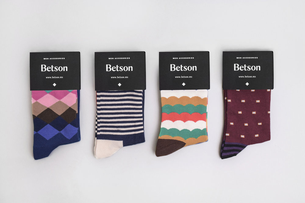
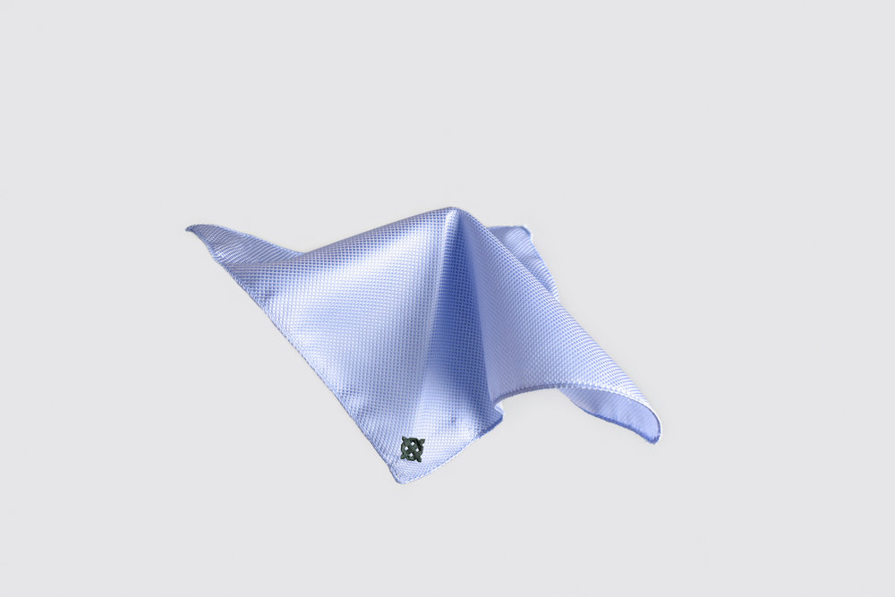
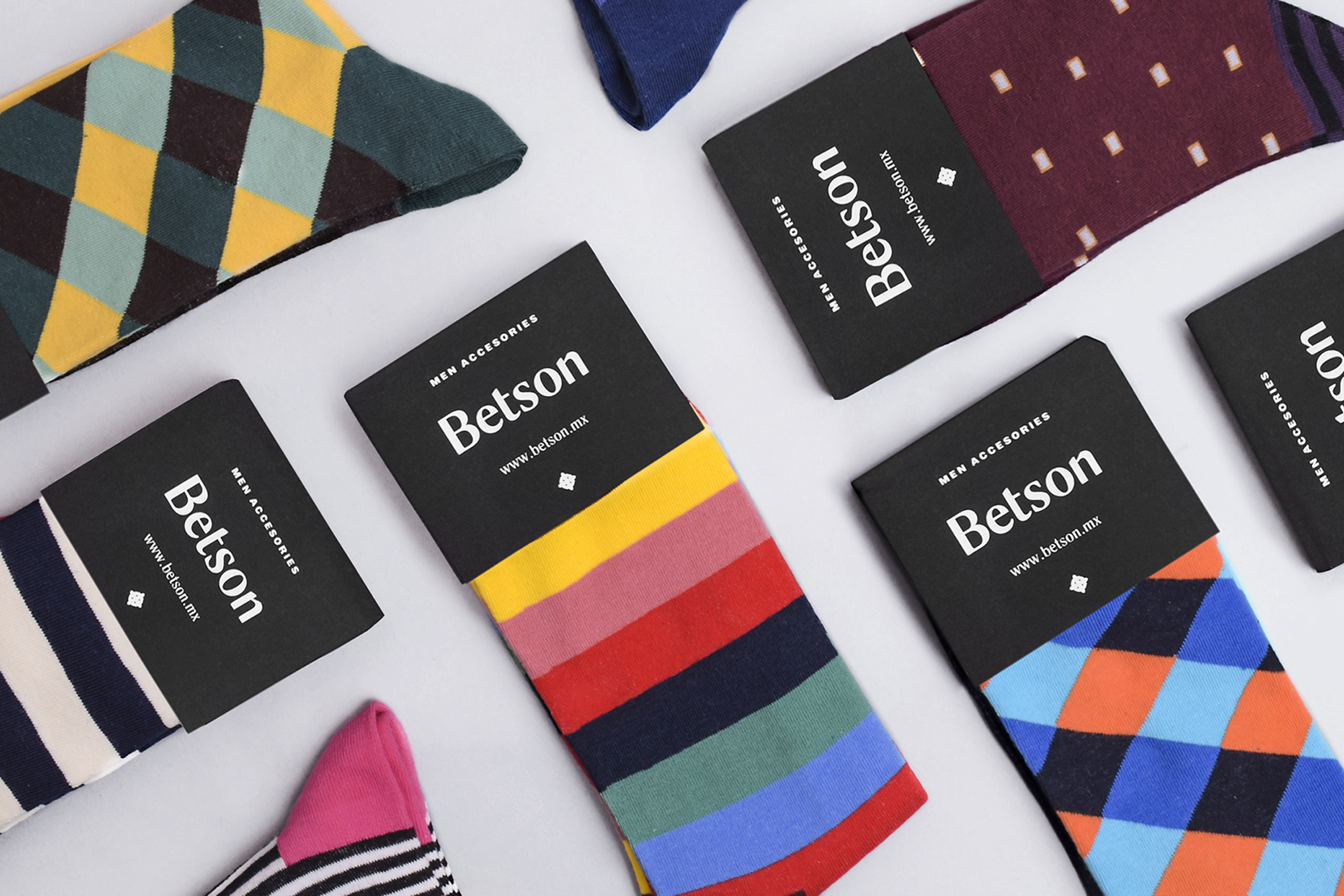
“Betson is a business that offers accessories for men, including socks, cufflinks, bow ties, tie clips. Through an online store, people can buy their products and subscribe to a monthly kit. Based on our research we found the insight that nowadays, men seek to express their style and personality through the elements that make them stand out and be unique.
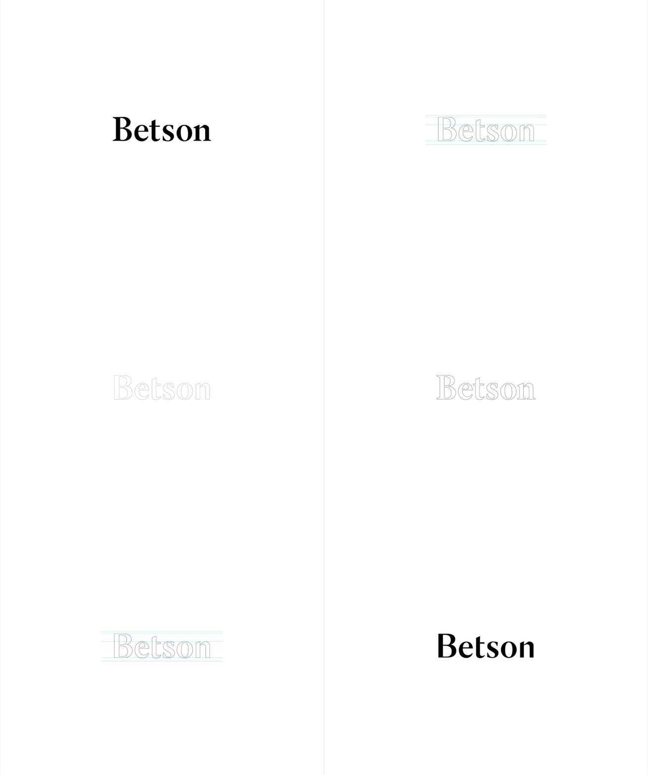
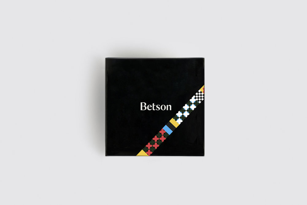
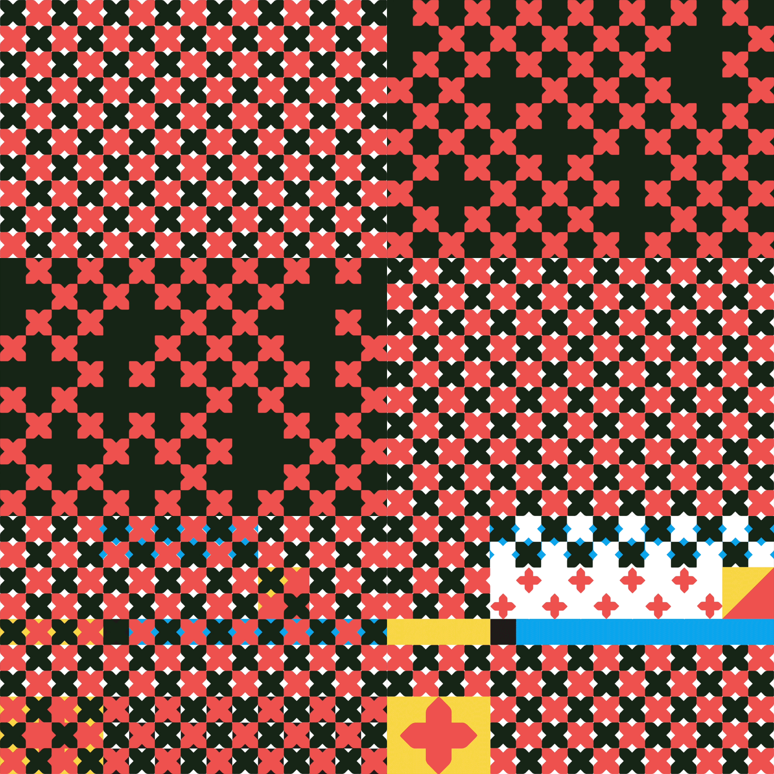
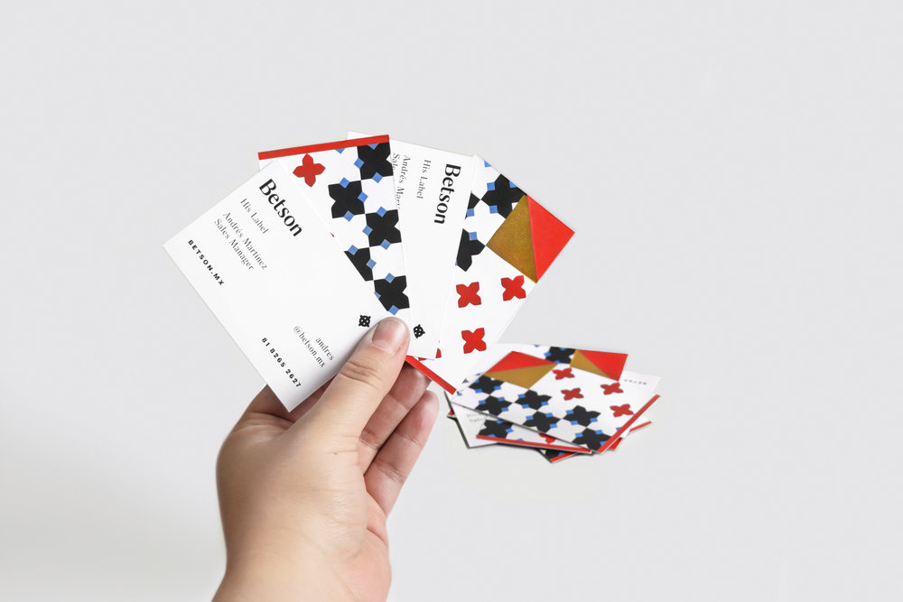
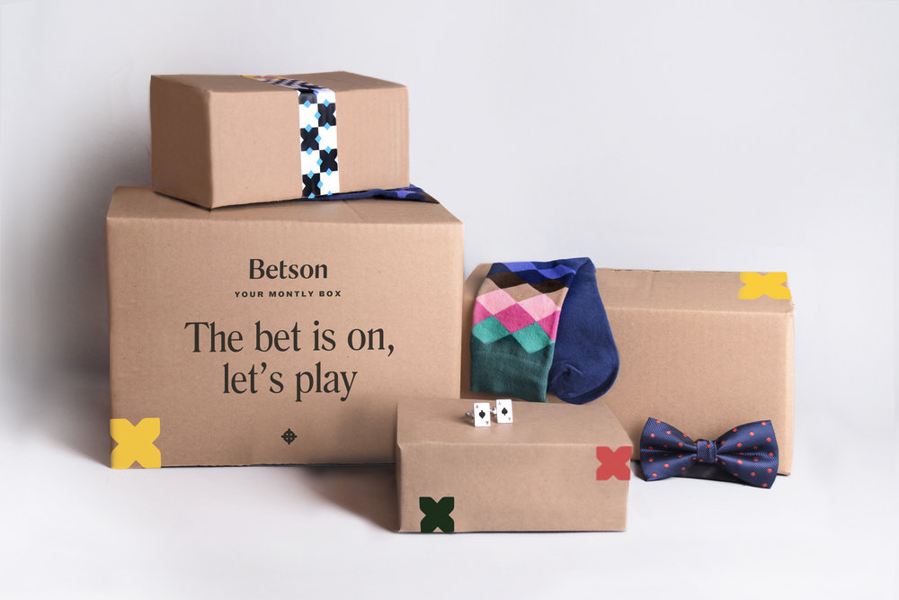
With this, we came up with the concept of Game Changer, encouraging men to live life by their own games and rules. The name Betson comes from the phrase: The BET’S ON, let’s play. This brand voice inspires man to be fun and bold , to play with the rules in his favor, using his ace up his sleeve. The design has a fun and adventurous language, taking as reference the games and adventures in life. The wordmark evolves from a serif typography. The design has custom-made endings that add a playful look and feel. The logo is inspired in board games and in the archery games, making reference that men can reach their goals and objectives. We created a dynamic pattern inspired in board games, that is used throughout the brand applications.”
