Industry: Security & Investigation
The project consists in designing a brand identity for Black Umbrella, which is a personal security training firm, operating independently worldwide.
The concept:
The idea behind the brand identity is to express the brand values as clearly as possible in a lightened manner. The naming of the brand itself shows what the brand is about, and when designing the logo there is no further need to illustrate a black umbrella, rather express a feeling of what the brand is about.
This being said, to give the idea of an umbrella, there is an arc applied at the bottom of the logo and other sub-logos, which helped develop the identity of this organisation. In a sense, this method lets the audience explore the logo themselves and implies curiosity in the viewers minds.
The logo:
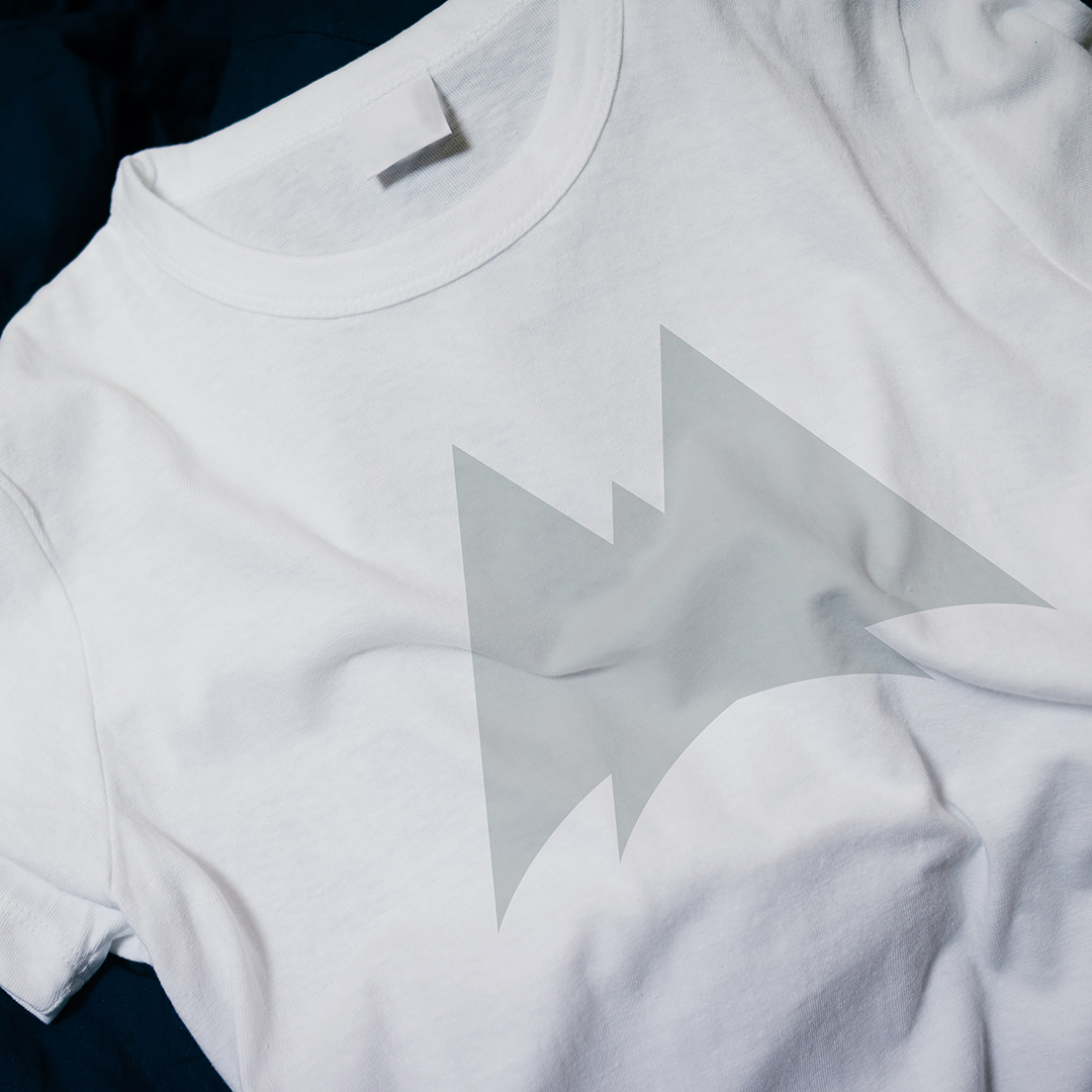
The logo is intended to represent strength, solidity, a guardian, sharpness, awareness and boldness.
The strength and solidity come into the viewers eyes, by looking at the triangle shapes that form a mountain-like contour of the logo. The sharpness and awareness are represented through the pointed corners while the boldness is defined by the minimal style of the logo and enhanced through the colour palette of the branding.
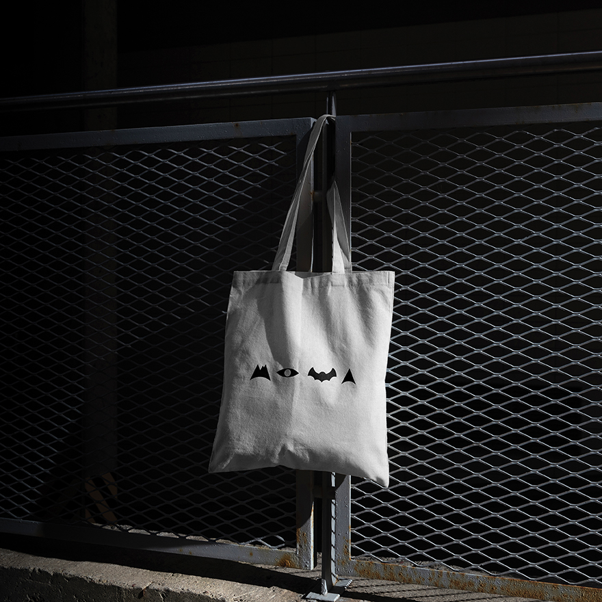
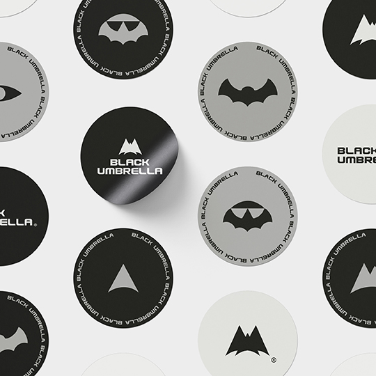
Furthermore, for this project there are other sub-logos or “icons” designed that will represent each, one sector of the brands purposes and services.
The bat silouhette icon – Represents the guardianship.
The bat as a symbol is known to be called as the guardian of the night. It made sense that this would be an icon to represent the nighttime services that this organisation offers.
The mountain-like icon – Represents professional team trainings.
In designing this one, the idea is to express a feeling of team-work and power at the same time. The team feature is represented by the “mountain-tops” while the power is shown through the triangle shape.
Face icon – Represents a speaker
This specific icon was designed to resemble a face but still be an unidentified creature in order to keep the mystery of the black umbrella’s identity.


CREDIT
- Agency/Creative: Vortolab / Vanesa Ajdini
- Article Title: Branding Identity for Black Umbrella
- Organisation/Entity: Freelance
- Project Type: Identity
- Project Status: Published
- Agency/Creative Country: Albania
- Agency/Creative City: Tirana
- Market Region: Europe
- Project Deliverables: Brand Design, Brand Guidelines, Brand Identity, Graphic Design
- Industry: Defence
- Keywords: Security, Investigation, Personal Security Training
-
Credits:
Graphic Designer & Art Director: Vanesa Ajdini


