


Designous Creative Agency – Daphne’s Club Hotel
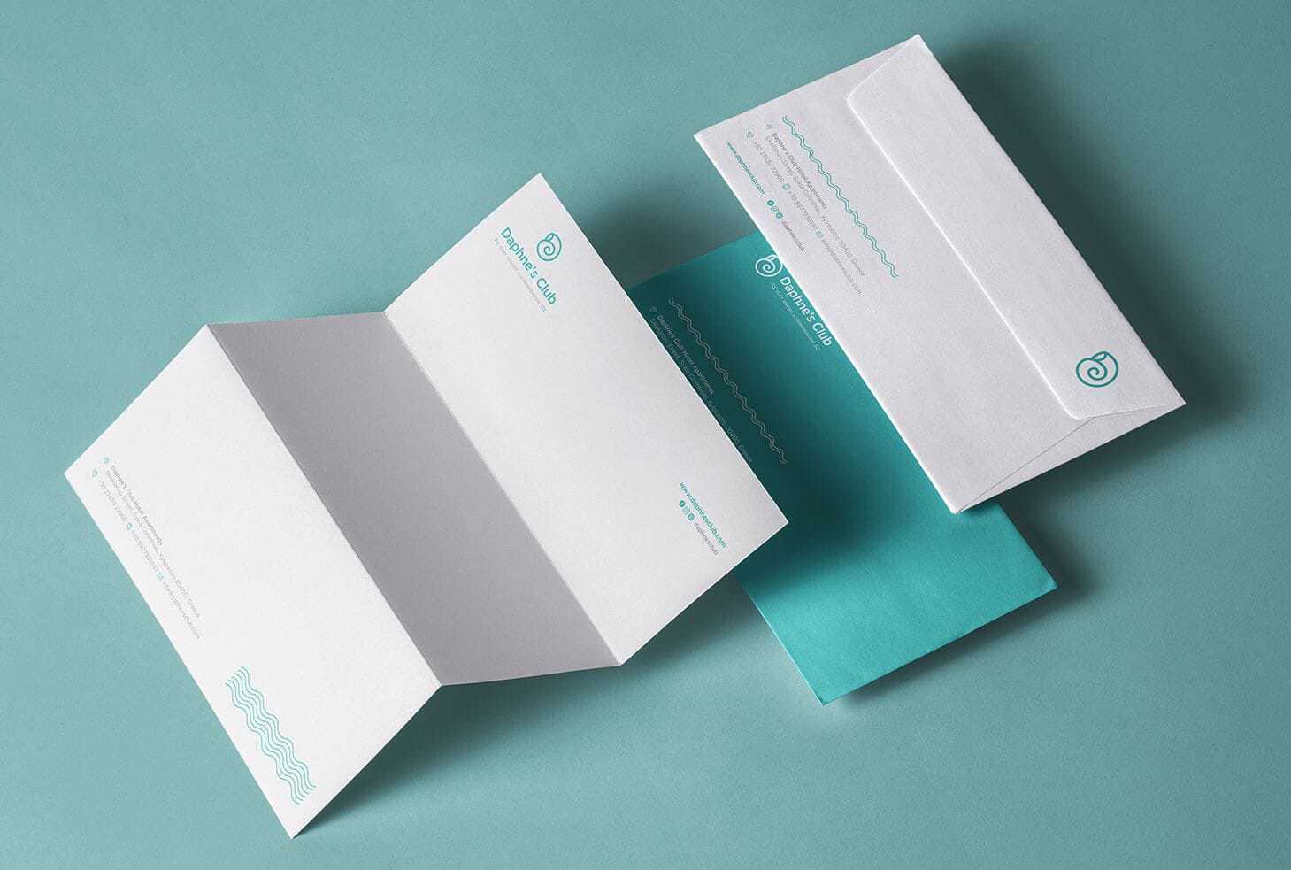
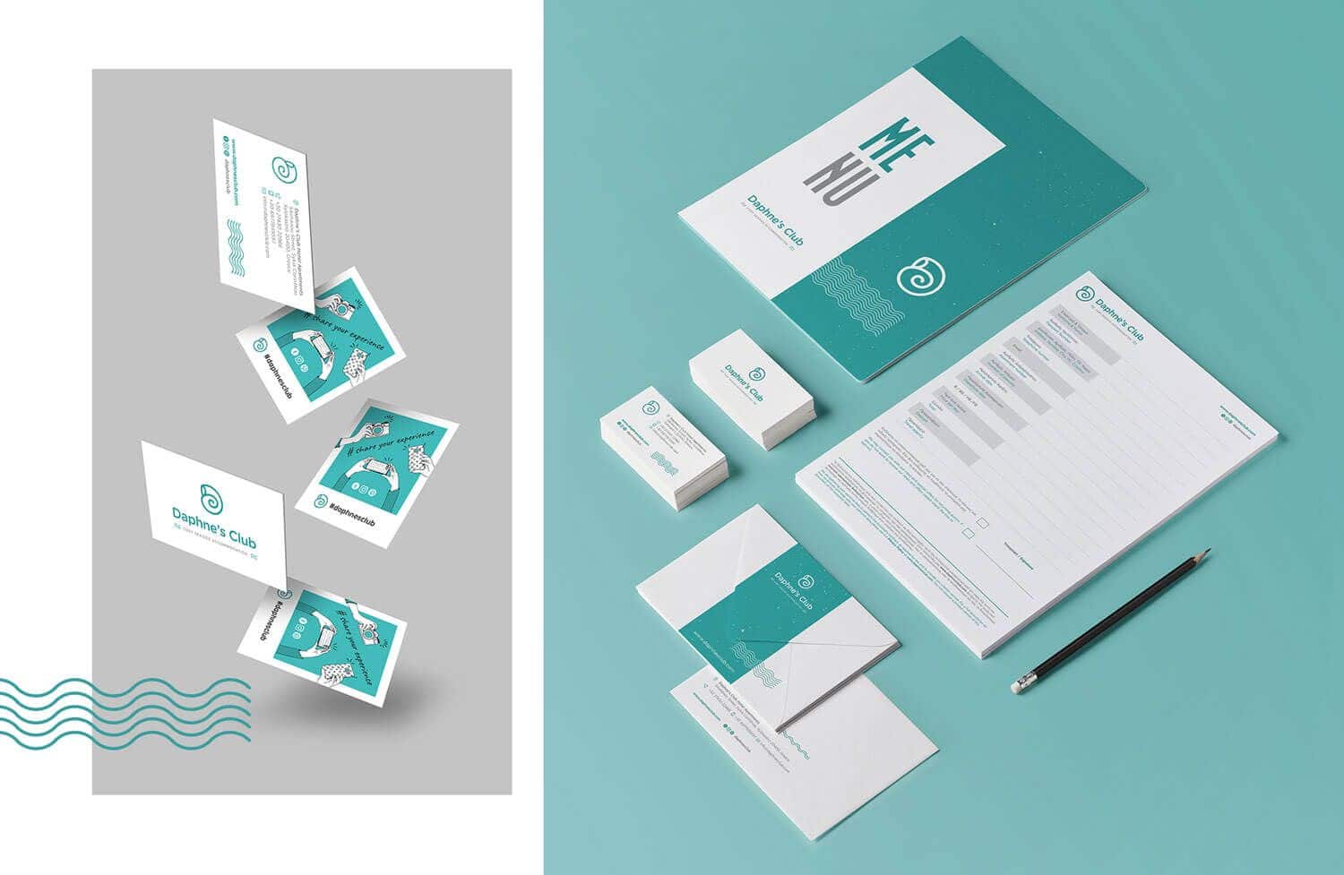
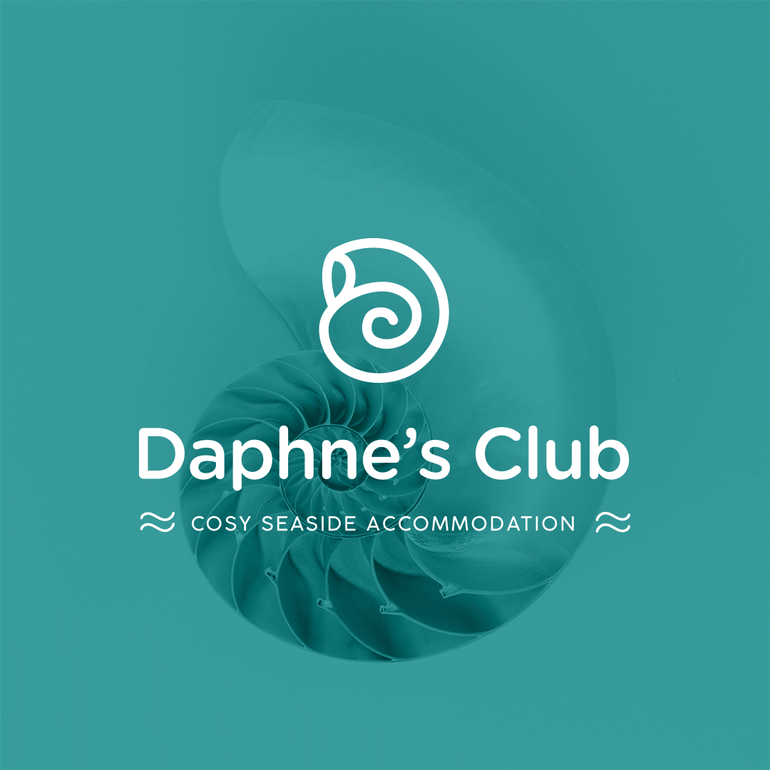
The visual depictionDesignous proceeded to the logo redesign for the Daphne’s Club Hotel Apartments, illustrating the letter D in the form of a shell, which at the same time refers to pebble or wave. The logo exudes immediacy and intimacy through its circular shape, creating a sense of calm and caring for the visitor, who is conveyed to the summer and the sea.We chose modern rounded fonts, in order to enhance the concepts of hospitality and warmth in a modern style.The basic color of the new visual identity is the petroleum color, with some details in light gray. The colors were chosen to also match the colors of the hotel’s restaurant, to maintain consistency and uniformity in the corporate identity and to achieve a flawless aesthetic result.
CREDIT
- Agency/Creative: Designous Creative Agency
- Article Title: Branding fot Daphne’s Club Hotel
- Organisation/Entity: Agency, Published Commercial Design
- Project Type: Packaging
- Agency/Creative Country: Greece
- Market Region: Europe
- Industry: Hospitality


