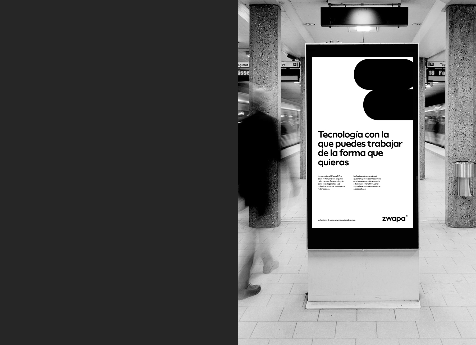
Challenge: Zwapa recycles and repairs mobile phones, in particular the iPhone. The key service consists in unique restoration of the IPhone using only original factory parts.
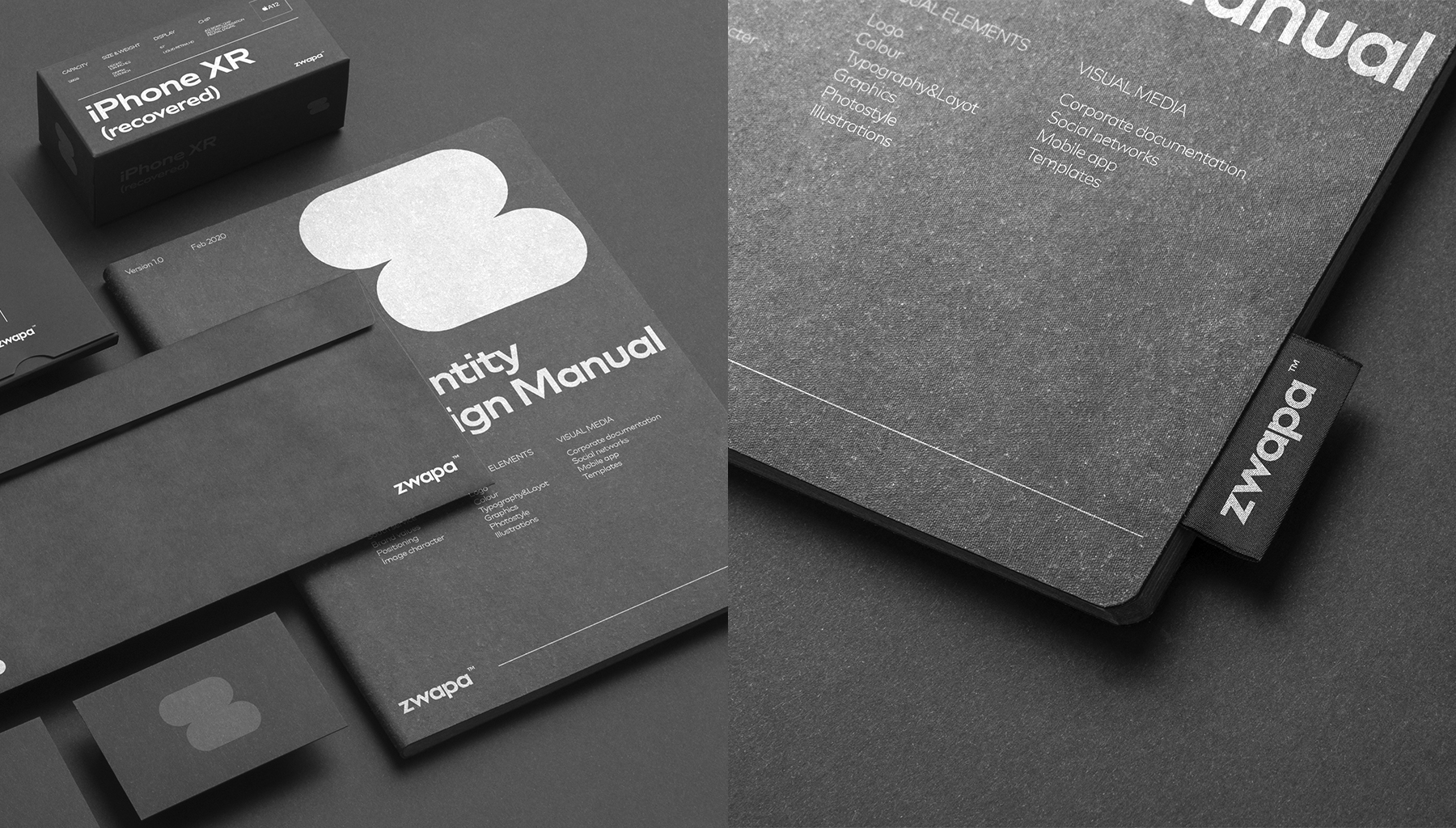
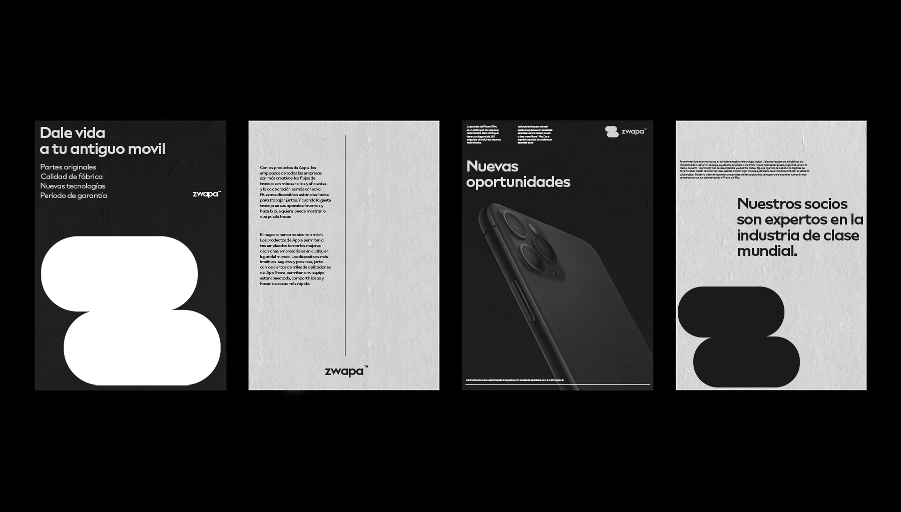
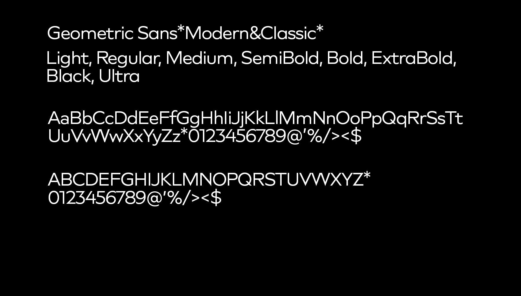
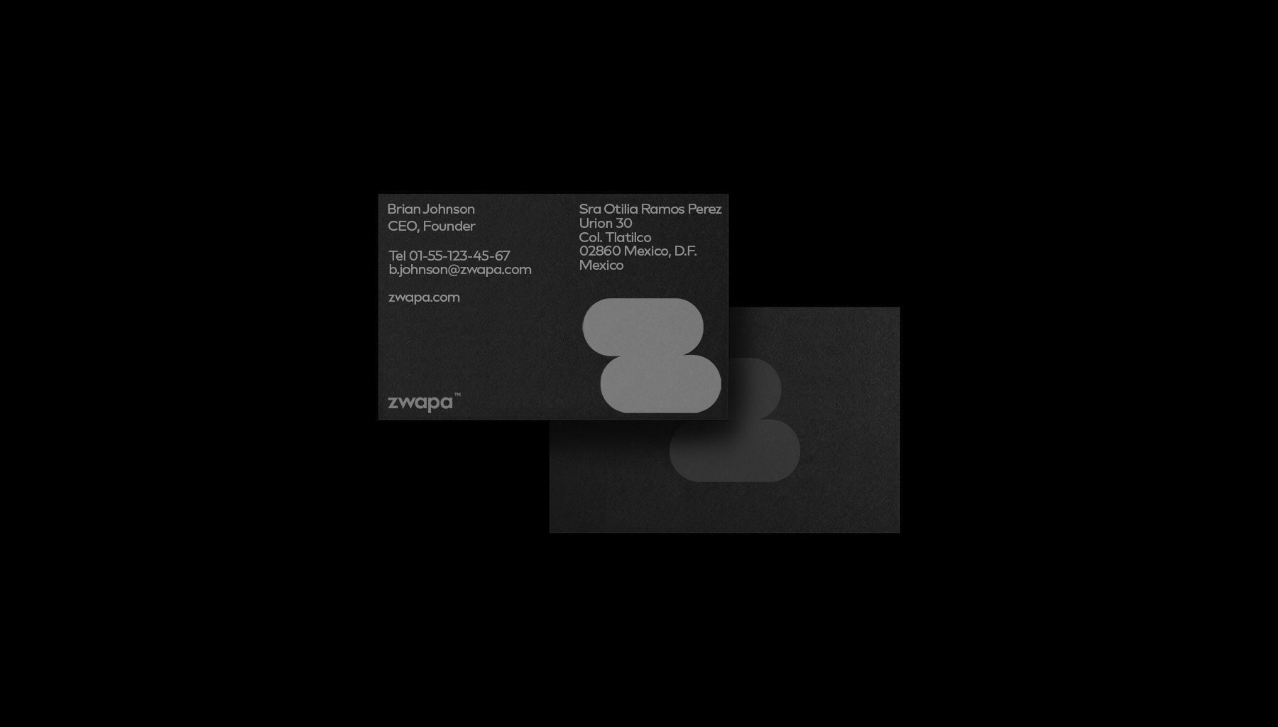
We have brought the Zwapa brand visual aspects of purity and nature, which is a reference to the recycling activities of the company. We used pure font solutions and monochrome colours as the main technique. Photographs of models are used in atmospheric style and are used mainly in black and white. The laconic visual language, stylized letter “Z” increased brand recognition and created a unique image.
Result: The result is increased recognition of the company, including on social networks, as well as an increase in the number of customers who want to cooperate with Zwapa.

CREDIT
- Agency/Creative: Anatoliy Terentyev
- Article Title: Branding for Zwapa a Company that Recycles and Repairs Mobile Phones
- Organisation/Entity: Freelance, Published Commercial Design
- Project Type: Identity
- Agency/Creative Country: Russia
- Market Region: South America
- Project Deliverables: Brand Architecture, Brand Experience, Brand Guidelines, Brand Identity, Brand Redesign, Brand Strategy, Branding, Graphic Design, Packaging Design, Research, Tone of Voice
- Industry: Technology
- Keywords: BRANDING CLEAR COMMUNICATION DESIGN IDENTITY MINIMALISM STRATEGY VISUAL


