


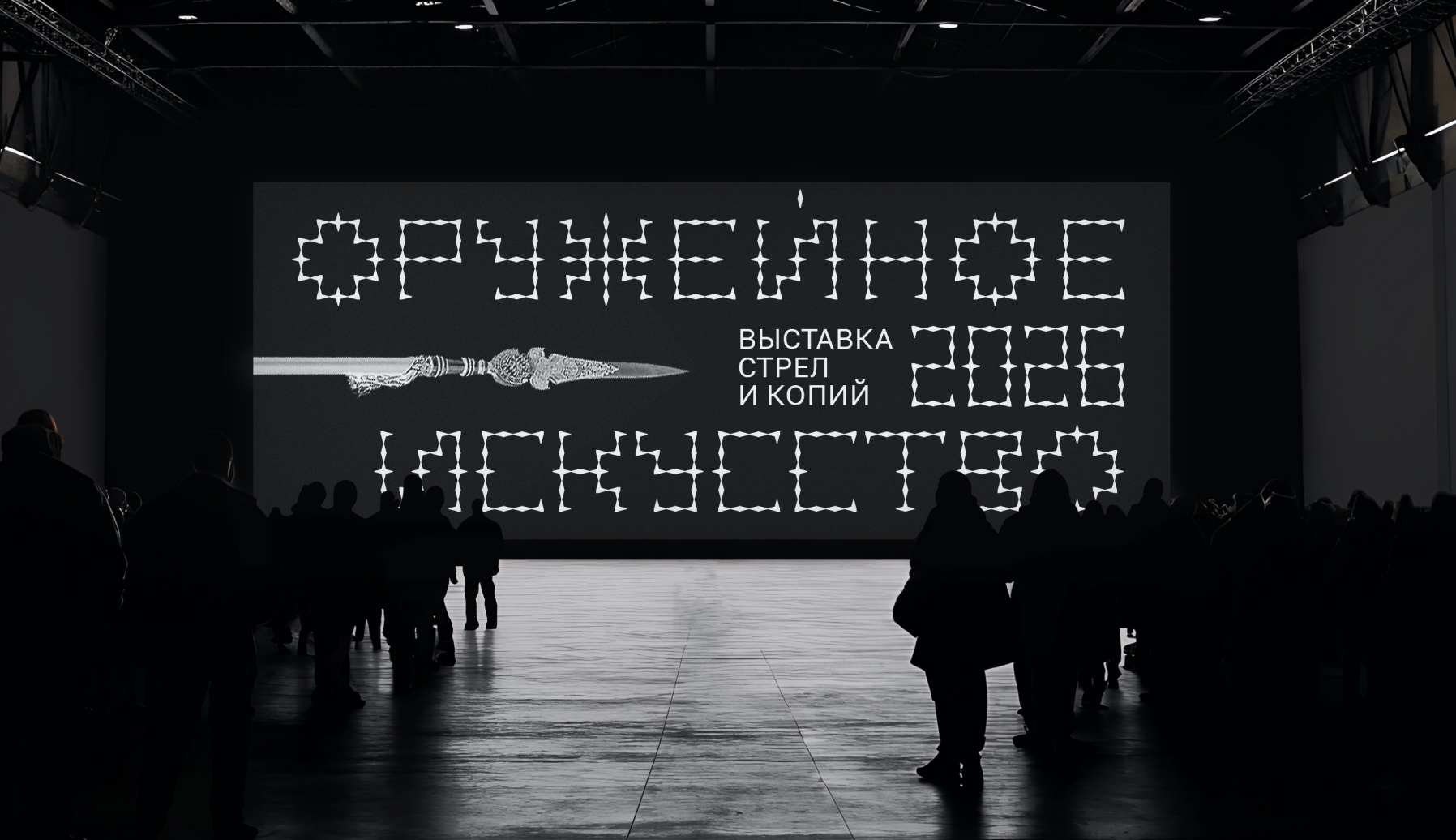
Distant Weapons is a fictional contemporary exhibition dedicated to the art and design of weapons created for long-range engagement. The project focuses on the aesthetic evolution, craftsmanship, and functional design of these objects, from historical artifacts to contemporary iterations.
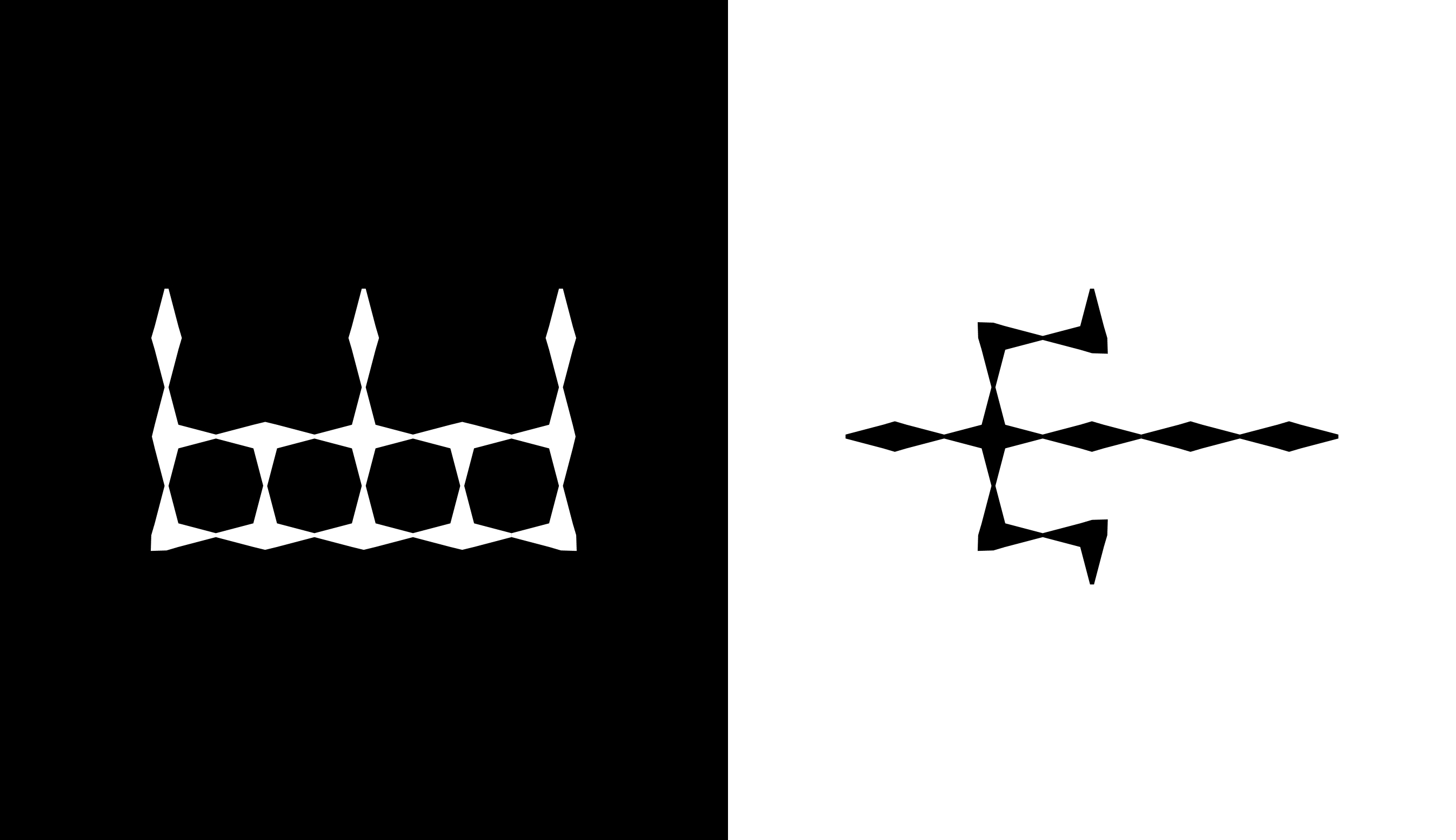
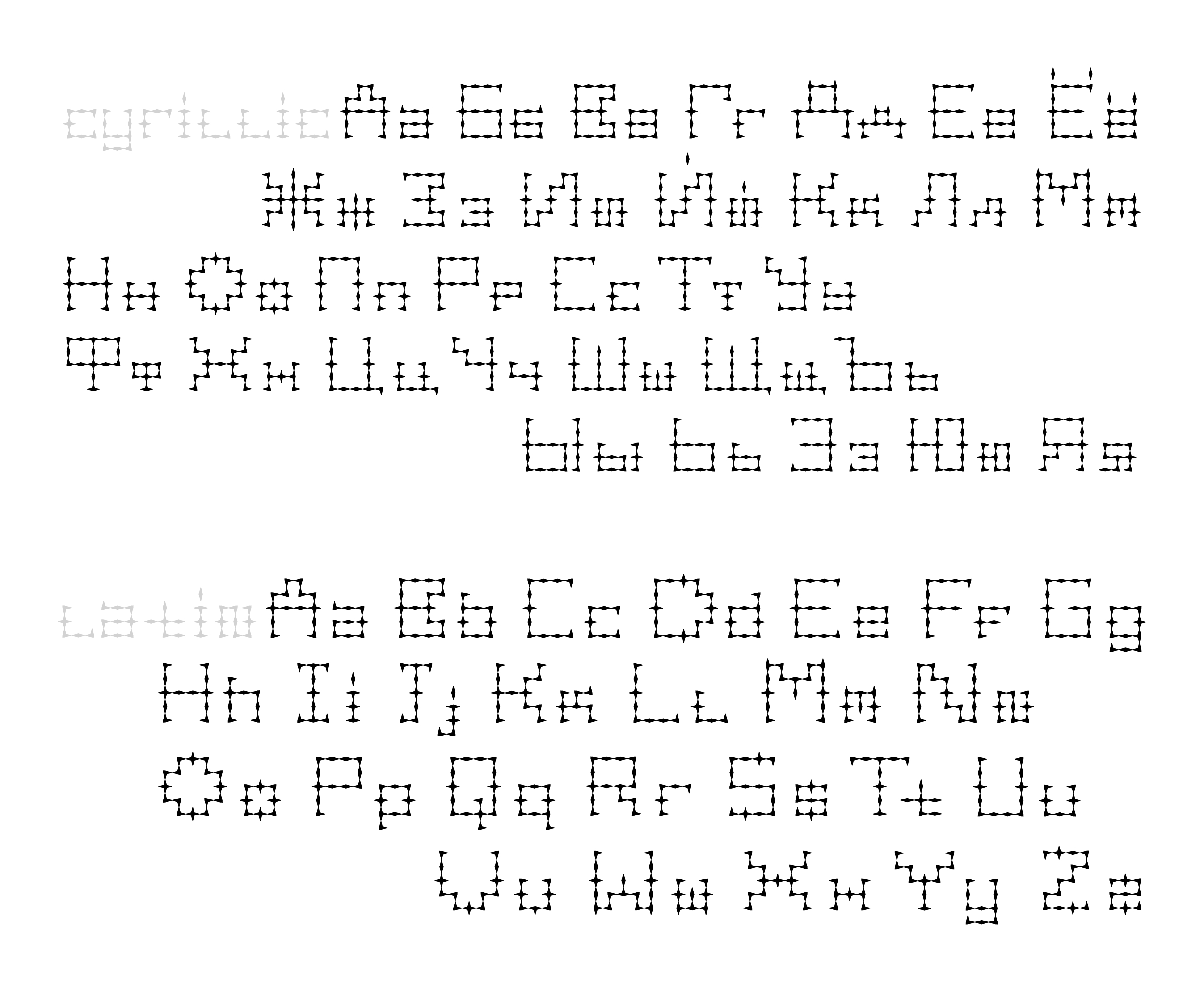
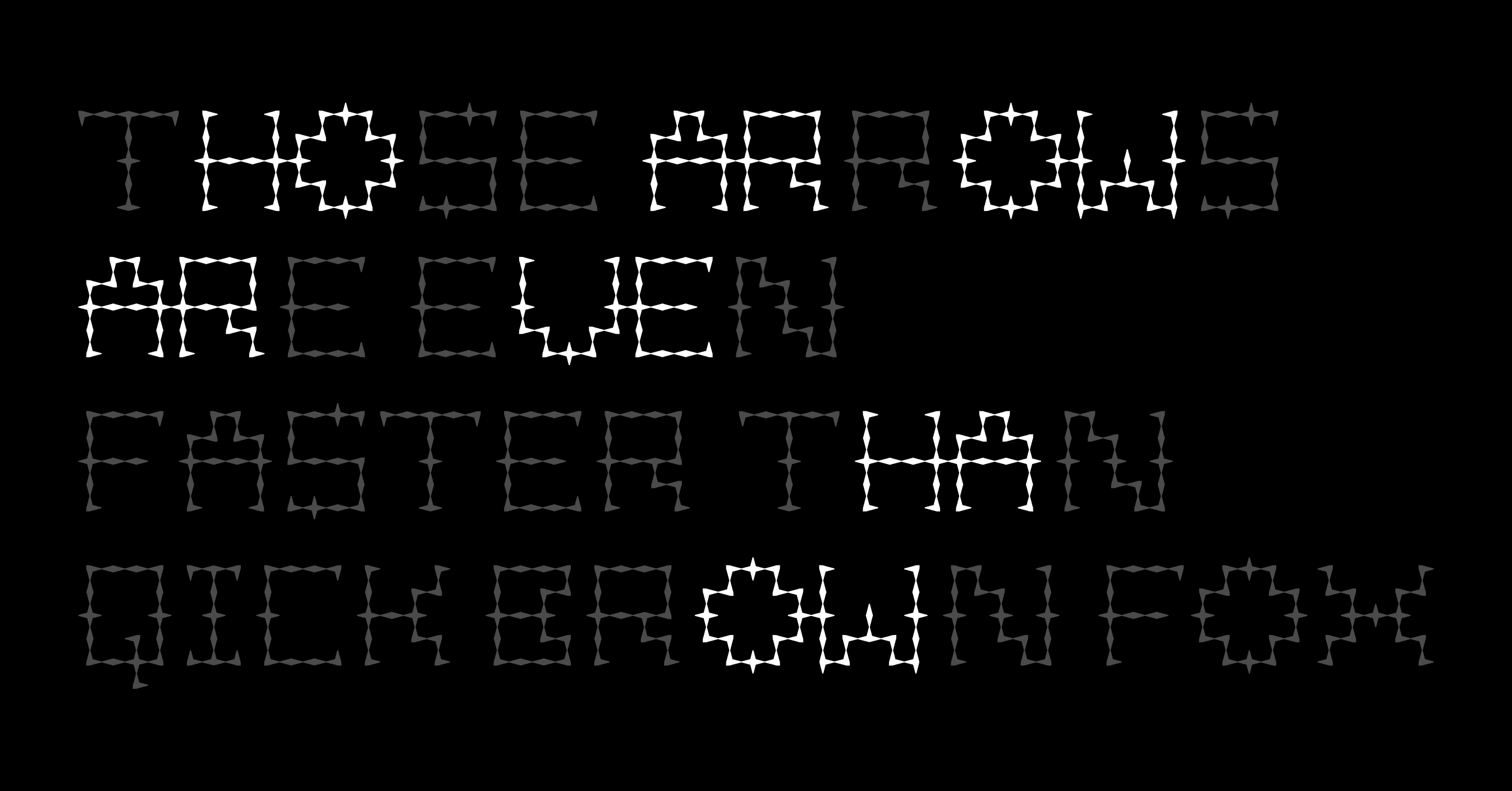
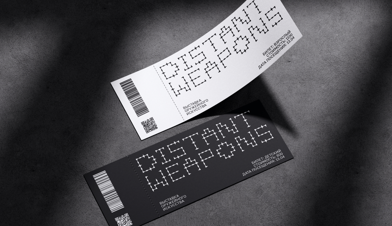
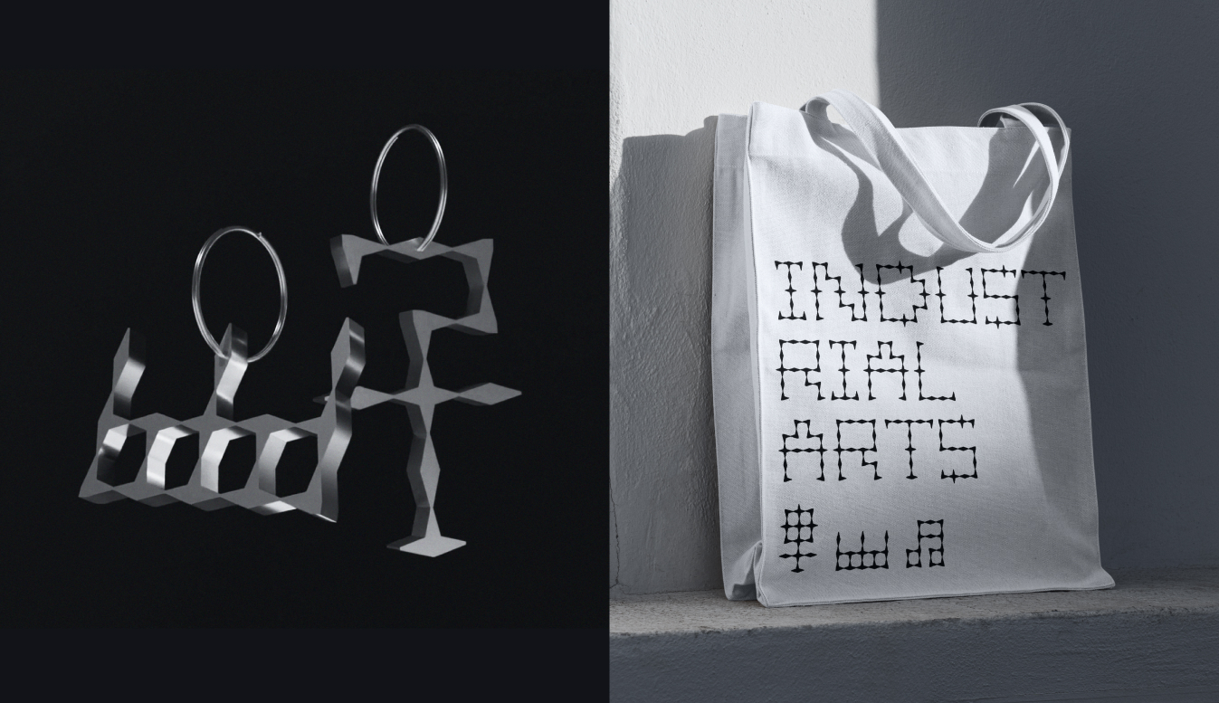
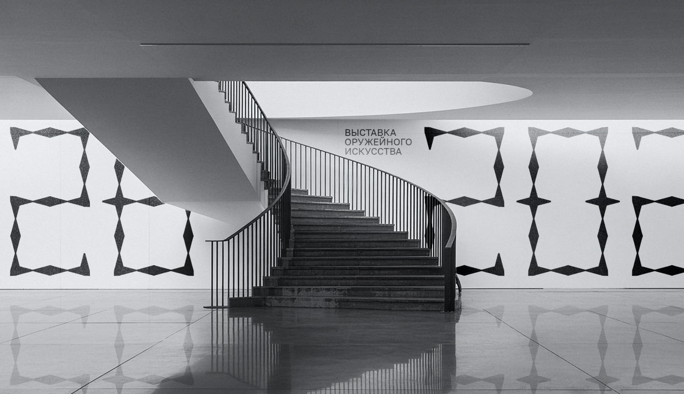
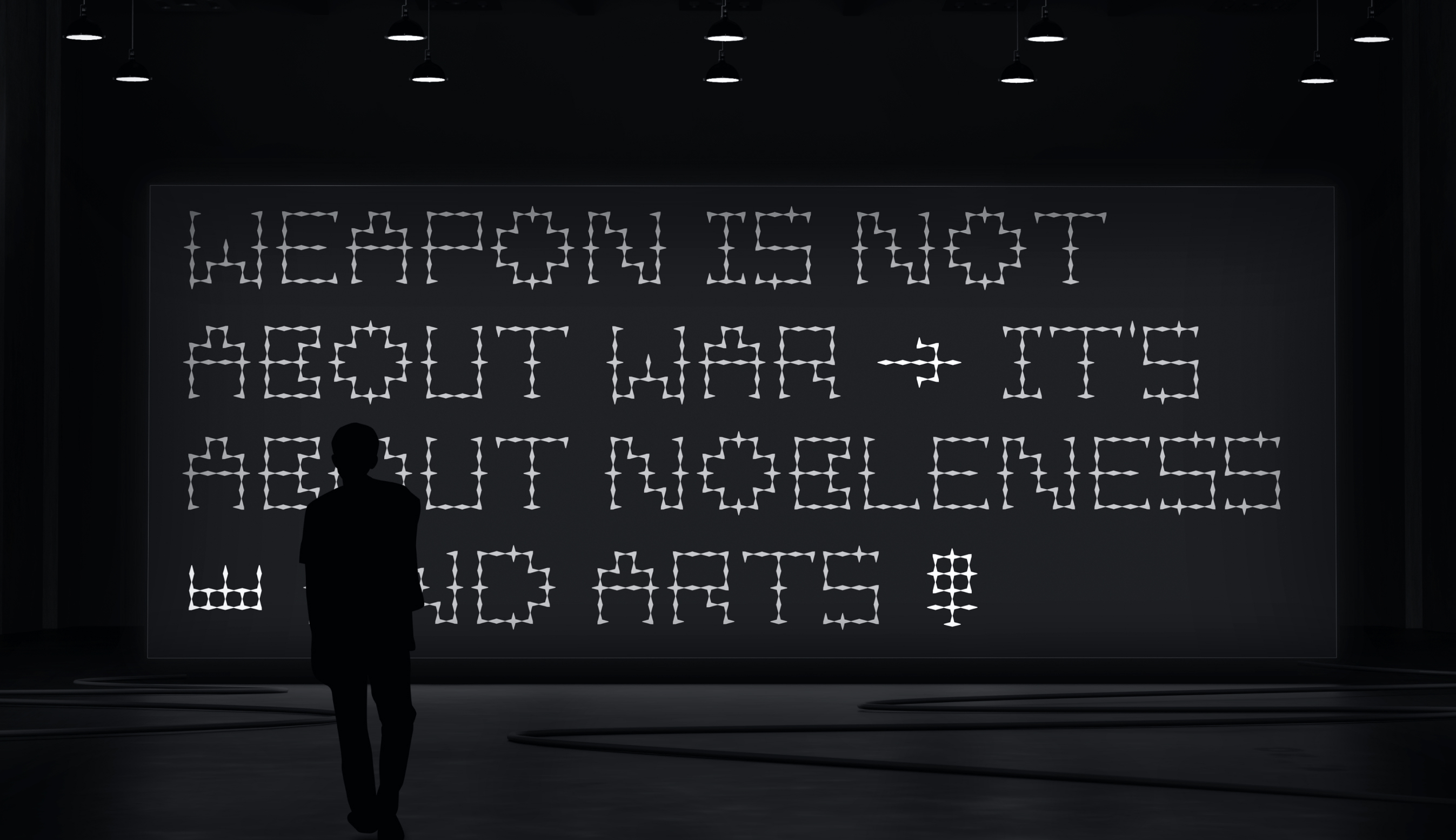
The exhibition’s visual identity is built upon Spear Serif, a bespoke modular typeface designed for the project. Its forms are a direct synthesis of two key principles: rough, industrial cuts and a refined, forged elegance. This duality is a deliberate visual reference to the core artifacts of the exhibition—arrowheads and spears—where lethal utility converges with striking beauty.
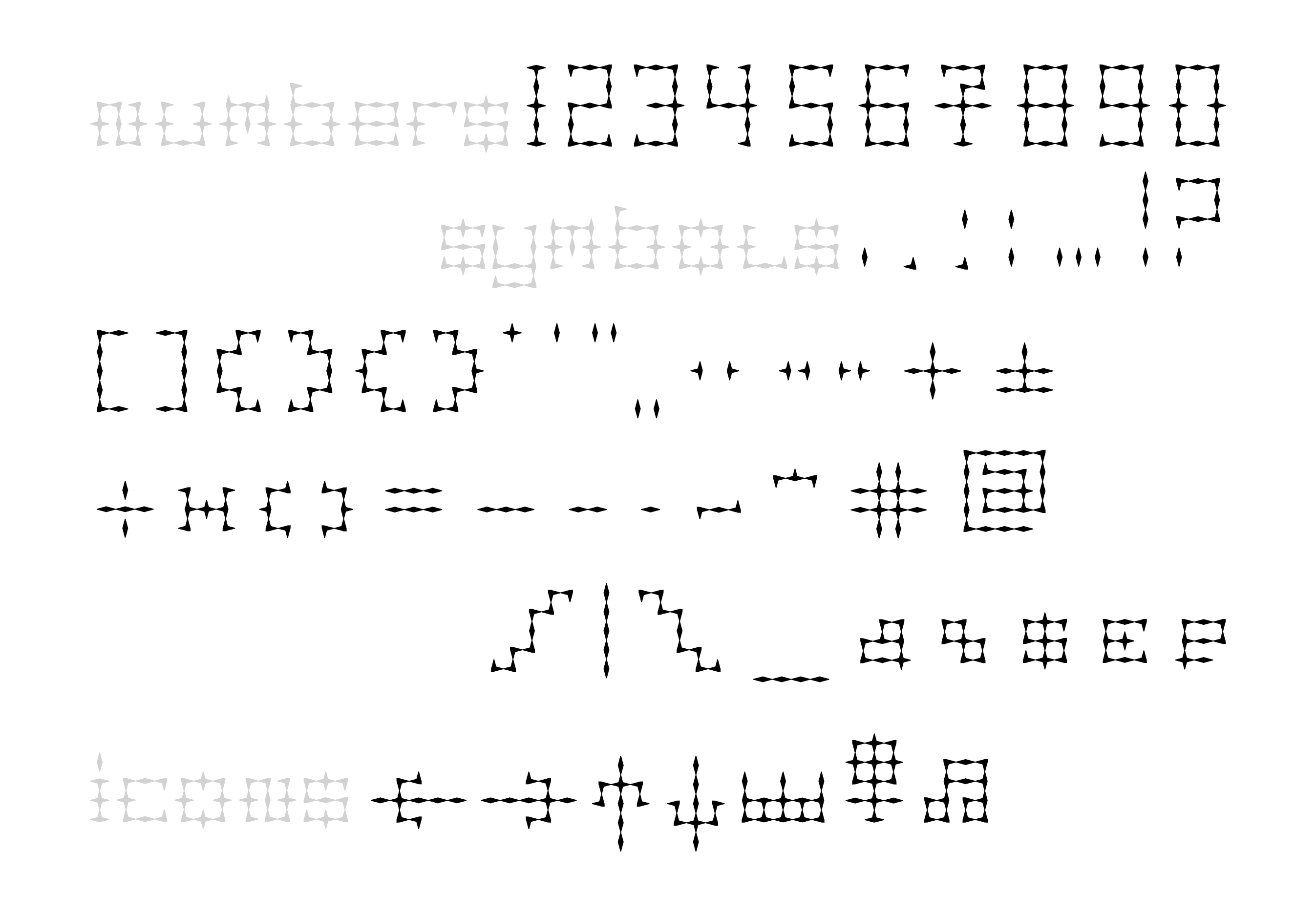
Spear Serif is a fully realized typeface with uppercase and lowercase characters, a comprehensive set of basic symbols, and a suite of stylized icons depicting abstracted weapon forms. To enhance its typographic sophistication and cultural adaptability, it includes a system of ligatures for both Latin and Cyrillic scripts. In these ligatures, glyphs visually interlock by connecting their horizontal serifs, mirroring the precise assembly of weapon parts. This comprehensive typographic system serves as the complete and versatile foundation for the entire exhibition identity.
The identity is applied consistently across all physical and digital touchpoints. In the exhibition space, the typeface dominates environmental graphics, signage, and wayfinding, creating an immersive atmosphere. For print, it structures the exhibition catalog and promotional materials, with ligatures providing unique typographic texture. Digitally, it powers the website and interactive displays, ensuring a cohesive narrative. The abstracted weapon icons serve as a flexible pictographic language for navigation and thematic emphasis. By strictly adhering to this single, robust system, the identity achieves a powerful and memorable cohesion, where every visual element is a direct expression of the exhibition’s core theme.
CREDIT
- Agency/Creative: Ekaterina Tupchienko
- Article Title: Branding for the Distant Weapons Exhibition by Student Ekaterina Tupchienko
- Organisation/Entity: Student
- Project Type: Typography
- Project Status: Published
- Agency/Creative Country: Russia
- Agency/Creative City: Moscow
- Market Region: Europe
- Project Deliverables: Typography
- Industry: Information
- Keywords: Spear Weapons Art
-
Credits:
Creator: Ekaterina Tupchienko
Educational Institution: HSE Art and Design School


