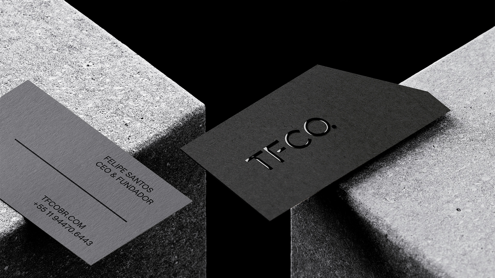
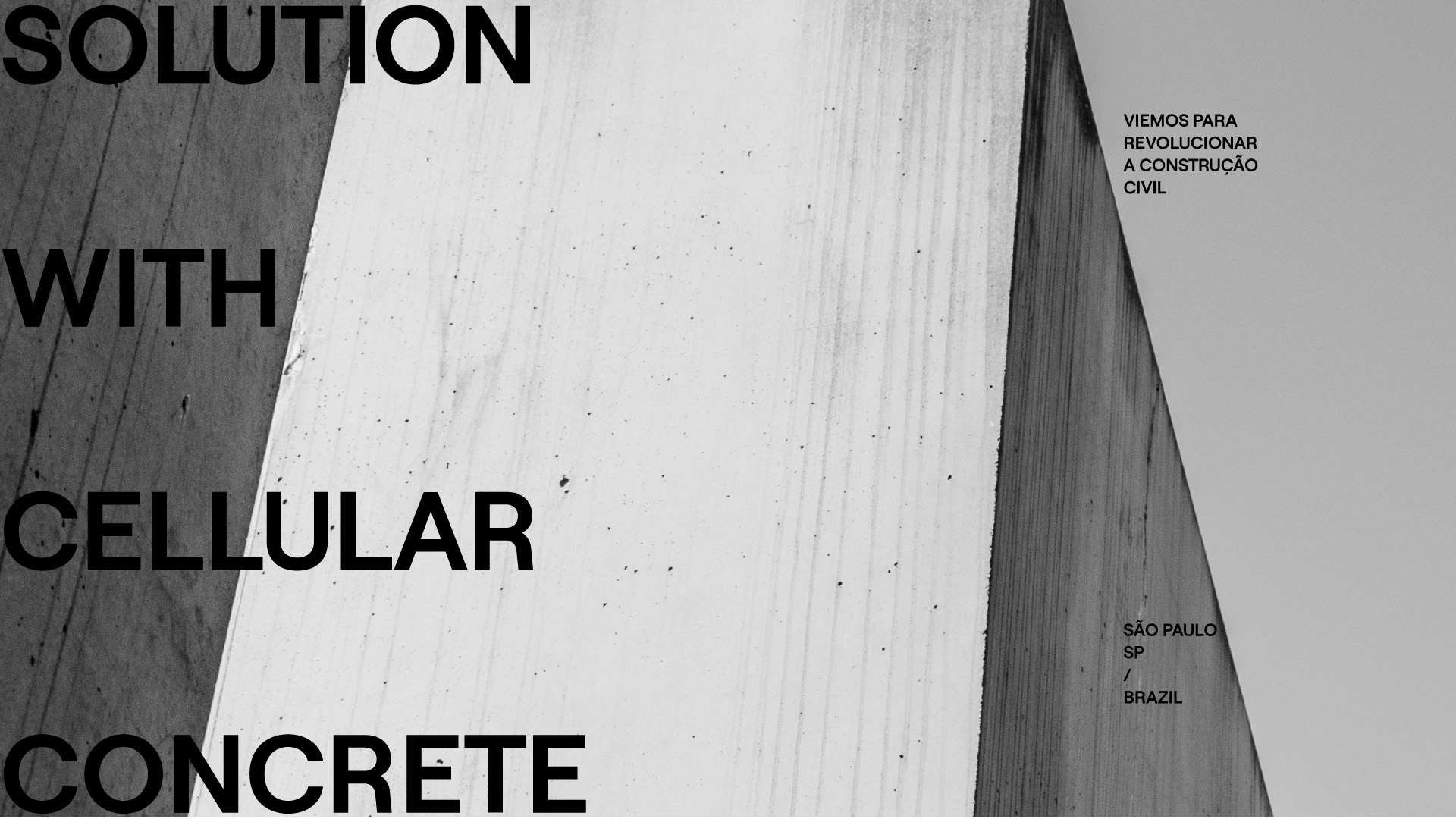
TFCO. is a company of the Nivelle Brasil group that was born to reinvent the foamy cellular concrete market.
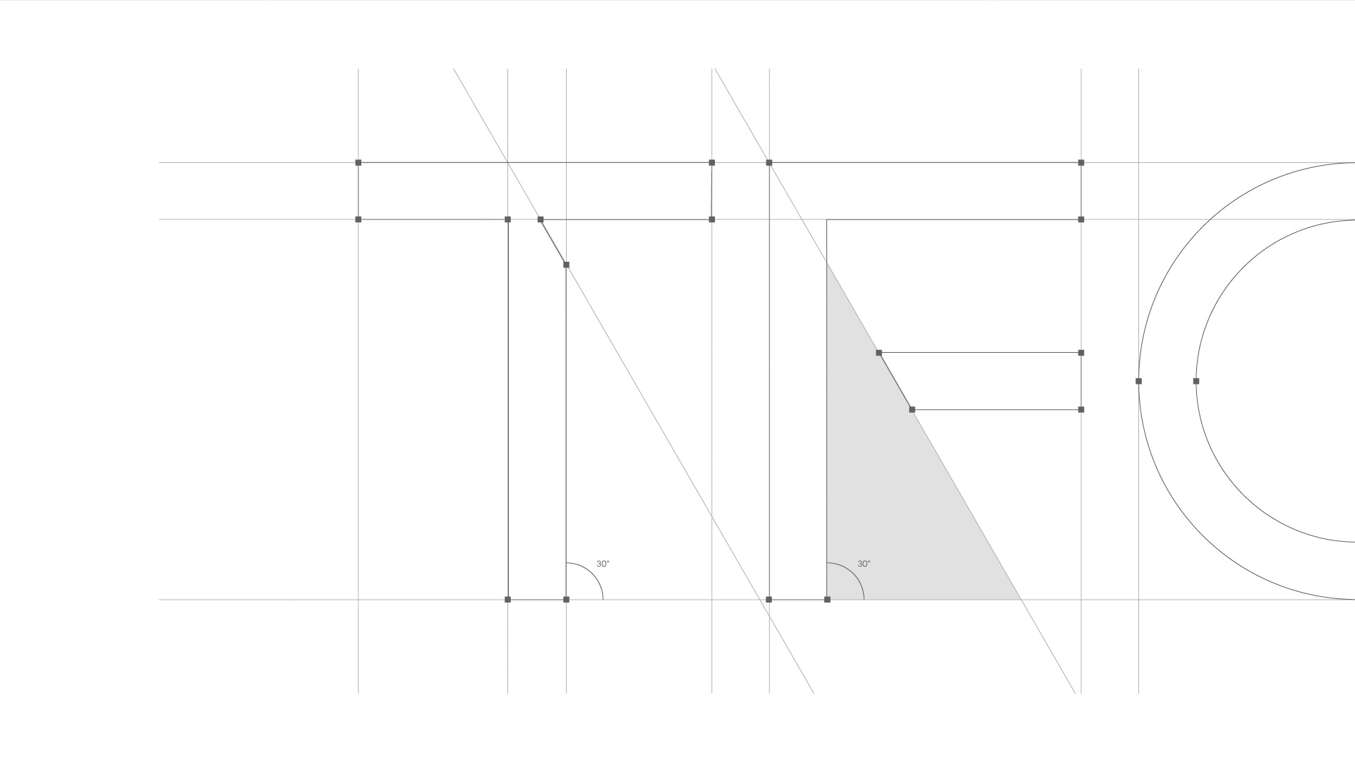
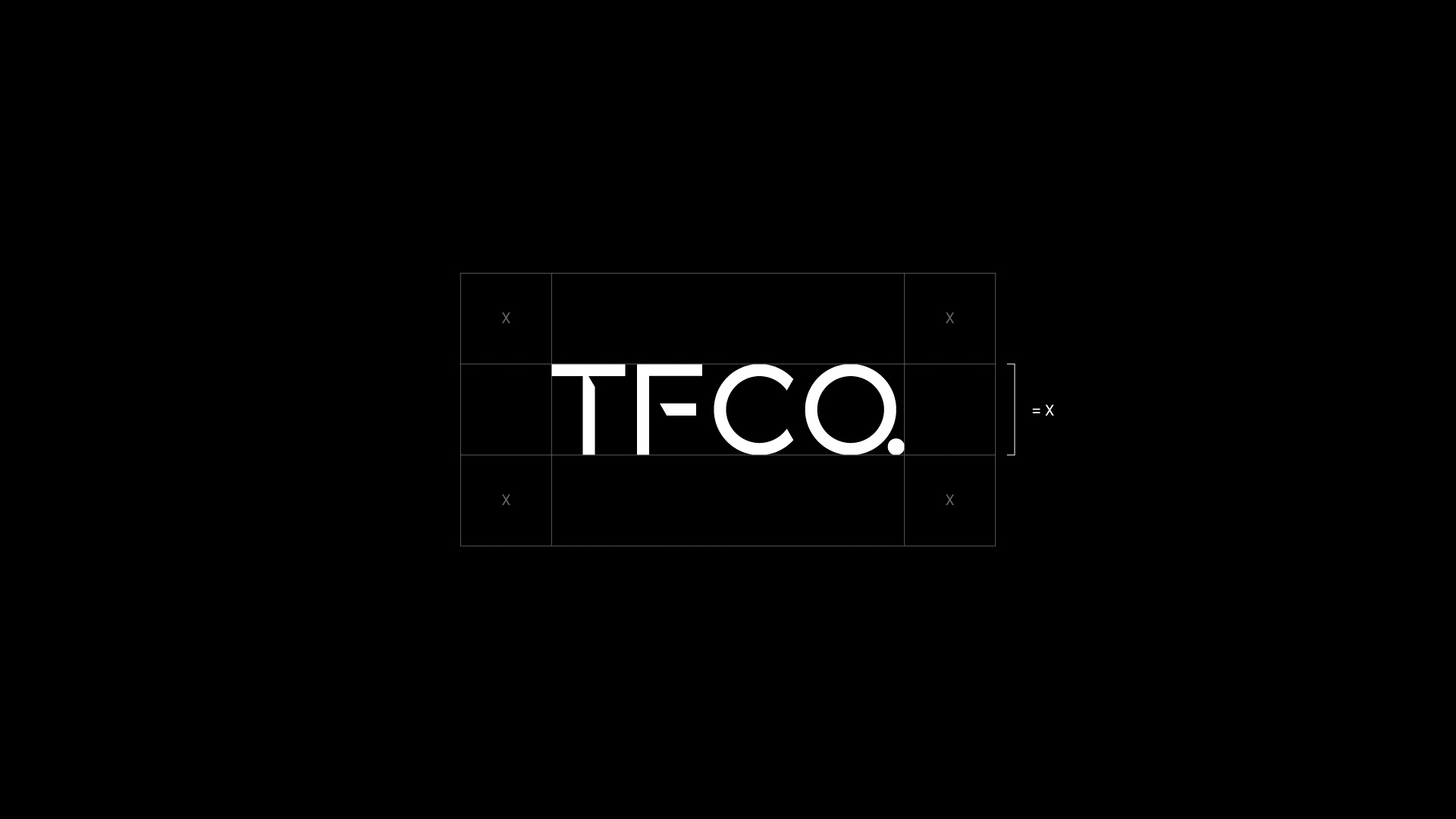
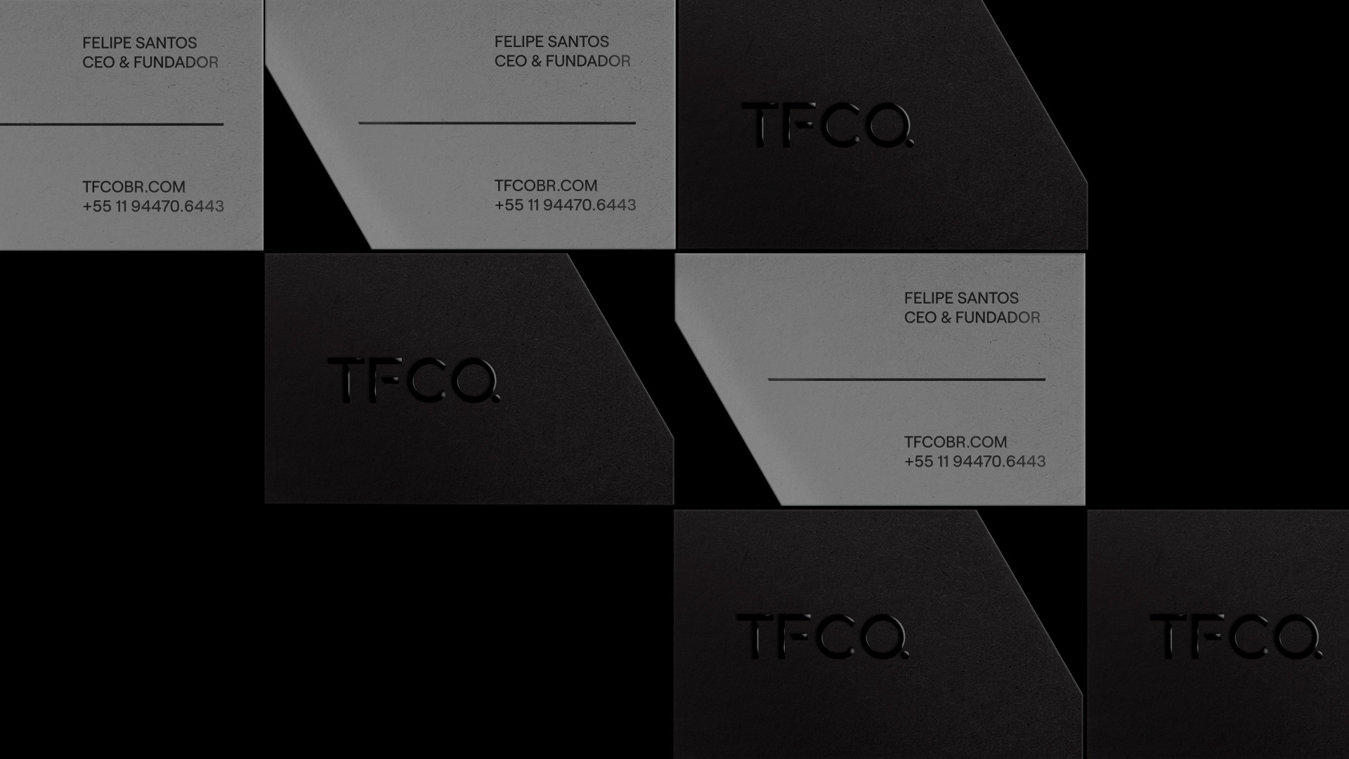
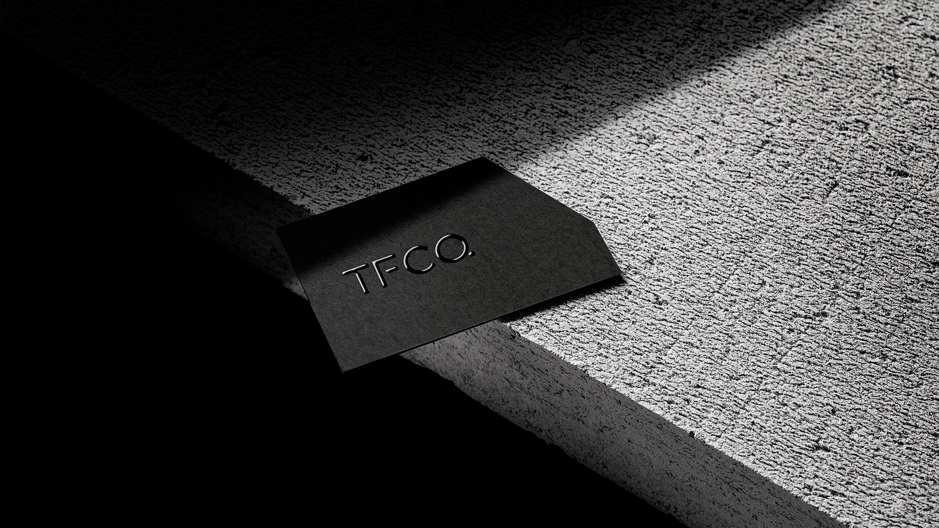
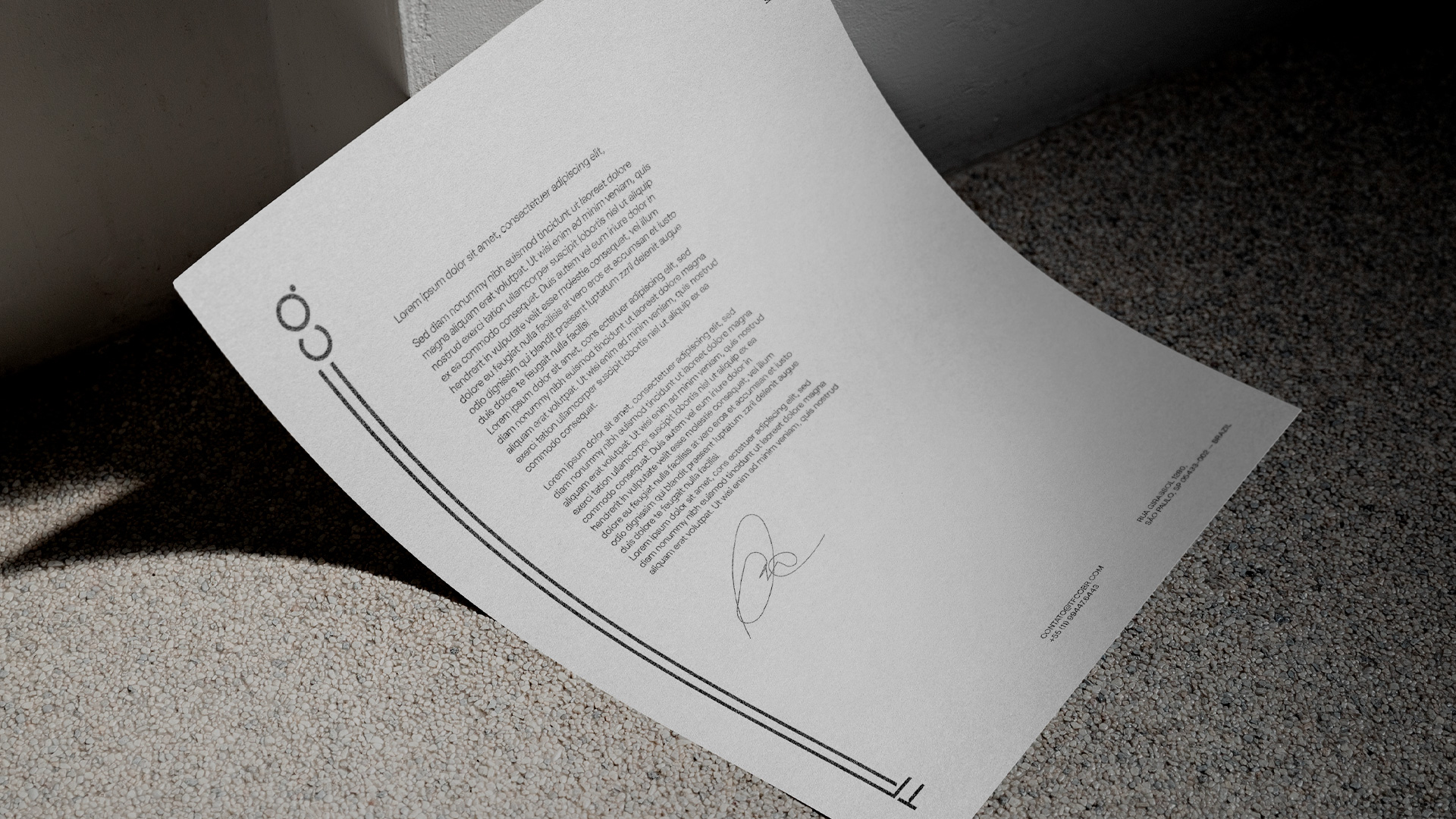
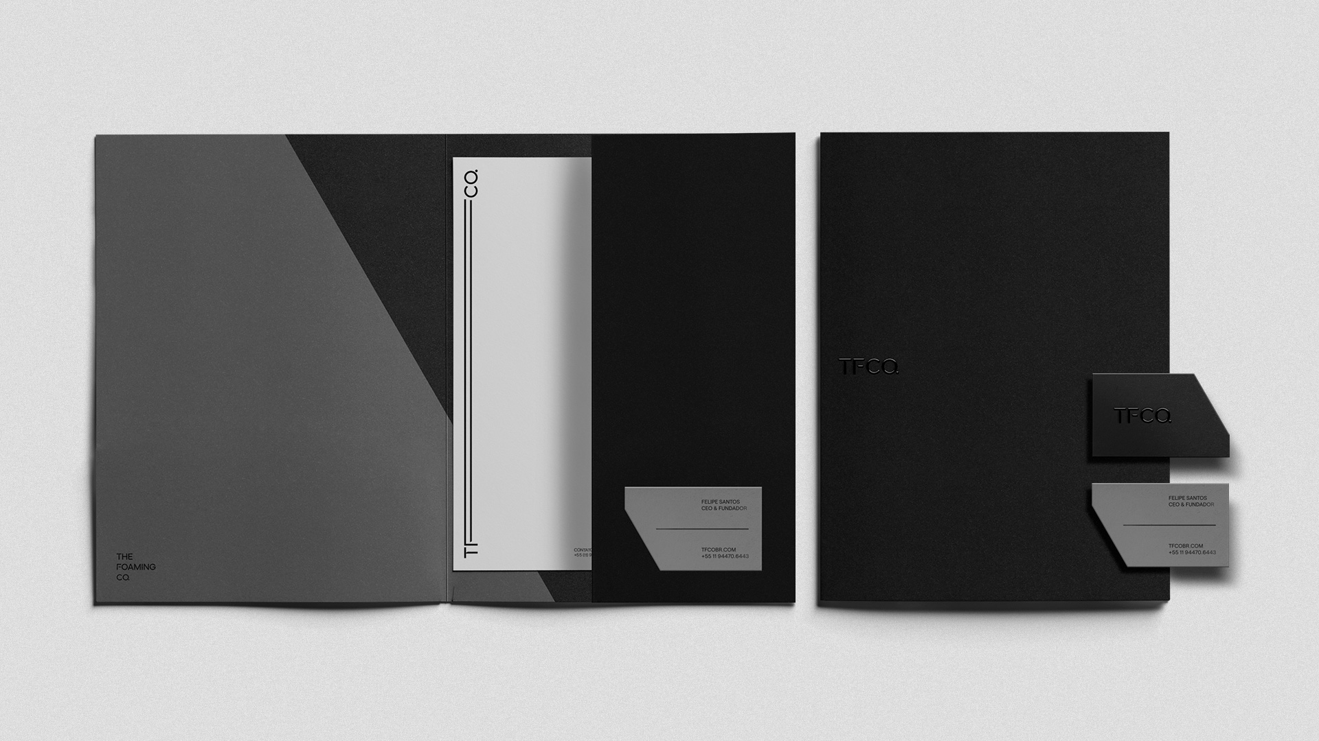
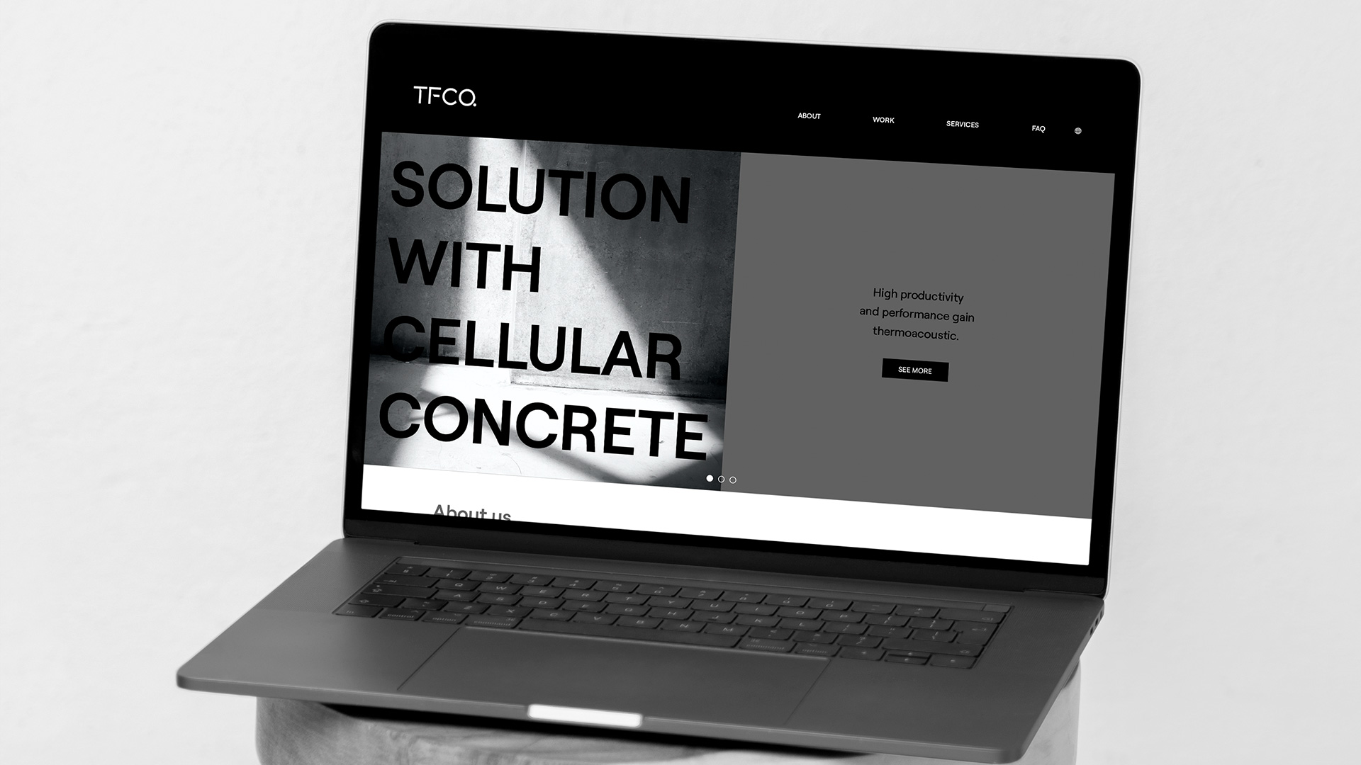
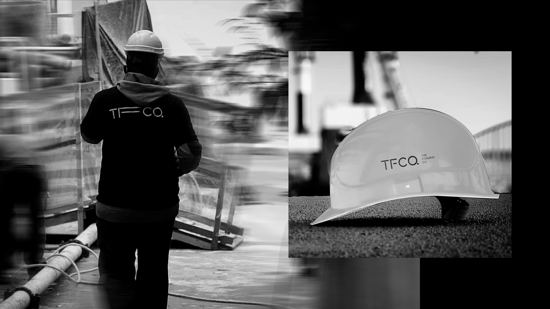
TFCO. (The Foaming Co.) developed a self-levelling foamed cellular concrete, an extremely useful solution in the modernization of the Civil Construction sector, ensuring efficiency in the final result of flatness, leveling and adherence, in addition to optimizing construction time and cost. The visual identity developed for TFCO has solid forms with a notch in the 30º angle, giving personality and originality to the brand. The notch symbolizes the shadow projected by the constructions, the stretched letter F, symbolizes the process of applying the cellular concrete to the surface.
Through this combination of colour, type, design, and language, Ted Oliver has created a refreshing brand identity which, while simple, has depth, character, and authenticity. It is clean and calm, but also strong and confident, making it feel more accessible than much of its industry.
CREDIT
- Agency/Creative: Ted Oliver
- Article Title: Branding for TFCO. Created by Ted Oliver
- Organisation/Entity: Agency
- Project Type: Identity
- Project Status: Published
- Agency/Creative Country: Brazil
- Agency/Creative City: São Paulo
- Market Region: South America
- Project Deliverables: Advertising, Art Direction, Brand Design, Branding, Creative Direction, Design, Graphic Design
- Industry: Construction
- Keywords: branding, logo, art direction, brand design, graphic design, concrete, construction
-
Credits:
Creation Director:: Ted Oliver
Video/Photography:: Tristian Pae
Translation:: Clarice Carvalho


