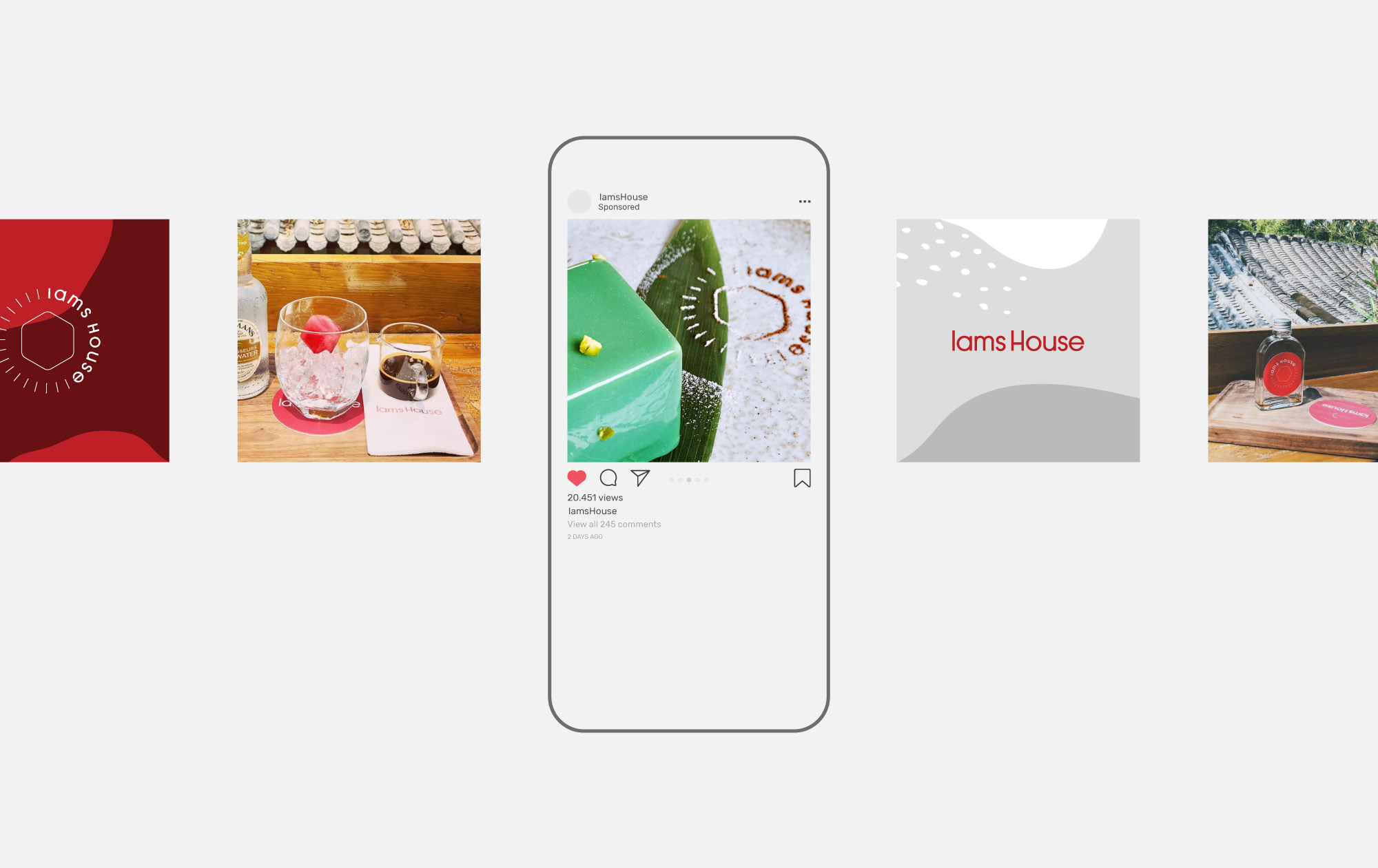
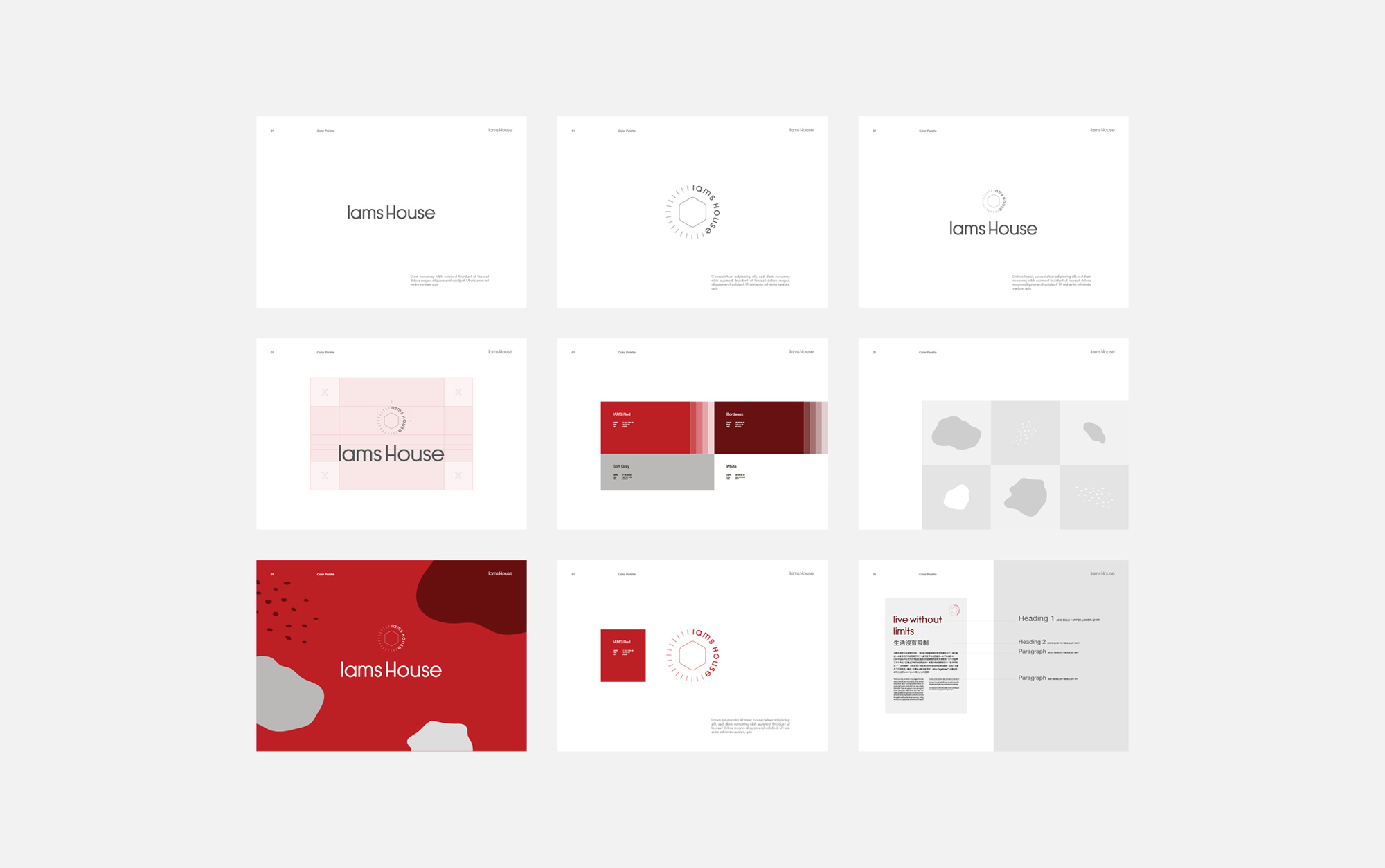
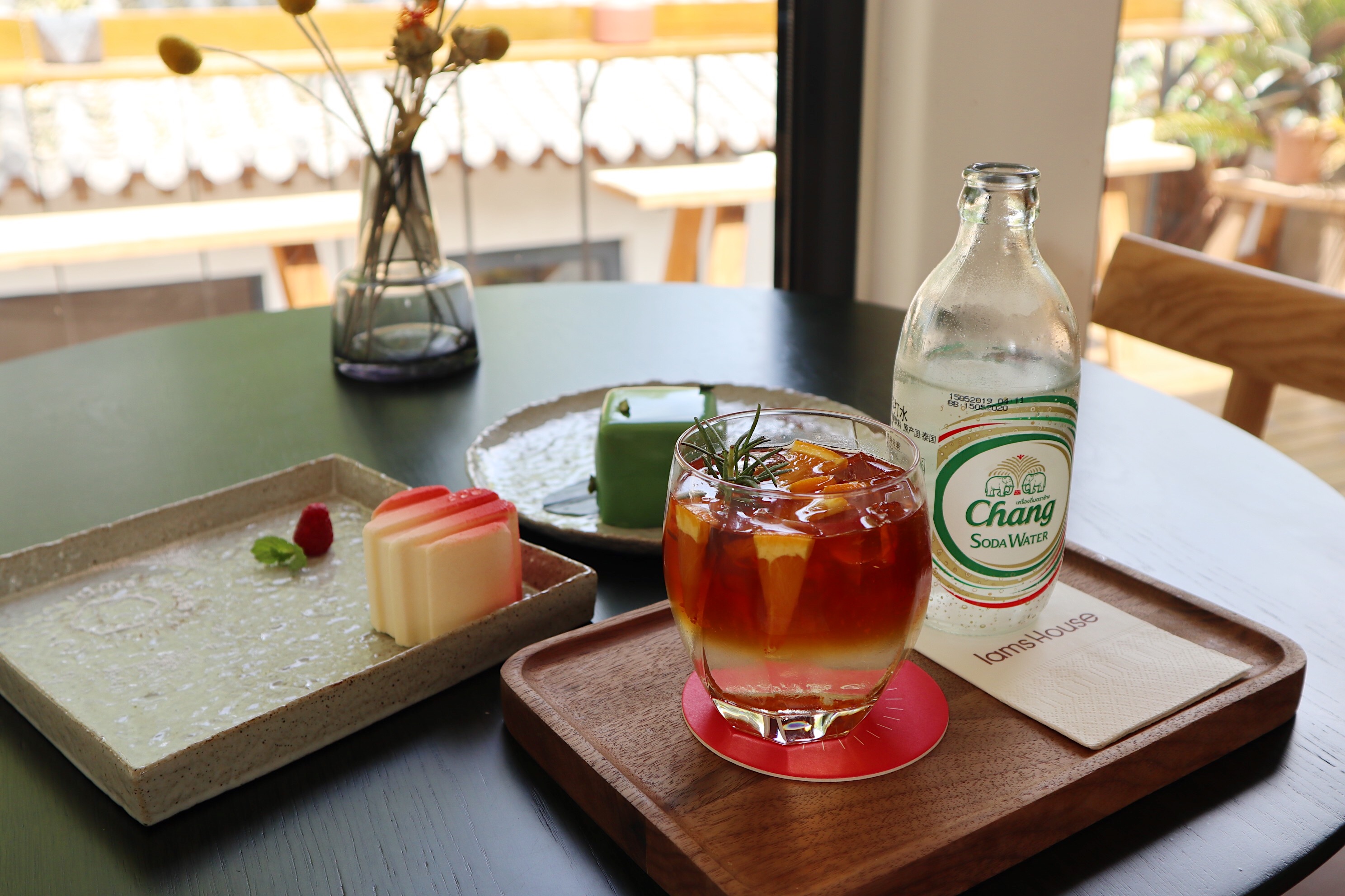
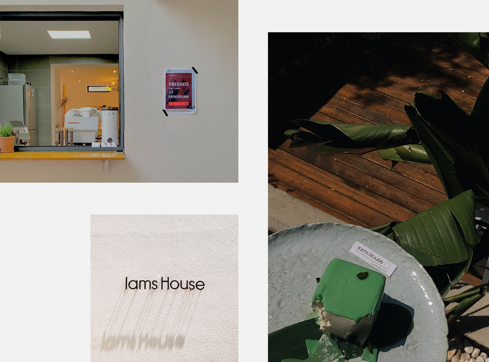
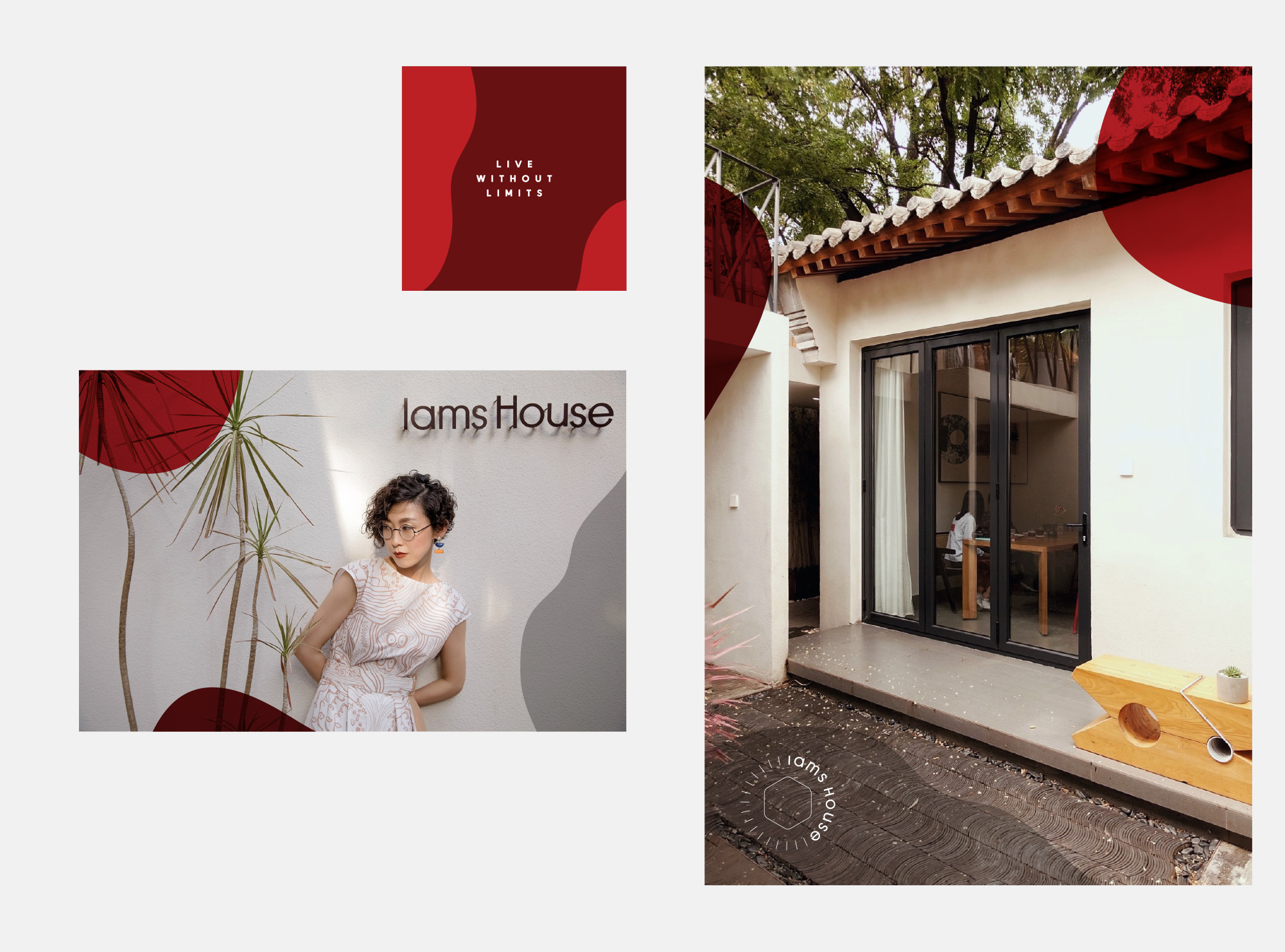
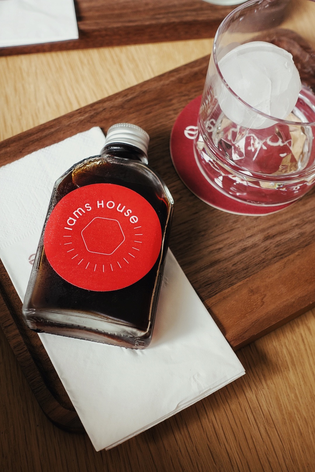
We used red and white in this project. We wanted a minimal and clean result. We combined modern typography and organic patterns. Thus, we achieved a minimalist result. We have created a libertarian and simple identity for this area where people feel comfortable and free.
CREDIT
- Agency/Creative: Marka Network Branding Agency
- Article Title: Branding for Lams House
- Organisation/Entity: Agency, Published Commercial Design
- Project Type: Identity
- Agency/Creative Country: Turkey
- Market Region: Asia
- Project Deliverables: Brand Identity, Brand Naming, Branding, Identity System, Illustration, Packaging Design
- Industry: Entertainment
- Keywords: branding, packaging
FEEDBACK
Relevance: Solution/idea in relation to brand, product or service
Implementation: Attention, detailing and finishing of final solution
Presentation: Text, visualisation and quality of the presentation


