


Lamon House approached us to create a brand identity that matched the planned experience of their resort programme in Hoa Binh City. This is the approved concept, not final work. A project far from perfect, conceived on a very simple intuition in a limited time, but which deserved to be presented here on Facebook.
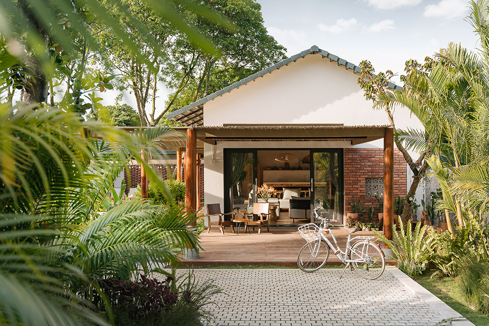
Lamon House has been loved by guests for its tranquil Vietnam traditional atmosphere and authentic Vietnam-style cuisine. Beautifully designed in 2022 by architects Inhouse Design Studio, Lamon House is now reborn. We constructed the logo, logo guidelines, and various graphic designs for Lamon House.
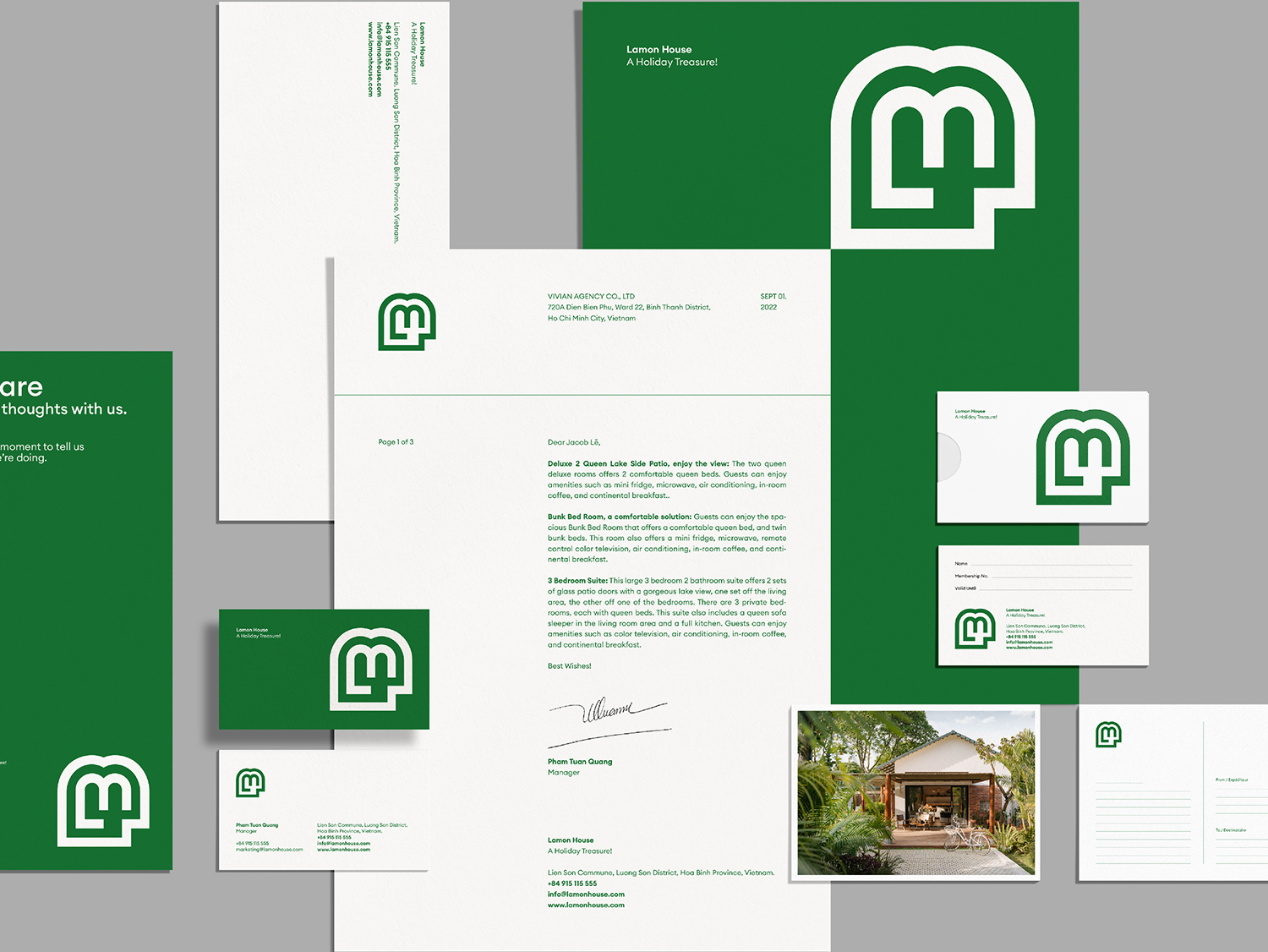
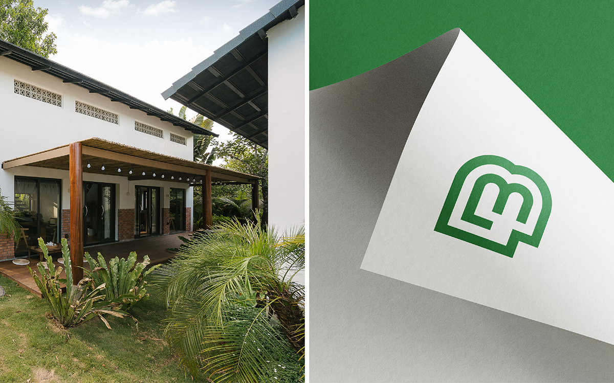
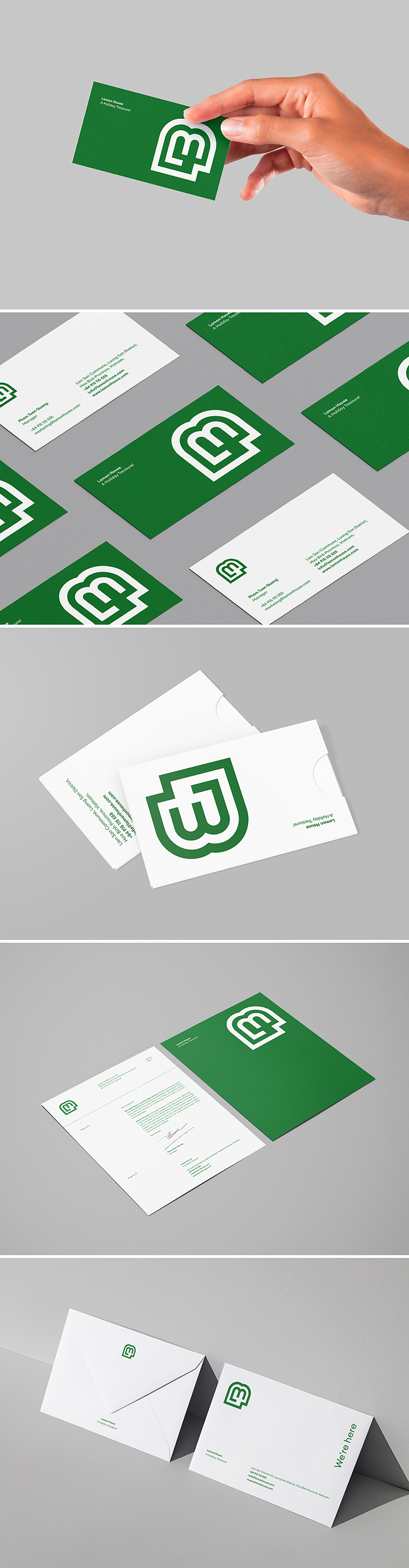
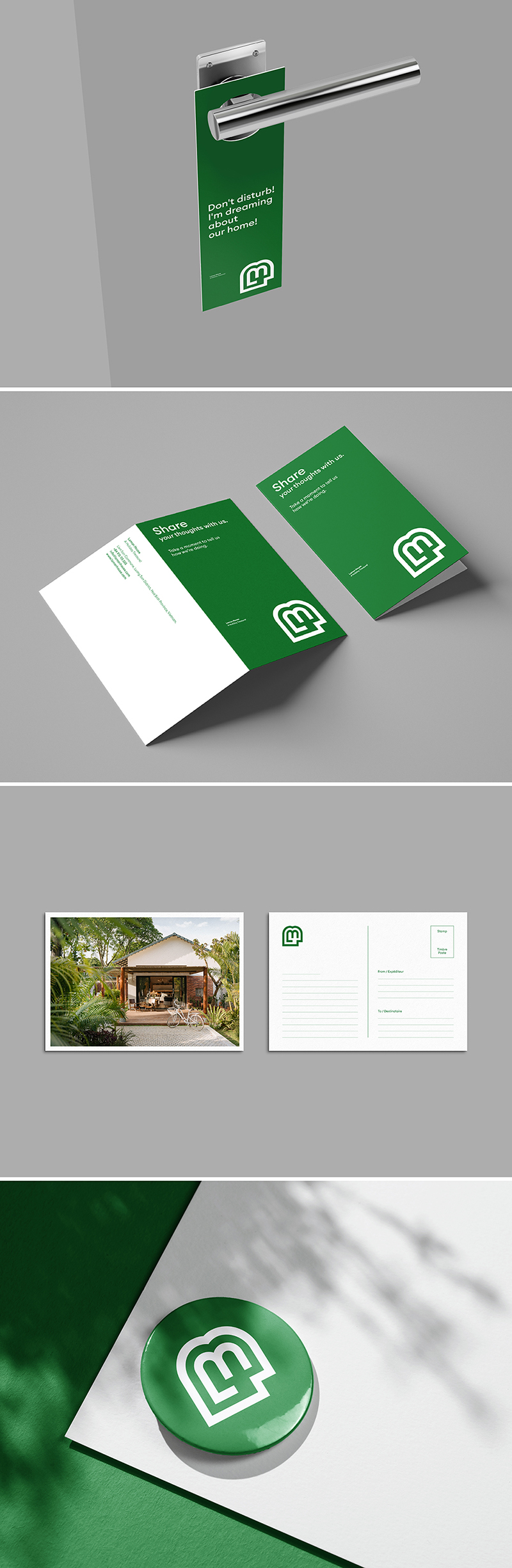
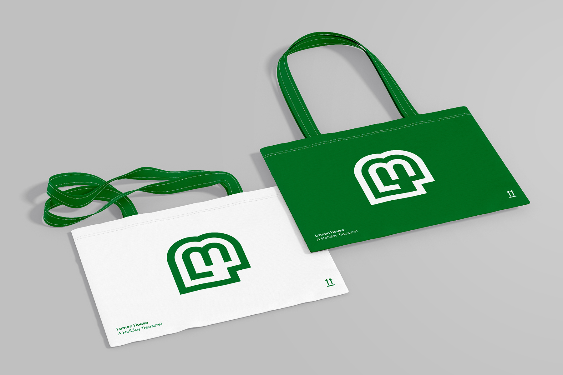
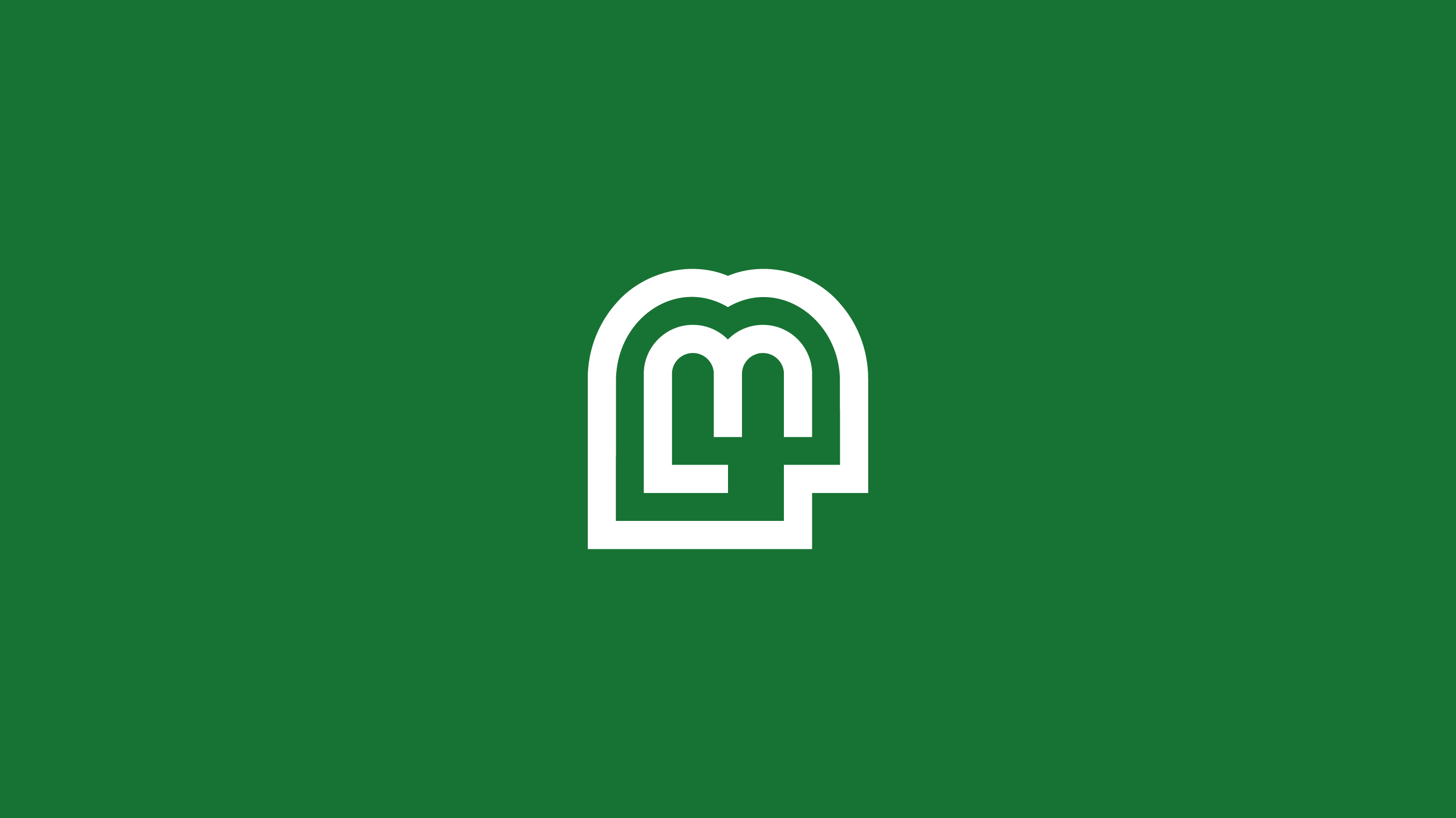
The new identity consisted of logotype, brand marque and supporting print materials. Key to the identity was the concept of ‘connection Green trees’. This is highlighted with the name itself, but also in the subtle element within the ‘LM” of the logotype. Sustainable papers and high-end finishes were combined to create tactile print materials that complemented the resort environment, including brochure, business cards and stationery.
Minimalist, sophisticated and contemporary. A resort that has design in its name and in every detail.
Pool lounging, endless cocktails, seafood dinners, peaceful, are a few of the common images that come to mind when you picture the perfect group and family vacation. With exceptional experiences and the finest services, Lamon House Resort could be exactly what you need during your next beachfront getaway.
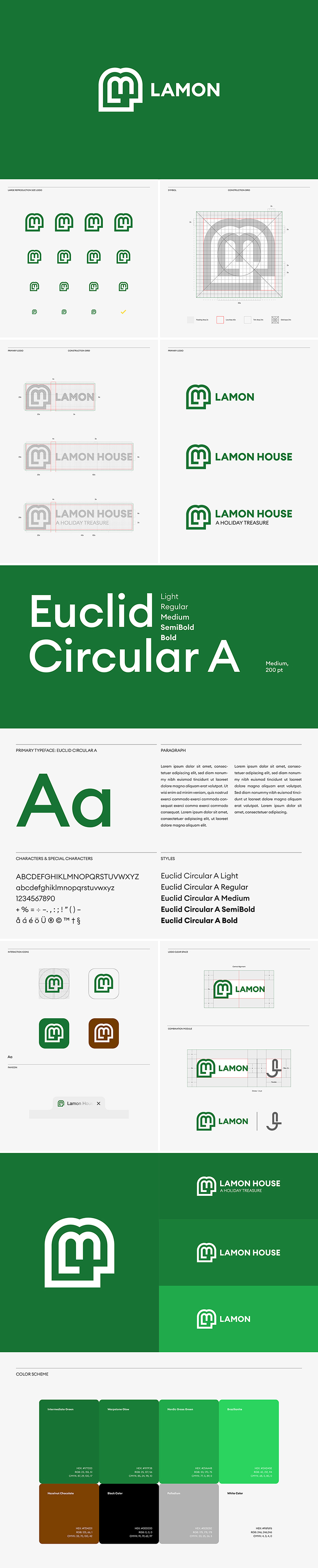
A simplified and modernized emblem.
We have chosen simplicity and modernity to set up a graphic design more adapted to digital and print, a sign that synthesizes the two monograms of the letter “L” and “M”. Geometric rigor is matched by the freedom of curves. Therefore the logotype becomes more functional and easier to use in small sizes.
A custom typography, the Euclid Circular A typeface.
This typography used for the whole communication is an inhouse font creation, which is used across all communication media, completes and widely disseminates the visual identity.
Euclid Circular A – Designed by Swiss Typefaces.
We created brand guidelines that include a strategic use of the color palette. The main brand color, Propulsion green is the central color of the identity.
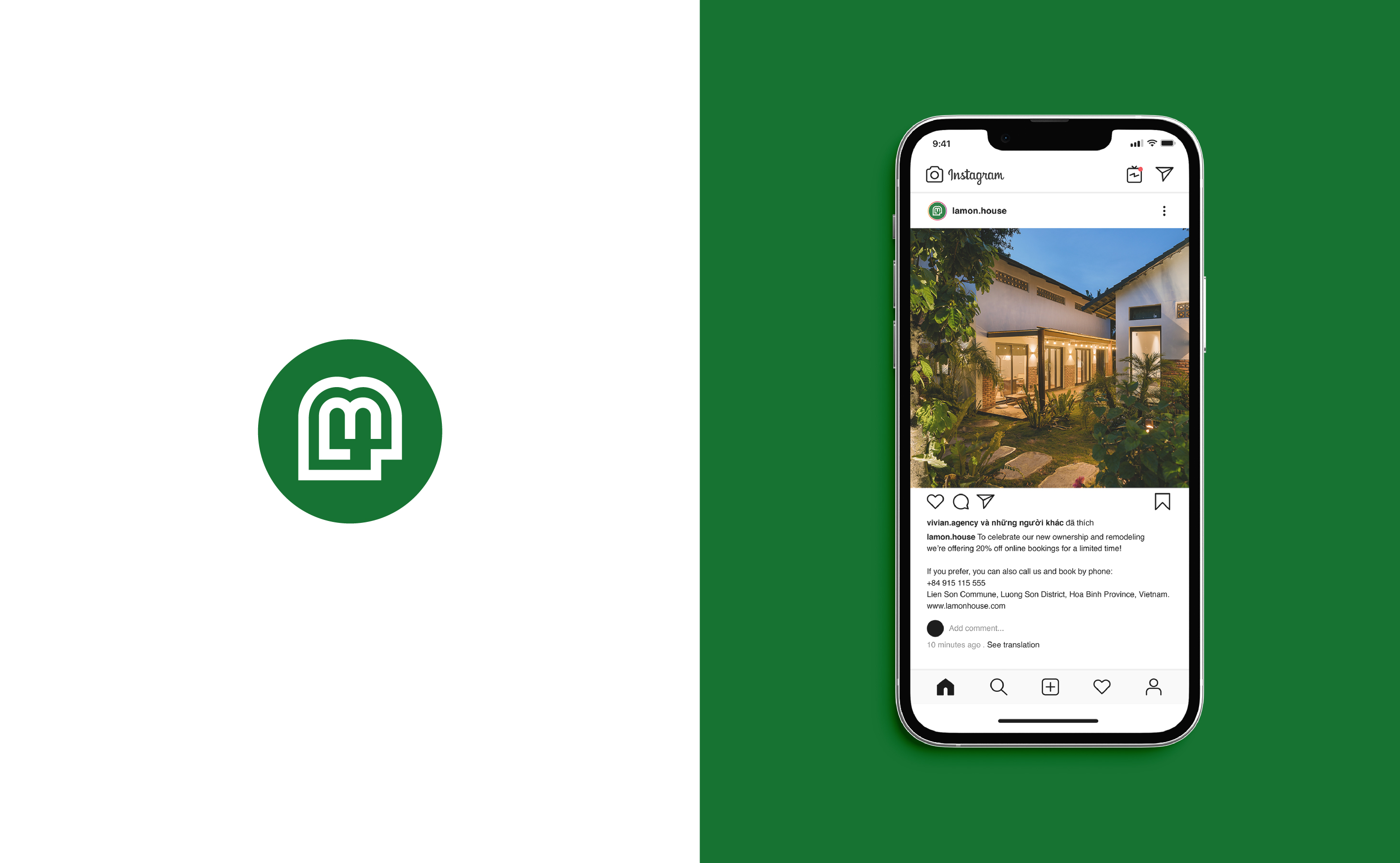
The identity now consists of an icon that can be dissociated from its wordmark and allows communication based on the emblem. One of the interests of this logo is that it is impactful enough to include images. It then becomes the central element of the graphic charter. All that remains is to play with shapes, images and colors.
Lamon House new graphic system has been designed to fit all formats, all available colours and to be very easy to use.
The system can be used for both print and digital, making it very easy to use.

CREDIT
- Agency/Creative: Vivian Agency
- Article Title: Branding for Lamon House
- Organisation/Entity: Agency
- Project Type: Identity
- Project Status: Published
- Agency/Creative Country: Vietnam
- Agency/Creative City: Ho Chi Minh City
- Market Region: Asia
- Project Deliverables: 2D Design, Art Direction, Brand Design, Brand Guidelines, Brand Identity, Brand Mark, Brand Redesign, Branding, Graphic Design
- Industry: Hospitality
- Keywords: resort
-
Credits:
Founder / Art Direction & Design: Jacob Lē


