


The Italian designer Bob Liuzzo has recently presented the brand restyling project and the new visual identity of the Italian Cultural & Community Center of Houston, Texas, known with the acronym of ICCC Houston.
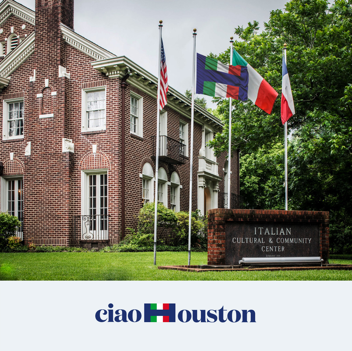
The Center was founded in 1976, thanks to the coordination of the activities of over 20 Italian clubs operating in the Houston metropolitan area. In 1982 the ICCC Houston, obtained the recognition as a non-profit cultural organization. In 1984 it purchased the historic Milford House, located in the Museum District of Houston. Milford House became the headquarters of the center, welcoming the large and varied Italian-American community and anyone interested in studying and deepening the language and the culture of the “Belpaese”.
An organization like ICCC Houston, explains Liuzzo, not only needs a purely commercial brand or brand identity but also a symbolism that can really foster the cohesion of its community, based on varied but easily recognizable values. These are the values that the Italian spirit also generates abroad, welcoming and allowing itself to be welcomed by local cultural needs.
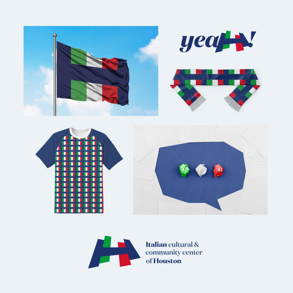
In this direction, the makeover was designed to be a “flag”, even before the logo. In fact, the flag wraps around more than one logo and has the potential to become a highly shareable tool. Waving can actually create cohesion in a community. It turns into a sticker, banner or cloak under which different activities coexist but animated by common starting values.
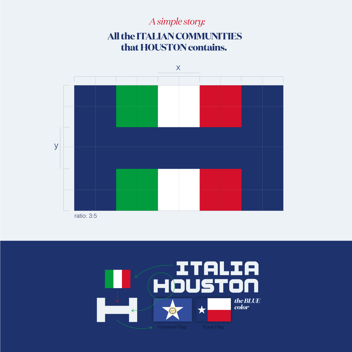
The starting concept of the new ICCC Houston identity has exploited some of the basic rules of the vexillology, at times placing them before the classic ones of brand design. The result was a flag that tells the story of Italian culture in Houston.
BOB Liuzzo is not new to symbolic designs of flags that escape the abstraction of stripes and colors to become perceptive objects with double vision. Known and awarded is its independent symbol for the city of Catania (Sicily) which with simple lines and colors recreates the illusion of the essential elements of the city: Etna, Lava and Sea. Elements from which all the stories of the Catania area originate.
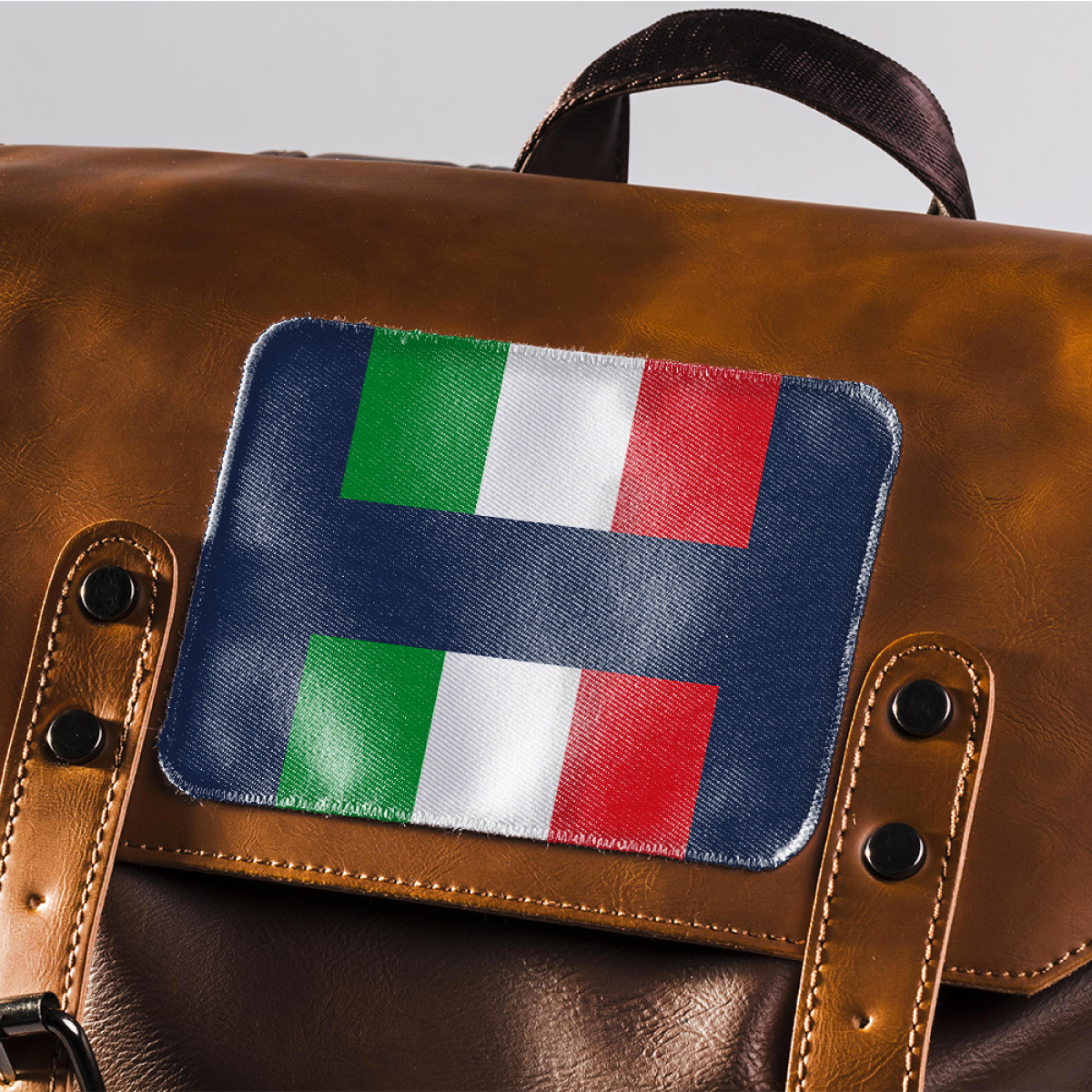
For the Italian Cultural & Community Center of Houston – Liuzzo explains – we started with the Italian flag (Tricolore). Inserted within a system of vertical and horizontal bars that resembles a letter “H”, highly identifying the city of Houston – Texas (There are not many cities in the world that have a letter H as initial). The blue color chosen to accompany and contain the Tricolore is also part of a specific language: it not only institutionalizes the symbol, but is strongly inspired by the flag of the city of Houston and that of the State of Texas.
Usually the rules of vexillology dictate that there is never a textual presence in the design of a flag. In this case, however, the letter appears only at a second glance as it is designed as a chromatic field. The message that the flag-logo conveys is strong and clear: not only to represent the cultural center, but to aspire to identify all that is Italy within Houston or a Houston that “embraces” all the Italy it contains. It is a much broader mission.
“So I started from the flag – explains Bob Liuzzo – to land on the brand that uniquely identifies ICCC Houston. I did this through its construction on a dynamic grid that can encourage more commercial and promotional uses. As a brand it will represent the center and its activities; as a flag, in its “flat” version, it will go beyond the borders and represent the entire community. As if to say: “Where Houston Speaks Italian”.

CREDIT
- Agency/Creative: Bob Liuzzo
- Article Title: Branding for Italian Cultural and Community Center of Houston
- Organisation/Entity: Freelance
- Project Type: Identity
- Project Status: Published
- Agency/Creative Country: Italy
- Agency/Creative City: Milano
- Market Region: North America
- Project Deliverables: Brand Design, Brand Identity, Brand Mark, Brand Redesign, Brand Rejuvenation, Brand Strategy, Logo Design
- Industry: Non-Profit
- Keywords: iccchouston, italian cultural center of houston, houston, italian flag, houston flag, texas, italian language, italian, italy,
-
Credits:
Brand Designer: Bob Liuzzo


