About: hong9 is a small homestay located in a flowerful street corner of our beautiful Da Lat, Vietnam. This peaceful home always welcomes everyone with attractive natural views, cozy accommodations, and of course, friendly and thoughtful services. The name ‘hong9’ not only addresses house number ‘9’ but also emphasszes the sweet persimmon garden surrounding the homestay. (‘Chín’ is a homonym of number 9 and ripeness in Vietnamese). It also declares guest’s enjoyable moments while staying here. Our goal is to become a home full of laughter for all wanderers and Dalat lovers.
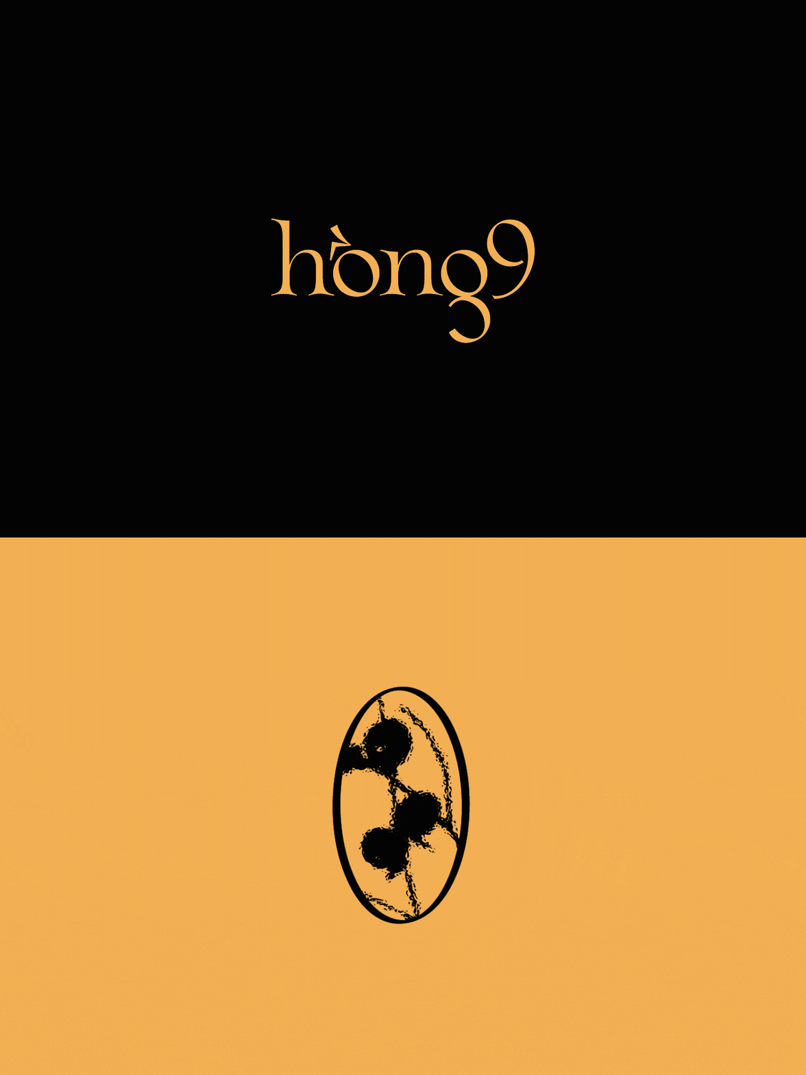
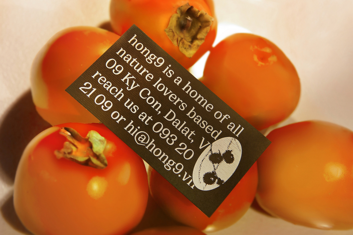
Concept: The logo mark directly conveys the idea of hong9 – See persimmons through every window. From the logo, we can get a vague image of the meandering persimmon branches on a misty day (the typical weather in Dalat). Consequently, rather than a neat minimal logo, we have an experimental symbol with organic and artistic features, defining a new distinctiveness of hong9 in the market.
Moreover, the logotype visually evokes the crooked and elastic sensation of persimmon trees with a humanist serif typeface. The viewers can also reflexively stimulate the persimmon fruit when approaching the letter ‘o’ in the logotype.
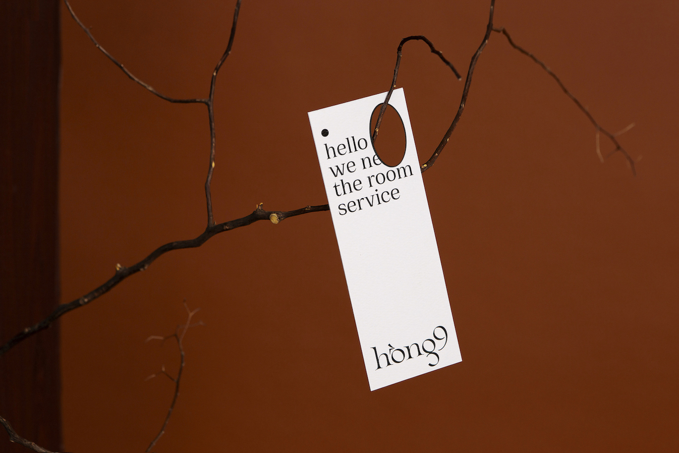
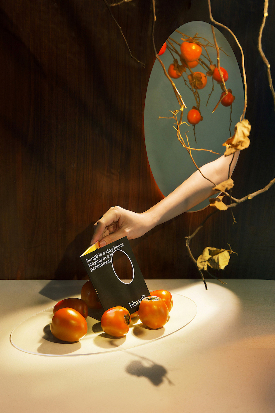
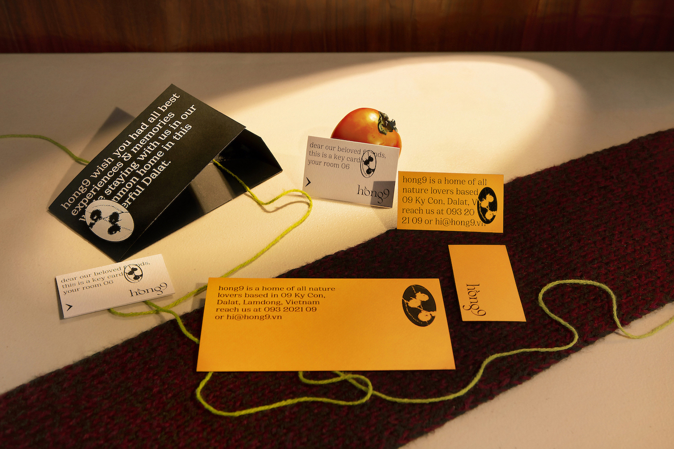
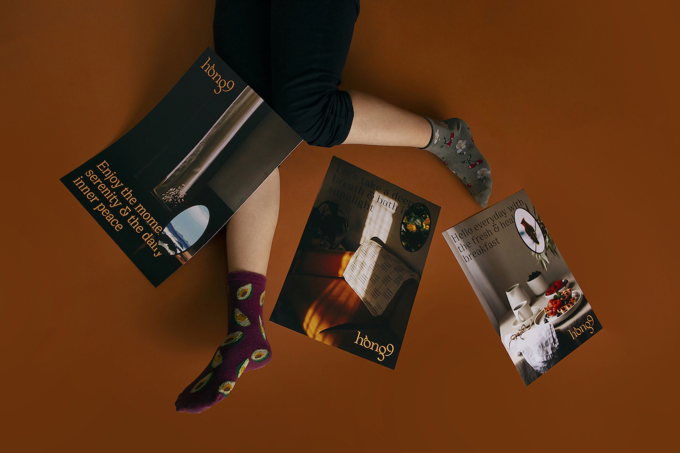
Visualisation: The interior ellipse windows are transformed into the die-cuts and applied to the identity system. Not only presenting the Asian essence, but the ellipse “windows” also awakens our sense of touch, including the perception of connecting the peaceful inside and the beautiful nature outside. This element would arouse more excitement if the viewers interact and play with it.
To let people experience the misty views beyond the windows, the imagery system applies the light distortion effects. Interior photos are clear and outer landscape photos are deformed. This unique treatment possesses a strange charm, creating a cold and “Dalat” feeling that liberates the senses.
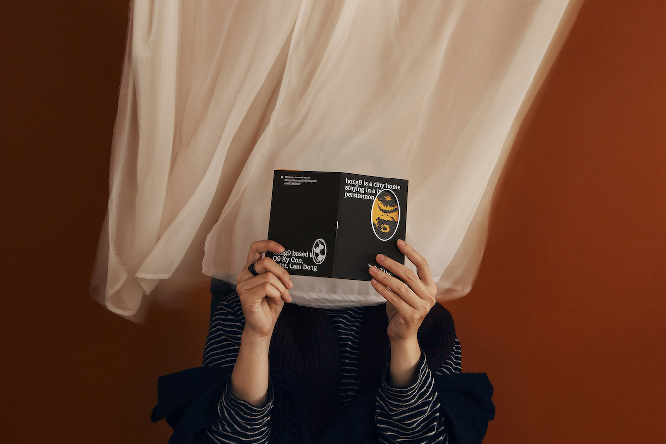
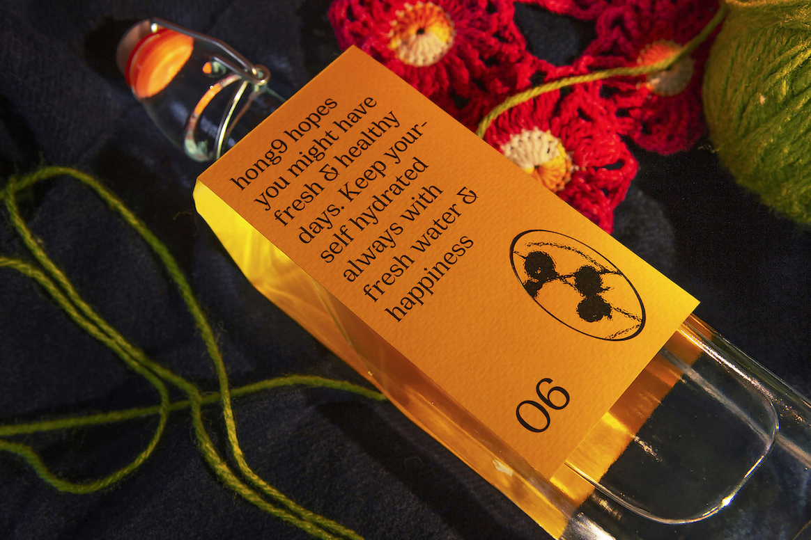
Approaches: A series of lovely messages and introductions from hong9 appears in precise and bold editorial settings. All contents are set in lowercase to preview the friendliness and welcoming of the host.
The ellipse window logo is brought back to life by interacting with the typography instead of standing still in a specific location. The hidden content under the logo also leads the readers to different assumptions and also enjoyment.
Messages: “Fully discover Dalat with hong9” is our message to the target audience. We appreciate all of your delightful moments in both our dreamy homestay or interesting landmarks in Dalat. A travel guide and a local map are ready for your awaiting adventures. Worry no more. Let’s get started.


CREDIT
- Agency/Creative: Alex Dang
- Article Title: Branding for hong9 Homestay Memories of Da Lat
- Organisation/Entity: Freelance, Non Published Concept Design
- Project Type: Identity
- Agency/Creative Country: Vietnam
- Market Region: Asia
- Project Deliverables: Brand Identity, Brand Naming, Brand Strategy, Branding, Graphic Design, Identity System, Research, Tone of Voice
- Industry: Hospitality
- Keywords: persimmon, dalat, vietnam, hotel, homestay


