Farmchix Company is family business with 22 years’ experience in high quality chicken meat. The company distributes to the B2B market two different product categories: fresh chicken products and convenience food products. End 2021, Farmchix made plans to make their snack offerings more inclusive and open to a wider public, including halal consumers.
Francis, the son of the founder and managing director of Farmchix, called in the help of DesignRepublic to create this brand new inclusive and qualitative snacking brand.
What we did:
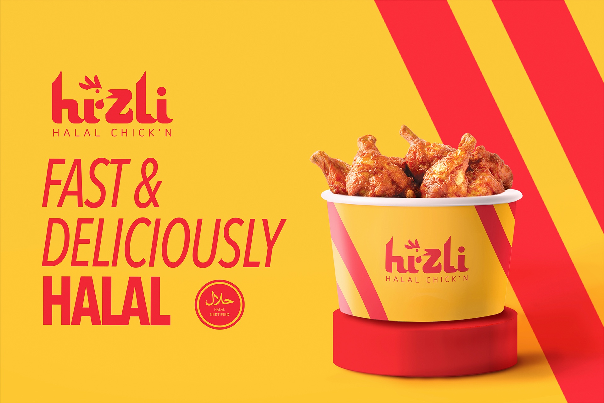
Naming: The name had to be easy to read by the wider public and had to have a subtle ethnic hint in it for those who feel addressed. It wasn’t too much of a tough egg to crack as one of the options was ‘hızlı’ (in Turkish: fast, quick). It instantly felt like a perfect match: Hizli Halal Chick’n!
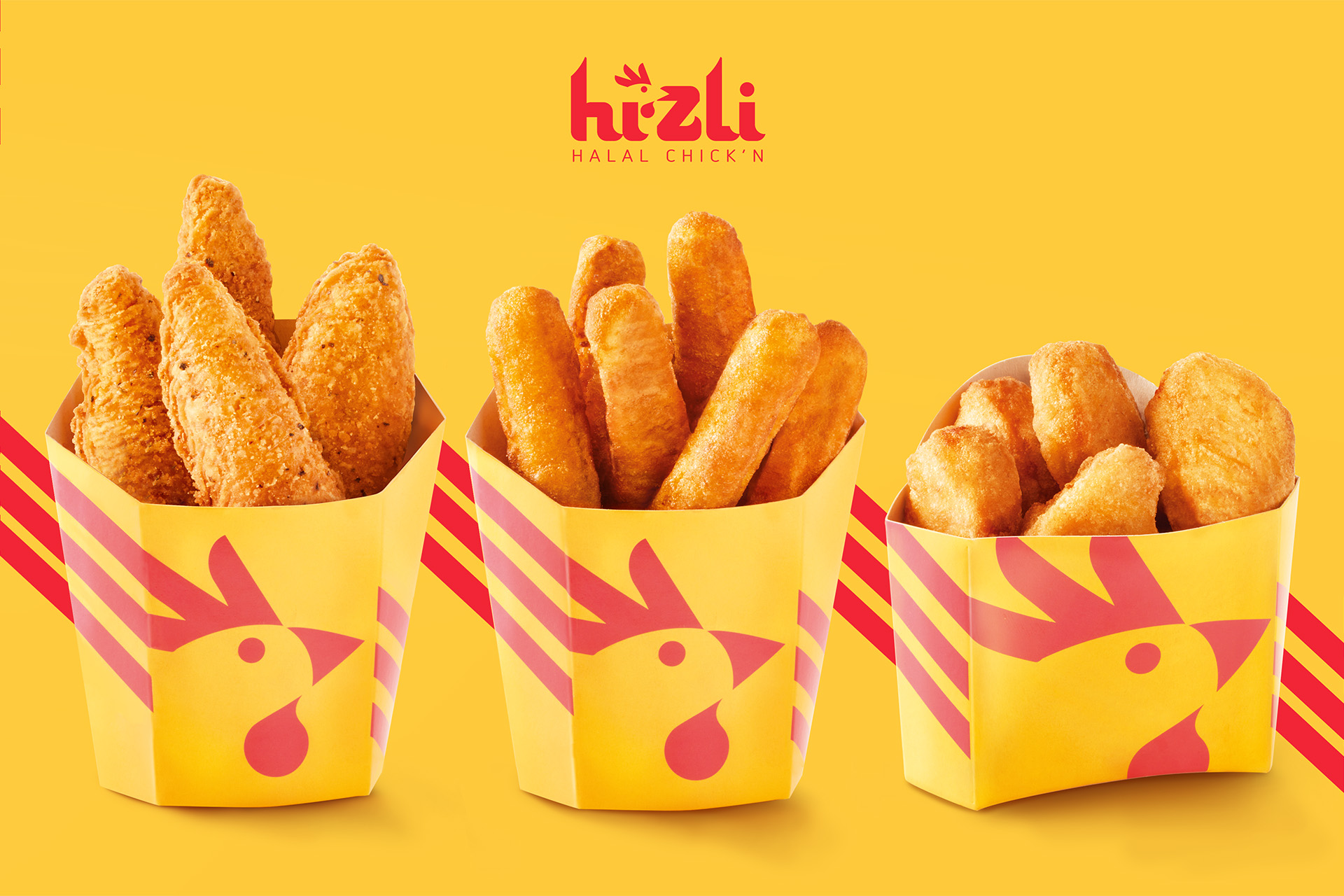
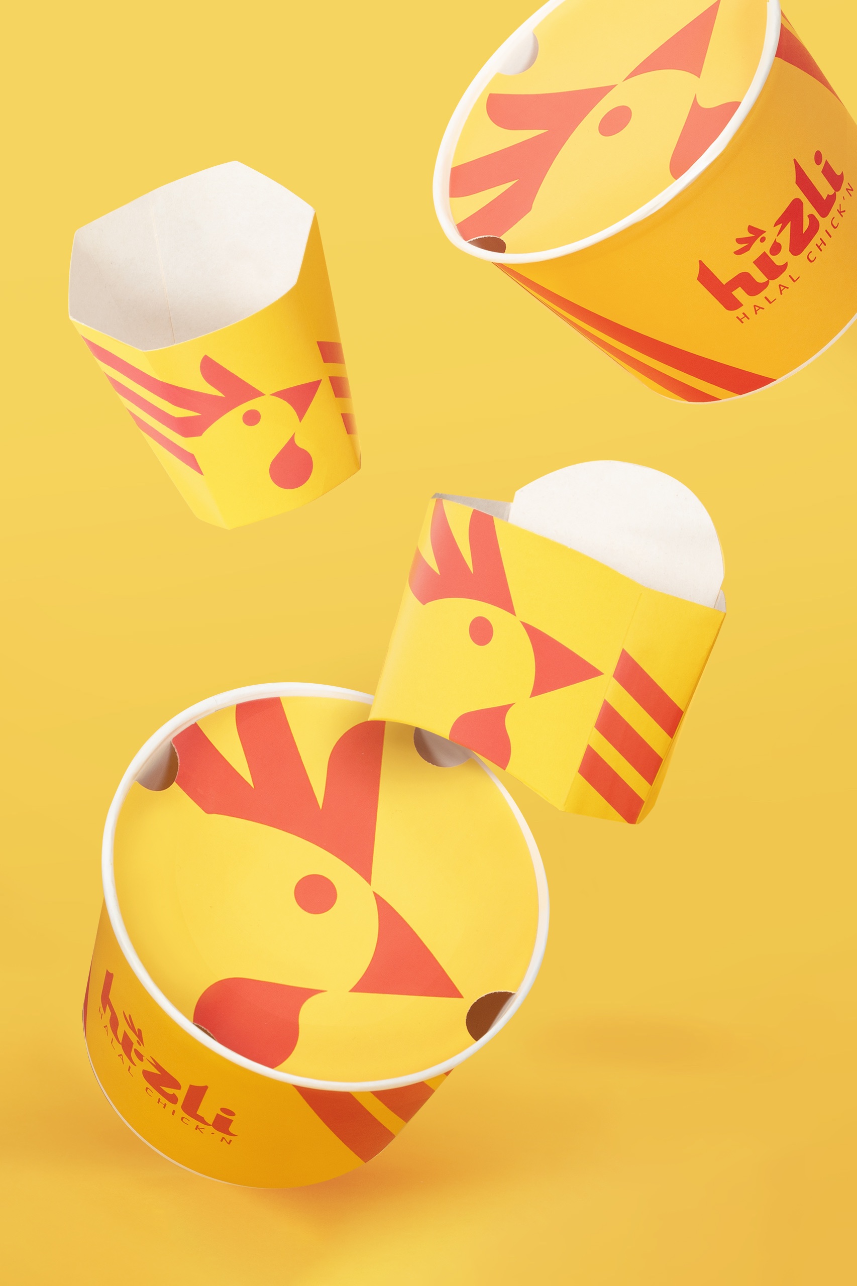
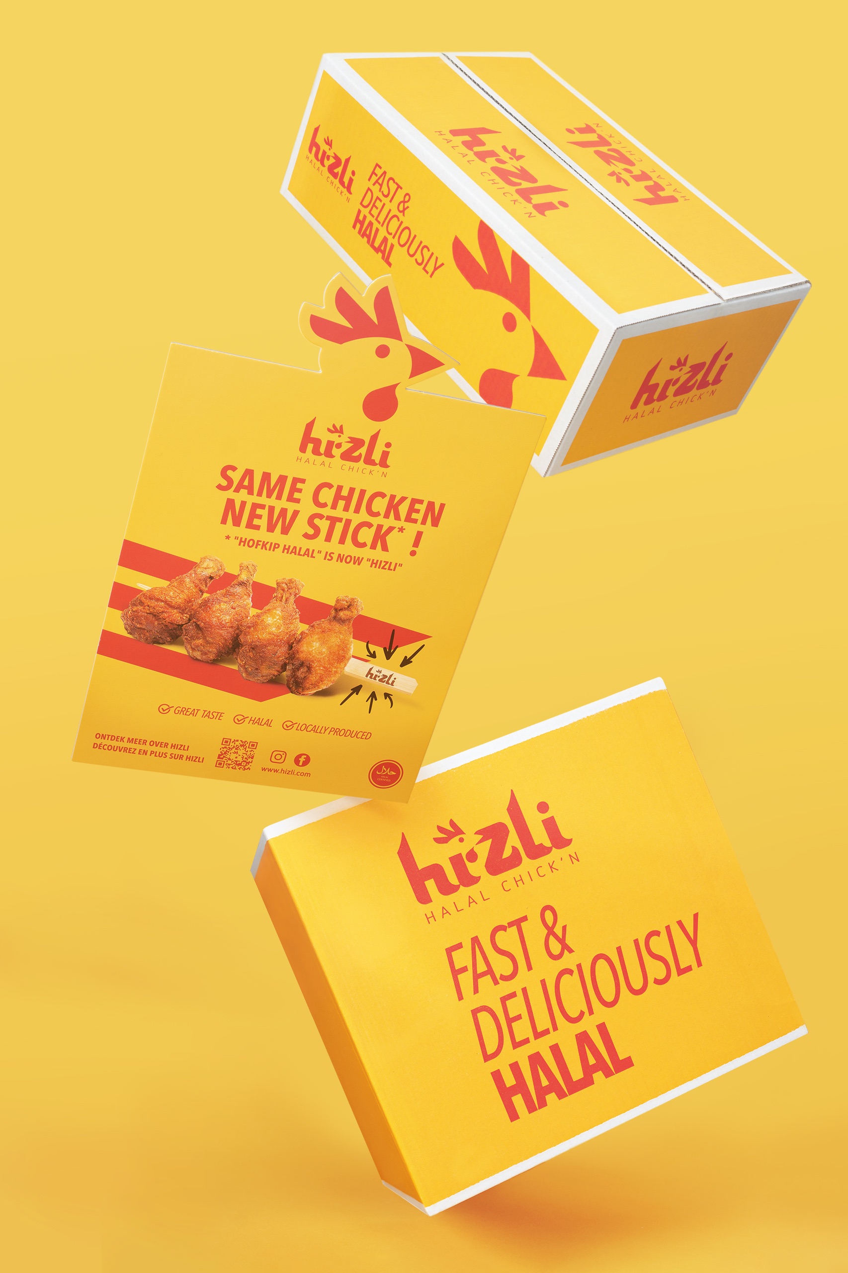
Brand identity creation: It was very important that Hizli Halal Chick’n had that typical ‘happy-go-lucky’-feel that is associated with snacking. At the same time we also had to be wary that the design did not detract from the brand’s credibility and quality perception. We wanted a chicken to be the hero of the brand and created an iconic, abstract illustration of the chickens’ head. This illustration is a fundamental feature of the brand logo, but can also be used as an isolated element thanks to its high recognizability.
We defined two main brand colors: yellow and red. They express energy, taste and fun and quite conveniently, these two colors are quite common on the halal market. The red lines in the design bring dynamism to the brand and allude to speed, wheel tracks,…
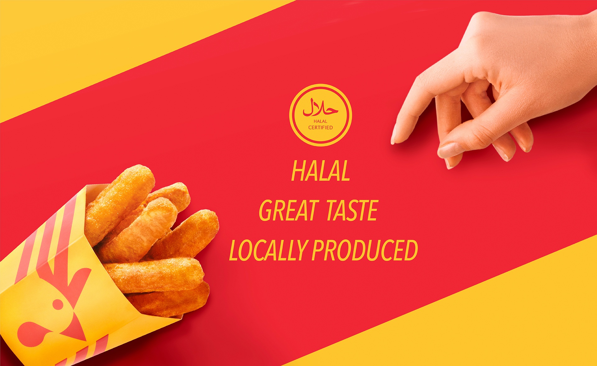
The halal-certified logo appears everywhere in front-view, in a very visible but not dominant position. This is a deliberate choice: the Hizli brand stands for high quality chicken snacks for everyone who is into chicken but it is also vital that halal-consumers feel safe and ensured that what they buy is 100% halal-proof.
Brand identity implementation: We rolled out the brand identity across a wide range of marketing communication channels such as POS (displays, posters, menu’s, carton trays, cones), social media (visuals), website pack-shots and packaging artworks (B2B product boxes, bags)
CREDIT
- Agency/Creative: DesignRepublic
- Article Title: Branding for Hizli, halal chick’n by DesignRepublic
- Organisation/Entity: Agency
- Project Type: Packaging
- Project Status: Published
- Agency/Creative Country: Belgium
- Agency/Creative City: Brussels
- Market Region: Europe
- Project Deliverables: Brand Creation, Brand Design, Brand Identity, Brand Naming, Brand Strategy, Branding, Design, Graphic Design, Logo Design, Packaging Design, Product Naming
- Format: Bag, Basket, Box, Bucket
- Substrate: Pulp Board, Pulp Carton, Pulp Paper
- Industry: Food/Beverage
- Keywords: halal, fast-food, chicken, qualitative, inclusive, branding
-
Credits:
Creative Director: Murtaza Teke


