


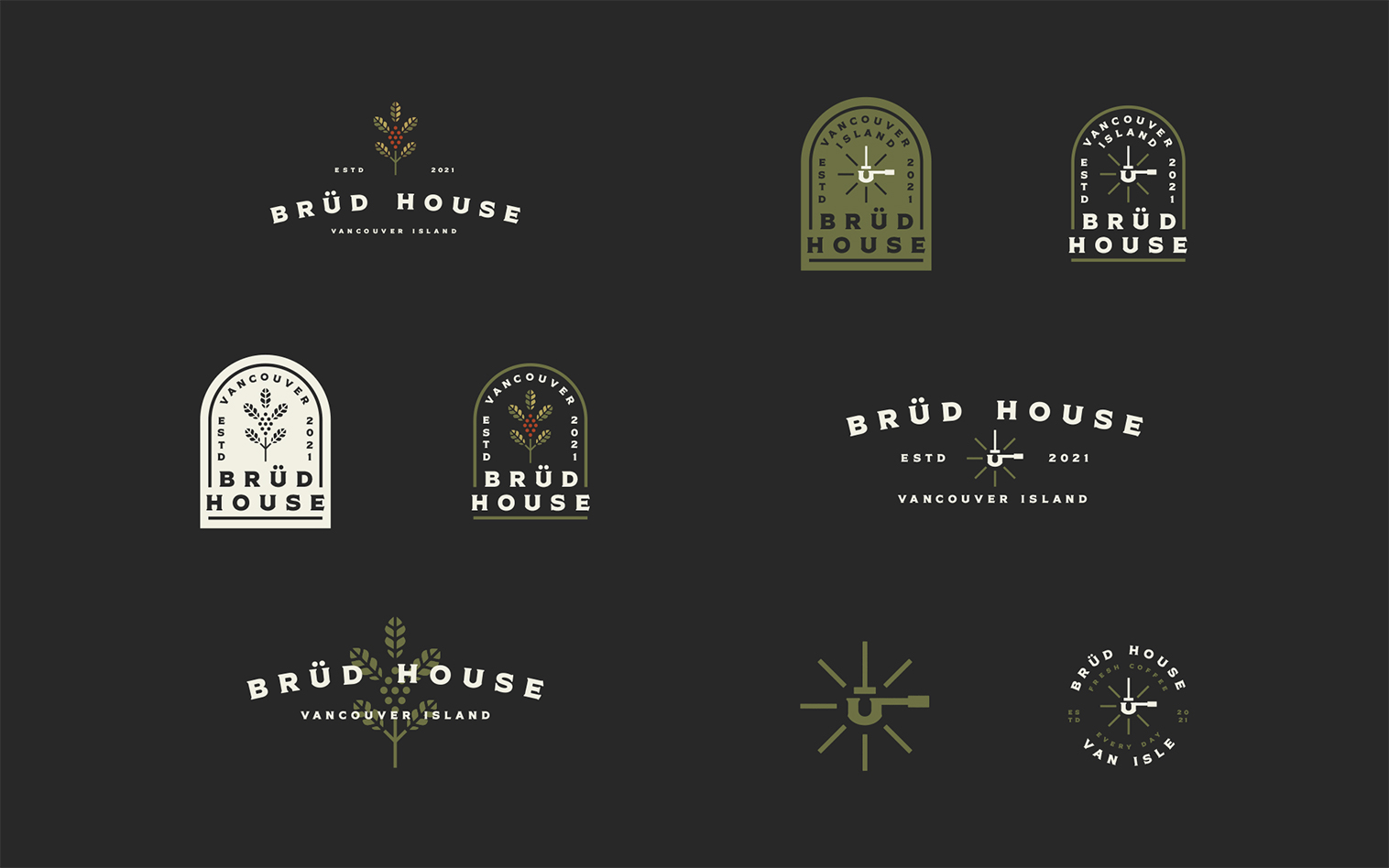
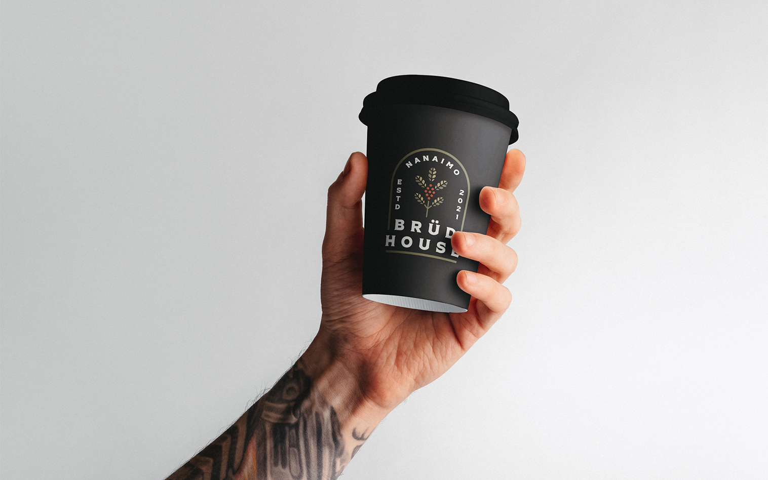
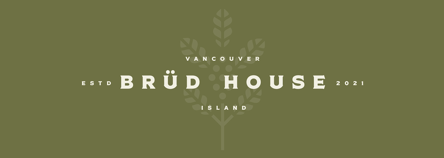
Brüd House is a community-based hub that’s the place to come after your trail run or bike ride for a coffee or a beer. A place where people with an active lifestyle hang out, feel warm but cool, clean and have high standards. It is located on Vancouver Island, on the West Coast of Canada. Being a west coast, outdoorsy town, client was looking to have a community based meeting place for people post mountain bike or run/hike. Brüd House name was chosen for the resemblance of word ‘brewed’.
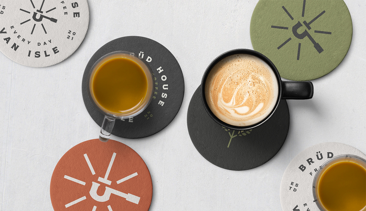
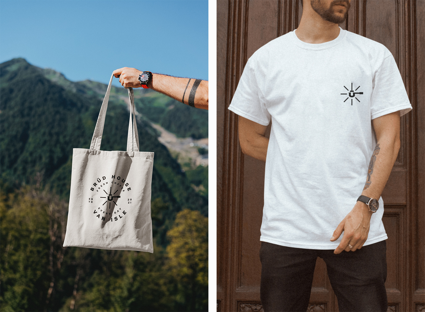
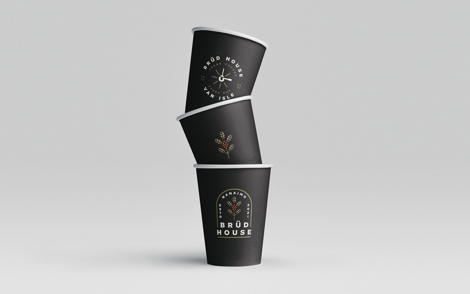
The logo was designed using a bold typeface for eye catching, classic and modern look. I wanted the logo to be recognizable and easy to use on products, so worked on a minimal coffee plant icon using a nature-inspired color palette suits for both the brand and interior design.
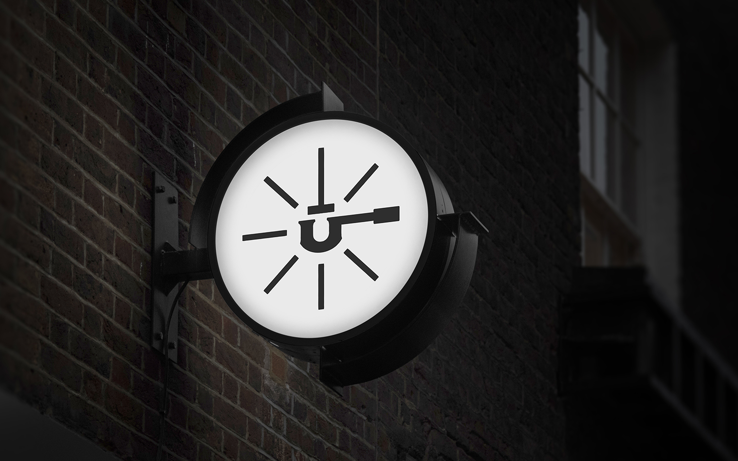
Since the name was already short and memorable, adding a portafilter merged with letter ü icon created a fun look for the branding completed the package more youthful look.


CREDIT
- Agency/Creative: Ceren Burcu Turkan
- Article Title: Branding for Brud House Community-Based Hub
- Organisation/Entity: Freelance
- Project Type: Identity
- Project Status: Published
- Agency/Creative Country: Turkey
- Agency/Creative City: Istanbul
- Market Region: Asia, Europe, North America, South America
- Project Deliverables: Branding, Creative Direction
- Industry: Food/Beverage
- Keywords: coffee, branding, roasting, artisan, packaging, small batch, hand drawn, vintage
-
Credits:
Creative Director: Ceren Burcu Turkan


