Gribouille is a brand offering organic ready meals for babies. Newborns are constantly discovering new things and learning. Scribbling is one of these discoveries that is universal to all babies. lt allows them to shape their imagination and practice while communicating with others: it’s spontaneous and limitless. Gribouille takes up this theme that speaks to both parents and children to transmit its main value: the simplicity of its recipes that leads to a healthy dish. A doodle is just as simple to make as Griboulle’s dishes. This pictogram with its strong personality is open to interpretation and is as spontaneous as a doodle. The very childlike writing refers to babies and in particular to their beginnings in writing. The layout of the logo is deliberately disordered to give the illusion that a young chi Id is at the origin of it. The baseline “ta petite tambouille” is phonetically similar to a children’s rhyme and is a familiar French way of referring to a meal. The logotype is thoughtfully designed to look like something a baby does without thinking.
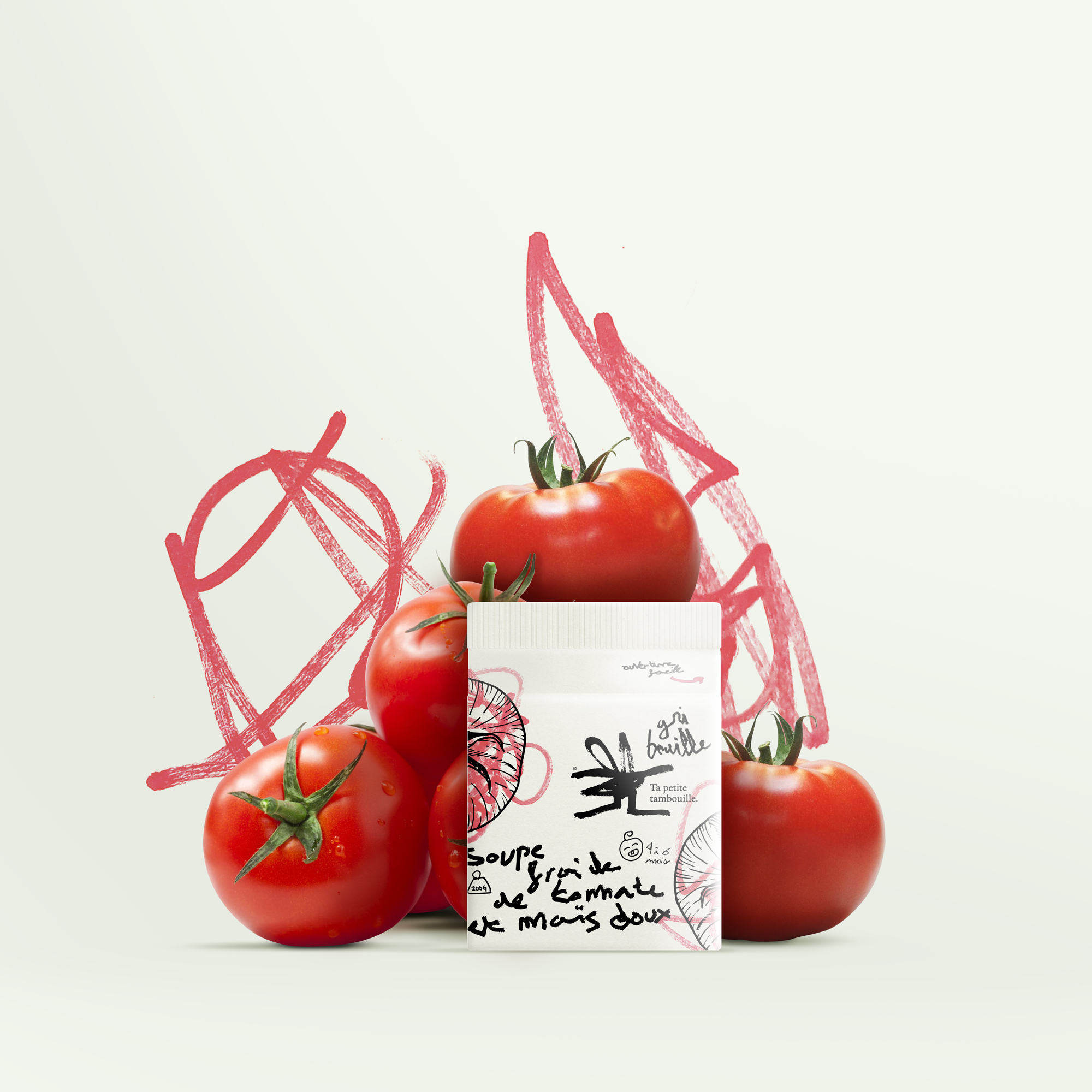
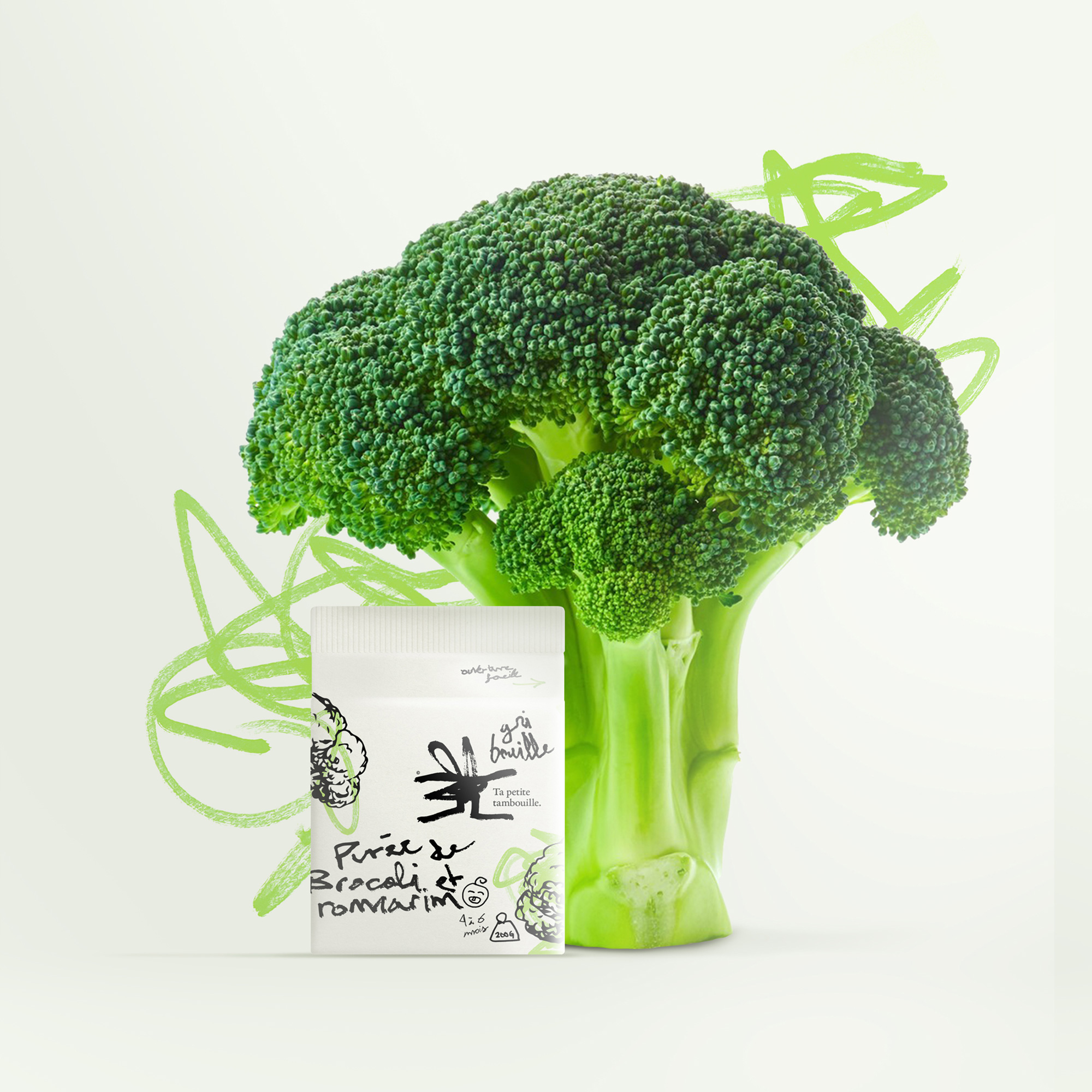
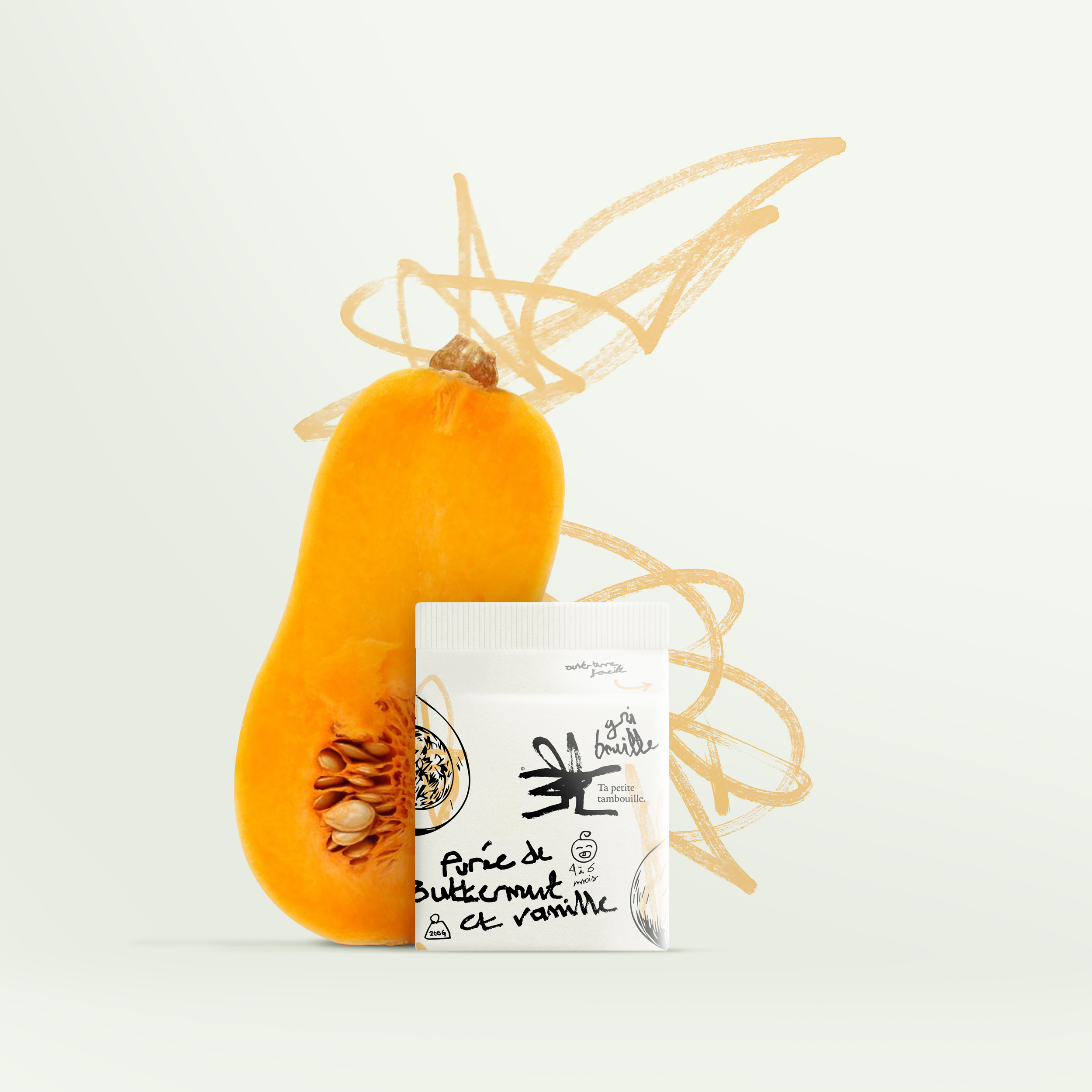
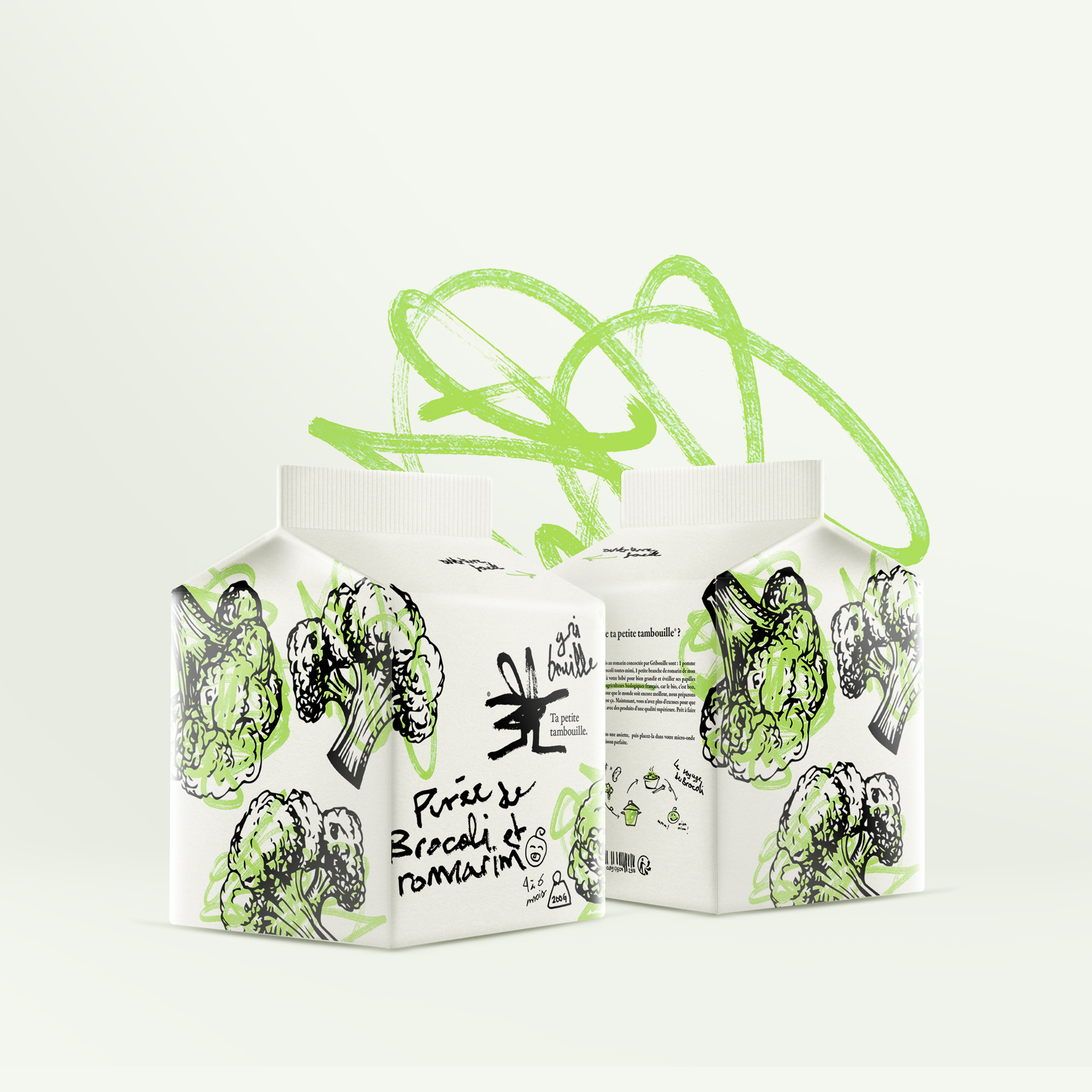
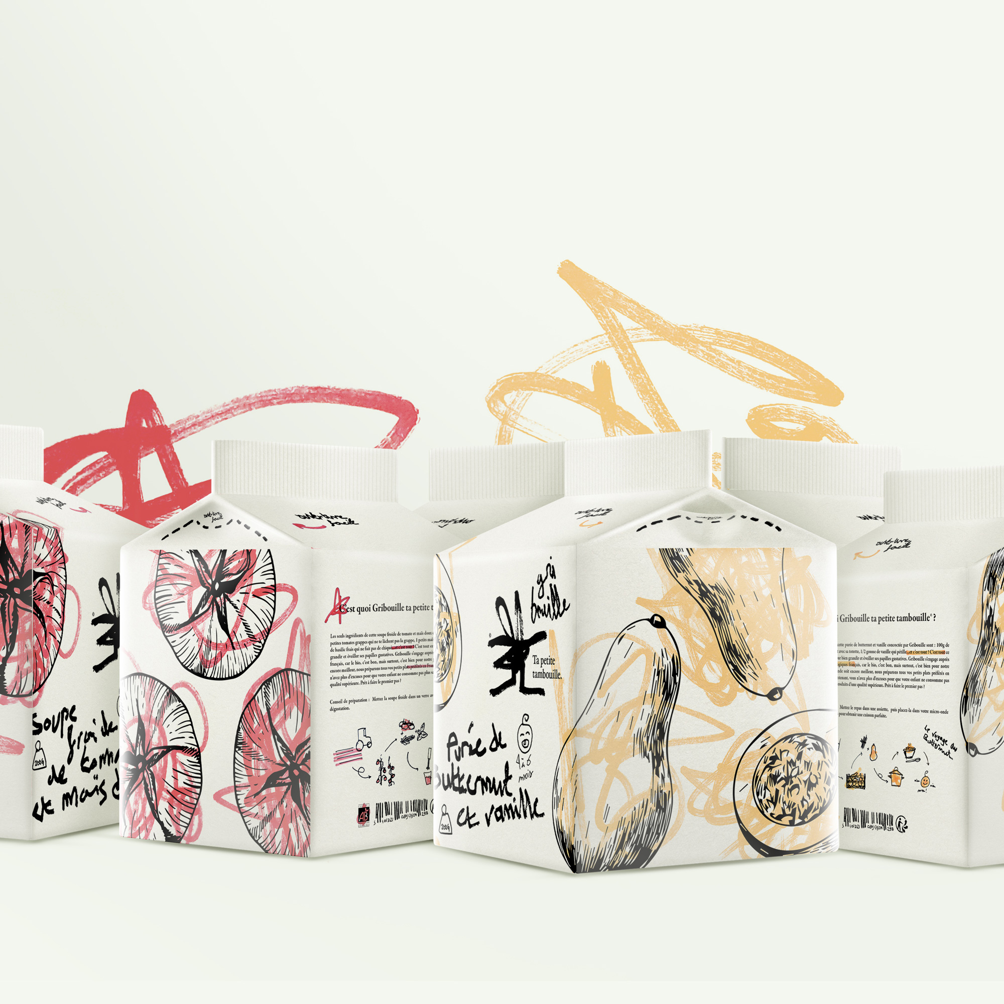
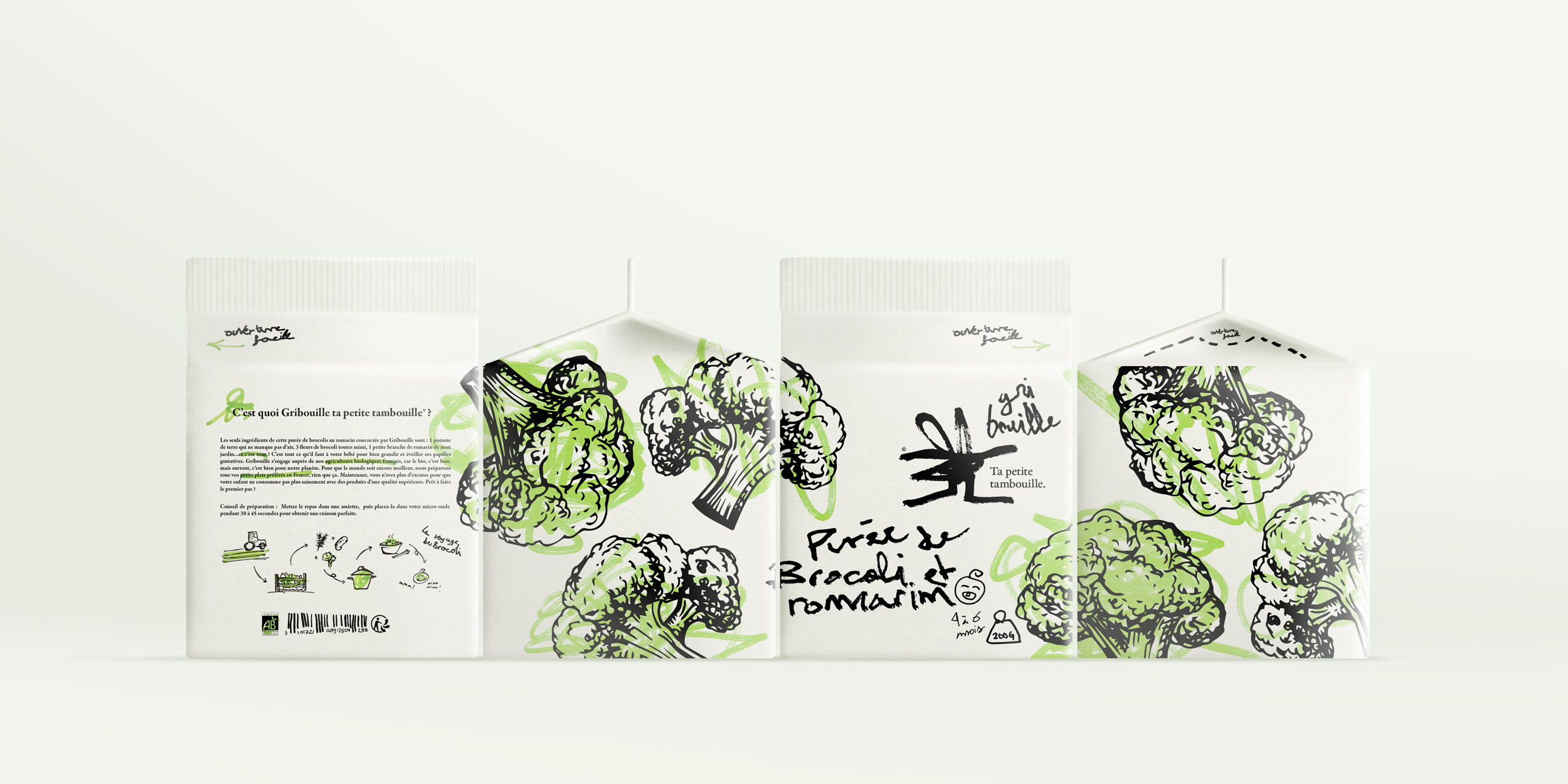
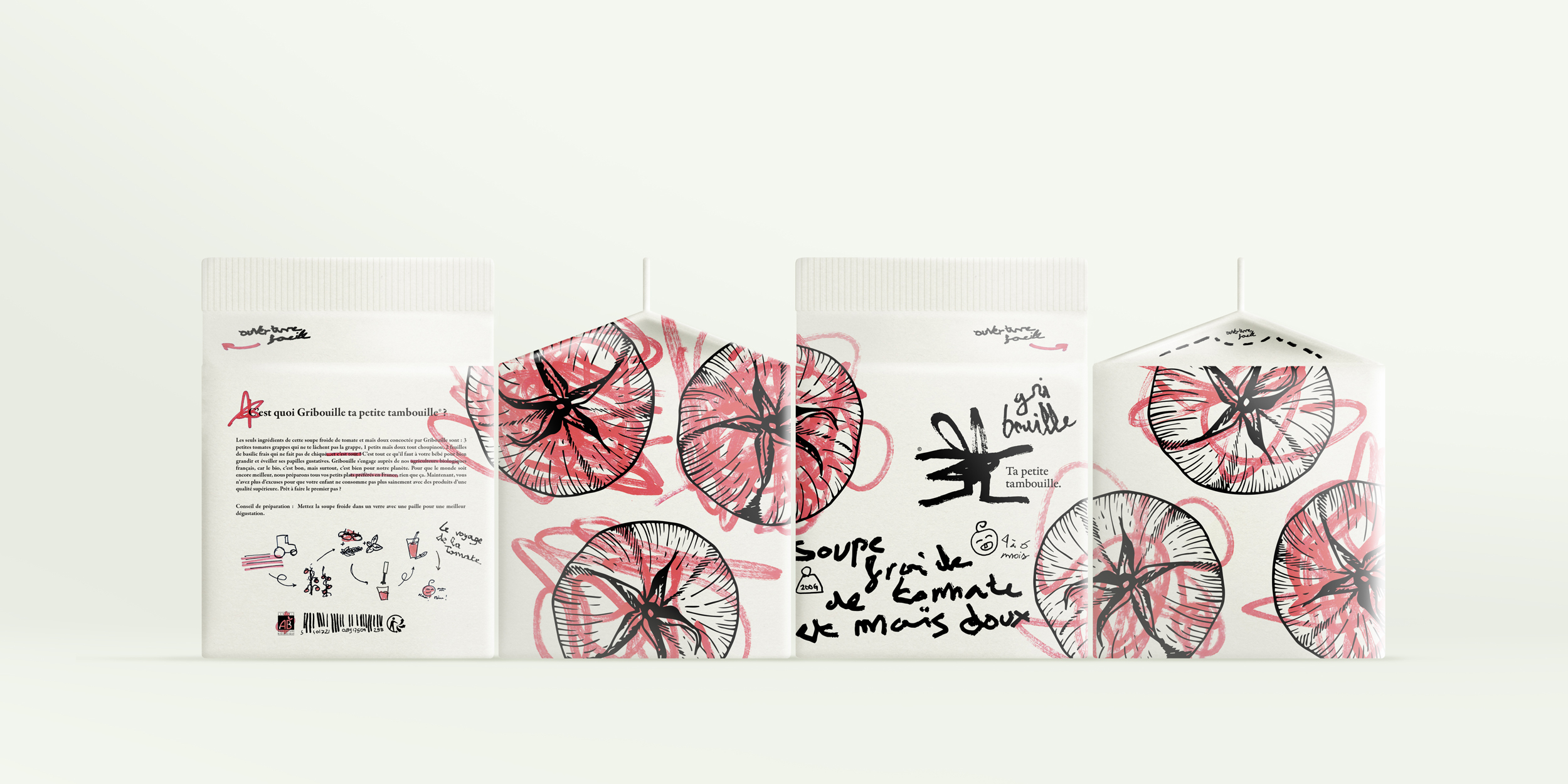
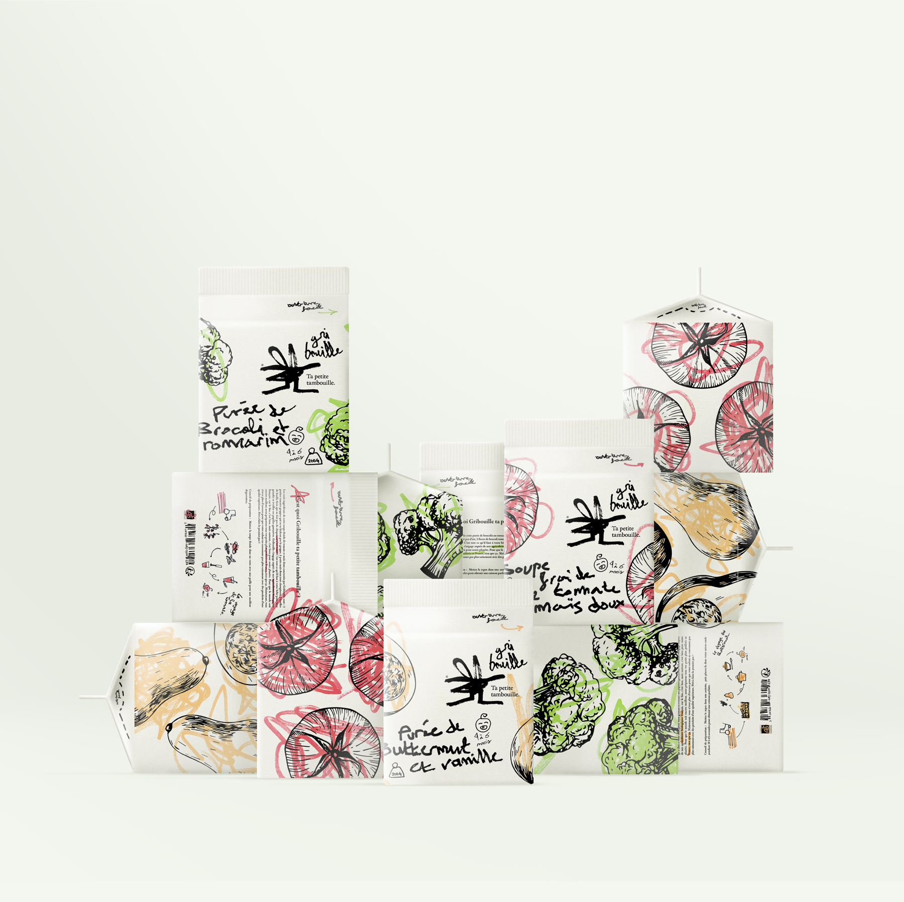
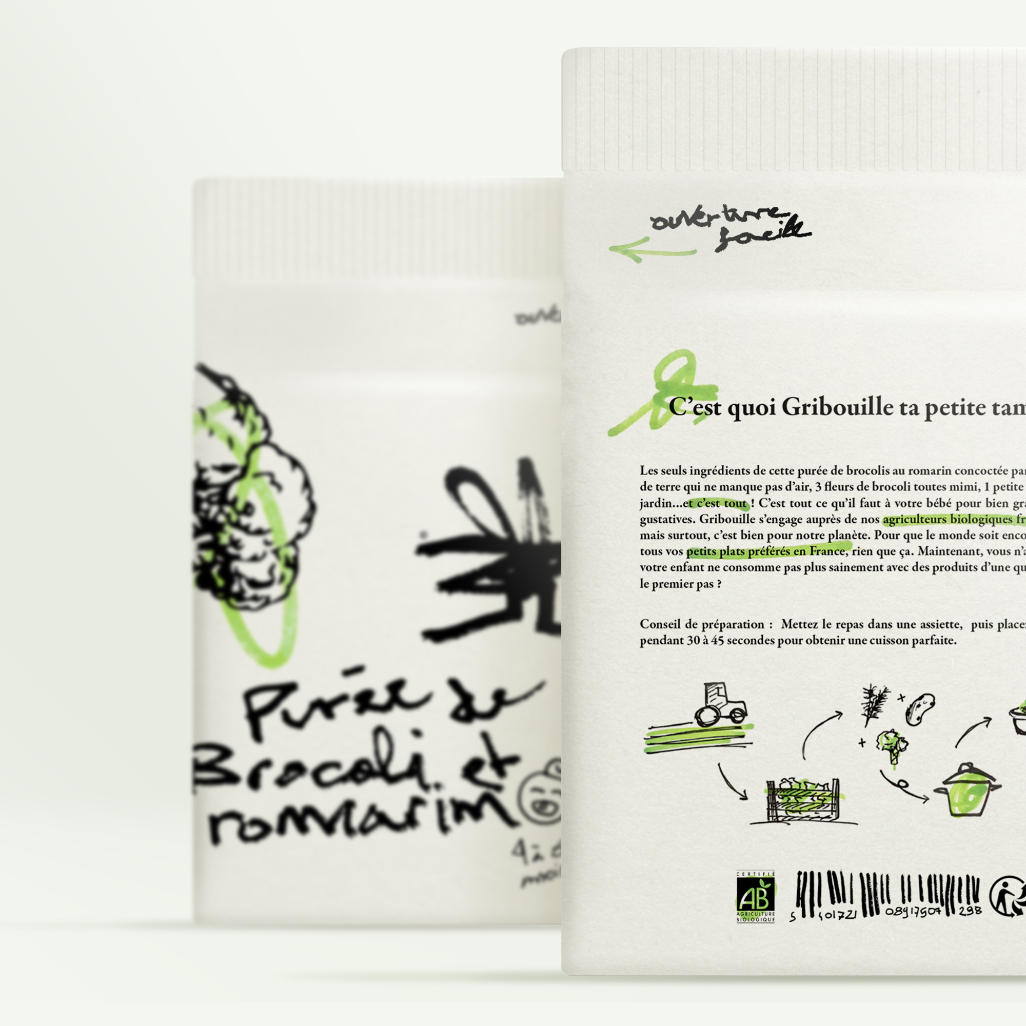
The little dishes prepared by Gribouille are cooked with healthy vegetables produced by our French organic producers. These little cardboard bricks are made up of several things that make up the world of childhood. First of all, the doodles on the vegetable illustrations. This is a nod to all the colouring where babies or young children are constantly scribbling on them. This spontaneous movement, understood by all, is an immediate reference to childhood. The typography allows to support this aspect of “discovery” already present in the scribbles. lndeed, a young child discovers and tries his hand at writing. lt is not neat or even neat, but that is the charm of Gribouille: imperfection. The texts are also very meaningful because the description on the back is written like a nursery rhyme, another characteristic of the world of childhood. The small handmade pictograms placed in such a way as to “fill in the gaps” punctuate this packaging with a soft, childlike note. The scribbles, the writing, the texts and even the pictograms are drawn in the manner of a child and this is what makes this packaging meaningful for them but also for the parents who can see their child through Griboulle. This packaging attracts the eye because it goes beyond the framework of “perfection”. This little brick could be entirely made by a child himself or herself and it wouldn’t matter. This is the message that Griboulle wants to put forward: to put oneself in the place of the chiId in order to know him better.
CREDIT
- Agency/Creative: Hurtikonn
- Article Title: Branding for Baby Food Made of Childhood Symbols, Designed by Hurtikonn
- Organisation/Entity: Student
- Project Type: Packaging
- Project Status: Non Published
- Agency/Creative Country: France
- Agency/Creative City: Hayange
- Market Region: Europe
- Project Deliverables: Brand Creation, Brand Identity, Logo Design, Packaging Design
- Format: Box
- Substrate: Pulp Carton
- Industry: Food/Beverage
- Keywords: Packaging design, Packagings, Salsa Packaging, Child, Ready Meals, Bricks, Scribbling, Baby, Drawings, Logotypes, Logo, Brand, Brand identity,
-
Credits:
Graphic Designer: Mattéo Tabutieaux


