studio and – Verloskundigen Oosterpark
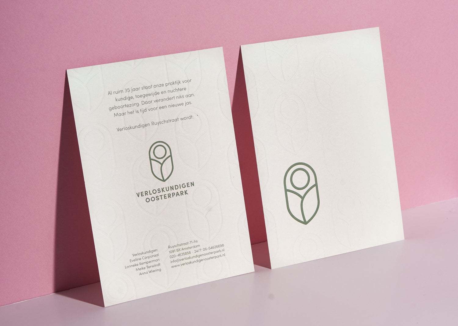
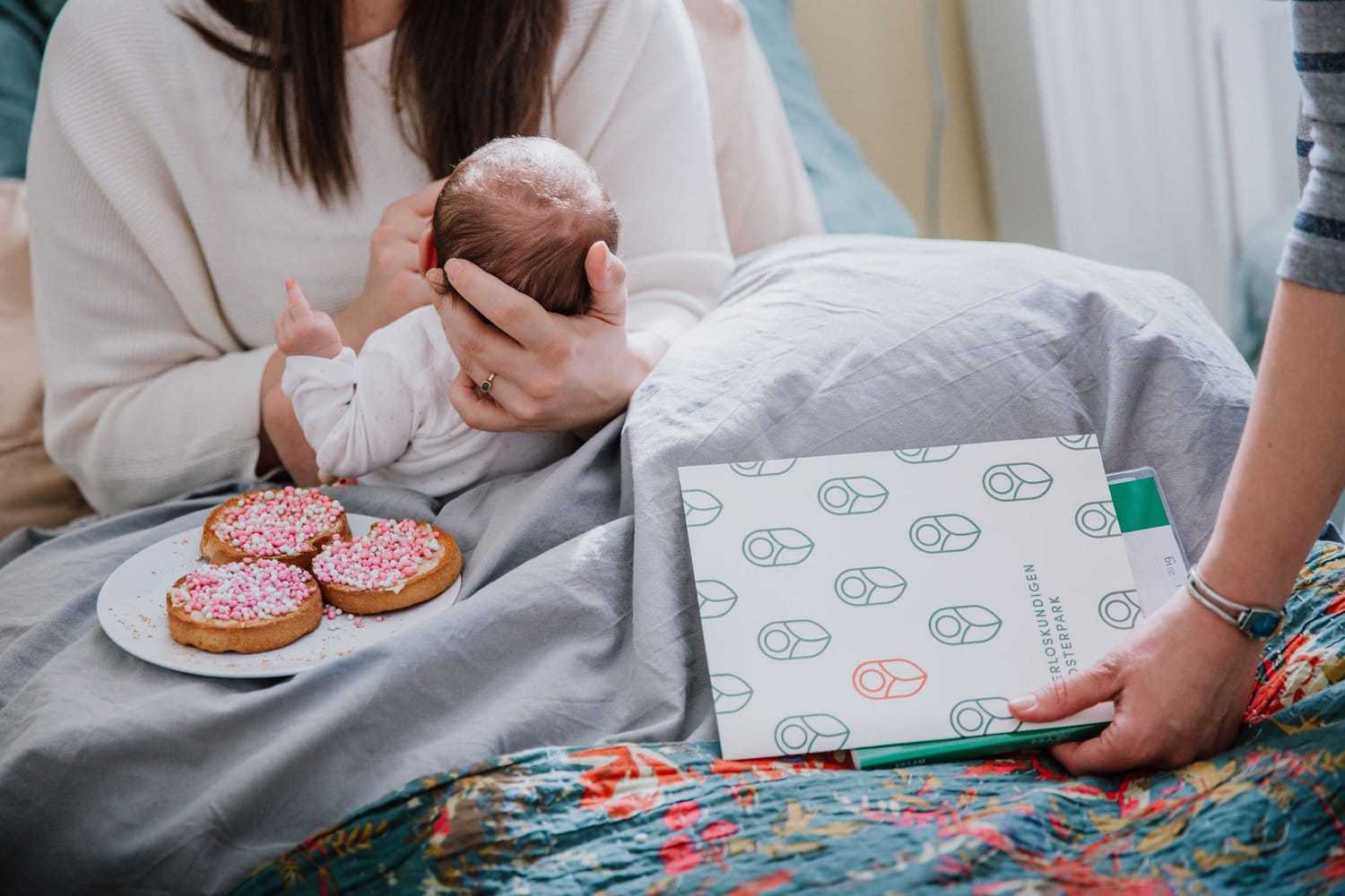
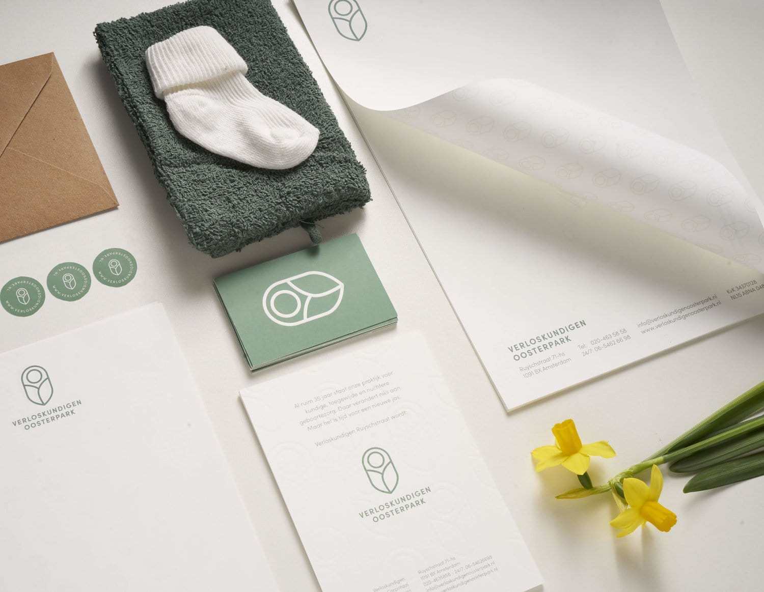
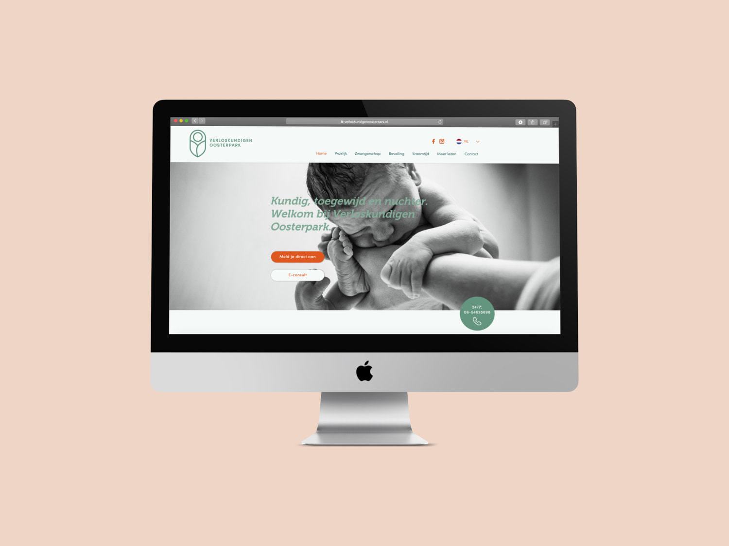
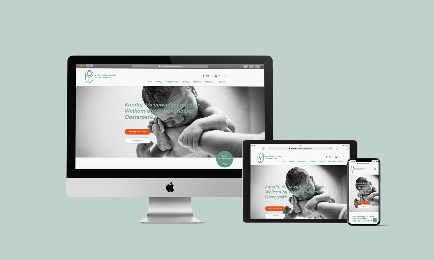
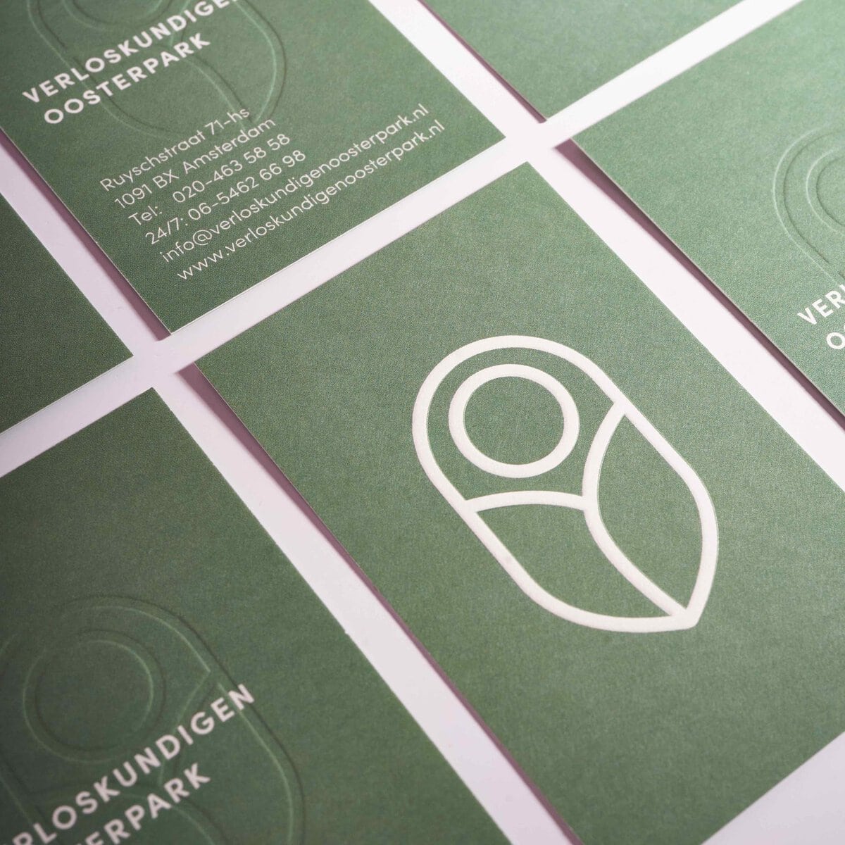
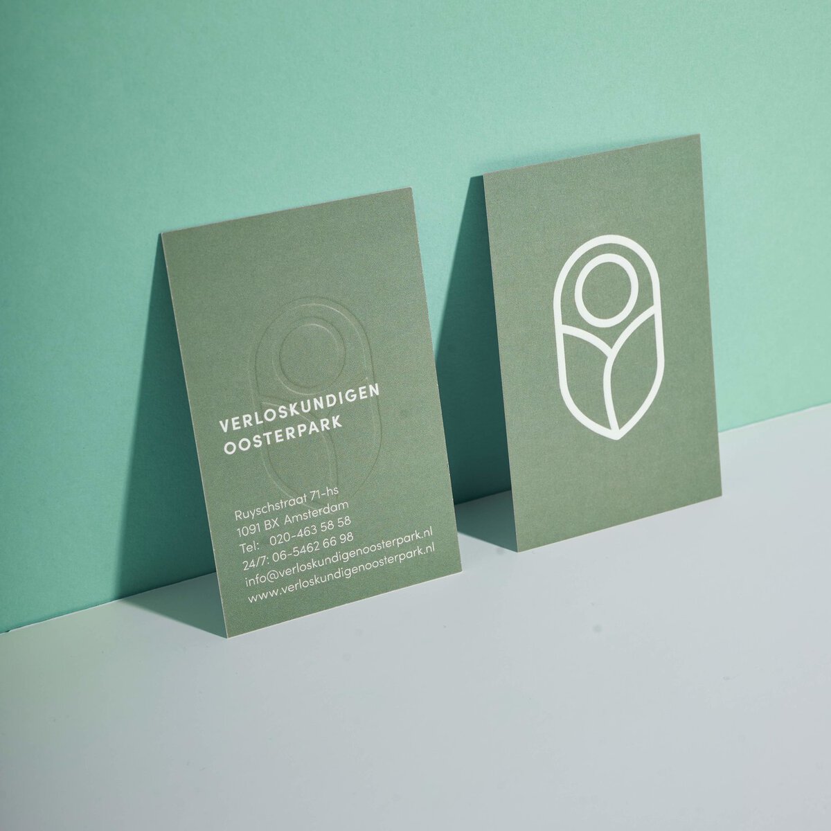
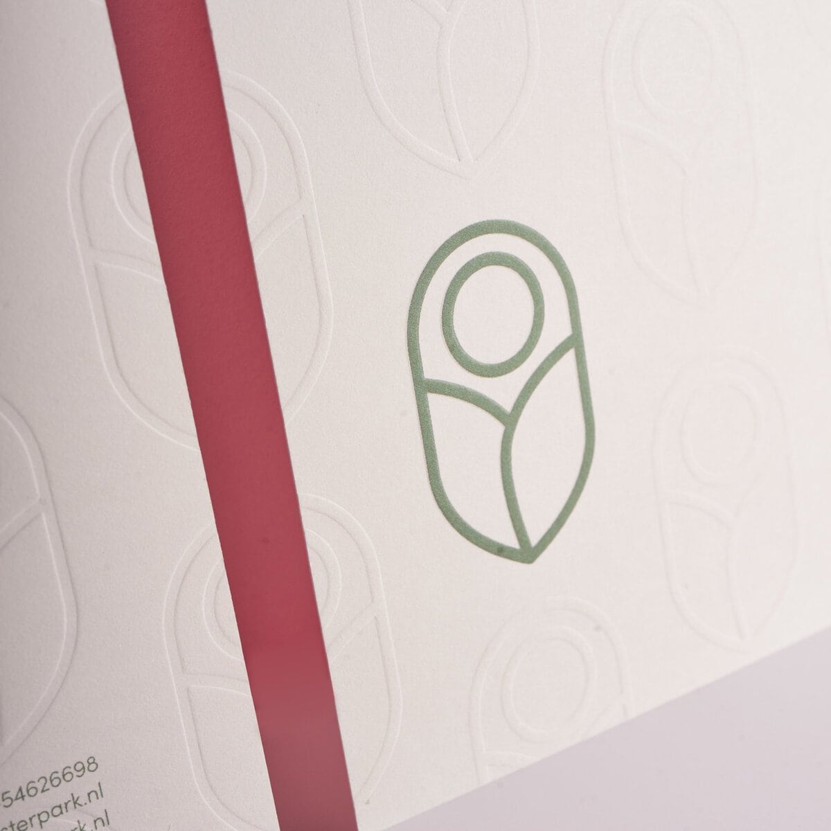
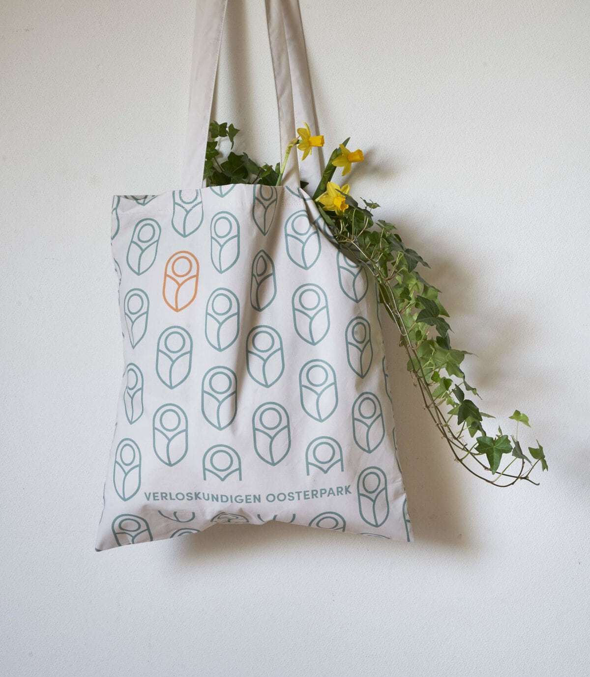
Verloskundigen Oosterpark is a small-scale midwifes practice in Amsterdam, located near a park called Oosterpark. The practice just got renamed and needed a completely new identity that fits their values and character: down-to-earth, friendly & involved, accessible to everyone and contemporary (providing up-to-date care).The new logo icon makes a reference to the park’s nature via the leaves. The leaves swaddle the baby, portraying the care these midwifes provide. The colour palette was also inspired by the colours in the park and create a sense of calm, nature and positivity.The logo icon is also used to create a pattern; a fun reference to the huge number of babies the practice has delivered since it started 35+ years ago. The pattern is used on various stationary and on the linnen tote bag for their pregnant clients.I designed a new (responsive) site, in line with the new look and feel: fresh, down-to-earth, friendly & involved, inviting and contemporary. The site is packed with info for people expecting a baby and contains beautiful photo’s that really brings the work of these midwifes’ to live.
CREDIT
- Agency/Creative: studio and
- Article Title: Branding For A Small-Scale Midwifes Practice In Amsterdam
- Organisation/Entity: Freelance, Published Commercial Design
- Project Type: Packaging
- Agency/Creative Country: Netherlands
- Market Region: Europ
- Project Deliverables: Digital Website, Print Stationery, Signage Exterior
- Industry: Health Care


