
Mano Negra Studio – Sauditas Taquería
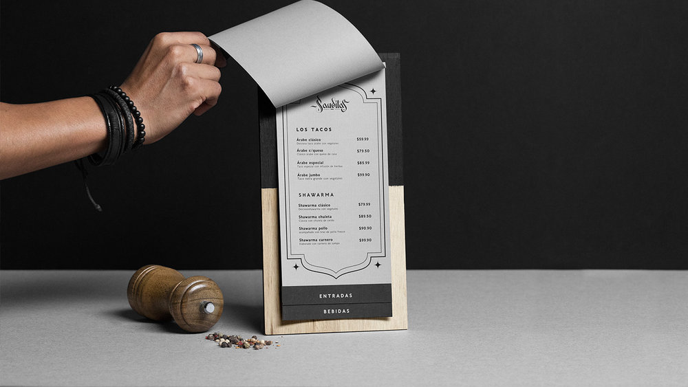
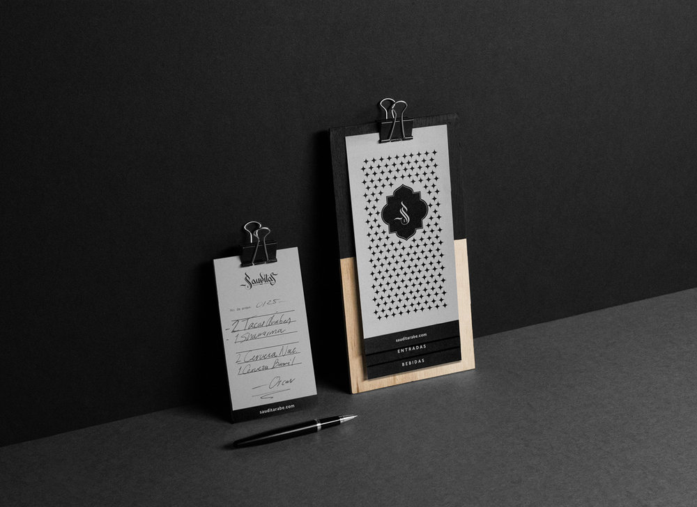
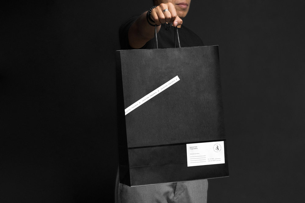
The graphic identity for Sauditas was designed, a place implemented in a container, reused and re designed to give it a commercial use. The taqueria specializes in serving Arabic tacos, kebab and various beverages. In collaboration with a firm of architects from Chihuahua, the expected result was achieved.
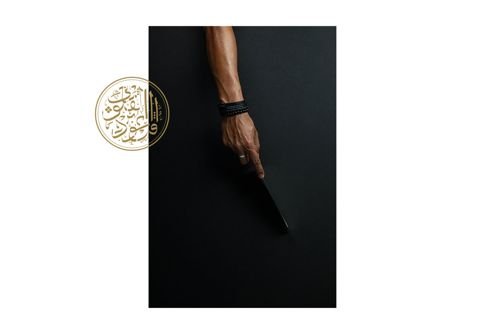
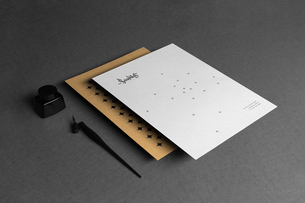
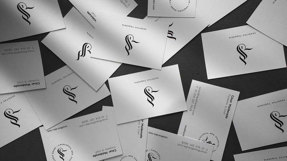
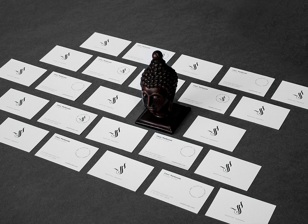
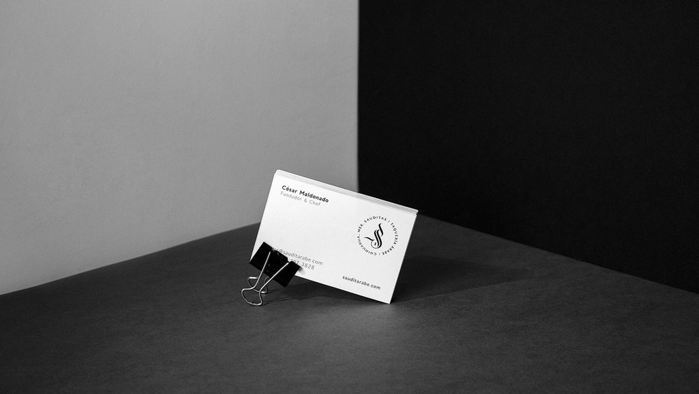
Development: The logo graphics coexist in a Middle Eastern atmosphere; figures, strokes, colors, contrasts, Arabic calligraphy, everything, in a parallel and harmonic structure within this container. The letter “S” is the main brand that encompasses the concept and name of the taquería.


CREDIT
- Agency/Creative: Mano Negra Studio
- Article Title: Branding for a Sauditas Taquería in Chihuahua MEX
- Organisation/Entity: Freelance Commercial, Published
- Project Type: Packaging
- Agency/Creative Country: Mexico
- Market Region: Central America
- Format: Bag, Box
- Industry: Food/Beverage
FEEDBACK
Relevance: Solution/idea in relation to brand, product or service
Implementation: Attention, detailing and finishing of final solution
Presentation: Text, visualisation and quality of the presentation


