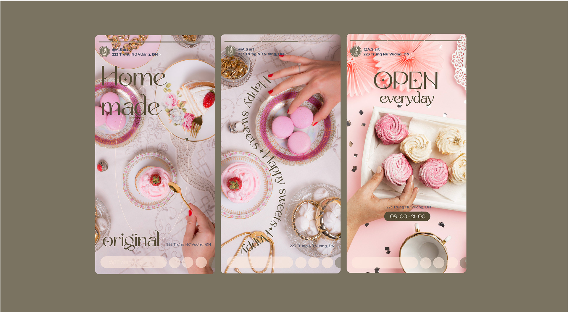
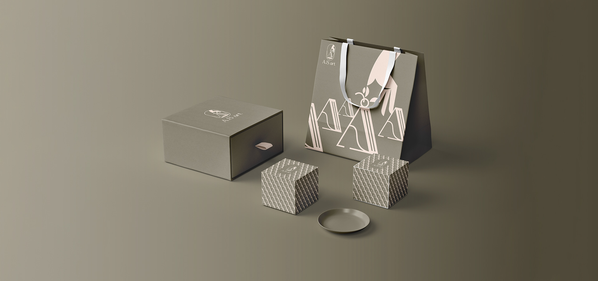
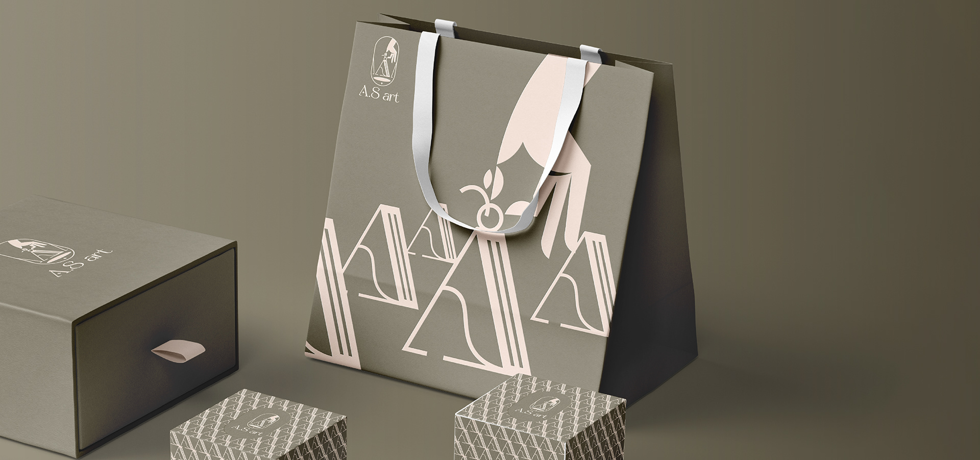
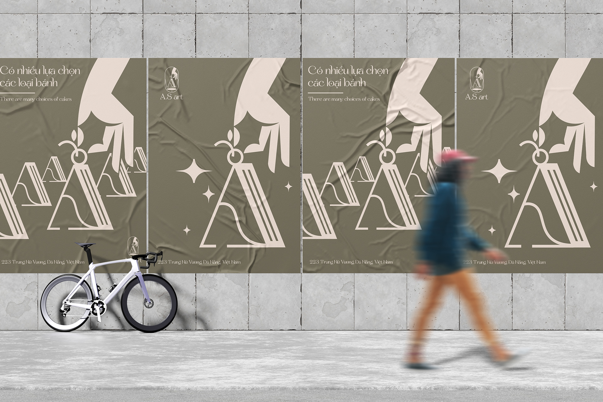
A.S art is the workshop organized by Ann’s Sweet bakery. A.S art’s logo is delicately designed, with the letter “A” and ellipse reminiscent of a delicious cake lying on a cake turntable. In particular, the logo is highlighted by the symbol of a hand placing a fresh cherry on the cake. It symbolizes the enthusiasm, creativity and passion of the baker in creating special cakes.
Gray and beige tones in the logo bring sophistication and serenity. These colors build a cozy space and convey a sense of luxury, in harmony with the bakery’s pastry space. Combined with the Line Art style, the logo becomes a unique and easily identifiable symbol.
A.S art can be considered as an “art exhibition” about delicious, attractive and creative cakes. Hopefully, this logo will give you a warm feeling and craving to enjoy these wonderful cakes from Ann’s Sweet house.



CREDIT
- Agency/Creative: 3T Branding
- Article Title: Branding for A.S Art Workshop by Ann’s Sweet
- Organisation/Entity: Freelance
- Project Type: Graphic
- Project Status: Published
- Agency/Creative Country: Vietnam
- Agency/Creative City: Da Nang
- Market Region: Asia
- Project Deliverables: 2D Design
- Industry: Food/Beverage
- Keywords: #cakelogo
-
Credits:
Design: Trương Thanh Thắng


