


3D Gripinsky is a large school specializing in teaching 3d modeling and working in 3DMAX. At the same time, the school’s unique feature lies in the founder’s solid brand, a fundamental and systematic approach to learning, and successful students who do “photographic” quality work.
The problem: If you look beyond the positive and strong sides of the brand, many competitors on the market are actively engaged in non-ecological promotion, creating a false impression on the consumer, which creates a negative attitude towards the segment as a whole. This creates distrust of the product and bias of the potential target audience – attracting them has become even more challenging.
In a world where 3D education is crowded, our goal was to highlight 3D Gripinsky, turning it not just into a school but a symbol of innovation and creativity. It was essential to shift the focus from the founder’s brand to unlocking the potential of each student. Based on the desk research conducted, an extensive survey of students, and focus groups, we have formed the brand’s USP, which included the basis for the updated positioning.
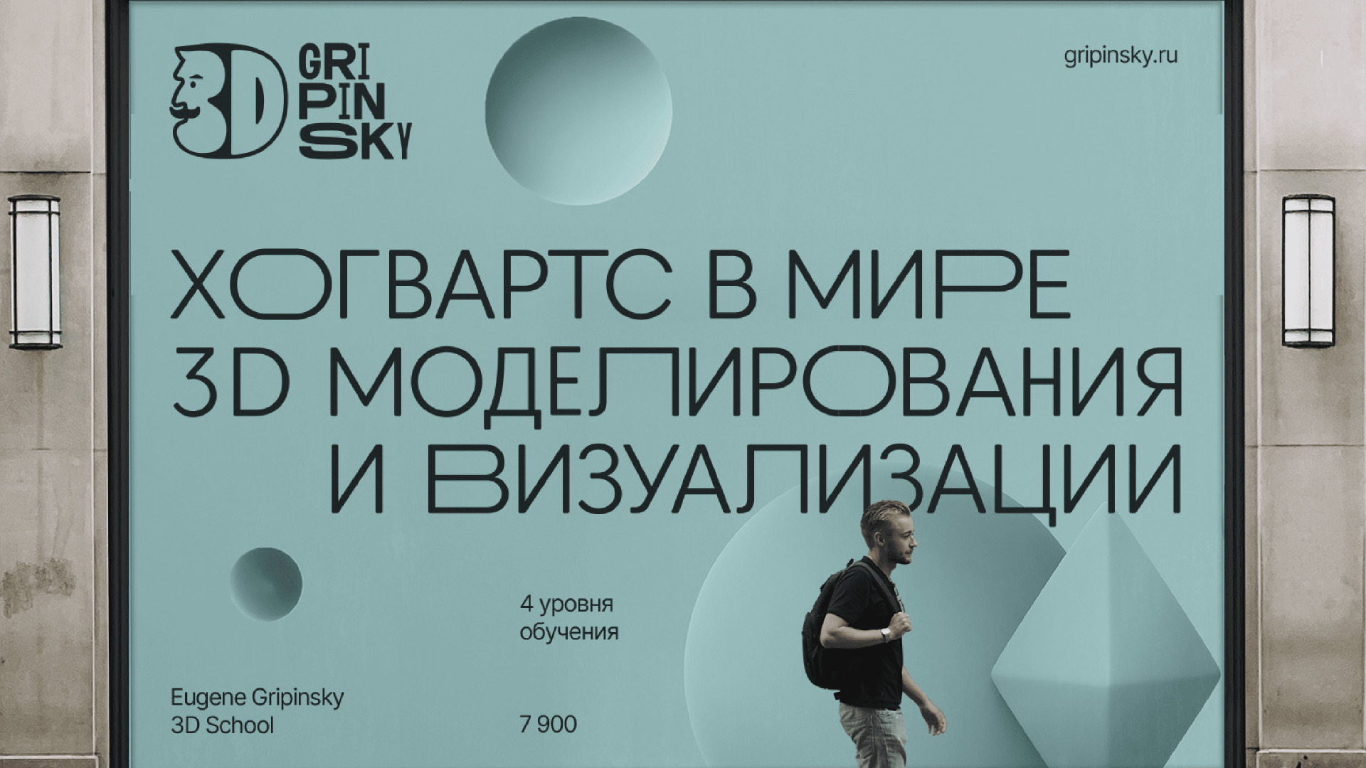
The created positioning takes the course and the knowledge taught there to a new level, building up from competitors with the word “academy” – a symbol of a deep and thoughtful approach. Based on research and a survey, the primary motive for buying the course was revealed – and this is not earnings, and not just mastering a new profession, but a more profound desire to create something unique and creative, to immerse yourself in “another world.” This formed the basis of the brand’s platform and was reflected in the visual style and communication: This is how associations with the Hogwarts School of Magic appeared, which we put into the slogan.
“Academy of Three–dimensional Arts” are three words that concisely reveal that the courses have a systemic solid knowledge base, thanks to which everyone can master 3d at a confident level. It is the promise of a systematic approach to learning and a platform for creative expression. The students’ works are not just projects; they are living stories created through deep knowledge and skill.
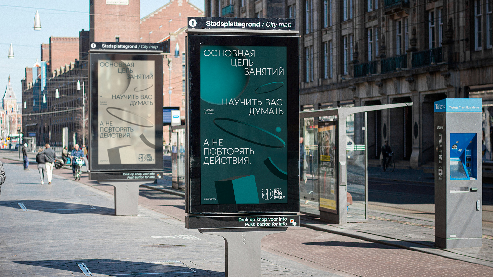
Creating a corporate identity
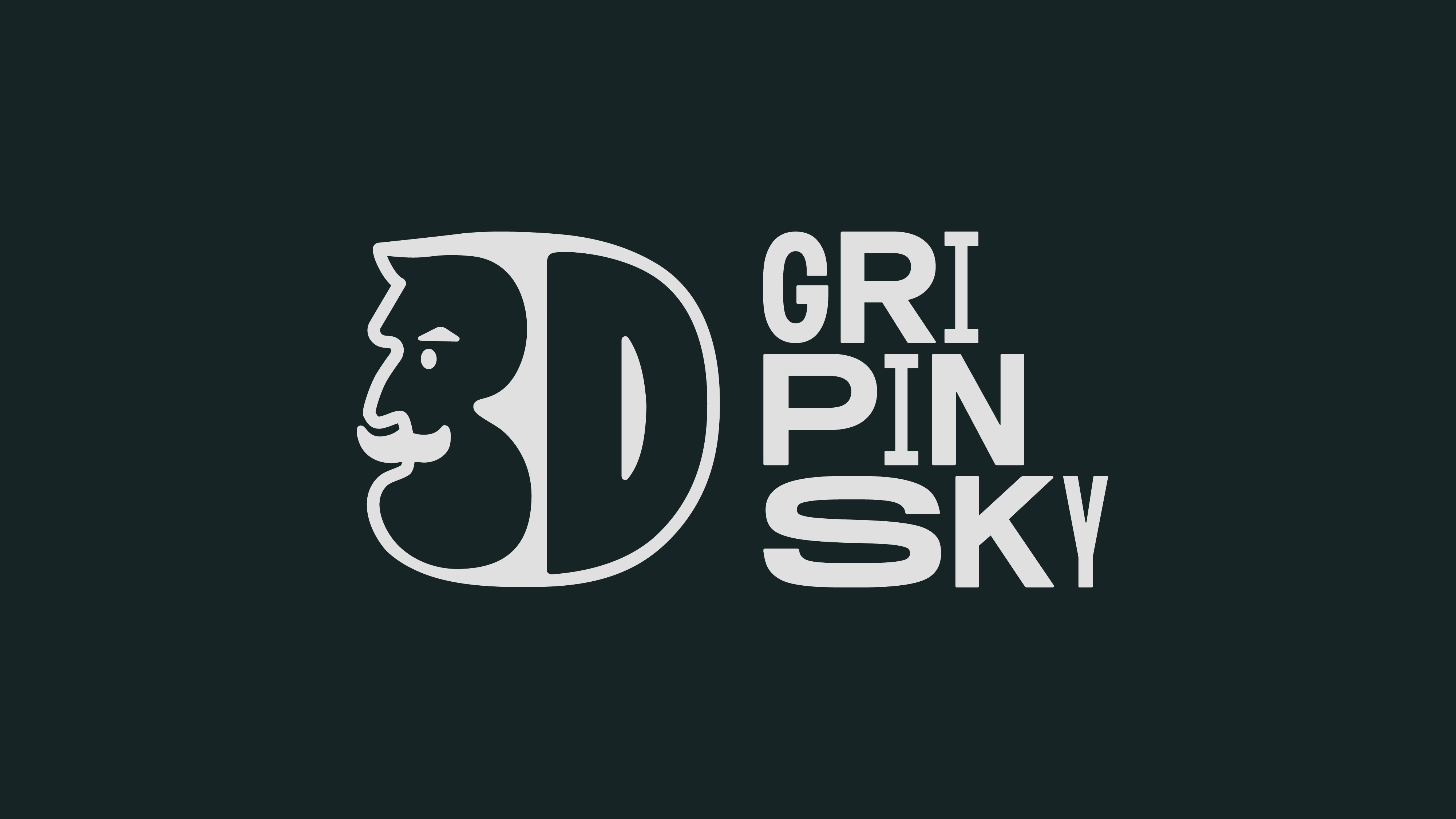
A logo is one of the most critical components of an identity. It was in this symbol that it was necessary to reflect the formula “creativity + 3D + systematic approach” as a new meaning of the brand, to preserve the image of the founder of the school, and, of course, to set it apart from competitors visually. The created symbol acquired an emotional, easily readable meaning simultaneously. It is easy to remember since the number 3 contains the prototype of the founder. Without forgetting about the very essence of the Academy, we keep the volume in the logo, which creates a direct reference to 3D.
The font part of the logo is also not easy! We tried to keep the dynamics in the font, which reflects the essence of learning. This is not a monotonous and primitive process but a whole path, a journey of students’ efforts and many attempts on the way to an ideal result.
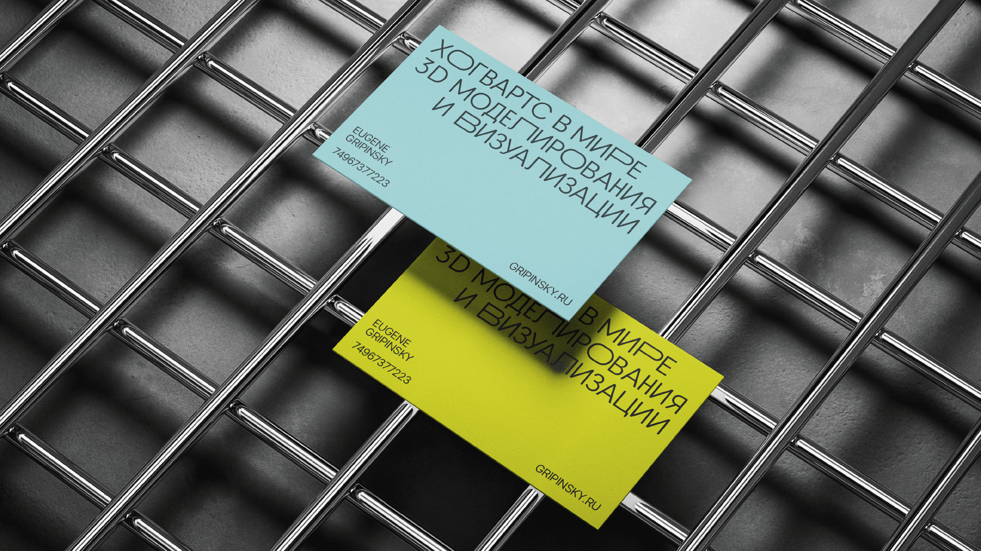
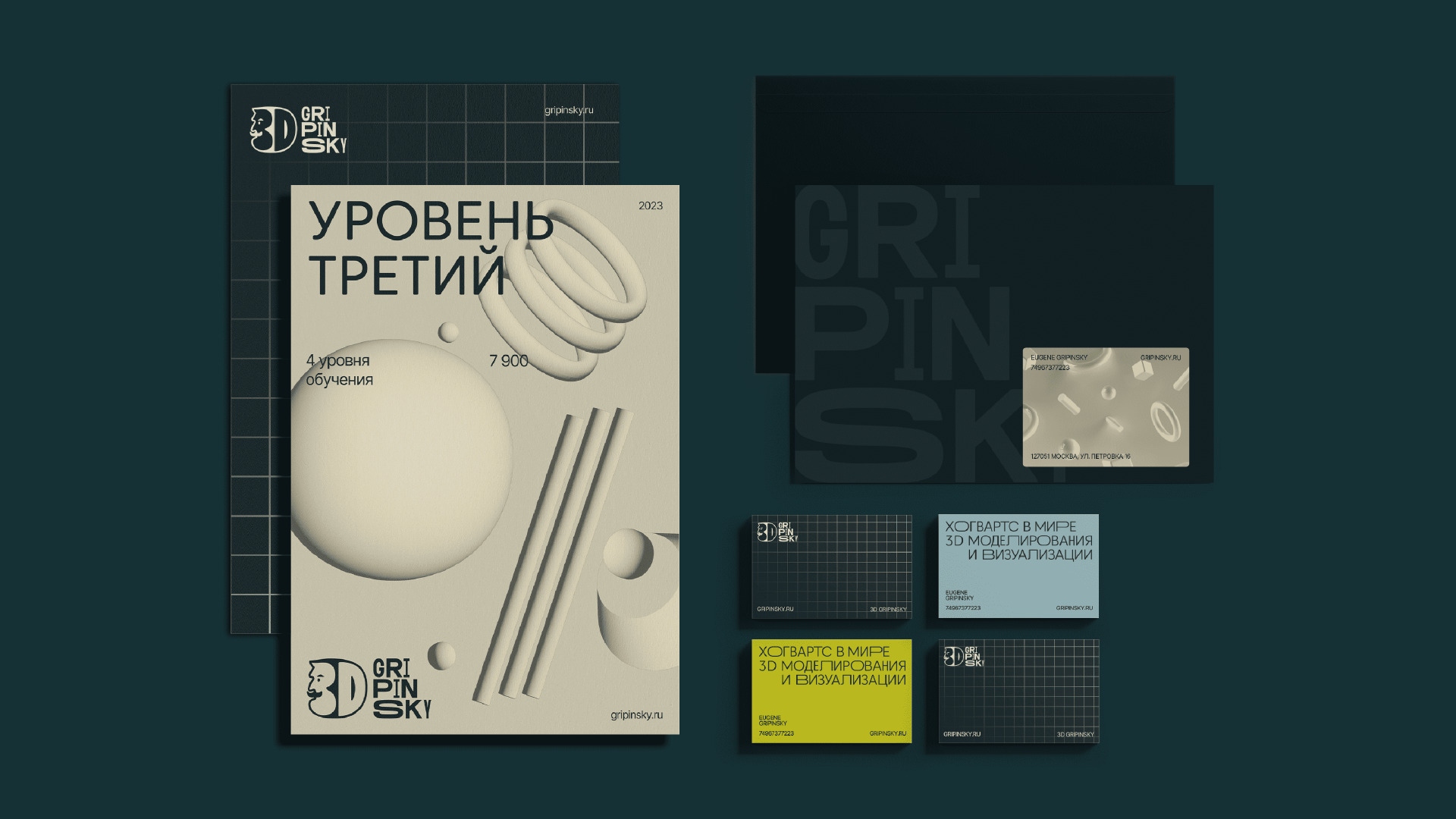
The color palette uses two accent colors that distinguish the brand from the rest but also look pretty strict. This decision was made based on a design study in which competitors, the market, and the present trends were studied in detail. A pattern system is also being developed in continuation of the logo idea. Their goal is to reveal the main product of the school; since the training itself consists of 4 levels, each pattern symbolizes a specific block and shows “progress in learning.”


CREDIT
- Agency/Creative: Moloko Creative Agency
- Article Title: Branding for 3D GRIPINSKY
- Organisation/Entity: Agency
- Project Type: Identity
- Project Status: Published
- Agency/Creative Country: Lithuania
- Agency/Creative City: Vilnius
- Market Region: Global
- Project Deliverables: 3D Design, Brand Identity, Brand Strategy
- Industry: Education
- Keywords: Brand identity for 3D modeling school
-
Credits:
Creative Director: Denis Misuylya
Creator: Darya Ivashka
Art Director: Elena Razenkova
Art Director: Anna Mikhnevich
Designer: Maxim Baranov
Designer: Ilya Yusko
Designer: Yulia Makarchuk
Designer: Valeryia Kaziuchyts


