The difference lies in the ability to convert complex processes into short and simple steps for the customer. With great know-how in the market, Muxima always finds the best deals.
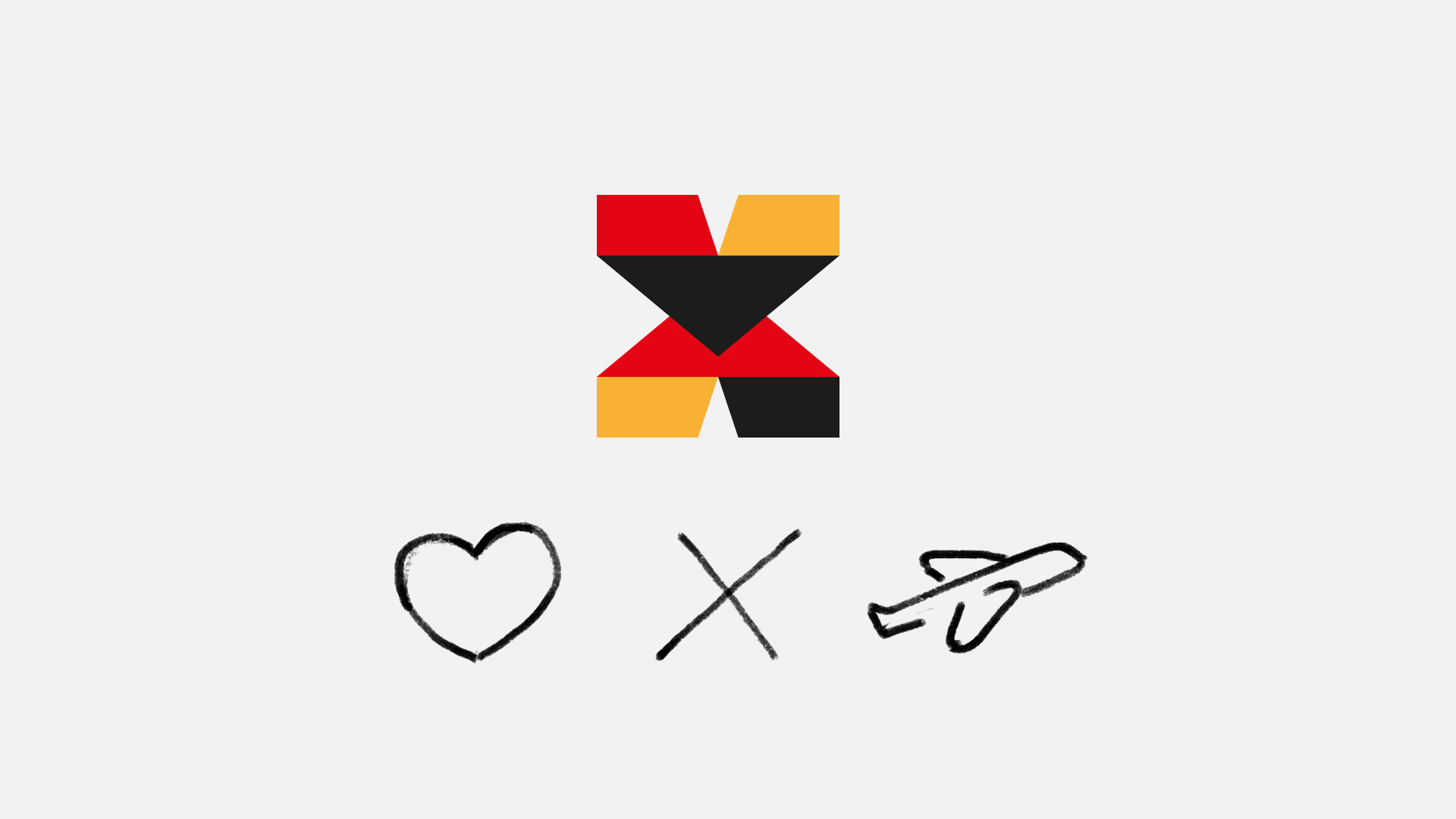
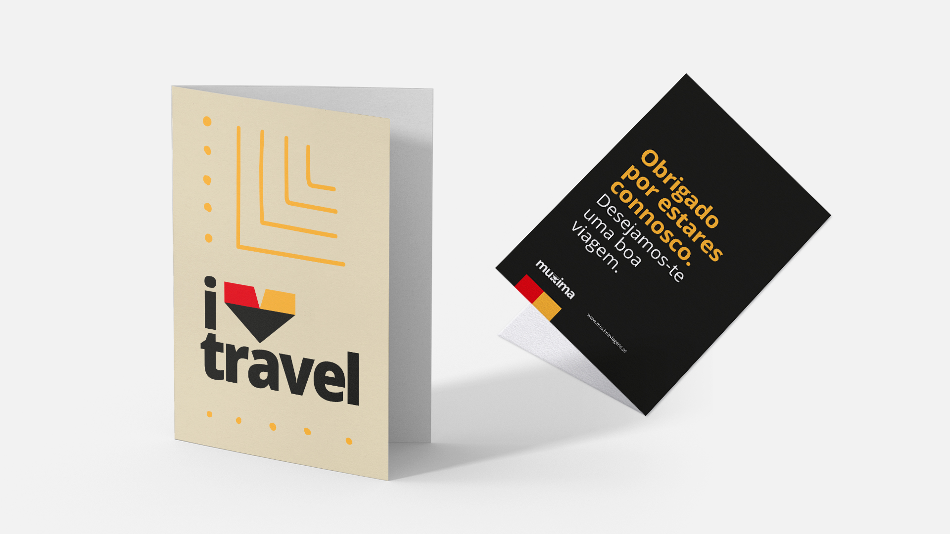
In Kimbundu language, Muxima means heart. The company’s relationship practices with the customer are totally in line with this meaning, so it was a point of great evidence, and, graphically, it would have to be on advertisements. The production has considered aspects of familiarity, Angolan identity and simplicity.
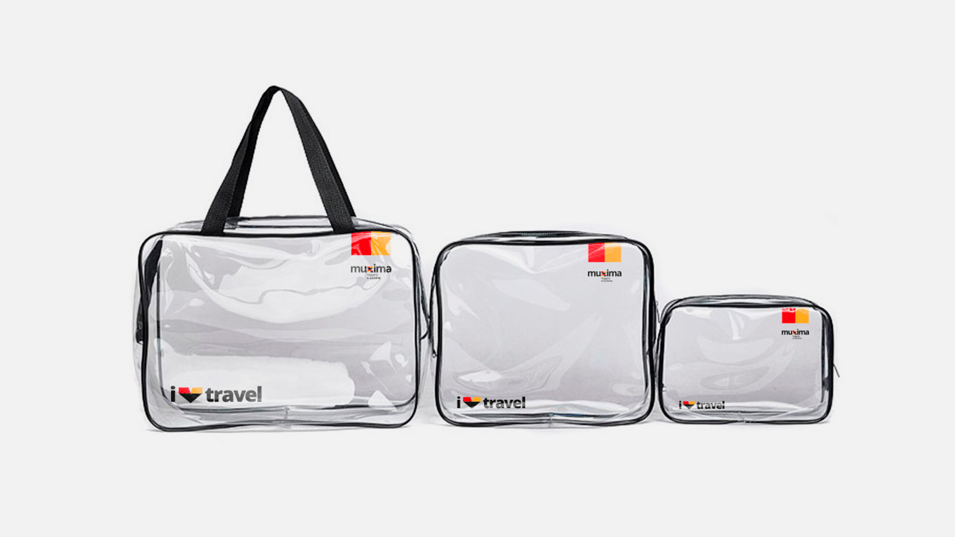
During the visual synthesis attempts, a fusion between the service provided – represented by the plane -, the heart and the letter “x” was created. By incorporating the icon into the word, the logo gained reading, originality and simplicity dynamics.
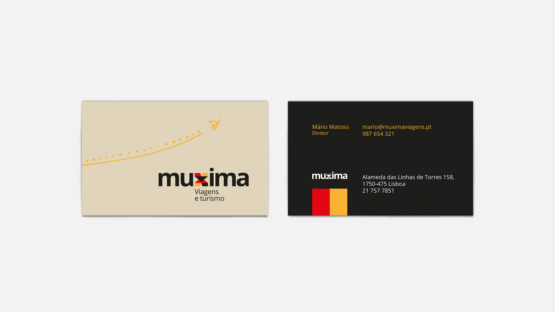
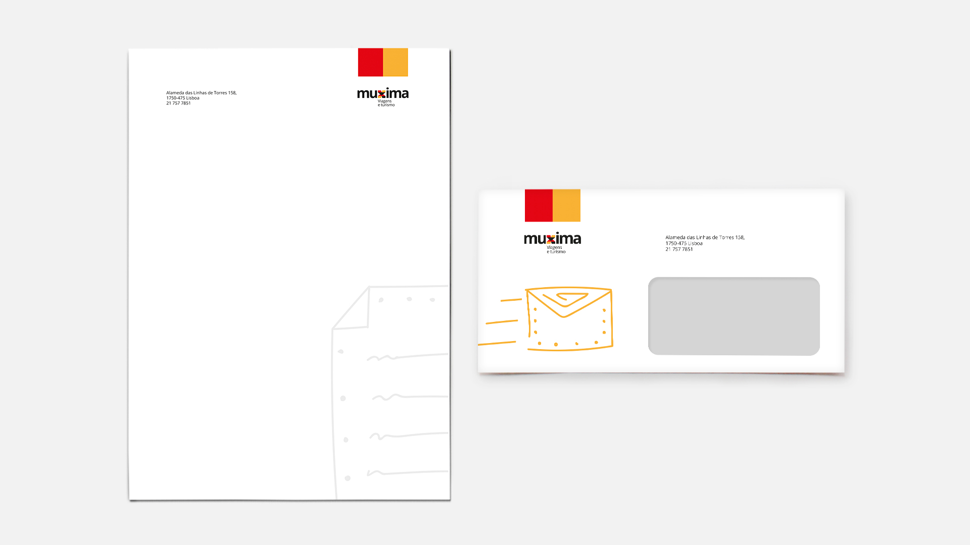
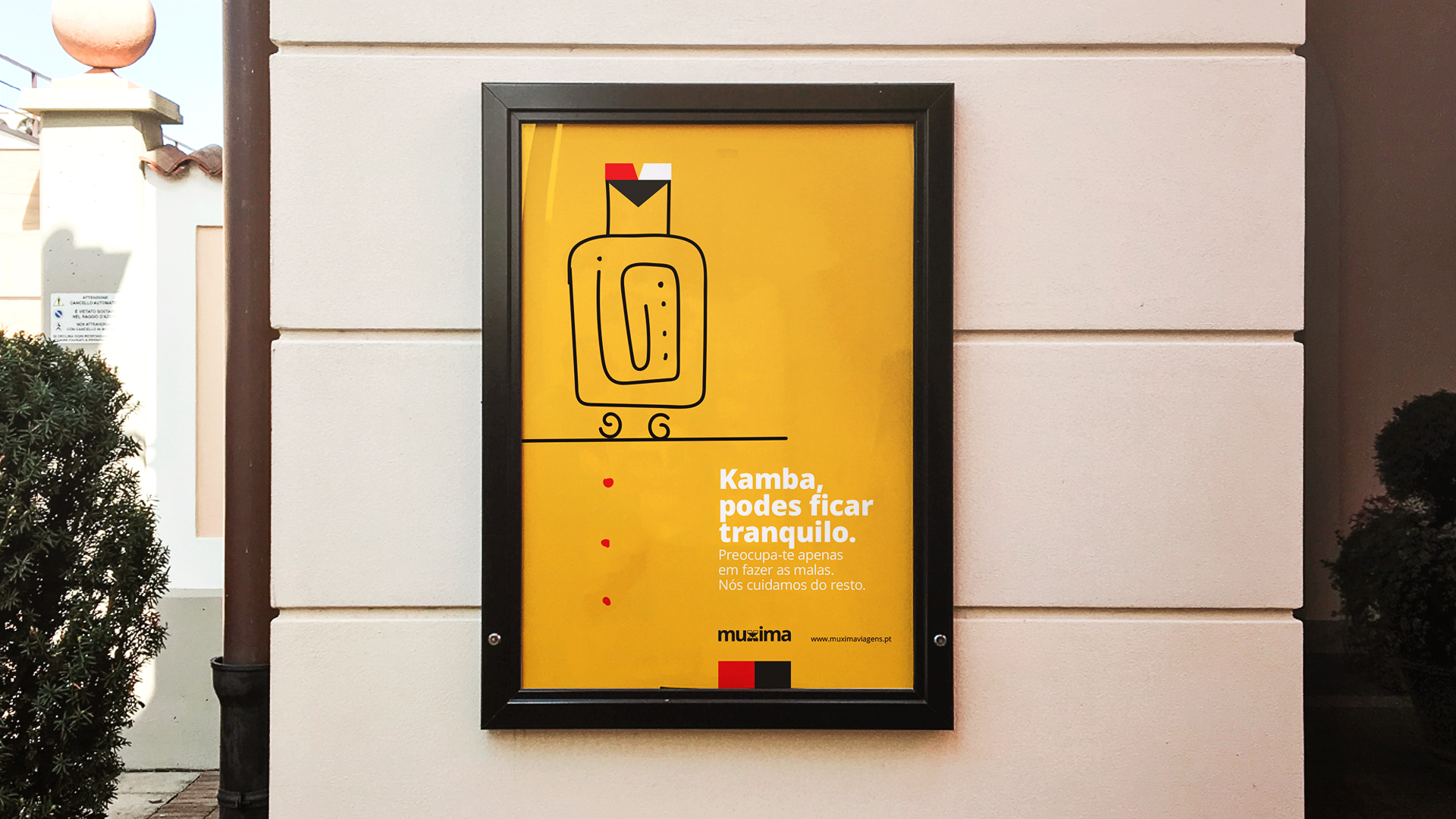
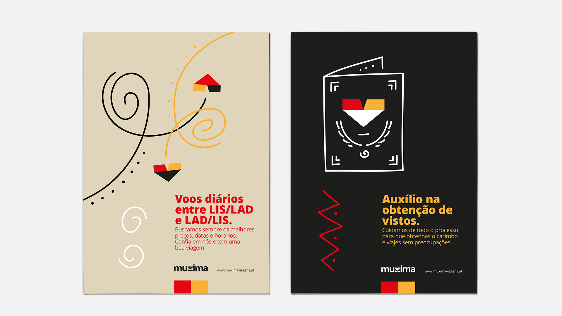
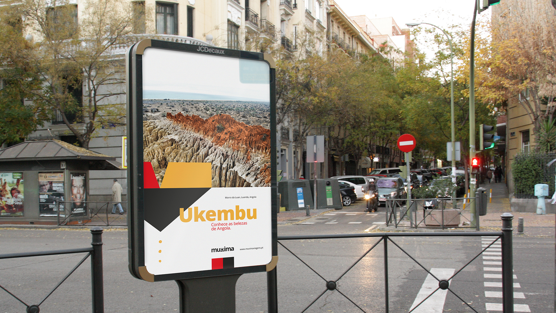
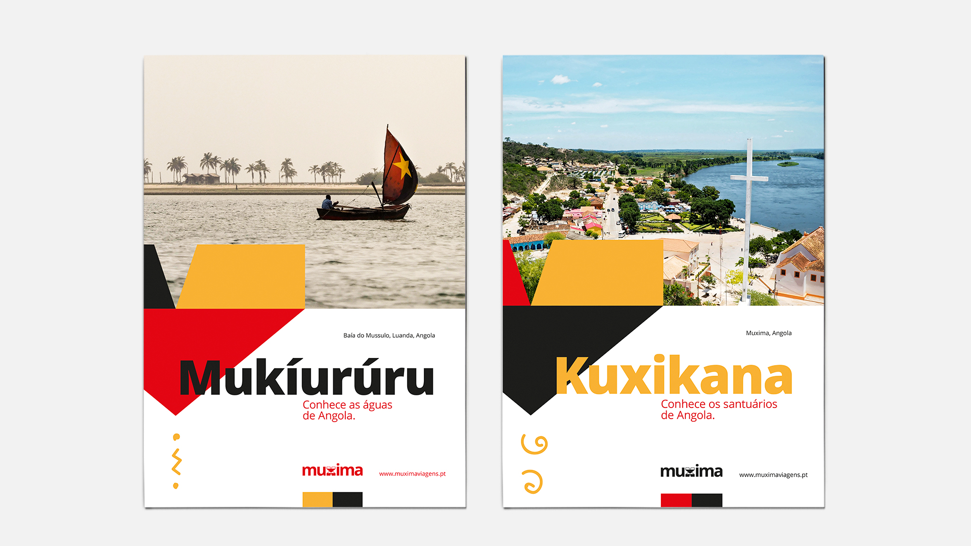
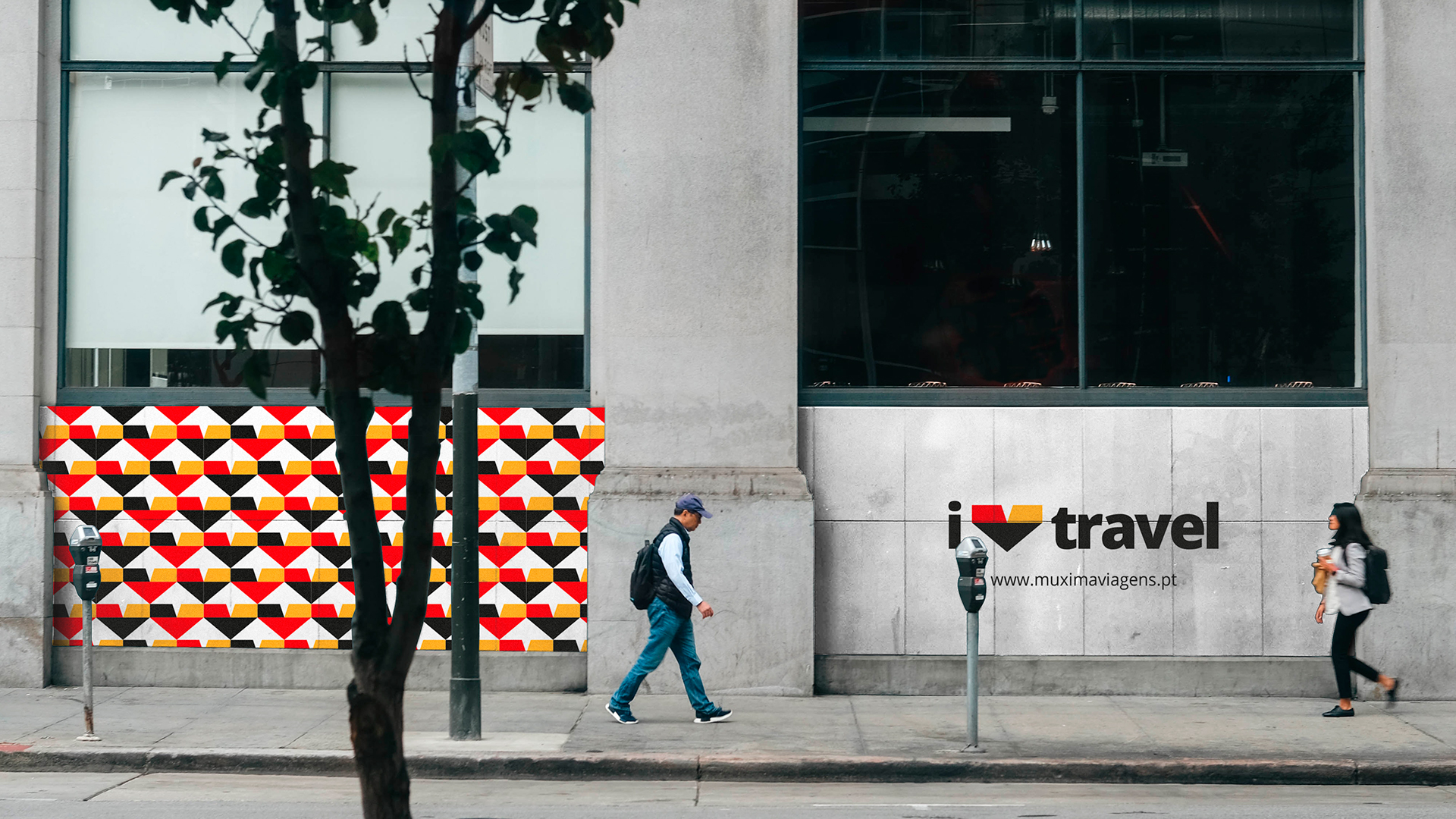
Increasing and highlighting the proximity that Muxima has with customers, the advertisiment contact points use the icon alongside the illustrations – with organic lines, reminiscent of African hand paintings – with the support of strong and vibrant colors. In way to show the greater proximity and thus to make the idea of the brand count, the graphic pieces were written according to Portuguese spoken in Angola and Portugal.

CREDIT
- Agency/Creative: Jardel Vieira
- Article Title: Branding Developed for Muxima
- Organisation/Entity: Freelance, Published Commercial Design
- Project Type: Identity
- Agency/Creative Country: Portugal
- Market Region: Global
- Project Deliverables: Brand Creation, Brand Identity, Brand Strategy, Branding, Graphic Design, Identity System, Illustration
- Industry: Transport
- Keywords: muxima, identity, branding, travel, illustration


