


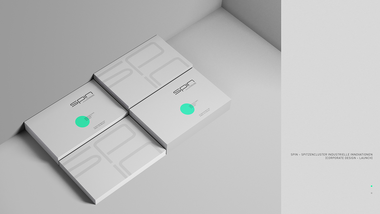
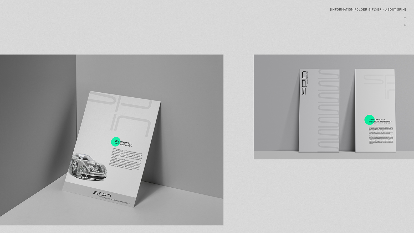
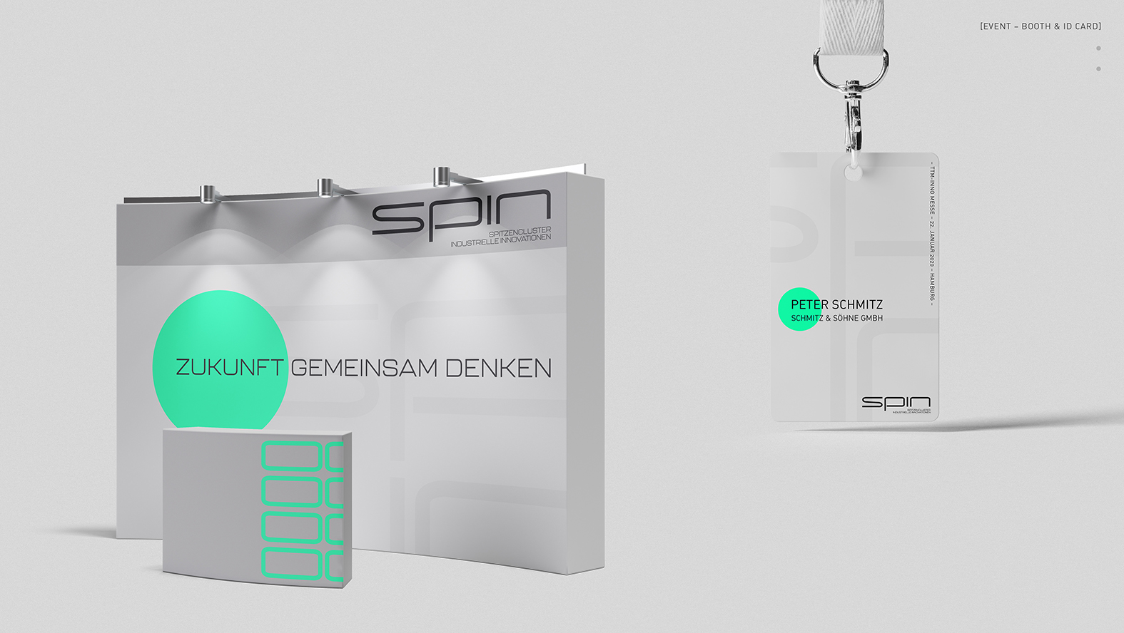
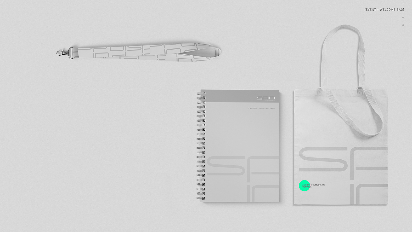
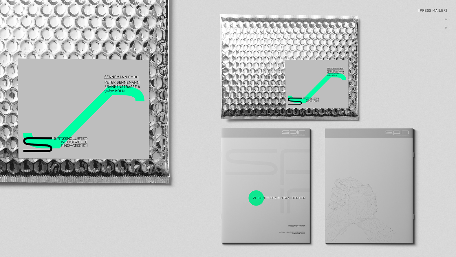
SPIN is a cooperation between industry, science and politics that develops answers to the major questions of our time (such as the energy revolution).
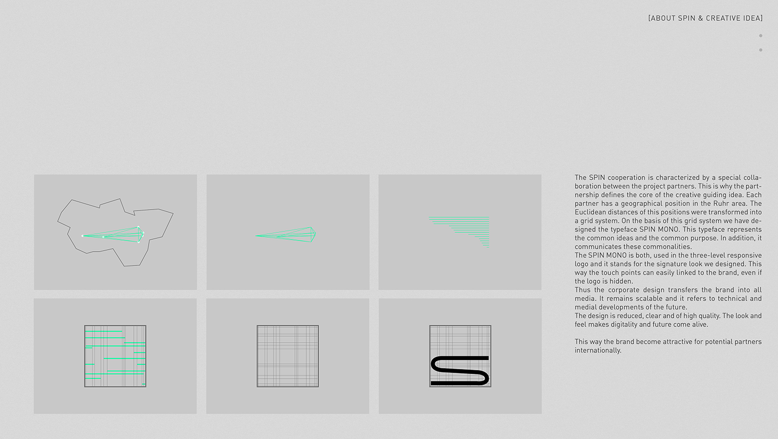
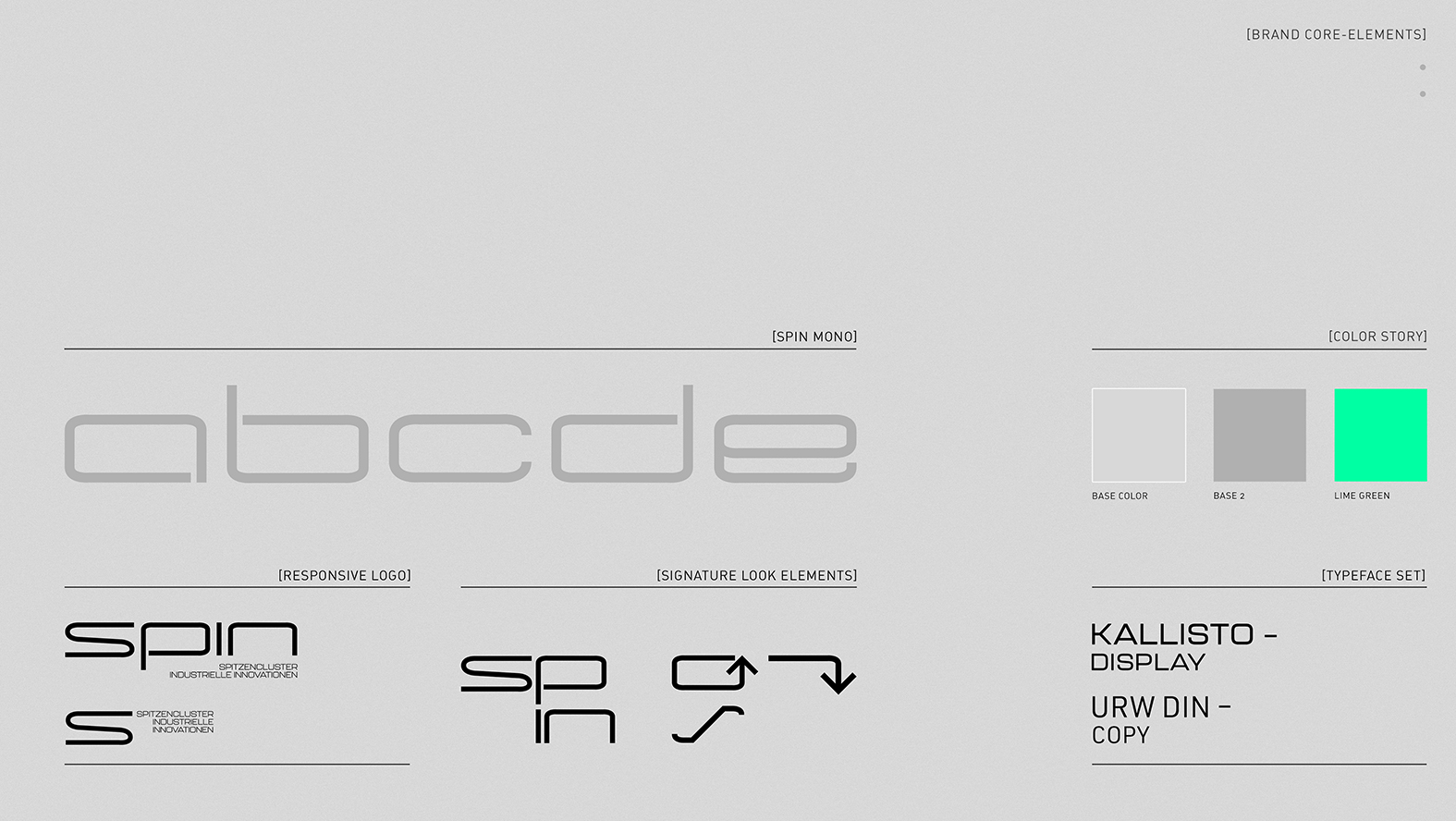
The challenge was to develop a corporate design that addresses business, science, politics and the media and clearly distinguishes itself from brand images of similar collaborations. Since the project is characterized by a special kind of cooperation, this became the center of the creative guiding idea: a network was derived from the geographical position of the project partners. On this basis, the Typeface SPIN MONO was developed as an expression of the common objective.
CREDIT
- Agency/Creative: BOBBY&CARL
- Article Title: Branding Design for SPIN
- Organisation/Entity: Agency, Published Commercial Design
- Project Type: Identity
- Agency/Creative Country: Germany
- Market Region: Europe
- Project Deliverables: Brand Creation, Brand Design, Brand Guidelines, Brand Identity, Brand Naming, Brand World, Branding, Graphic Design
- Industry: Energy
- Keywords: Branding Design, Corporate Design
FEEDBACK
Relevance: Solution/idea in relation to brand, product or service
Implementation: Attention, detailing and finishing of final solution
Presentation: Text, visualisation and quality of the presentation


