


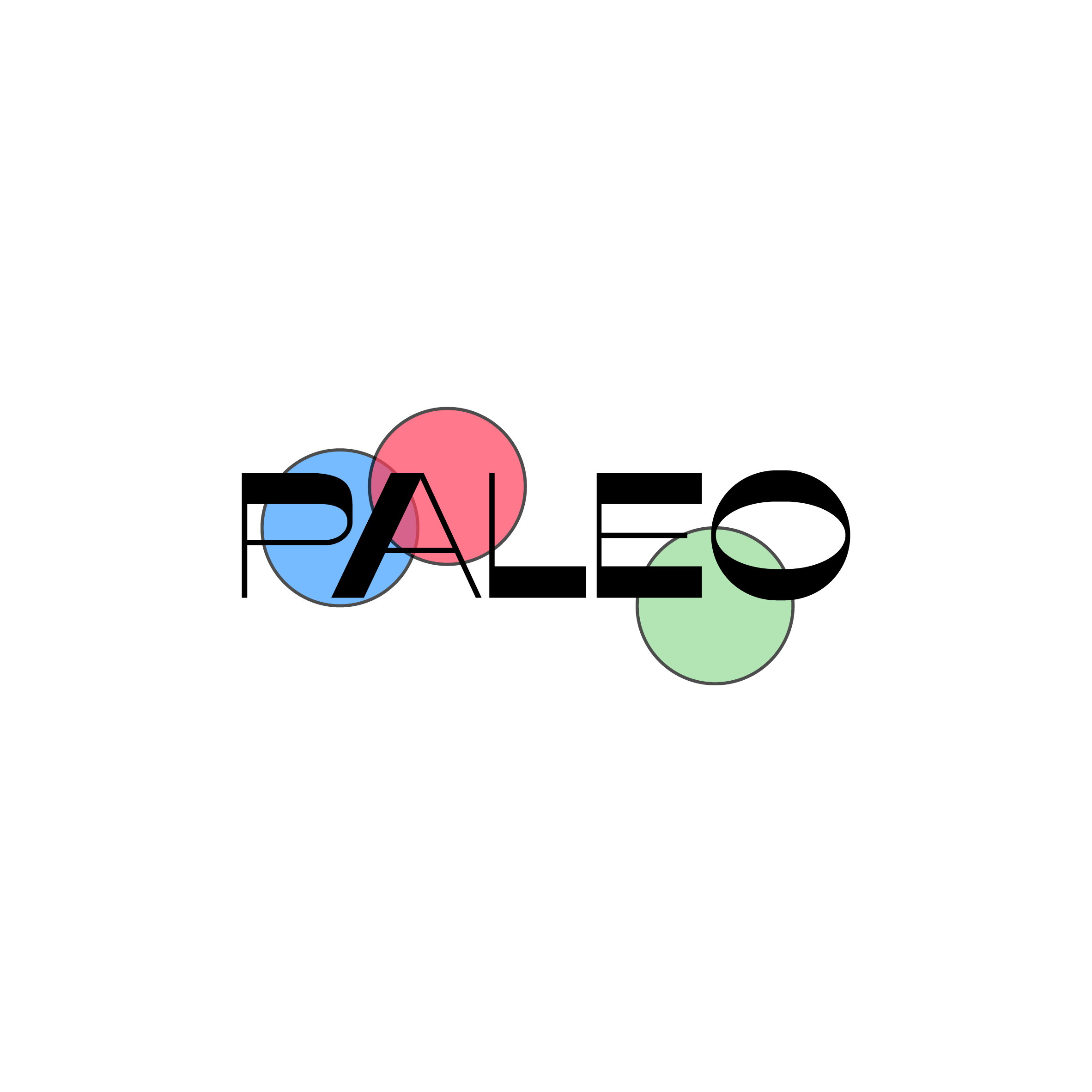
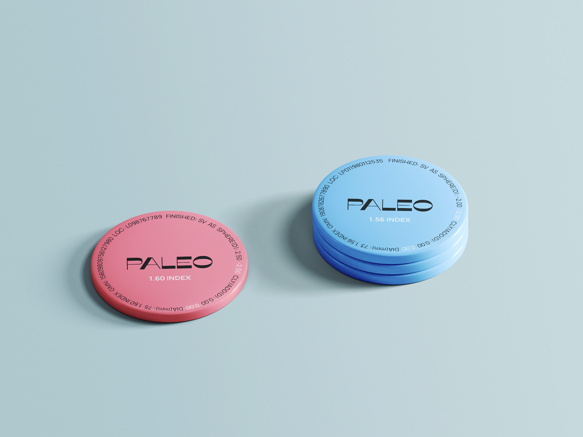
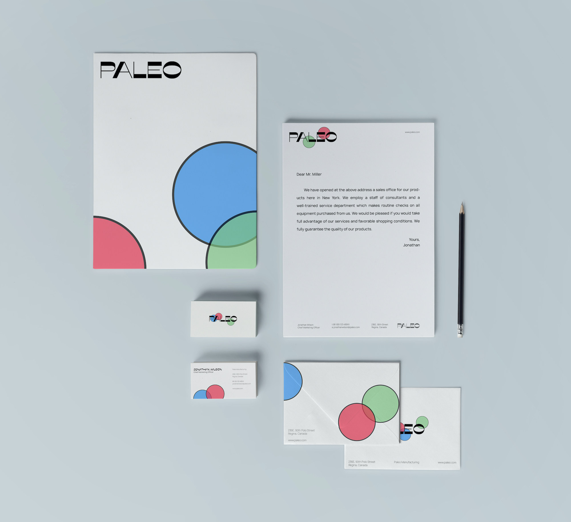
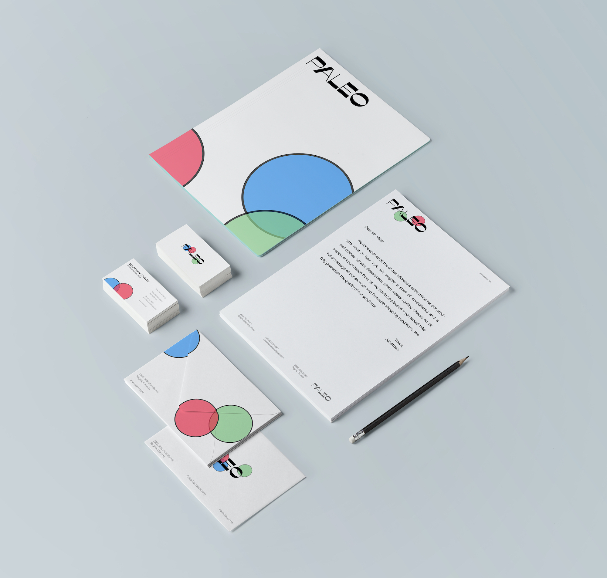
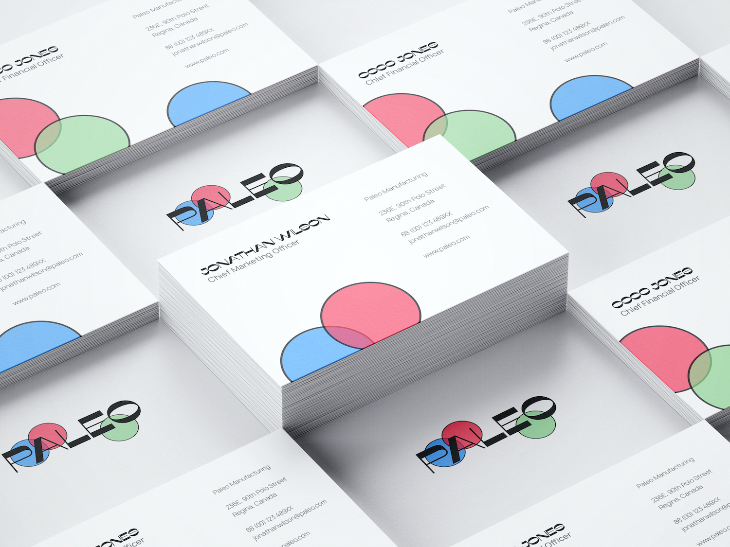
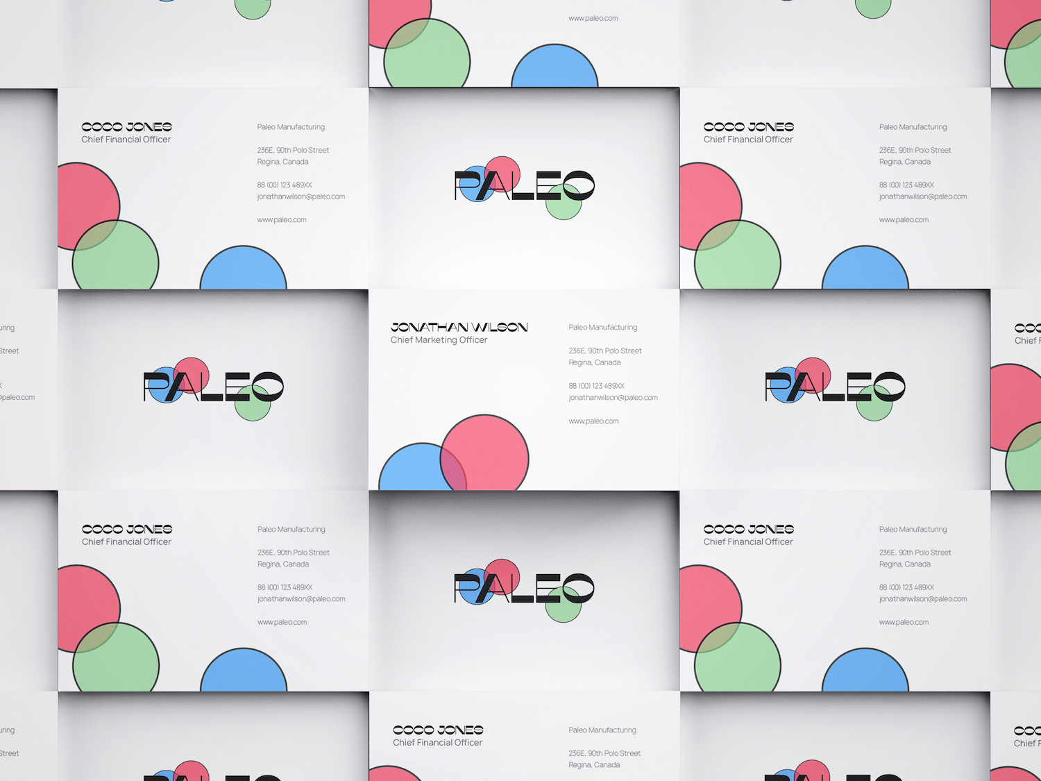
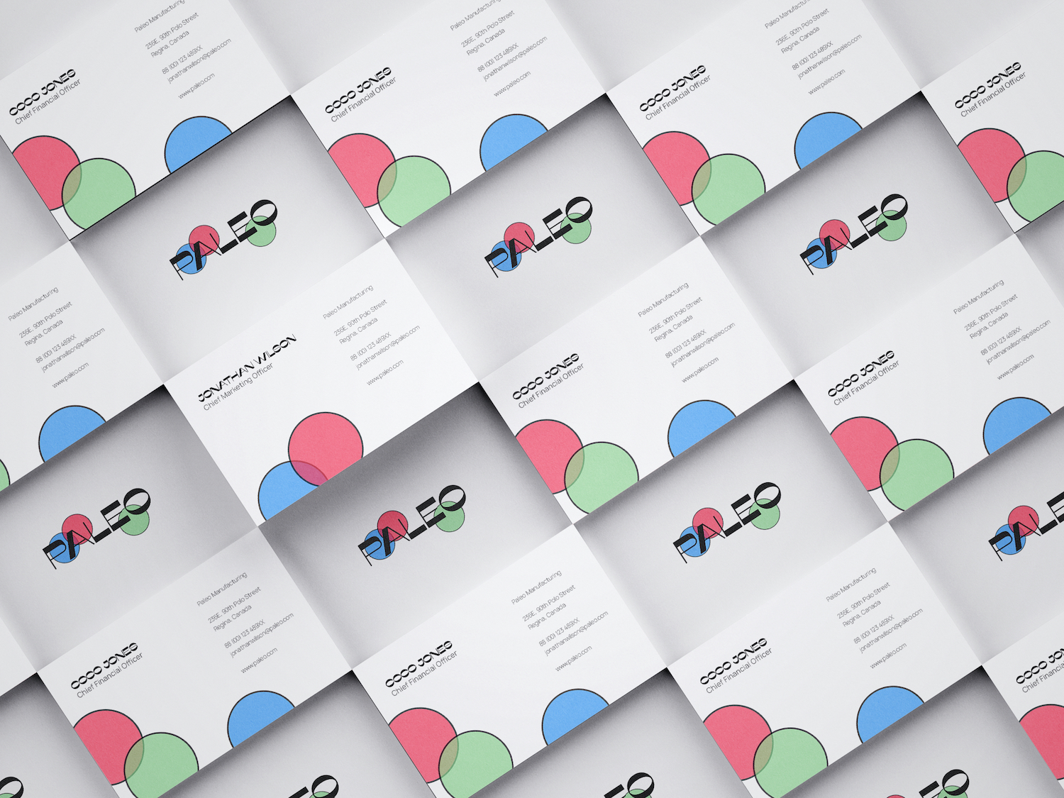
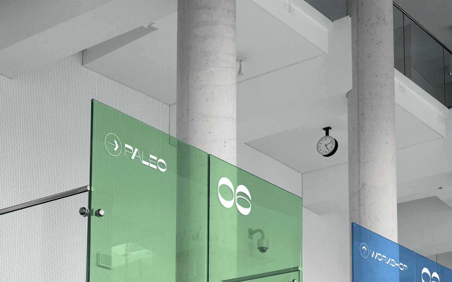
Paleo is a lens manufacturing enterprise headquartered in Canada. In this branding design, I used three primary of light and the shape of the lens to make the most direct expression, showing the brand‘s product concept of specificity, professional and high quality. And this simple symbol also extends to packaging design and wayfinding system design.
CREDIT
- Agency/Creative: CAI Qingyi
- Article Title: Branding Design for Paleo Lens
- Organisation/Entity: Freelance, Published Commercial Design
- Project Type: Identity
- Agency/Creative Country: China
- Market Region: North America
- Project Deliverables: Brand Advertising, Brand Architecture, Brand Creation, Brand Design, Brand Experience, Brand Guidelines, Brand Identity, Brand Naming, Brand Redesign, Brand Refinement, Brand Rejuvenation, Brand Strategy, Brand World, Branding, Graphic Design, Identity System, Industrial Design, Packaging Design, Photography, Product Architecture, Product Naming, Research, Retail Brand Design, Structural Design, Tone of Voice
- Industry: Manufacturing
- Keywords: graphic design, branding, packaging, lens, color
FEEDBACK
Relevance: Solution/idea in relation to brand, product or service
Implementation: Attention, detailing and finishing of final solution
Presentation: Text, visualisation and quality of the presentation


