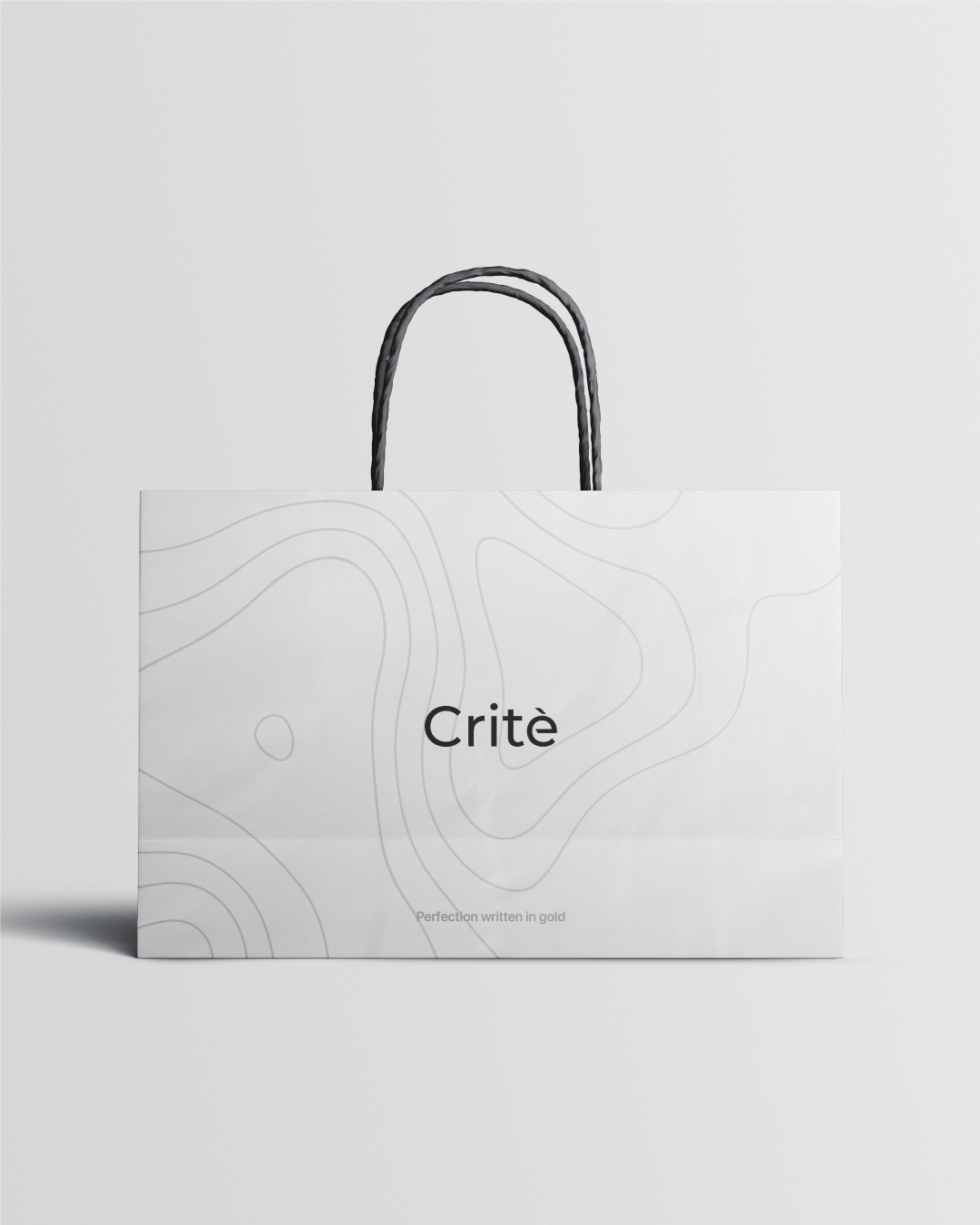
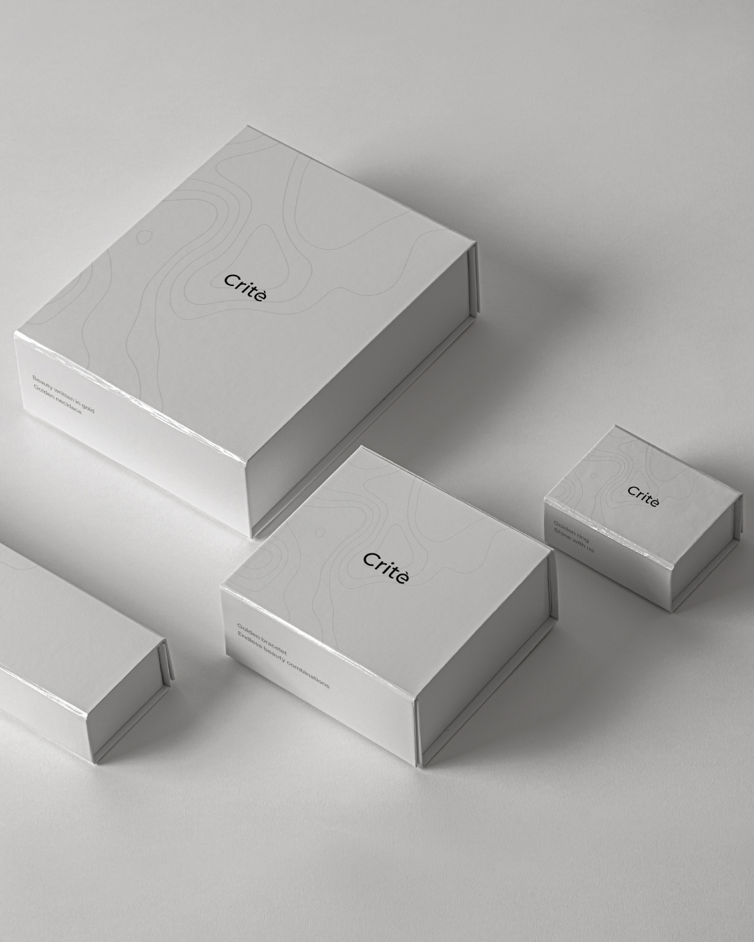
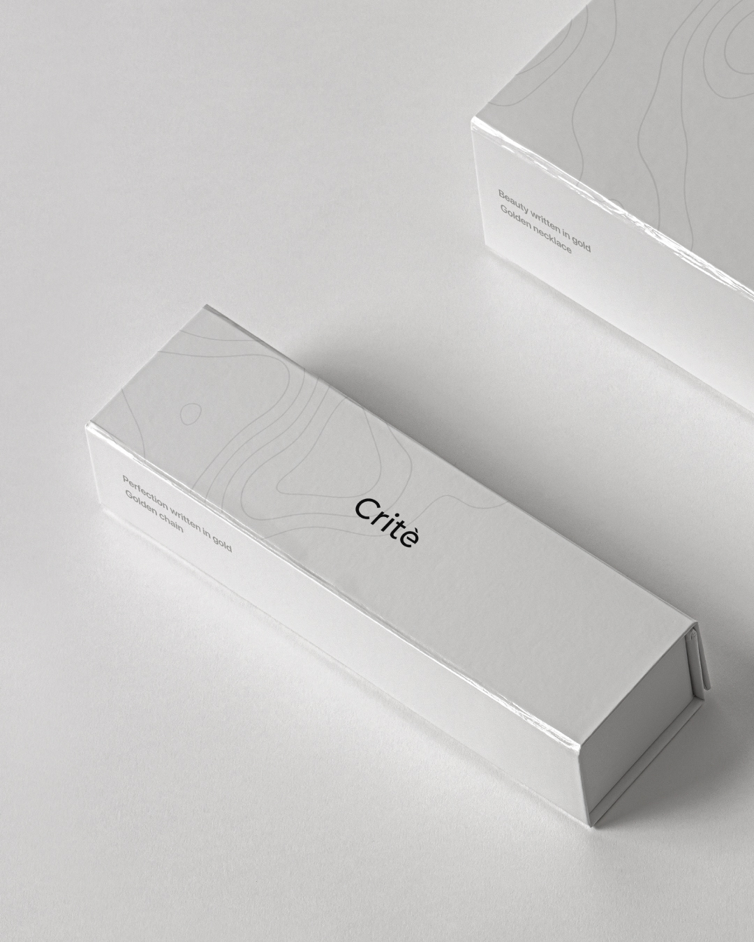
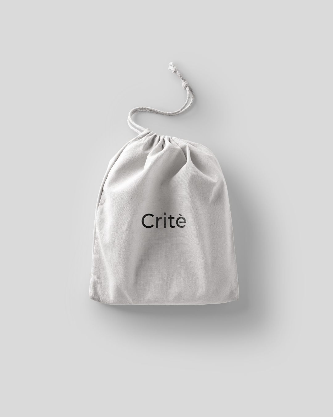
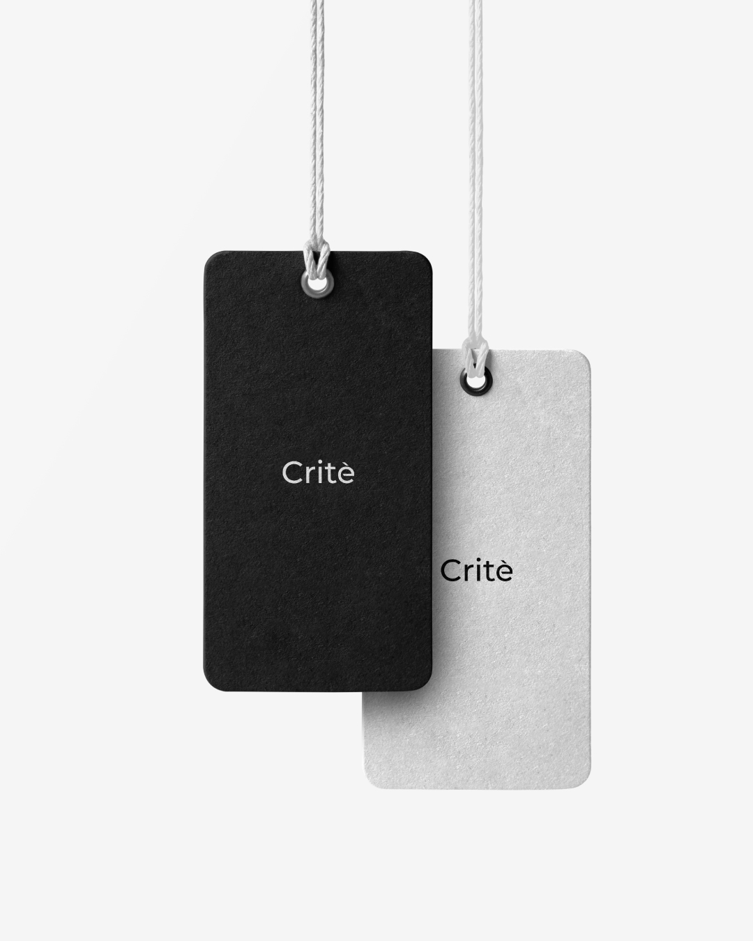
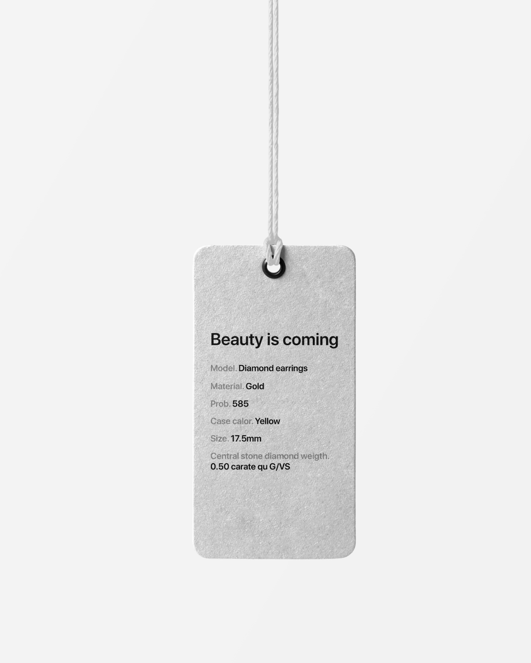
Here we present the packaging design for golden jewelry brand Crite. Crite is specialized in molding the gold into exquisite pieces of jewelry. Their design varies from simple pieces to luxurious ones satisfying the needs of people with different tastes. The common thing that unites all the models of Crite jewelry is the high quality. Thus, the branding had to be of supreme standards and delicate design. Our initial goal was to create a brand that looks plain and yet bold, calming and yet intriguing, serene and yet fascinating. Here we present the result: a new voice in the world of golden jewelry. Simplicity and confidence best describe this design. It is crafted with classical combination of thick black color on a plain white background. The minimalistic logo in black illustrates the lucidity of the brand and the white background with the fine linear elements creates serenity and easiness for eyes. These simple and functional paper boxes with magnet perfectly suit for the presentation and maintenance of expensive golden jewels. This design emphasizes the elegance of the brand and creates high expectations compelling to open it. One can be sure that the box contains something valuable and precious. The packaging includes a tag and a passport that contain all the important information about the jewel, a letter where one can write about their best wishes when giving a gift to their loved ones. The whole the packaging is one complete story. There is nothing to take away from this design and nothing to add. Just enjoy it.
CREDIT
- Agency/Creative: TheProject.Design
- Article Title: Branding Design for Crite Jewelry by TheProject.Design
- Organisation/Entity: Agency
- Project Type: Graphic
- Project Status: Published
- Agency/Creative Country: Armenia
- Agency/Creative City: Yerevan
- Market Region: Europe
- Project Deliverables: Branding
- Industry: Fashion
- Keywords: logo branding jewelry
-
Credits:
Art director: Rafayel Danielyan


