


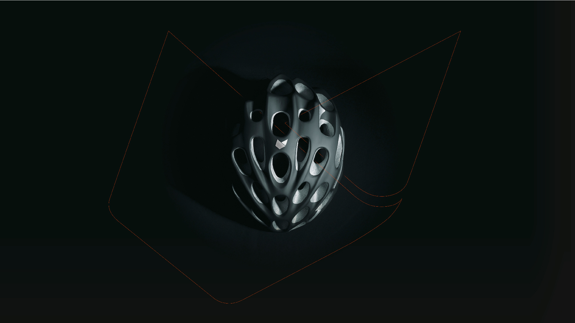
The sport of cycling is becoming more and more sophisticated and technical. The manufacture of any component is linked to technology and refined design. Branding is crucial to differentiate yourself and have your own personality. Founded by cyclist José del Ramo in Spain 25 years ago, Catlike manufactures the best helmets for demanding cyclists. Innovation and new materials such as graphene nano fibers, which have revolutionized the cycling industry in the pursuit of safety but also lightness. Catlike has worked with the best cyclists in major international competitions: Tour de France, Giro d’Italia and Vuelta a España.
For 25 years, their products have redefined comfort, performance and cycling style for professionals and serious amateurs. And now, the Spanish branding agency Bbrand has been in charge of renewing Catlike’s international branding at all levels.
To extend the reach of the Catlike brand, and reposition it as a relevant player within the cycling market, the strategic context and brand definition was set as the first step of the process. Instead of focusing on the tangible value, we worked on the intangible side of the brand: a lifestyle, a mindset, a personality, a community; with the objective of creating a brand culture that would attract new members to its team and its community of users.
After an exhaustive process, Bbrand defined Catlike’s brand idea as “Premium manufacturer” and its positioning as “The different and unique brand”, as well as the purpose, mission, vision, values, tone of voice and attributes.
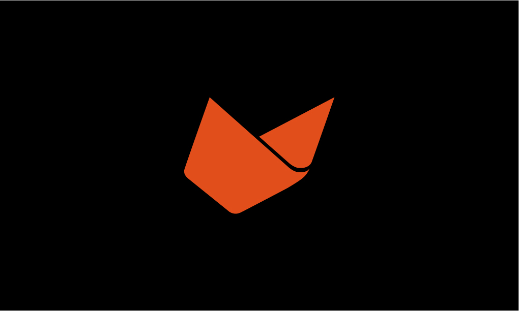
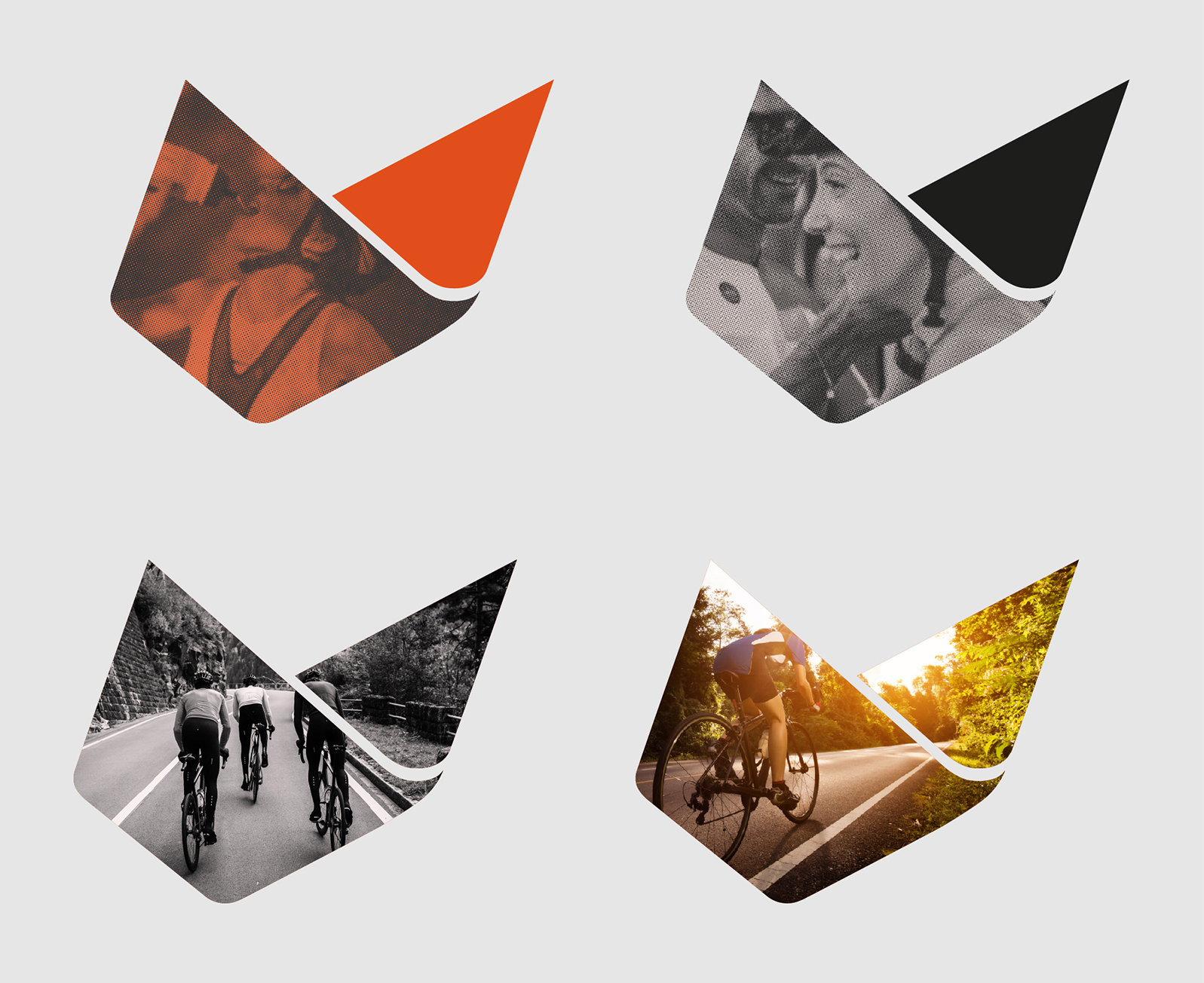
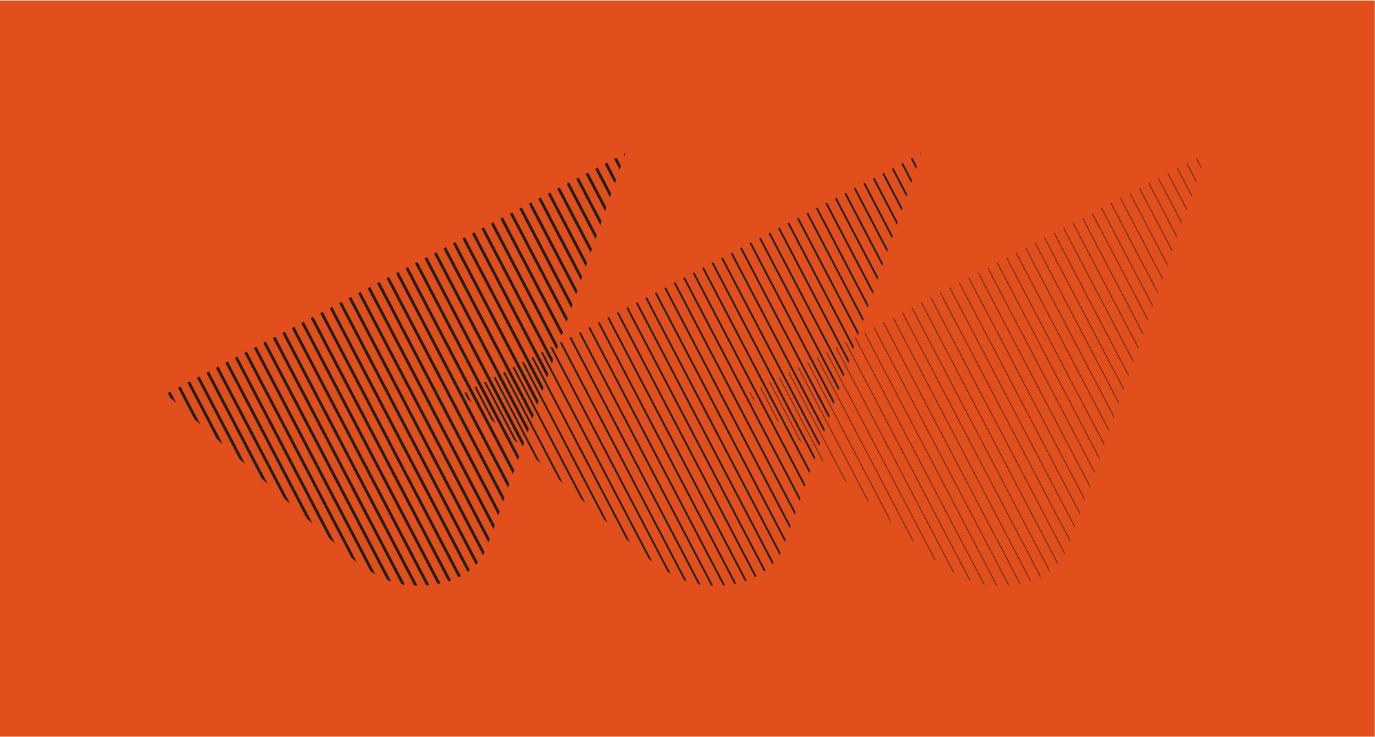
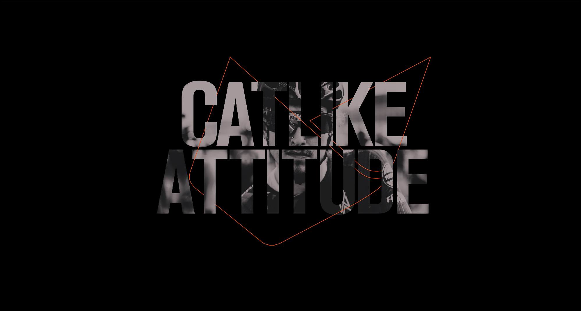
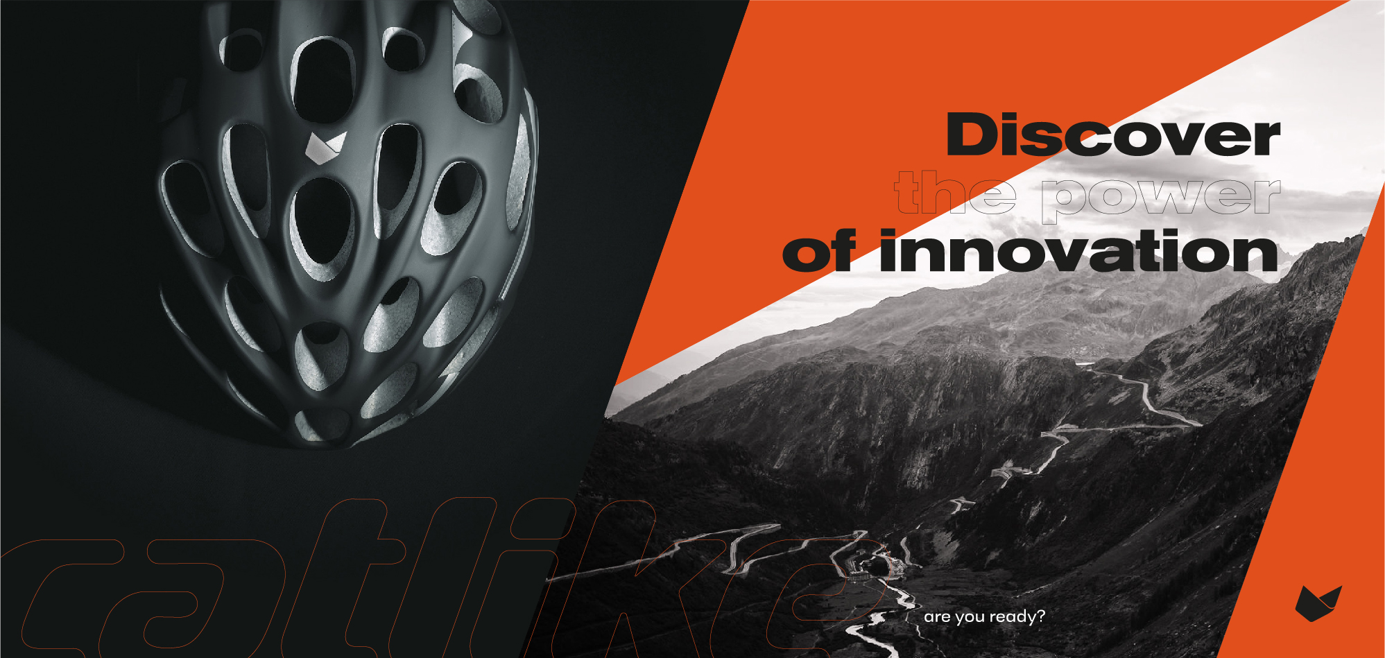
“To visualise the brand idea, we focused on two main strategic pillars: 1. Origin, trajectory and recognition, and 2. When working on the symbol, we modified the silhouette of the cat’s head into a dynamic shape reminiscent of its previous origin. The brand is completed with a typography designed specifically for the logo’s composition. For the colour palette, we kept orange and black as the main colours and added three secondary colours to distinguish the different types of cycling experiences.” – says Bbrand about the new visual identity for the sports brand.
Catlike’s communication had to convey the strategic idea and positioning. In that context a new claim was made “Feel free, explore, connect” playing along with the ideas of new sensations, connecting the moment, Catlike protects you…
The new storytelling summarises the new values of freedom and living the moment with intensity.
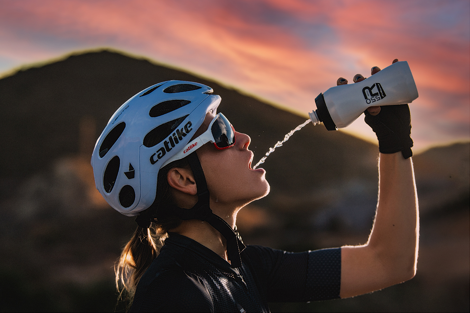
Bbrand also has also carried out the art direction of the new product and brand presentation videos: Closer images, more careful, epic landscapes and environments, color saturation, red sunrise lights, more dynamic scenes recorded in very close shots to capture the sensations of the cyclist, combined with scenes of effort and overcoming maximum performance.

CREDIT
- Agency/Creative: Bbrand
- Article Title: Branding Design for Catlike by Bbrand
- Organisation/Entity: Agency
- Project Type: Identity
- Project Status: Published
- Agency/Creative Country: Spain
- Agency/Creative City: Murcia
- Market Region: Global
- Project Deliverables: Animation, Brand Architecture, Brand Design, Brand Guidelines, Brand Tone of Voice, Branding
- Industry: Retail
- Keywords: Branding, Sports, Cycling, Helmets, Bicycle
-
Credits:
Designer: Bbrand


