


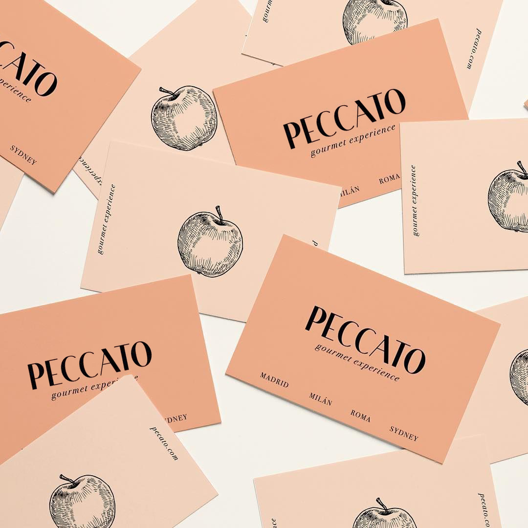
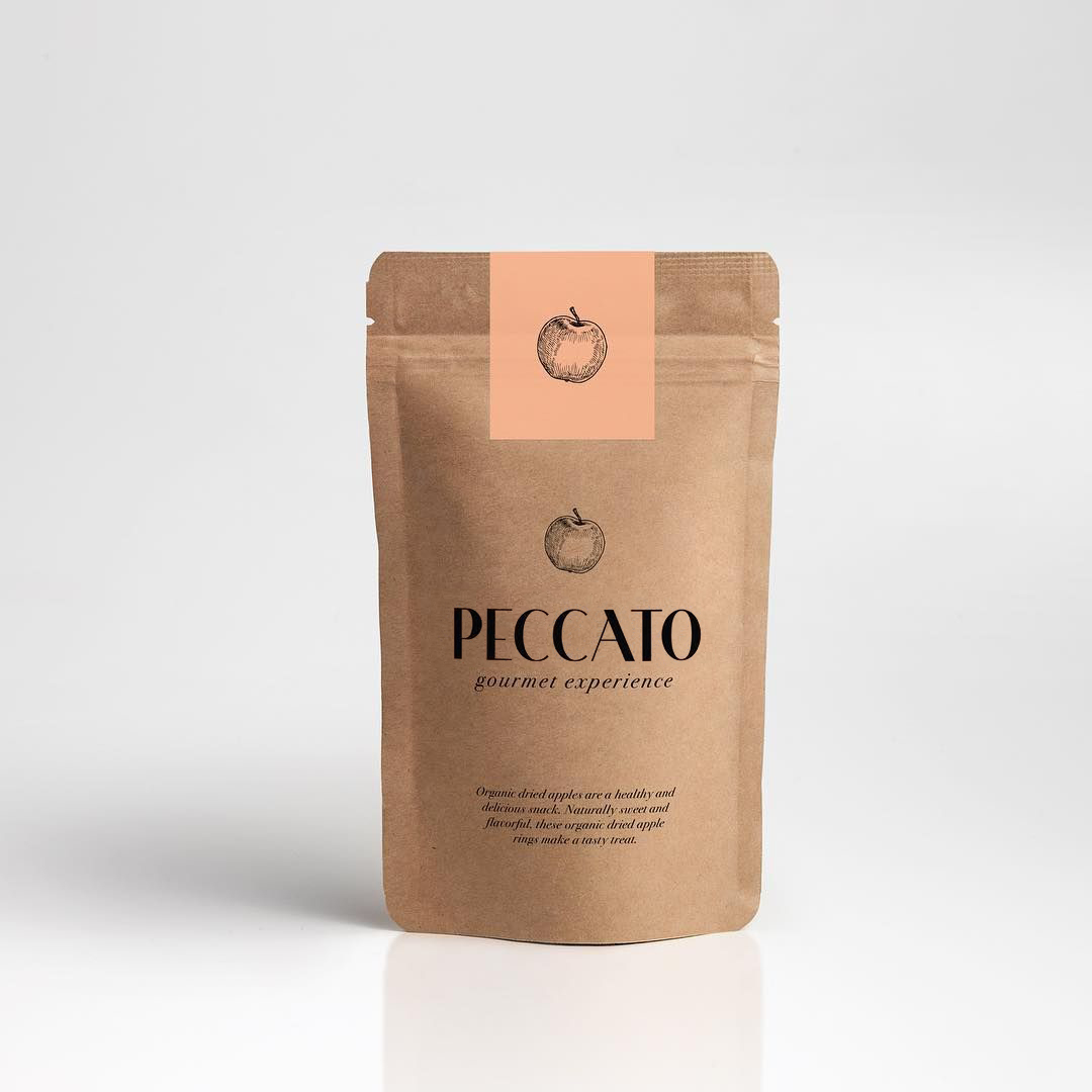
The name origin is Captial sin and pleasure for eating: “gluttony”. “Peccato” is an italian word that means “sin”.
The engraved illustration of an apple refers to the sin of “Adam and Eve”. Engraving technique was an historically important method of producing images on paper in artistic printmaking, in mapmaking, and also for commercial reproductions and illustrations.
Engraving technique is from the 15th Century to the Year 1914 and Art deco 1908 to 1935. That is the reason I have used an art deco typeface for the logo with a soft colours typical of that art style to bring an elegant, glamorous and luxurious look and feel.

CREDIT
- Agency/Creative: Estudio del Mar
- Article Title: Branding Design For a Gourmet Supermarket
- Organisation/Entity: Freelance, Non Published Concept Design
- Project Type: Packaging
- Agency/Creative Country: Spain
- Market Region: North America
- Project Deliverables: Brand Identity, Brand Naming, Brand Strategy, Branding, Graphic Design, Packaging Design, Research, Retail Brand Design
- Keywords: branding, logo design, supermarket, gourmet, luxury, elegant, visual identity, artdeco
FEEDBACK
Relevance: Solution/idea in relation to brand, product or service
Implementation: Attention, detailing and finishing of final solution
Presentation: Text, visualisation and quality of the presentation


