Client
“Victoria 92” is one of the largest horticultural enterprises in the Krasnodar region. Over more than 30 years of development, the brand has established itself as a reliable supplier of fresh fruits and berries in southern Russia.
Task
The brand has achieved a high status in the B2B segment, but decided it was time to enter the B2C market. For this, a well-thought-out company image and consistency in materials were needed. We began working on the brand identity.
Metaphor
While studying the processes within the horticulture, we discovered that despite the hard work, most employees approach their tasks with love and diligence. The first association that comes to mind when observing this is bees. However, we chose not to delve into the aesthetics and life of these wonderful insects. Instead, we made the entire world around our horticulturists resemble a vast garden.
Thus, the metaphor of the “Universe of Taste” was born, where every employee of “Victoria 92” works diligently for the sake of juiciness and ripeness.
Graphic Solution
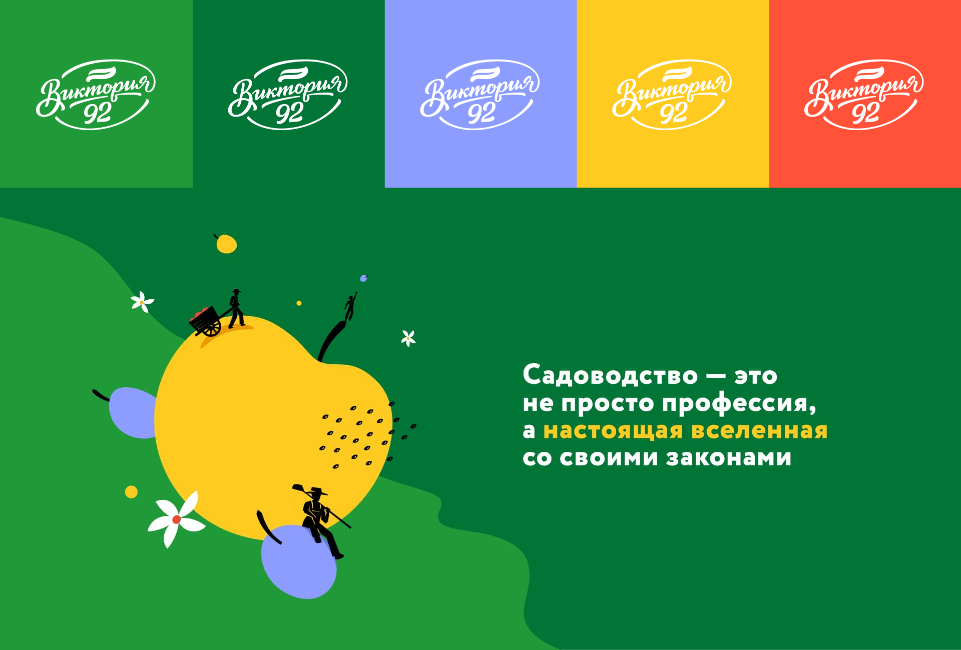
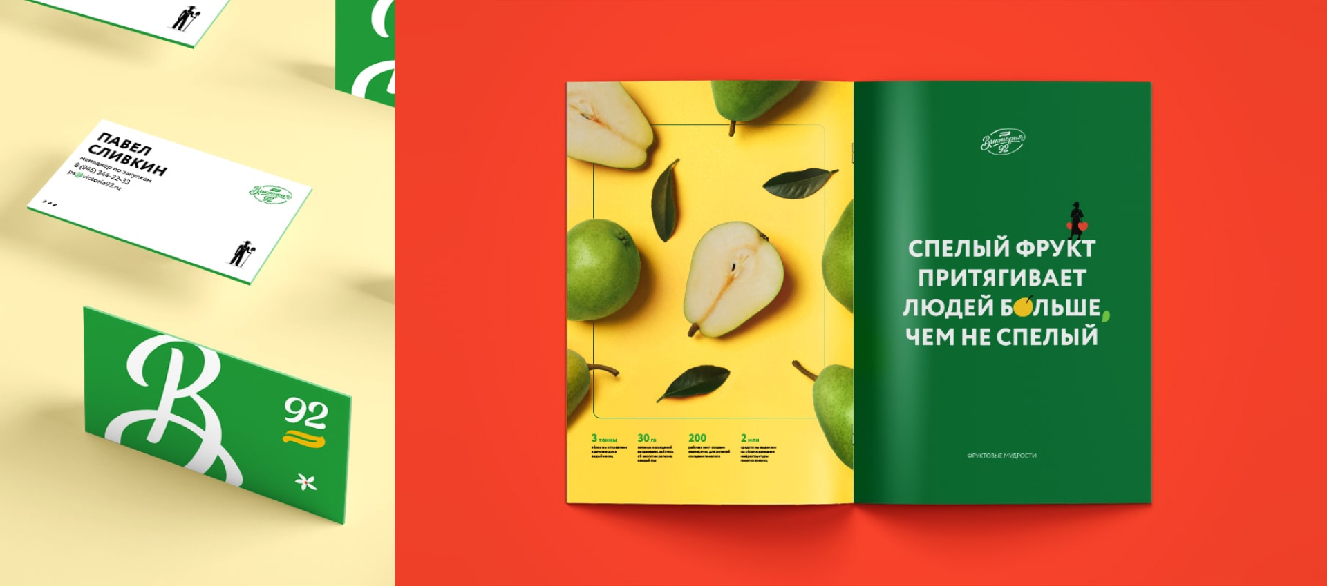
In the logo, we wanted to combine a seal, symbolizing quality, with a signature, as if every employee is ready to personally vouch for this quality. To achieve this, we utilized a lettering style.
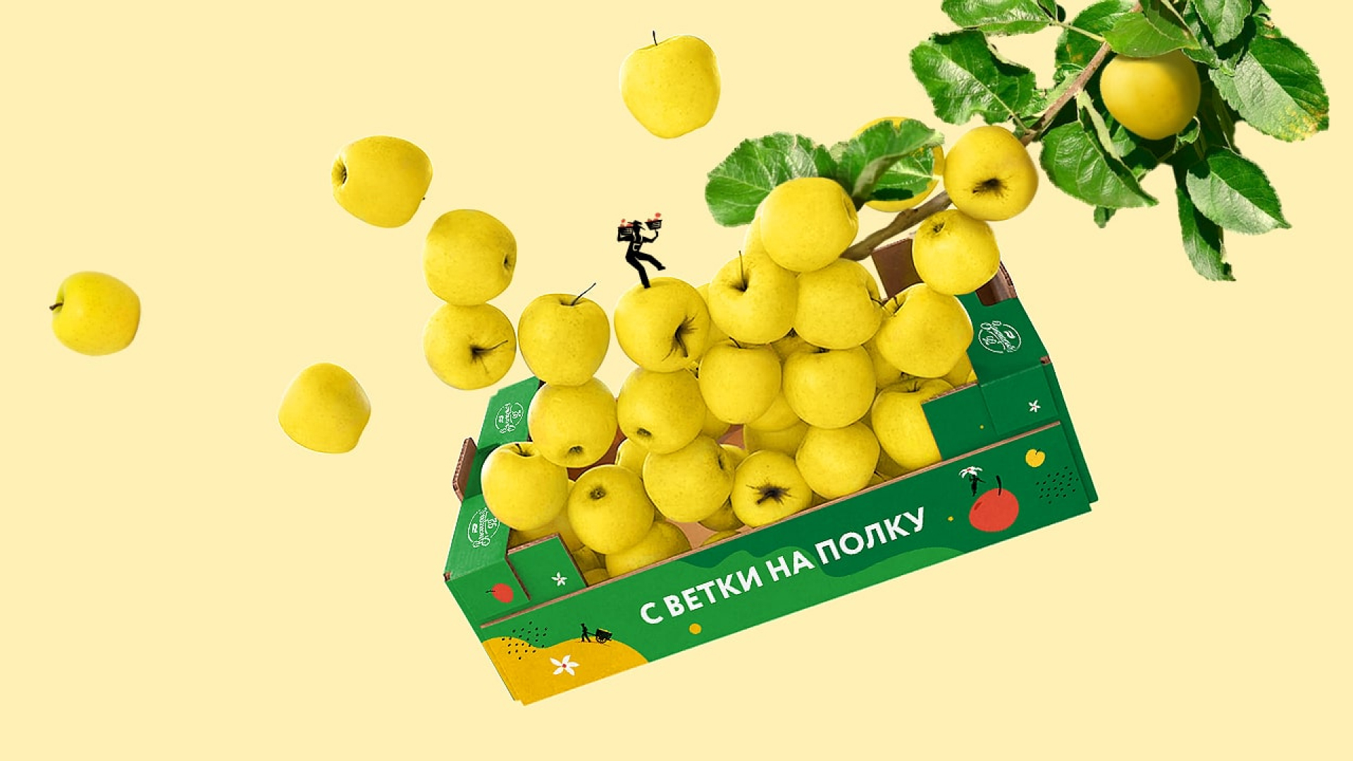
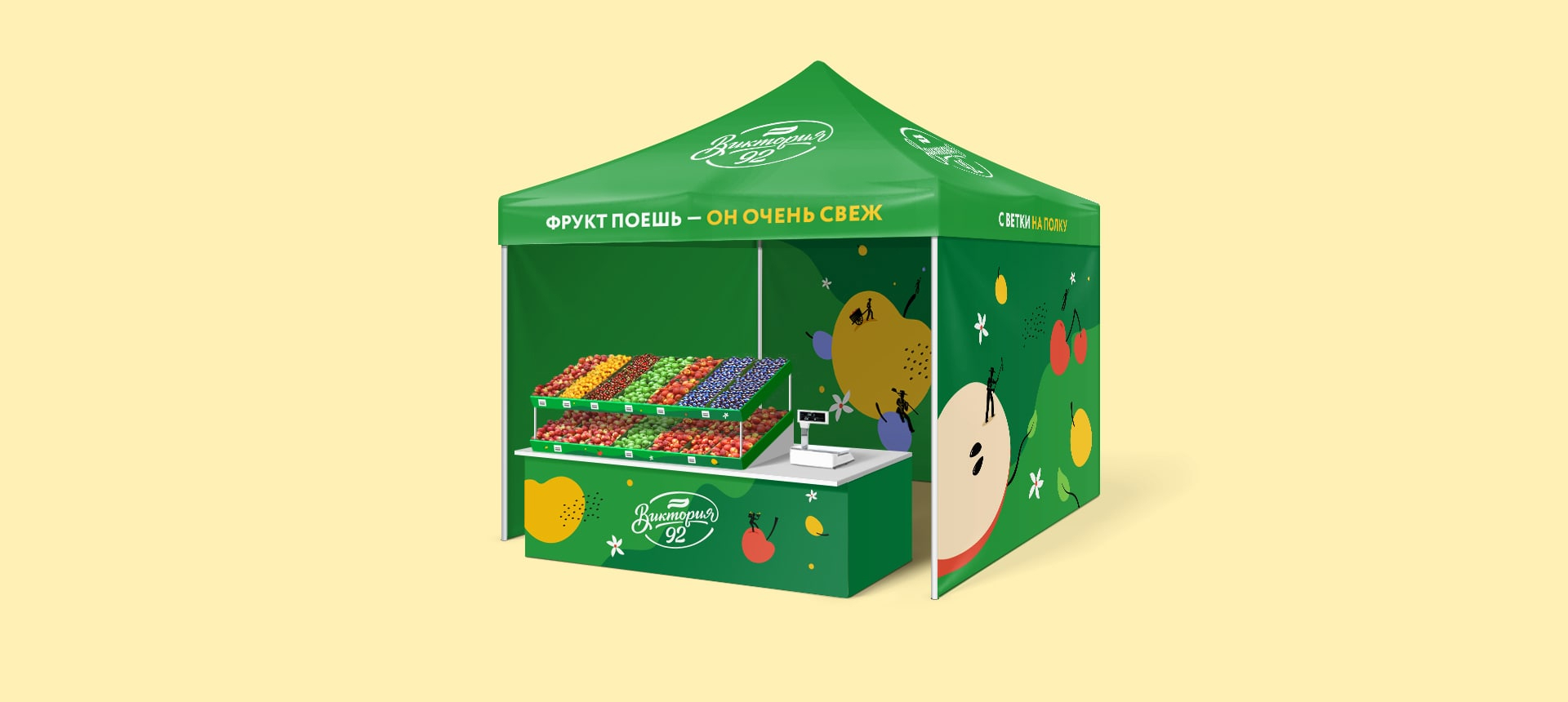
When we began creating the brand element, we realized that with the diversity of products and processes within the company, it wouldn’t be possible to create something static and universal for every application. This led us to develop a system of images that would exist within our universe. The overall feel of the style would be like magic, created by the hardworking horticulturists.
After sketching the character images, we moved on to creating the world. It was decided to make it flat, to avoid overwhelming it with details. The colors were chosen to be as natural as possible, avoiding any neon shades, as we wanted to convey the naturalness and ripeness of the products. The overall composition was slightly chaotic, to reflect the way things float in zero gravity, just like in space.
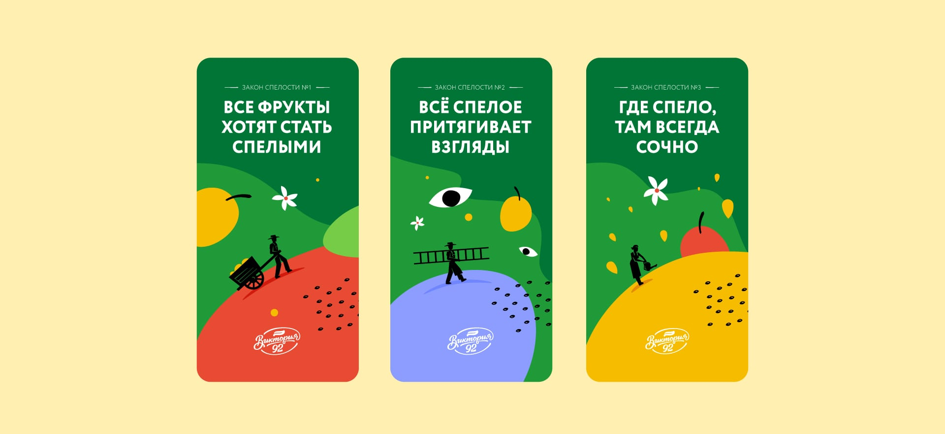
In addition to the graphics, we complemented the world by formulating its laws, which we called the “Laws of Ripeness.” The overall mood of the brand identity is very positive and friendly, so we decided to write these laws in a humorous style. This set the tone for all further communications, where there was always room for humor.
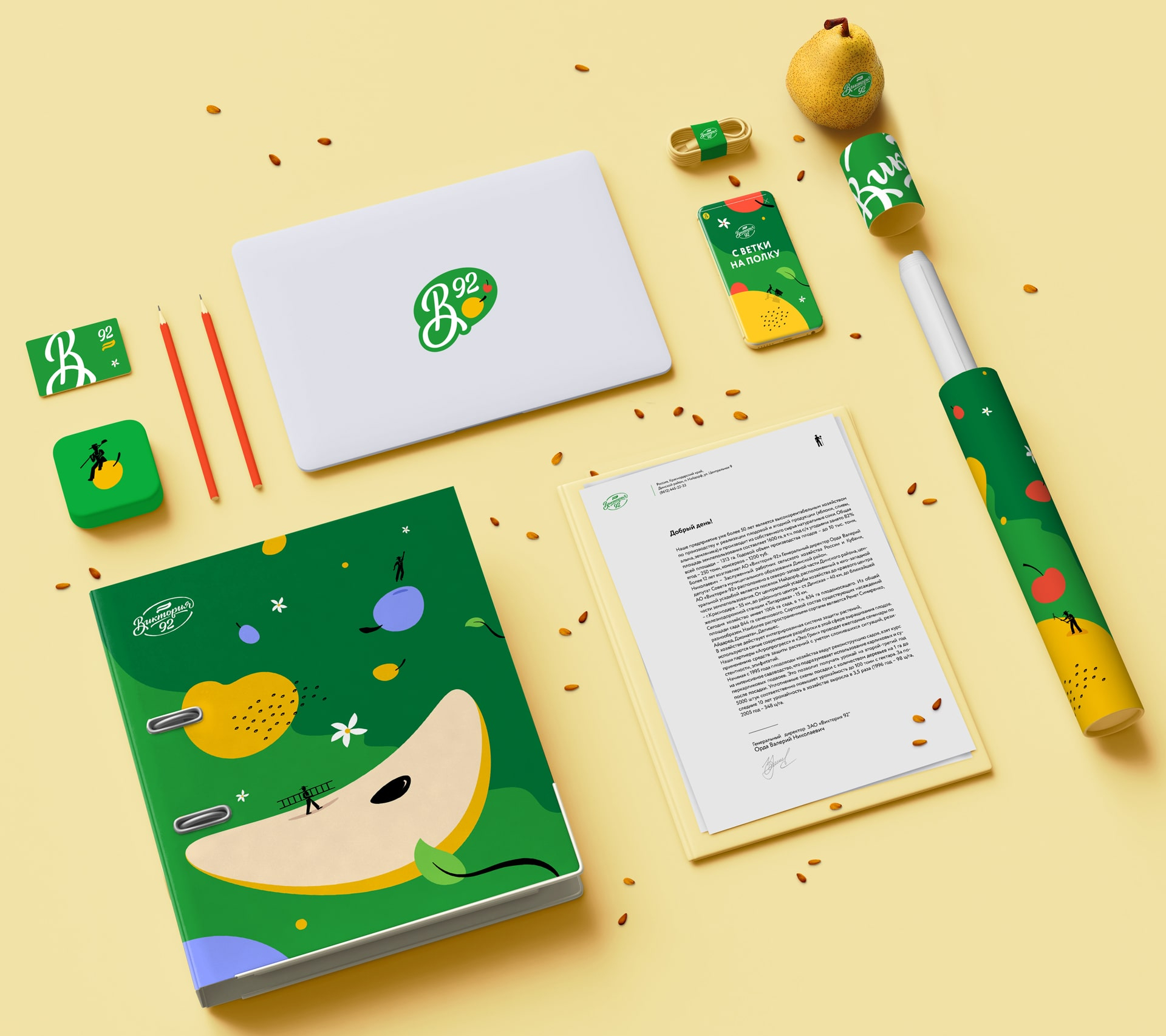
When scaling the style, we considered that it should work both in minimalist executions, where there is little space for design, and in more detail-rich versions. For example, in business documentation, we decided to forgo decorative details, while on promotional materials, we fully covered the surface with the brand element featuring the small gardeners.
During the development process, we learned a lot about industrial-scale fruit and berry cultivation. We understood that alongside the machines, there are people who truly love what they do. It is crucial for the company’s style to reflect the spirit of its team. In this project, we succeeded in creating not just a set of elements, but telling the story of the people behind “Victoria 92.”




CREDIT
- Agency/Creative: ICU
- Article Title: Branding by ICU, a Fruit Universe for One of the Leading Horticultures
- Organisation/Entity: Agency
- Project Type: Campaign
- Project Status: Published
- Agency/Creative Country: Thailand
- Agency/Creative City: Bangkok
- Market Region: Global
- Project Deliverables: Brand Design, Brand Identity
- Industry: Agriculture
- Keywords: brand strategy, brand core, brand identity
-
Credits:
Creative Director: Alexey Molchanov


