Auxility is not just a traditional software development company, it’s so much more than that. Fueled by passion and innovation, we have been crafting digital solutions for over eight years. Our areas of expertise include fintech and healthtech, where we specialize in bringing transformative technologies to businesses. Every project we undertake is a labor of love, as we strive to provide businesses with the tools they need for a limitless future.
We view human-centric design as the fundamental lens through which we approach our work. Every aspect of our creations, from the single pixels to the complex systems, reflects our belief in creating experiences that put humans at its heart. This principle is embodied in the very essence of our corporate design, and it guides us in every decision we make.
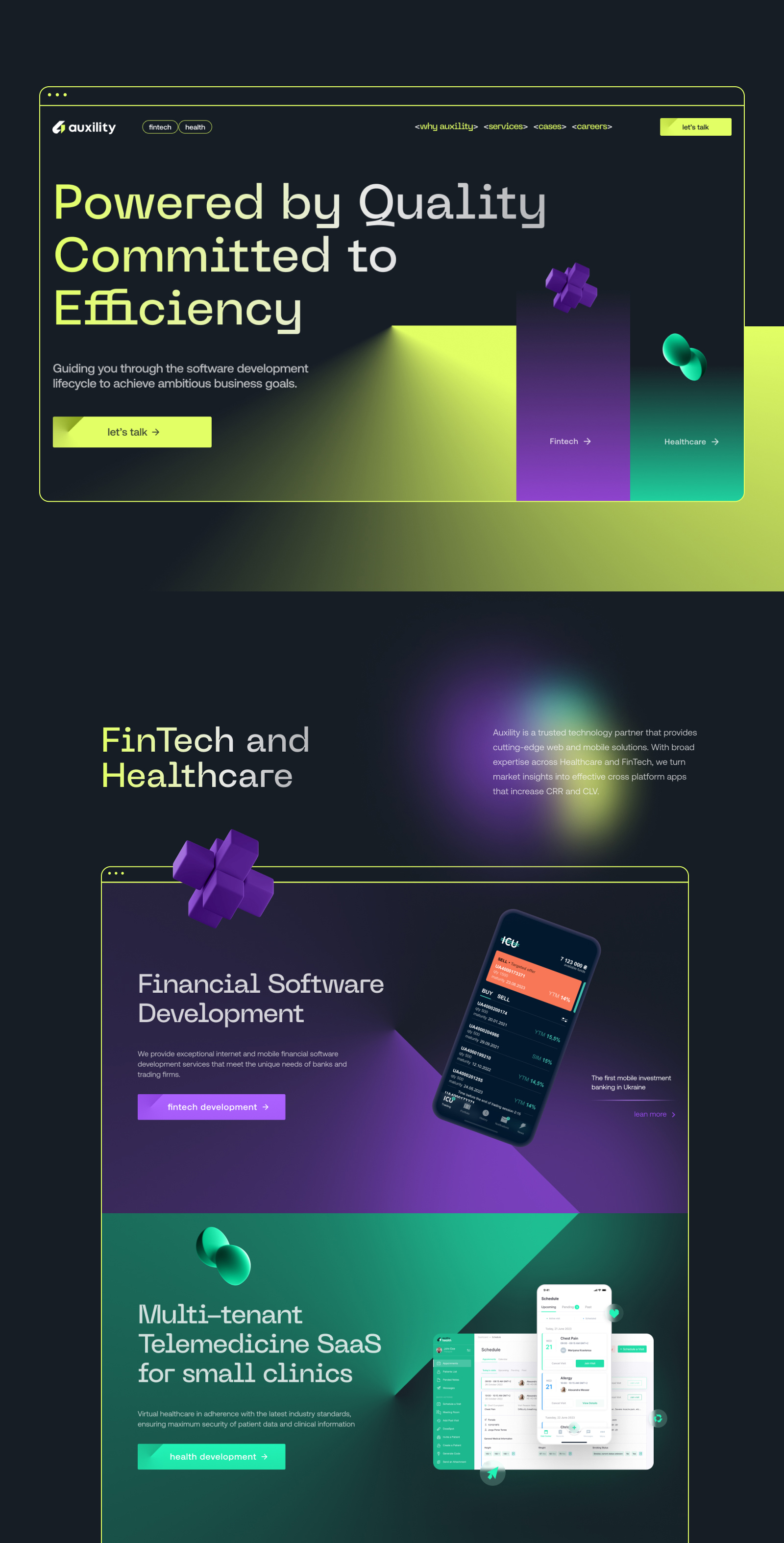
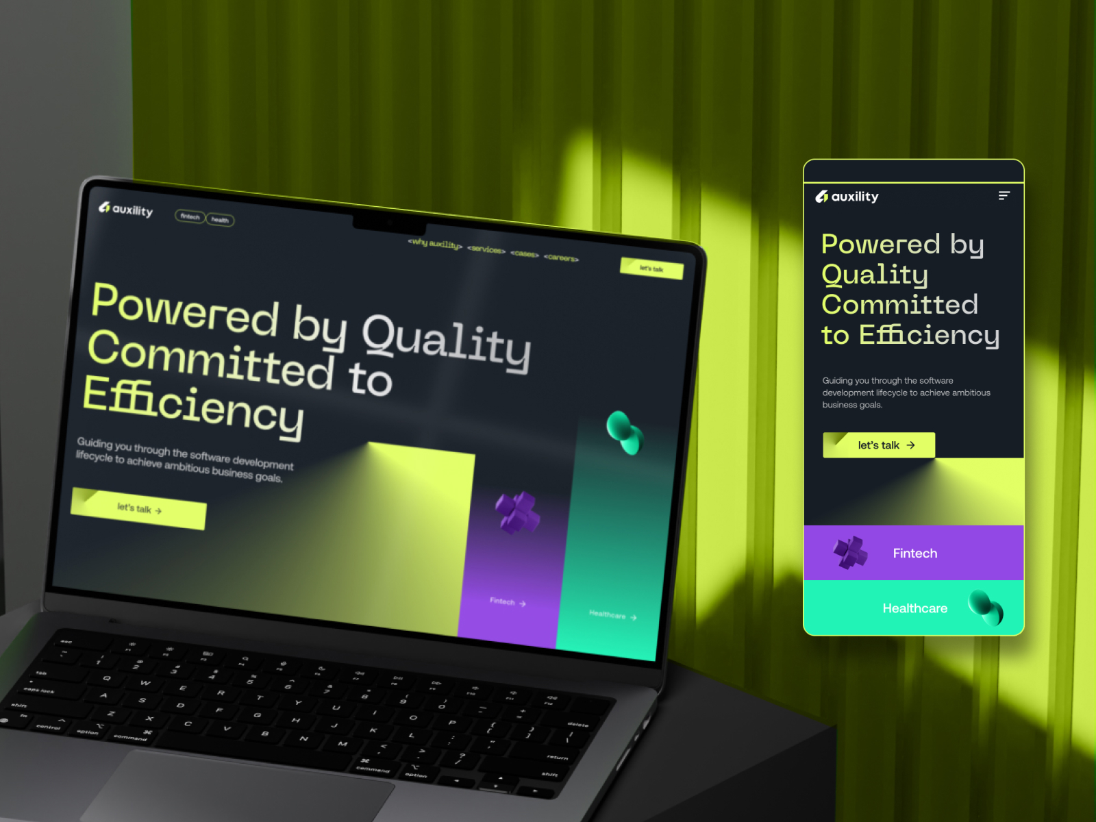
The slogan “Powered by quality, committed to efficiency” is literally a compass that directs us on the journey towards creating impactful solutions. This phrase represents the commitment to maintaining high standards at every step of the process, from research and design to development and deployment.
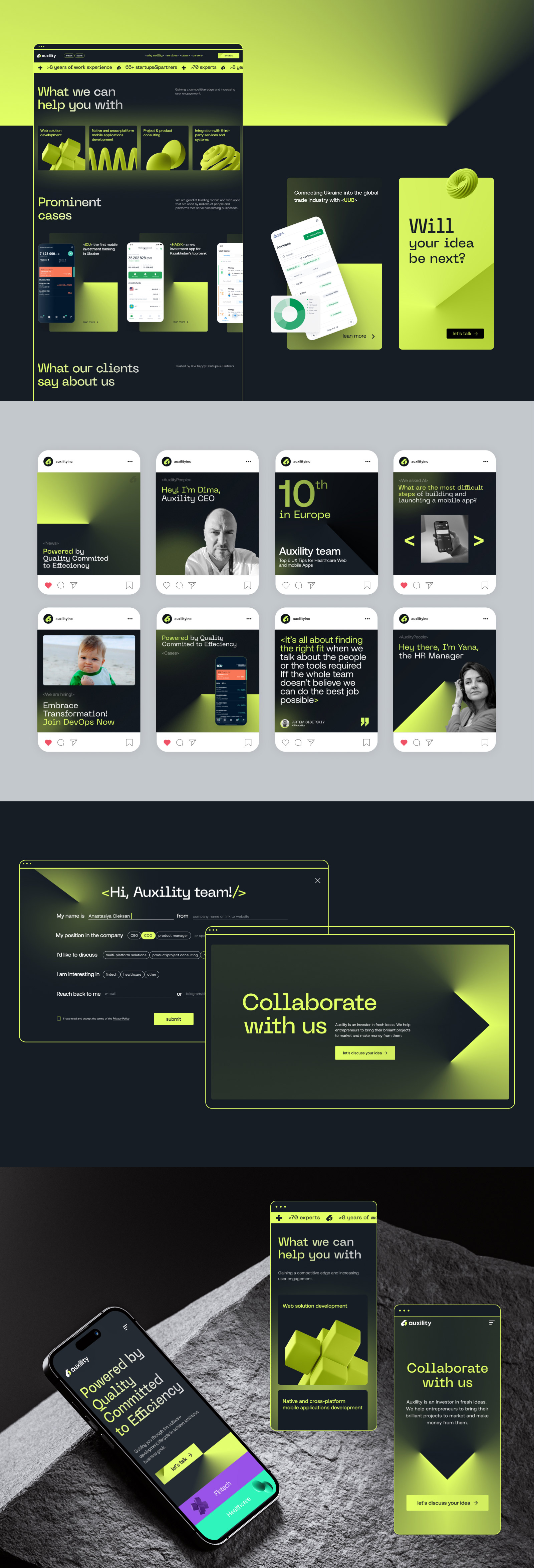
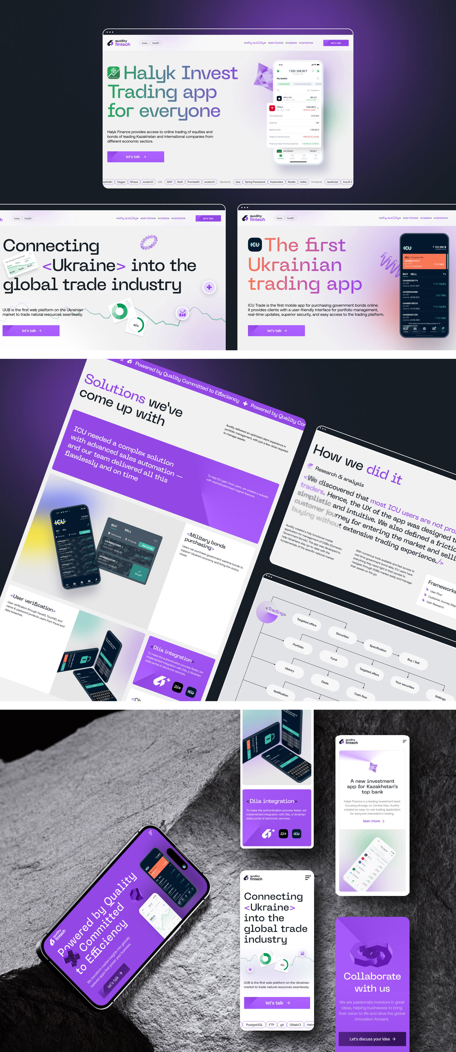
As users navigate our website, they are greeted with an experience that prioritizes both ease of use and human-friendliness. Every aspect of the design reflects the intention to make technology accessible and inviting.
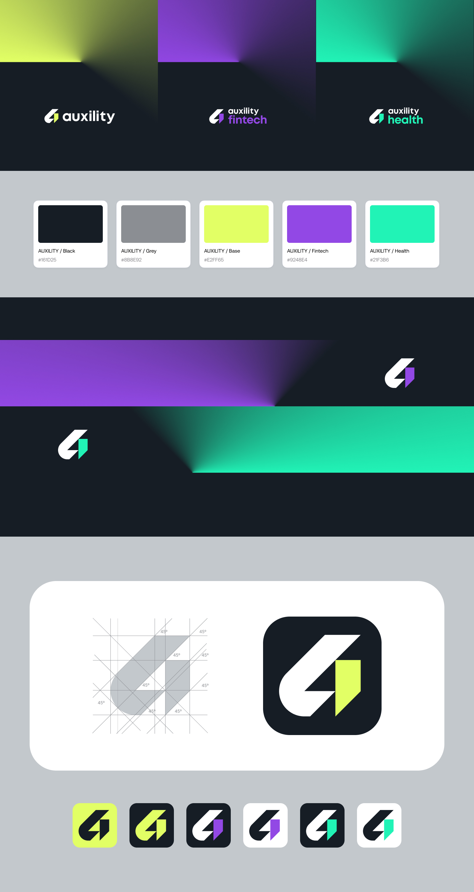
Our visual identity is a deliberate design choice, grounded in the letter “A”. It’s not just the first letter of the company name, it’s also a cornerstone, representing our foundation and dedication to being at the forefront of innovation.
The careful consideration of angles (45 degrees) in our design is a nod to precision and dynamism, showing how we approach the work with a balanced blend of accuracy and energy. The logo boasts versatility, offering a full version and a one-letter version, symbolizing our adaptability and efficiency.The use of angular gradients on the website creates a visual language that echoes the dynamism inherent in our digital solutions.
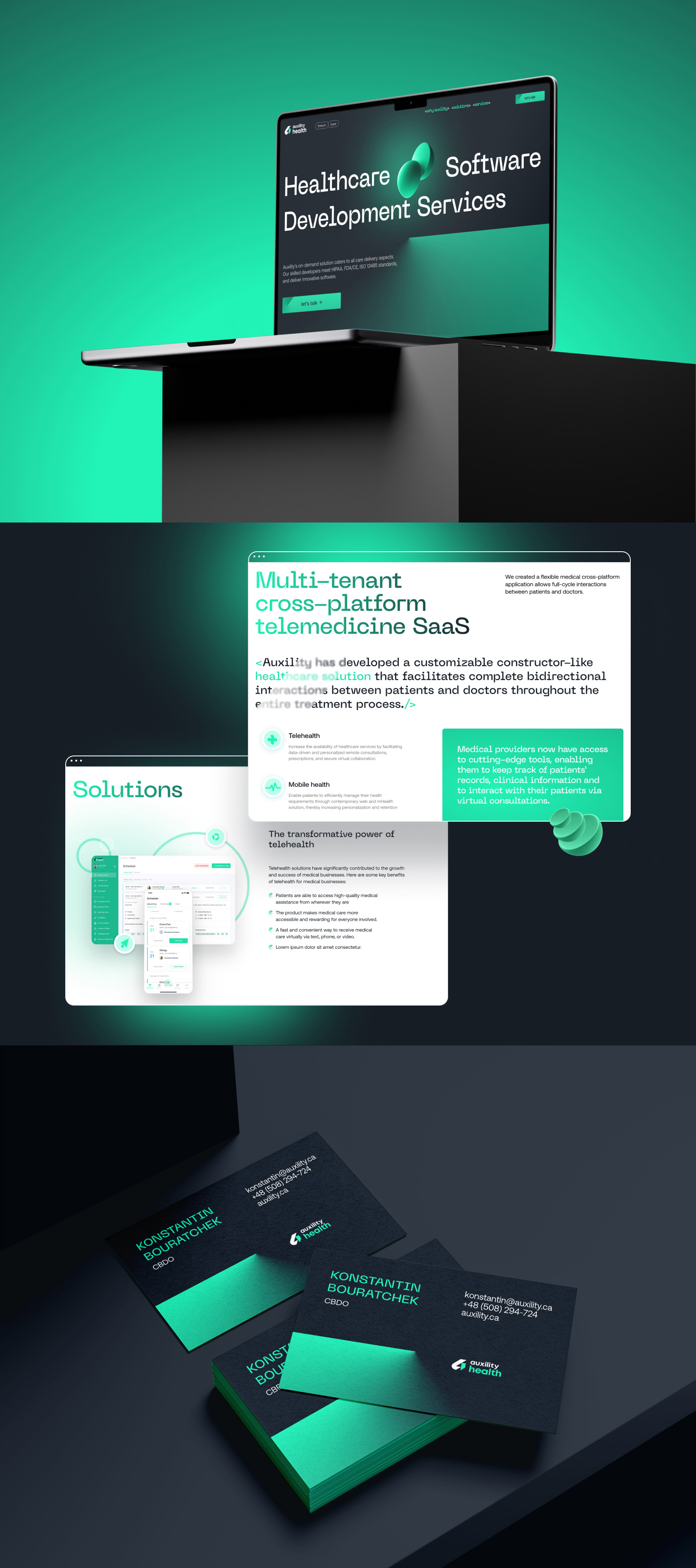
Our three main colors are yellow, dark lilac, and mint, and are mindfully picked to convey a distinct aspect of Auxility’s multifaceted identity. Yellow symbolizes the energy and enthusiasm we infuse into each endeavor; dark lilac exudes sophistication and reliability, aligning with the gravity of fintech solutions. Mint represents the vitality of the healthcare sector, reflecting our dedication to fostering impactful changes.
On our website we also utilize 3D figures — dynamic visual anchors connected to each industry we serve.. Each industry-specific 3D figure serves as a visual gateway, inviting site visitors to explore and connect with the unique solutions we offer.
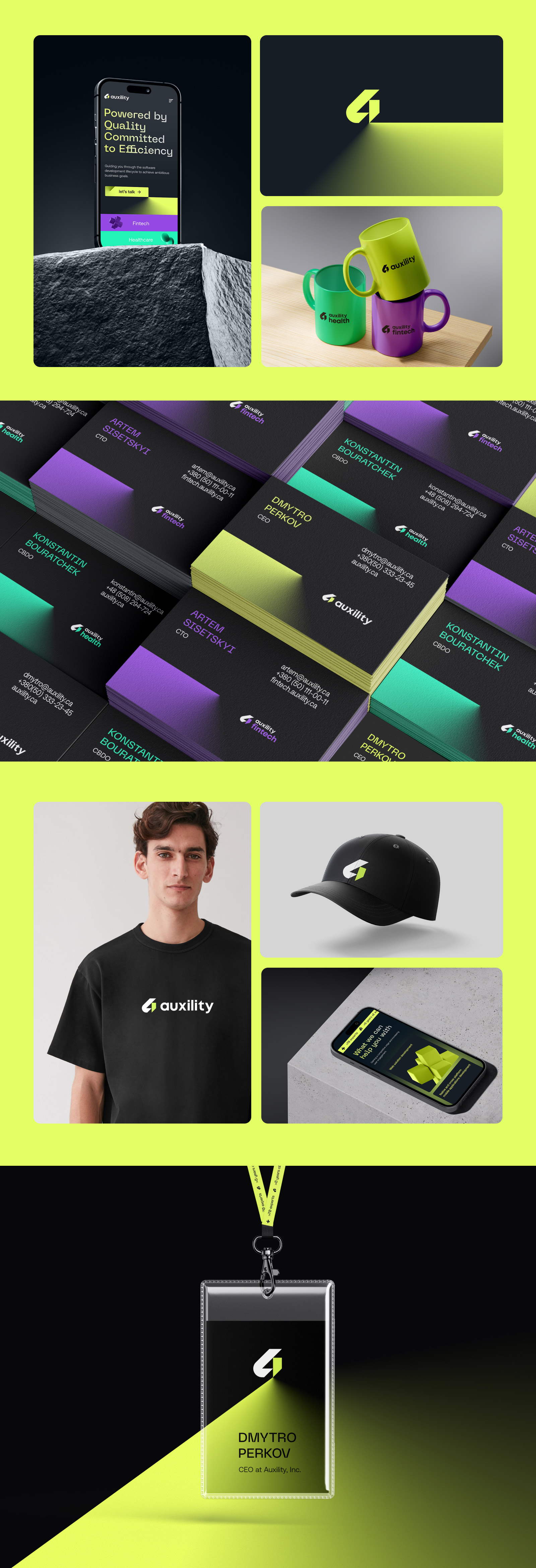
Auxility’s corporate merchandise is not simply a collection of practical things; each item, business card, holder, branded t-shirt, cap or a coffee mug, echoes our core values of quality and efficiency, serving as a physical representation of our guiding principles. Every piece is, a reminder of the purposeful approach we take to innovation and adaptability.
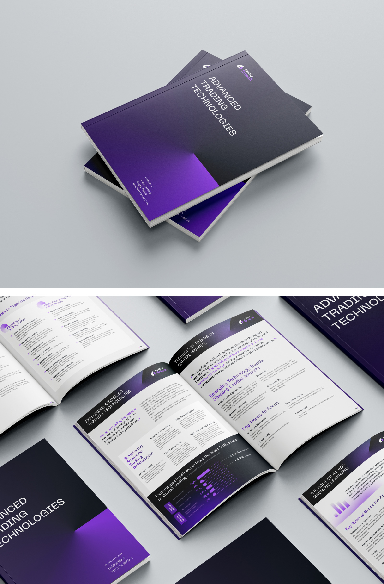
Our e-books, a result of in-depth research, are crafted as immersive journeys, expertly guiding readers through insights that are thoughtfully highlighted using a palette of colors, fonts, and visually engaging elements. The pages of these e-books serve as canvases where information is not just presented but orchestrated for maximum impact. Every visual element is a companion in the learning journey, transforming complex data into clear, simple narratives. We strive to make every page readable at a glance, allowing readers to quickly grasp key information before delving into the details.
So navigating the Auxility digital landscape is not just experiencing colors and shapes; it’s experiencing a visual narrative that encapsulates dedication to innovation, adaptability, and the meaningful impact we strive to make in the fields of healthtech and fintech.

CREDIT
- Agency/Creative: Auxility Software Development Agency
- Article Title: Branding and Web Design by Auxility Software Development Agency
- Organisation/Entity: In-House
- Project Type: Digital
- Project Status: Published
- Agency/Creative Country: United States
- Agency/Creative City: Delaware
- Market Region: Global
- Project Deliverables: Brand Identity, Graphic Design, Identity System, User Experience, Web Design
- Industry: Technology
- Keywords: development, fintech, healthcare, cases, portfolio, app, application, web, design
-
Credits:
Senior Web Designer: Oksana Tumeniuk-Malashenko
Product Design Lead: Daria Tatar
Content Lead: Dariya Bogretsova
CEO: Dmytro Perkov
Developing Innovative FinTech Solutions | CTO at Auxility: Artem Sisetskyi
Marketing Lead: Zamora Olena
Graphic Designer: Anna Korniets


