


Crafting the Brand Identity:
At the heart of Kikibix’s brand revitalization was the cultivation of a distinct and memorable identity that would resonate with its target audience. Drawing inspiration from the brand’s core values of health and simplicity, we conceptualized a minimalist yet impactful visual identity. Clean lines, modern typography, and a muted color palette formed the cornerstone of Kikibix’s new brand identity, evoking a sense of sophistication and trustworthiness.
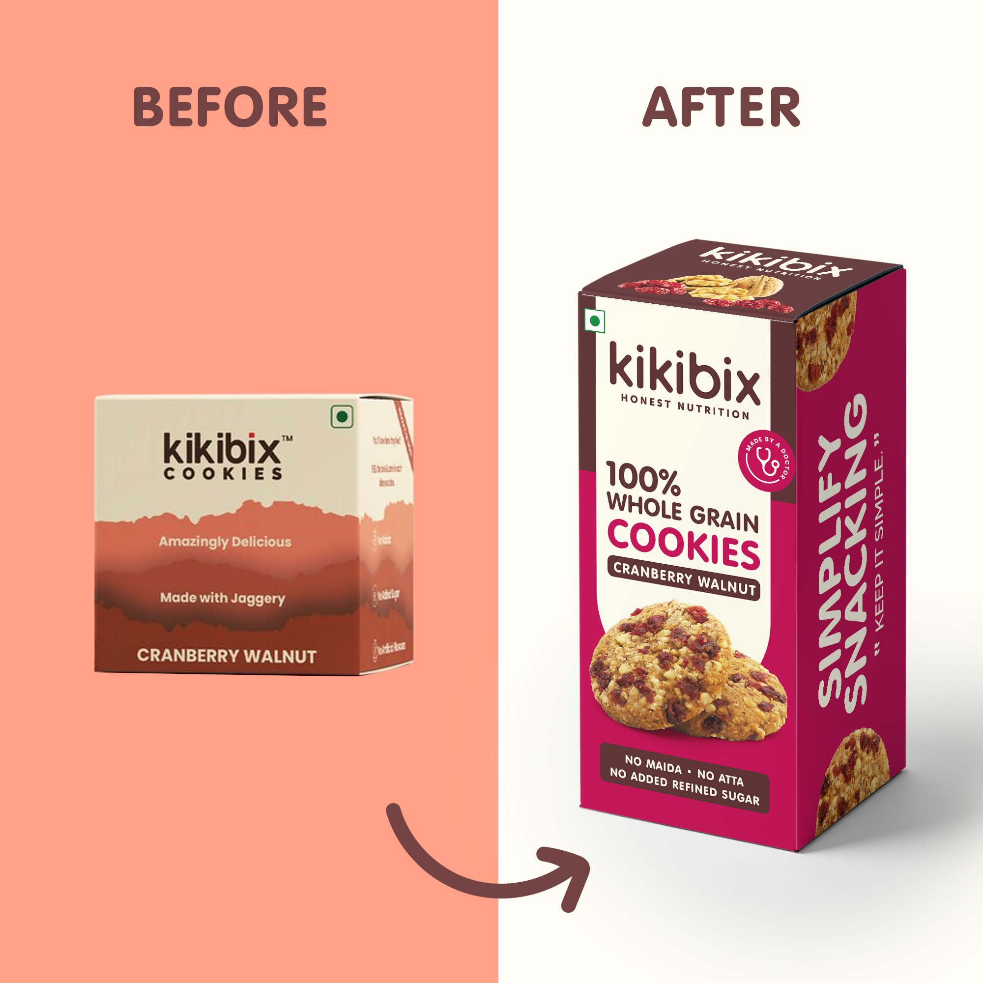
Reimagining the Packaging:
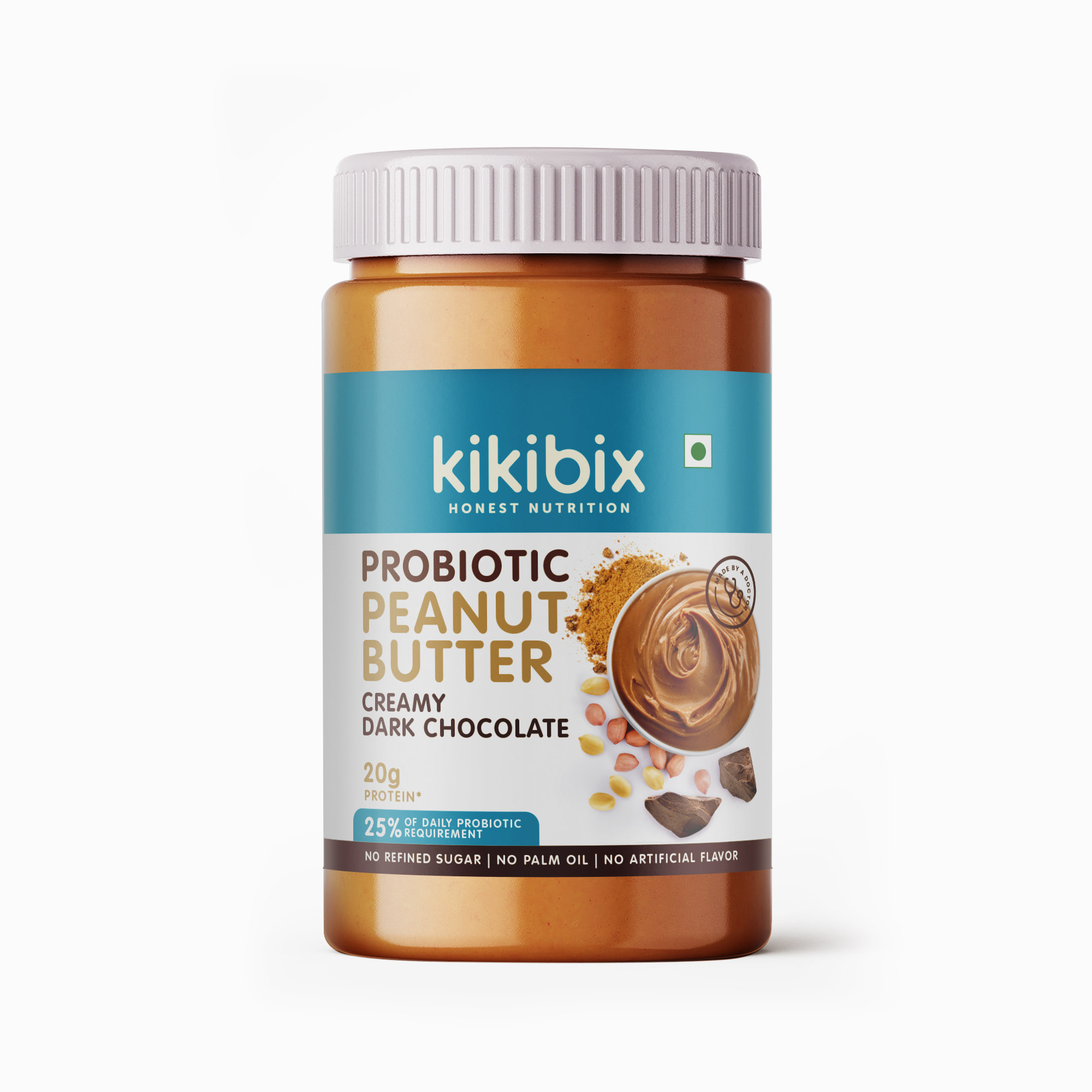
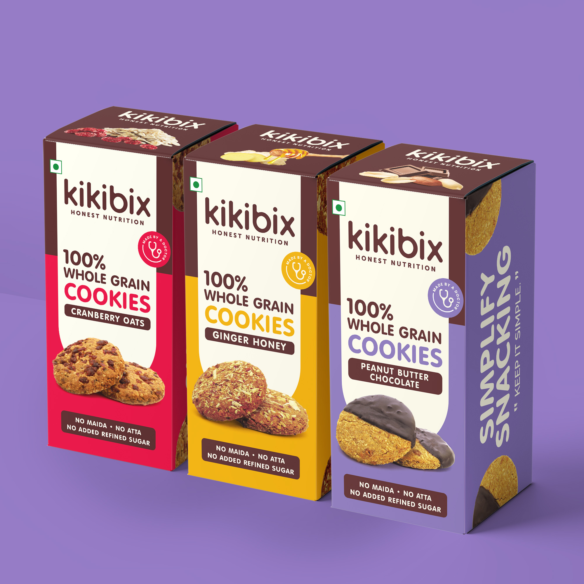
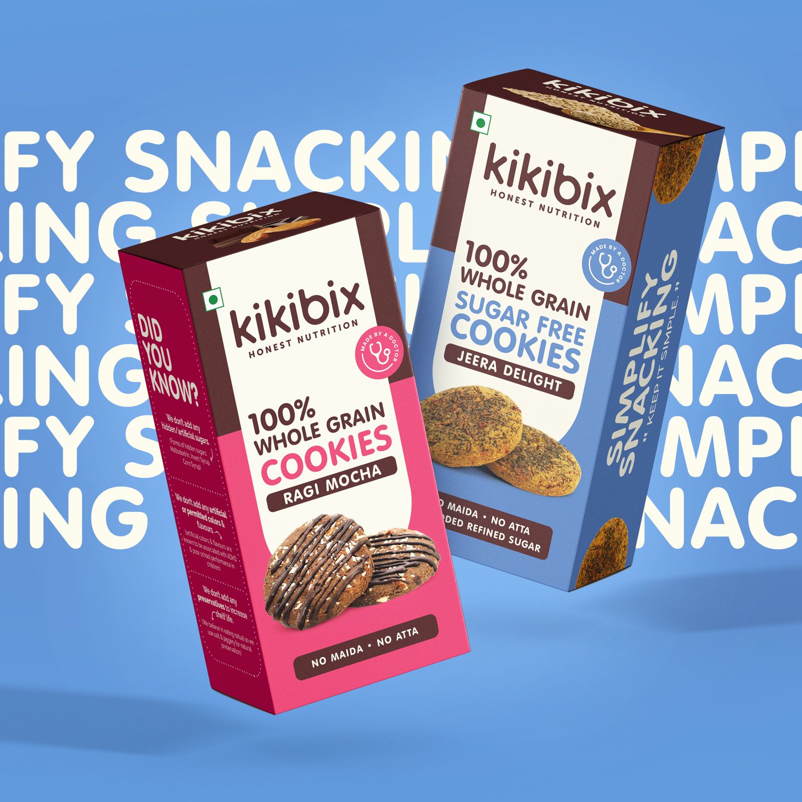
Building upon the foundation of Kikibix’s refreshed brand identity, we turned our attention to the packaging redesign—a critical component in shaping consumer perceptions and driving purchase decisions. Our objective was twofold: to emphasize a minimal ingredient profile and promote health while also infusing the packaging with a sleek and modern aesthetic. The result was a harmonious fusion of form and function—a packaging design that not only captured attention but also communicated Kikibix’s commitment to quality and simplicity.
The new packaging design placed a spotlight on Kikibix’s minimal ingredient profile, prominently featuring cookies and peanut butter as the focal points. By leveraging clean and uncluttered layouts, we ensured that consumers could easily discern the brand’s key offerings, reinforcing a message of transparency and authenticity. Through thoughtful use of negative space and strategic placement of product imagery, we created a visual hierarchy that guided consumers’ eyes to the most important elements of the packaging.
Promoting Health and Simplicity:
In line with Kikibix’s positioning as a health-conscious brand, the packaging design was imbued with cues that underscored its commitment to wellness. Vibrant imagery of fresh ingredients and subtle nods to nature served as visual cues of the brand’s dedication to quality and nutrition. Additionally, clear and concise messaging communicated the brand’s minimal ingredient profile, further reinforcing its promise of health and simplicity to consumers.
Reflecting Competitiveness:
Beyond its health-oriented messaging, the new packaging design also reflected Kikibix’s competitive edge in the market. A sleek and modern aesthetic, characterized by minimalist graphics and contemporary typography, positioned the brand as a leader in both aesthetics and product quality. The use of premium materials and finishes further elevated the packaging, enhancing its shelf presence and commanding consumer attention.
Communicating Brand Values:
At its core, effective packaging design serves as a vehicle for communicating brand values and forging emotional connections with consumers. Through the strategic use of imagery, messaging, and design elements, Kikibix’s new packaging effectively conveyed its commitment to health, quality, and simplicity. By aligning the packaging design with the brand’s overarching values and positioning, we fostered a sense of trust and loyalty among consumers, ultimately driving purchase intent and brand advocacy.
CREDIT
- Agency/Creative: Urvi Jaidka Design
- Article Title: Branding and Packaging Redesign for Kikibix
- Organisation/Entity: Agency
- Project Type: Graphic
- Project Status: Published
- Agency/Creative Country: India
- Agency/Creative City: gurugram
- Market Region: Asia
- Project Deliverables: Brand Design, Packaging Design
- Industry: Food/Beverage
- Keywords: healthy cookies, health food, Cookies, Bakery, packaging design
-
Credits:
Creative Head: Urvi Jaidka


