


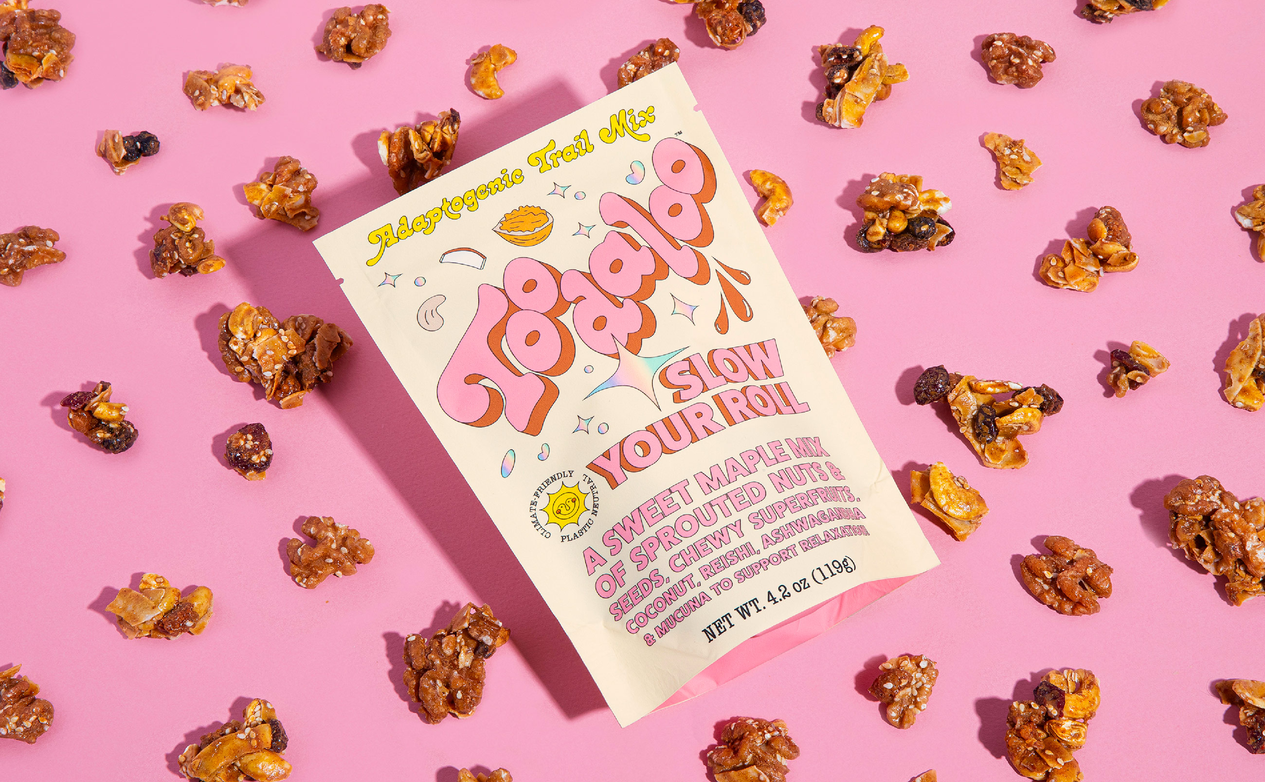
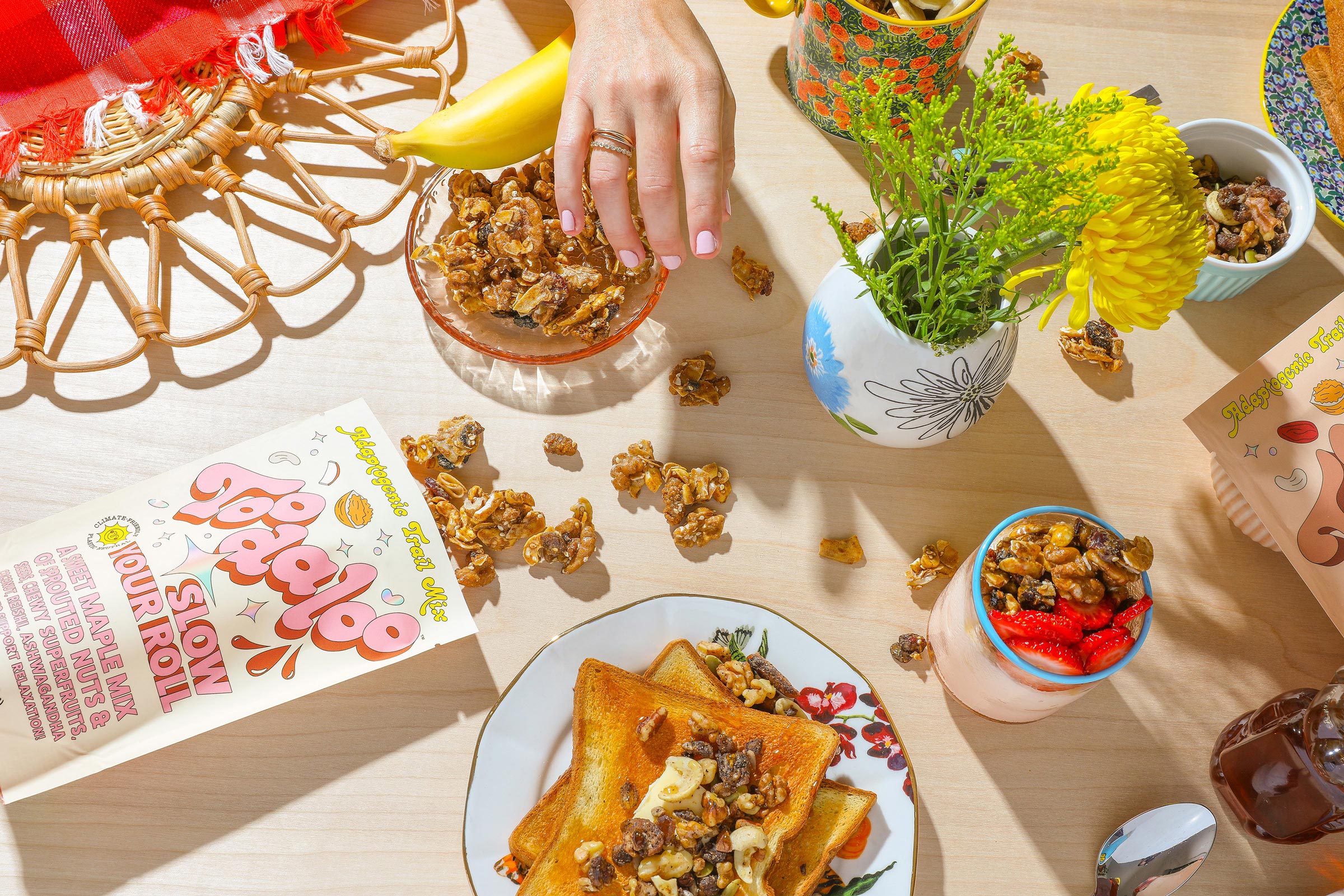
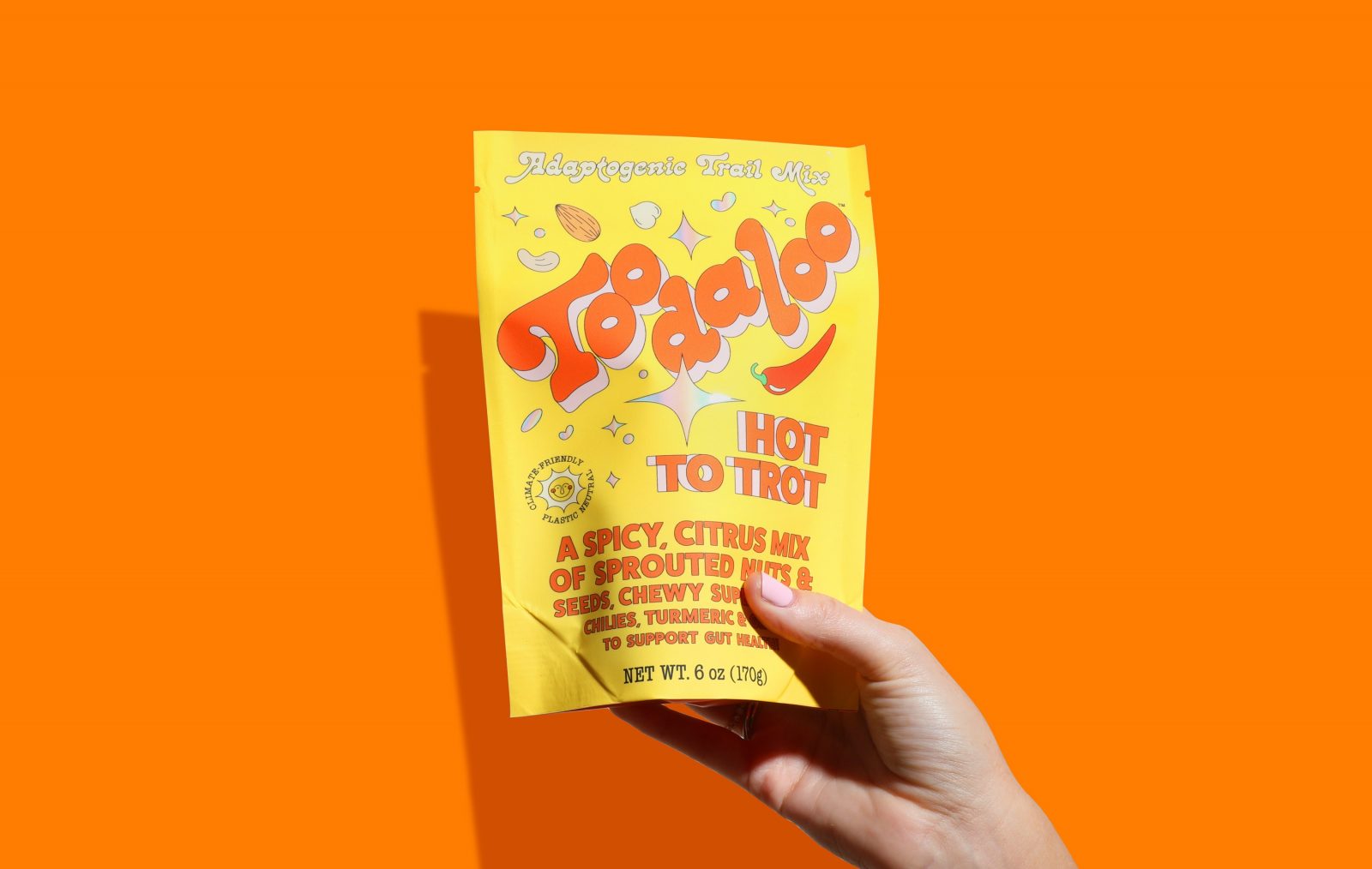
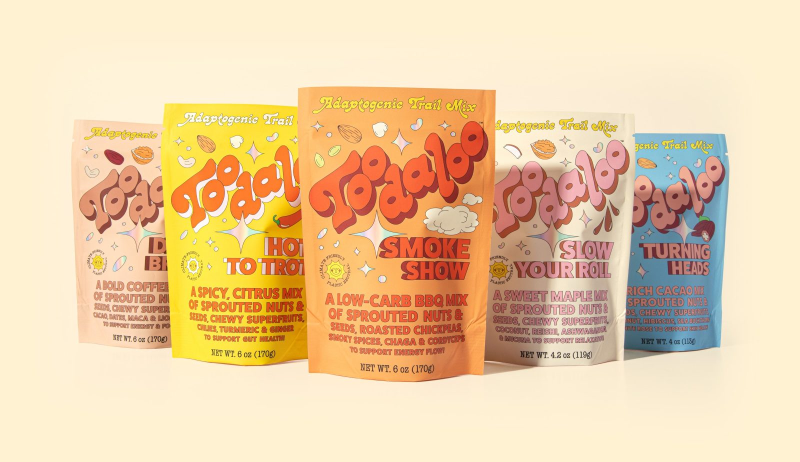
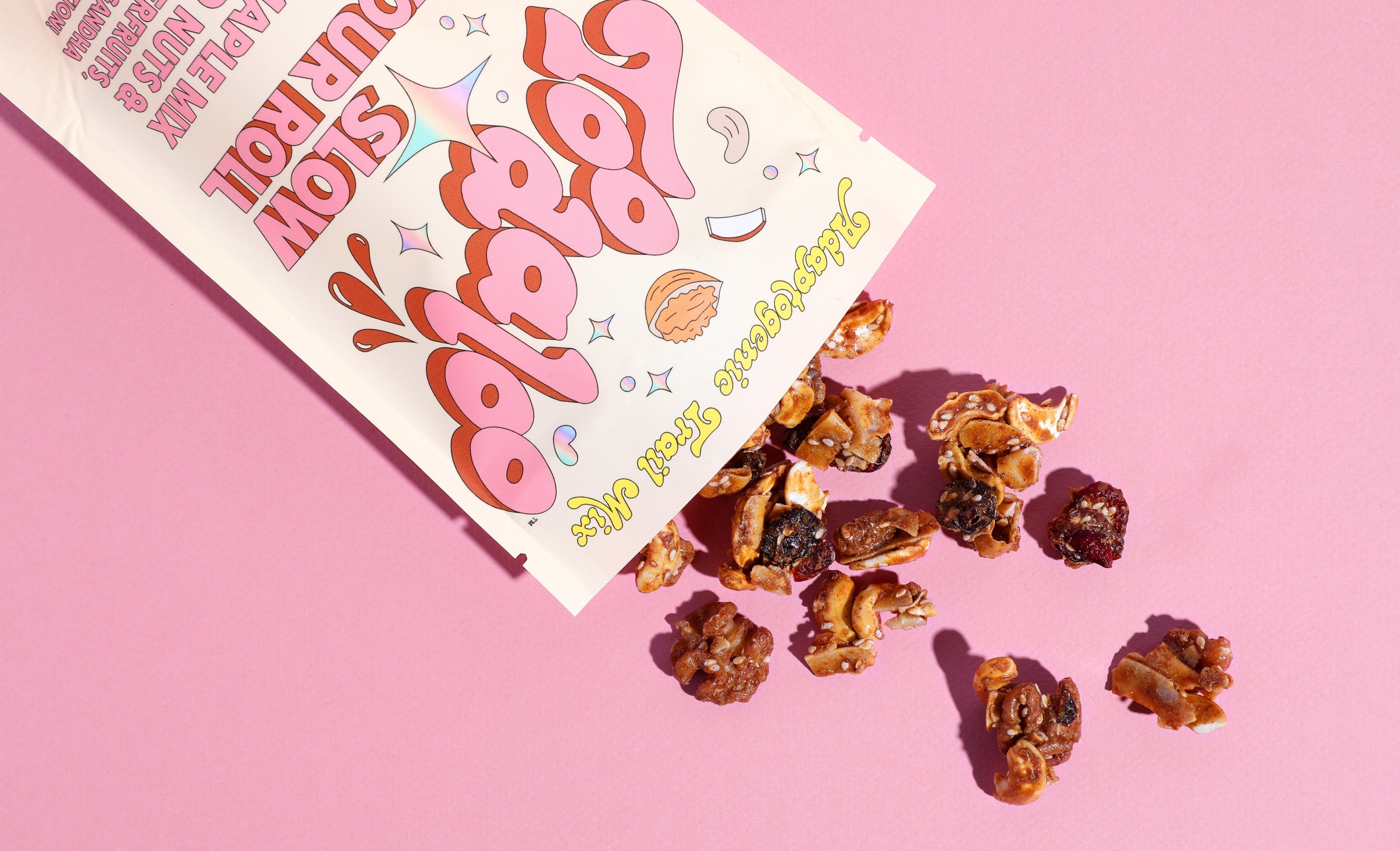
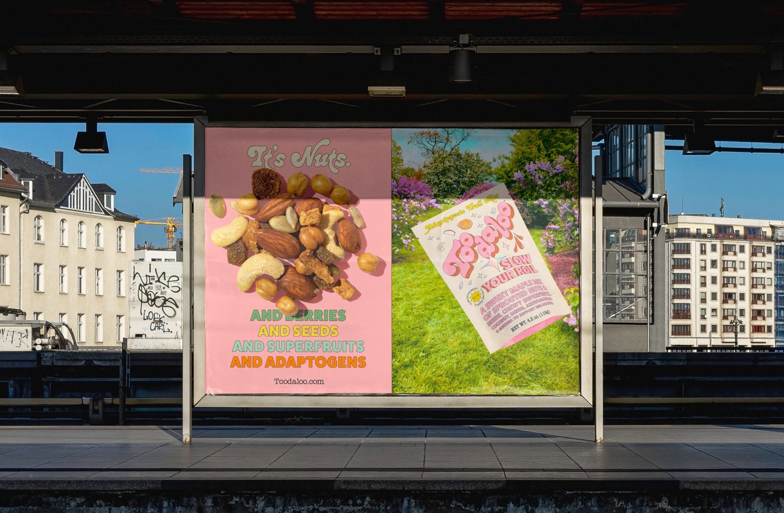
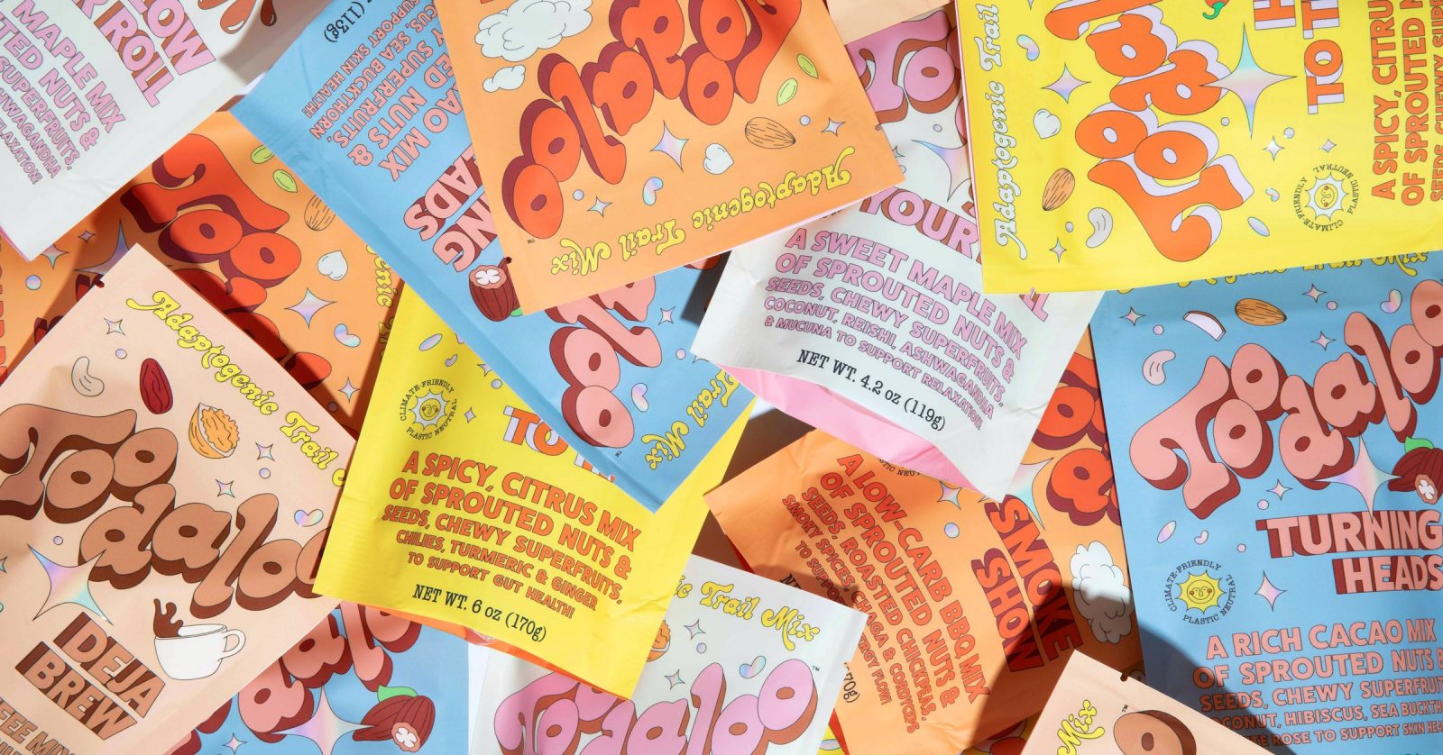
Toodaloo is an adaptogenic trail mix that says ‘goodbye’ to snacking as we know it and ‘hello’ to a new and better way. Enter the Toodaloo. A brand that’s on a mission to heal your body and the planet. Toodaloo is loaded with functional ingredients like ashwagandha, reishi, turmeric, lion’s mane, mucuna and more. If that wasn’t enticing enough, Toodaloo also uses plastic-neutral packaging and is climate-friendly, committed to regenerative agricultural practices by donating to the regeneration of 100 square feet of polluted farmland back to the rich, neutral soil Mother Nature intended. With 5 functional flavours, there’s something for everyone.
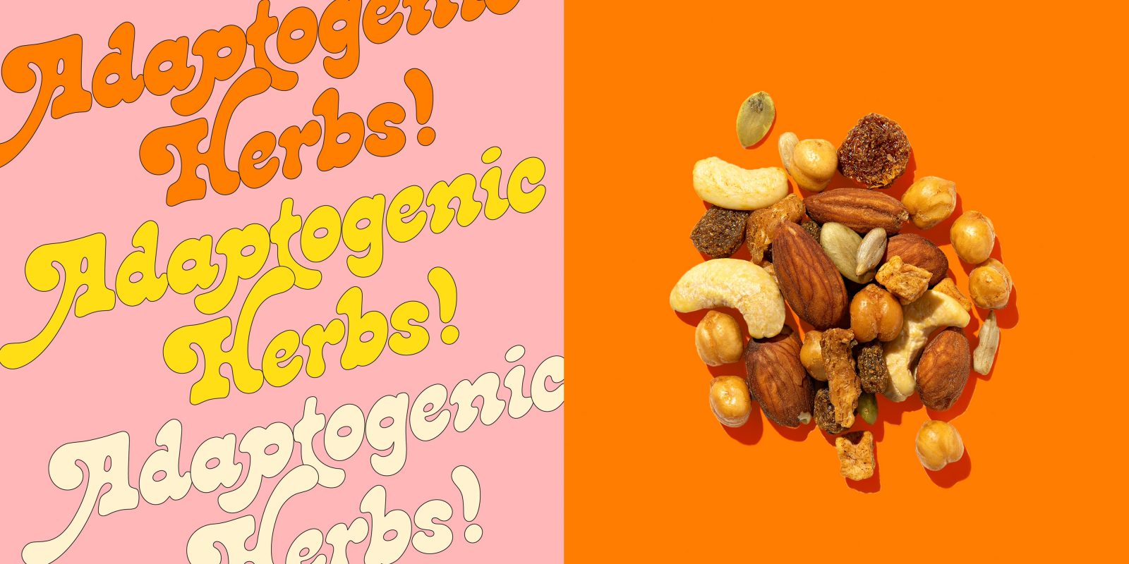
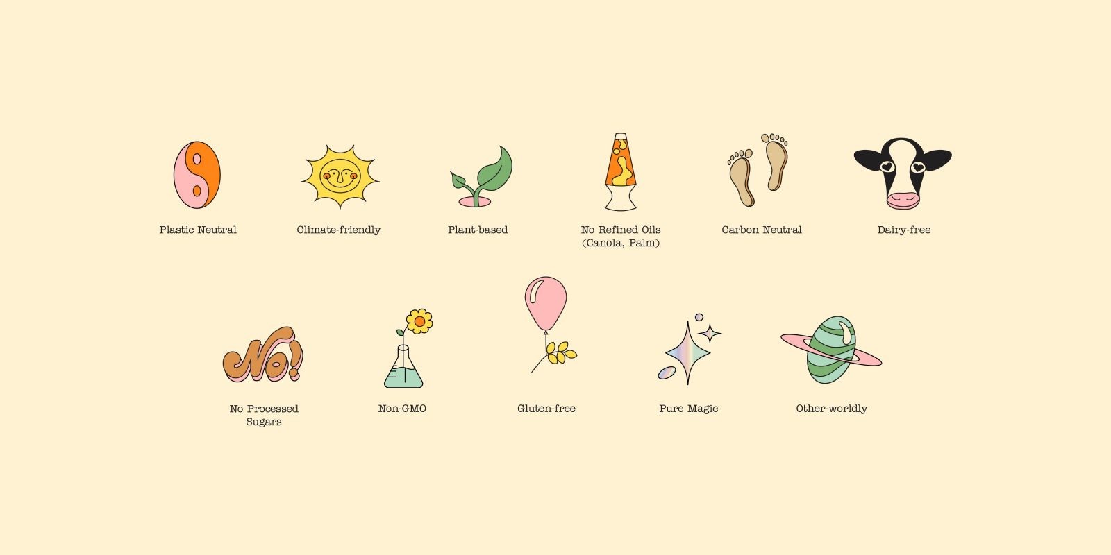
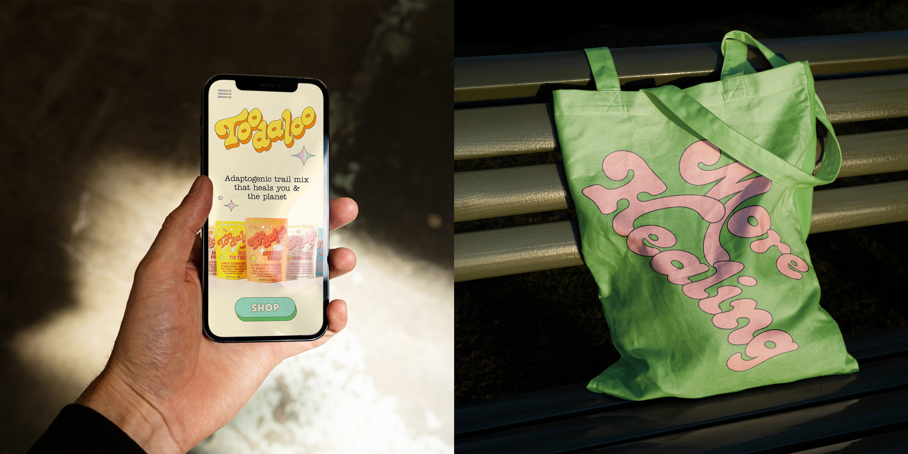
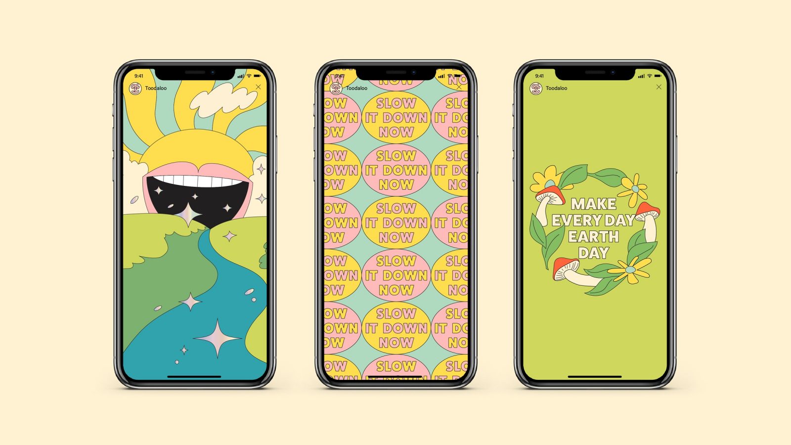
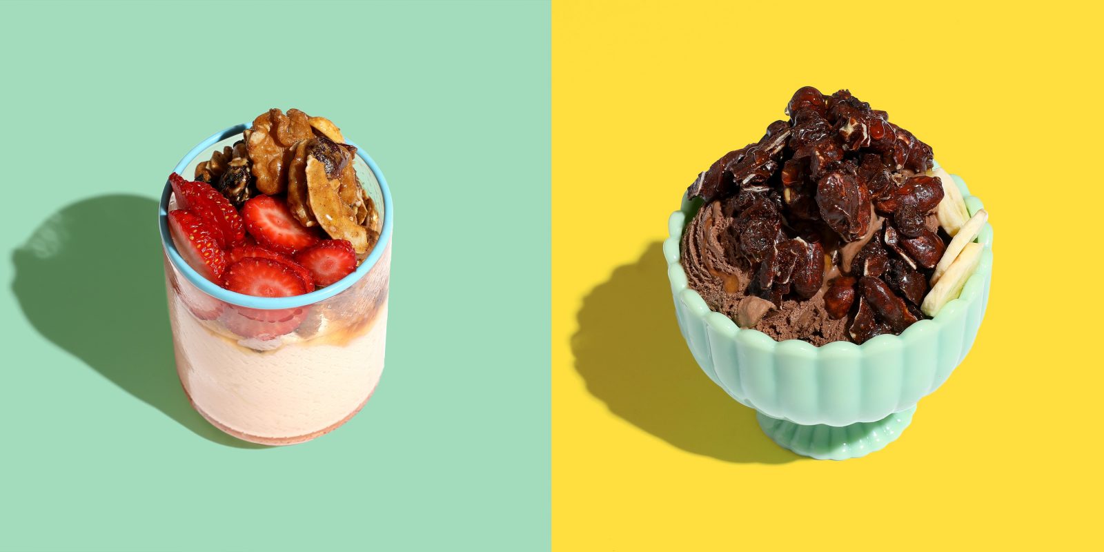
When we set out to build the brand identity and packaging design system for the team at Toodaloo, our goal was to showcase the magic behind the mix. We leveraged lively colour palettes, playful typography, and a whimsical illustration style that when combined, dials up the taste and brings to life the inherent purpose behind the brand. And because Toodaloo has so much to offer, we developed an icon system that displays its many benefits – like being plastic-neutral, plant-based, non-GMO and made with no processed sugars or refined oils – in a story-like and engaging way.
From Philippe Chetrit, CEO, Toodaloo. “We approached Herefor with the idea that we wanted to build a world where healing was universal and nourishing food was fun. They were like “Yes. We get it. Let’s build it!” After collaborating, refining and perfecting the brand, we had Toodaloo – my happy place. A place of nostalgia, play and inspiration. I would dream up worlds any day with Herefor.”
From Cattie Khoury, Founder & Chief Creative Officer, Toodaloo. “We came to Herefor with a vision to create a healing brand that we could only put into words and Herefor created the most visually stunning, magical Toodaloo universe that I love more than words could ever express. Sometimes our requests weren’t always crystal clear – we wanted a whimsical but still mission-based, cosmic but still down to earth, nostalgic but hopeful for the future brand that could transport people to a world where healing of the mind, body, spirit and planet was fun. They delivered the most excellent branding work I have ever encountered which has garnered us so much attention and has helped our business succeed tremendously. They are part of our Toodaoo family and are our design agency of choice for life.”
CREDIT
- Agency/Creative: Herefor Studio
- Article Title: Branding and Packaging for Toodaloo by Herefor Studio
- Organisation/Entity: Agency
- Project Type: Identity
- Project Status: Published
- Agency/Creative Country: United States
- Agency/Creative City: Brooklyn
- Market Region: North America
- Project Deliverables: Art Direction, Brand Identity, Copywriting, Creative Direction, Icon Design, Identity System, Illustration, Logo Design, Packaging Design, Photography Styling, Product Photography, Writing
- Industry: Food/Beverage
- Keywords: CPG Branding, Trail Mix, Toodaloo, Herefor Studio, Brand Identity, Package Design, Adaptogens,
-
Credits:
Creative Direction & Design: Ryan Hammond
Creative Direction & Design: Cory Uehara
Account: Jena Garlinghouse


